

You've got the assignment brief open, the paper's taped to the board, and the clock is already pushing you towards portfolio review, not a loose classroom exercise. The question isn't just whether the piece looks strong at the easel. It's whether the work will survive handling, photography, mounting, and the blunt questions that come up at interview.
That's the right way to think about soft pastel drawing if you're aiming for Level 2 or Level 3 progression. Every choice, from paper to pressure to fixative, changes how the surface behaves when it's scanned, stored, or lifted into a portfolio PDF. If you treat those choices as presentation decisions, your work starts to hold together in a way tutors can read.
Table of Contents
- Setting Up Your Studio for Portfolio-Ready Work
- Choosing Paper and Surfaces That Match Your Project
- Building Layers From Block-In to Refinement
- Blending Tools and the Overblending Trap
- Fixative, Mounting, and Storage That Protect Your Work
- Two Project Scenarios to Practise the Full Process
- Checking Your Pastels Against University Portfolio Standards
Setting Up Your Studio for Portfolio-Ready Work
The first thing to get right is the physical setup, because soft pastel punishes sloppy handling faster than most media. Work vertically on an easel, tape one sheet of pastel paper to a rigid board, and keep a clean backing sheet under the drawing to catch dust for reuse. That simple arrangement helps reduce hand-smudging and keeps the paper tooth available for later layers, which matters when you still need to photograph, mount, and explain the piece at interview The Hobby Library's soft pastel drawing guidance.
Why the angle matters
A flat table invites your hand to drag through finished areas, and it tempts you into pressing harder than you should. Once the tooth gets flattened too early, later marks sit on top instead of locking in, and the result can look tired in a portfolio image. A tilted surface lets gravity do part of the work, so pastel dust falls away from the picture rather than being pushed across it.
Practical rule: if your sleeve or wrist is touching the surface regularly, the setup needs changing before the drawing gets any further.
Light is part of the setup too. Side-lighting helps you read tooth, pigment load, and value shifts while you work, so you can see when a passage is dark or just overworked. Keep a soft brush nearby for dust control, wear protective gloves if you tend to smudge with your drawing hand, and set aside a corner away from food and pets. Pastel dust and casual interruptions are a bad mix when the same sheet has to leave the studio looking calm and deliberate.
The ultimate test is simple. Ask yourself, will this setup protect the picture from first mark to final PDF page? If the answer is no, the issue isn't your drawing skill, it's the studio arrangement.
Choosing Paper and Surfaces That Match Your Project
Paper choice decides how much pastel the surface will take, how far you can push layering, and whether the finished image still looks alive when it's photographed. Heavyweight cartridge is usually too smooth for serious pigment load, so it can frustrate layering and leave students fighting the sheet instead of building the image. That matters in portfolio work, because a surface that won't hold enough pastel often looks skimpy in close-up and weak in a scan.
Matching the surface to the brief
For Level 2 and Level 3 work, the realistic choices are sugar paper, Ingres, Canson Mi-Teintes, and Colourfix. Each gives you a different balance of tooth depth, colour, and layering strength. The sheet colour isn't just background, it acts as a mid-tone that changes how you organise the first layers.
A warm grey Ingres sheet behaves differently from a sandy Colourfix surface. On Ingres, hard pastel pushed into the grain can feel restrained and elegant. On Colourfix, the same pressure bites more assertively, so the paper supports bolder pigment load and more obvious mark-making. Darker sheets also change the order of decisions, because the paper itself becomes part of the value structure rather than something you cover up at the end.
| Surface | Tooth Depth | Best For | Portfolio Note |
|---|---|---|---|
| Heavyweight cartridge | Light | Quick studies, limited layering | Too smooth if you need strong pastel build-up |
| Sugar paper | Moderate | Early practice, simple studies | Useful for learning values, less forgiving for heavy refinement |
| Ingres | Moderate | Controlled layering, tonal work | The sheet colour can support a clear mid-tone structure |
| Canson Mi-Teintes | Moderate to varied | General soft pastel work | A dependable classroom surface when you need balance |
| Colourfix | Strong | Heavier pigment load, more ambitious layering | Better when you want the surface to hold up in a PDF close-up |
| Sanded paper or pastel board | Strongest | Final pieces that need depth | Costlier, but they take more pigment per layer and photograph well if handled carefully |
For ambitious final pieces, sanded papers and pastel boards are worth considering, but they demand more pigment per layer and they cost more to use. That trade-off matters if you're doing a sequence of portfolio studies, because you don't want to burn through your best surface before you've tested the composition. For a university-ready piece, a tooth that holds pigment usually photographs far better than a sheet where everything sits too lightly on the surface.
If you're still deciding how paper choice feeds into study habits and progression, the decision-making side is explored in more depth in this guide to improving your drawing. The key point here is practical. Choose the surface that supports the assignment, not the surface that happens to be nearest to hand.
Building Layers From Block-In to Refinement
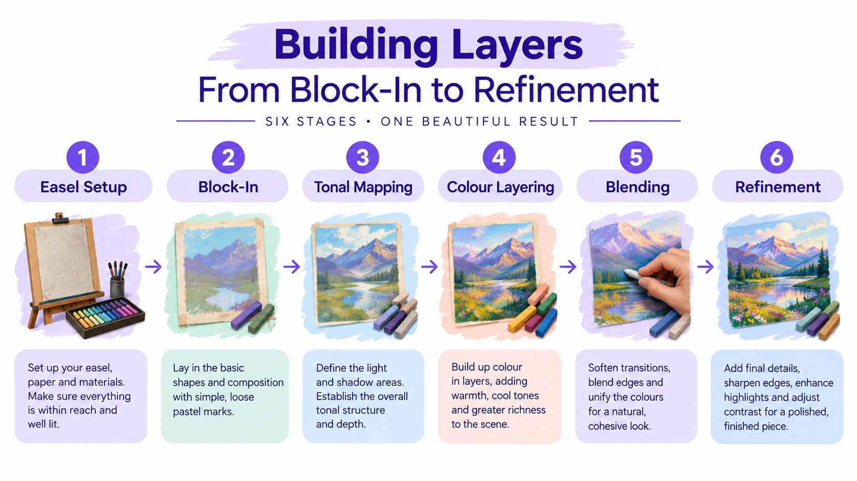
The six-colour limit is one of the best disciplines for early pastel work because it stops you hiding behind endless choice. With only a small set of related colours, your block-in has to be confident, and that confidence reads better in a portfolio than muddied mid-tones that suggest hesitation. The same method also helps preserve the surface for later layers, because the first passes stay light and purposeful rather than overpacked.
A sequence that keeps the tooth alive
Start with a light, loose underdrawing in a single cool tone to map the proportions. Then move into a thin warm block-in that places the largest shapes before you worry about detail. After that, build progressively, using increasing pressure and smaller areas as the structure firms up. Finish with sharp accent marks laid on top, not blended in, so the drawing keeps its clarity at interview distance.
Portfolio rule: if the early stages already look finished, you've probably used too much pressure too soon.
Light-to-dark usually wins in soft pastel because the tooth fills quickly. If you drop dark pigment too early, later layers have less grip, and the surface can starve itself of room. On a scanned PDF page, a whisper of pigment leaves tooth visible for atmospheric passages, while firmer pressure loads the grain for opaque areas that need to read clearly. That pressure shift is not a technical detail, it's the difference between a drawing that breathes and one that goes dense.
The same sequence behaves differently on Ingres, Mi-Teintes, and Colourfix, so don't treat layering as a fixed formula. On a more delicate surface, the later layers need restraint. On a stronger tooth, you can push further before the sheet gives up. If you want to compare how development and confidence show up in practice, the structure of the work often matters as much as the subject, which is why process is such a big part of portfolio review at Level 3.
See how students build technical control across drawing projects
The most useful habit is to stop before the surface starts telling you it's had enough. That's when the work still looks intentional, and intentional work photographs better.
Blending Tools and the Overblending Trap
Blending is useful, but it's also where many pastel students flatten their work. Fingertips, chamois leather, paper stumps, hog-bristle brushes, and tortillons all do different jobs, and the right choice depends on the area you're handling. If you use them interchangeably, you can easily crush the tooth or turn strong edges into a soft blur that disappears in the portfolio.
Tool choice should follow the task
Fingertips work best for the softest edge transitions, but they warm the pigment and can lift more than you expect. A damp chamois gives the gentlest broad transition on sanded surfaces, especially in skies or skin passages where the surface needs smoothing without total collapse. Hog-bristle brushes are surprisingly useful for larger passages because they move pigment across the grain without pressing the tooth flat in the way a stump can.
Paper stumps and tortillons belong in smaller areas, where you want controlled blending rather than broad smearing. They're useful for fine lines, tight corners, or a little adjustment around a contour, but they're easy to overuse. Once the drawing starts to look airbrushed, the pigment load drops, the edge variety disappears, and the piece loses the evidence of process that tutors like to see.
That's the overblending trap. The edges stop reading at interview distance, the surface looks over-finished, and the next layer has nowhere to sit. If a passage goes flat, don't keep rubbing. Scrape back with a blade, re-lay a mid-tone, and stop. That rescue move is faster than trying to polish a dead area back into life.
If you're deciding between a soft, expressive finish and a more controlled one, leave some marks visible on purpose. The visible stroke tells the viewer how the piece was made, and that matters when your work is being assessed as evidence of development rather than just presentation. I'd rather see a few honest transitions than a whole drawing that feels cosmetically smoothed out.
Photographing your pastel work clearly helps you see whether the blend has gone too far. If the image already looks flat in the camera, it usually won't improve in the PDF.
Fixative, Mounting, and Storage That Protect Your Work
Fixative shouldn't be your automatic last step. It's one decision in a chain that starts with handling and ends with storage, and if you use it badly, it can dull the colour you worked hard to build. In the studio, workable fixative can hold dry pigment just enough to resist smudging without sealing the tooth, while heavy coats can yellow, shift colour, and block further layering. That's why the timing matters as much as the product itself.
Use fixative with restraint
Apply workable fixative between layers only when the passage needs stabilising, then let it dry before adding more pastel. For final fixative, keep the application light, even, and measured, because the goal is to settle the surface rather than flood it. A heavy spray changes the character of the drawing, and once that happens, the work is harder to defend when it's being reviewed for a portfolio or interview.
For mounting and storage, conservation guidance for drawings and other works on paper recommends keeping finished pastel works in a plan chest or specially designed case when they're not on display, and using mounts that prevent static or friction. The National Archives also advises rebated mounts to reduce surface damage, and the practical benchmark is to minimise contact, avoid pressure on the pastel layer, and store flat to prevent dust loss and abrasion National Archives conservation guidance.
| Decision | Recommended Option | What to Avoid |
|---|---|---|
| Working fixative | Light passes between selected layers | Heavy coats that seal the tooth |
| Final fixative | Sparse, even application at the end | Spraying until the colour shifts |
| Mounting | Acid-free foam-centred board, corner mounts, hinged formats | Anything that presses directly on the pastel layer |
| Storage | Flat drawers, glassine interleaving, rigid support | Sleeve systems that create static lift |
| Handling | Lift by the mount or board edge | Fingers touching the pastel surface |
The goal is simple. When the work arrives for interview, it should still have the same surface structure it had at the easel. That means no dust loss, no unnecessary friction, and no pressure marks from storage.
If you're preparing a digital submission alongside physical work, the OCAD online portfolio option can sit alongside other pathways that use tutor-led presentation and portfolio-based study, especially for learners balancing work or home commitments. The useful part here is not the branding, it's the structure, because pastel work survives assessment better when the process from studio to submission is treated as one system.
Two Project Scenarios to Practise the Full Process
A good still life gives you enough surface variety to test the full pastel process without demanding portrait-level finish. Three to five objects work well, especially if you choose mixed reflectance such as a glazed ceramic, a folded cloth, and a polished apple. The glazed surface teaches you where sharp edges belong, the cloth asks for softer transitions, and the apple shows whether your colour layers can hold form without drifting into a blur.
Project one, a controlled still life
Pick a mid-tooth UART-style sheet or something similar, then build the piece on the easel with the six-colour rule. Start with the light underdrawing, block the major shapes, and add a single workable fixative pass between layers only if a passage starts to slide. That keeps the surface stable without making the whole piece feel sealed. Finish with a final fixative only if the drawing still needs protection after all the pastel work is complete.
Project two, a one-session portrait study
Use a single-source portrait under window light and keep it compressed to one session. That forces you to judge how far to push a passage before overblending starts to win. In a portrait, it's usually better to preserve the structure of the face and let a few edges remain open than to keep blending until the expression turns generic.
If the first pass already says enough, leave it alone and move on.
Both projects should end with the same question. Could this sheet go straight into a 20-page portfolio PDF without retouching? If the answer is yes, the piece is doing more than looking good on the easel. It's behaving like a university-ready study, which is exactly where Level 3 learners need the work to land.
Use these as templates, not formulas. The still life teaches handling, the portrait teaches restraint, and together they make the rest of your portfolio decisions easier to trust.
Checking Your Pastels Against University Portfolio Standards
A finished pastel should prove more than neatness. It needs to show process sketches, a resolved final outcome, and at least one developmental sheet that shows experimentation with surface, blending, and fixative. That lines up with the way UK portfolio guidance often looks at progression, not just polish, and it's the same logic behind the portfolio preparation requirements used by institutions such as the University of Edinburgh, which ask for process, investigative work, personal projects, and finished work in one PDF University of Edinburgh portfolio preparation guide.
Seven questions to ask before you submit
- Is the subject matter clear without explanation? If the viewer can't read the idea quickly, the piece needs more structure.
- Are the layers visible enough to show technical control? Tutors want to see decision-making, not just a polished surface.
- Have you included a back view or detail crop? A close crop can prove how you handled edge quality and tooth.
- Does each piece sit flat on board with a window mount? Smudging from careless storage will undermine a strong drawing.
- Have you photographed the work under daylight-balanced bulbs at a consistent angle? Uneven lighting can make the same pastel look weaker in the PDF.
- Is one piece labelled with medium, surface, and intention? A short annotation is enough if it's specific.
- Does the selection show range? One observational piece, one expressive piece, and one developmental sheet give the tutor something to assess beyond a single strong image.
The easiest way to sort the set is with a coloured sticker system. Mark the strongest observational work in one colour, developmental experimentation in another, and pieces that still need handling or mounting checks in a third. That gives you a fast visual audit before you book the review.
If you want a digital submission workflow to match that level of organisation, this online art portfolio guide is useful for thinking about sequence, selection, and presentation. The standard to keep in mind is straightforward. If the piece can't survive the journey into the PDF, it isn't ready for university scrutiny yet.
OCAD offers tutor-led creative courses that fit this kind of portfolio work, including pathways that support Level 2 and Level 3 study, foundation progression, and SEND-friendly learning. If you're building soft pastel drawing work for interview, PDF submission, or a university portfolio, visit The Online College of Art & Design (OCAD) and look at how its online study model can support your next submission.