

You've spent an evening carefully blending a portrait, yet under the grey light from a UK window the face still looks flat, waxy, or oddly orange. The pencil marks seem to have disappeared, but the likeness hasn't arrived. This is a common problem with skin colour coloured pencil work, and it usually isn't solved by buying more shades.
Realistic skin depends on undertone, value, paper tooth, layering and restraint. A smaller palette can outperform a large skin-tone set when you understand how to build colour gradually. The methods below are designed for a kitchen table, a household lamp and the kind of reference photograph students use, rather than a controlled studio setup.
Table of Contents
- Why Skin Tones Look Flat or Waxy
- Reading the Undertone Before You Pick a Pencil
- Layering and Burnishing for Believable Skin
- Choosing Paper, Pencils and Tools That Work Together
- When Inclusive Skin-Tone Sets Help and When They Hold You Back
- A Short Portrait Study From First Mark to Final Highlight
- Building a University-Ready Portrait Into Your Practice
Why Skin Tones Look Flat or Waxy
A finished portrait can contain plenty of colour and still feel lifeless. The most familiar version has a uniform mid-tone spread across the cheeks, forehead and neck. You've blended until the surface looks smooth, but the face has lost the small shifts that tell the viewer whether the light is warm, the shadow is cool, or the skin is turning away from the source.
The second fault is a hard orange surface. This happens when pigment is pushed aggressively into the paper tooth before the underlying temperature has been understood. The pencil fills the texture, but it doesn't create convincing form. A pale complexion, an olive complexion and a deep complexion can all become orange if the artist uses local colour as a shortcut.
Practical rule: Smoothness isn't the same as realism. Skin needs controlled variation before it needs a polished surface.
The four checks that reveal the problem
- Rushed burnishing: Heavy pressure arrives before the form and temperature are established, leaving little tooth for later layers.
- A mid-tone-only pencil set: The palette may include beige, tan and brown, but no convincing cool anchor, blush colour or deep neutral.
- Ignored paper grain: The artist treats smooth and textured paper identically, even though each surface accepts pigment differently.
- No reserved highlights: White areas around the nose, lower eyelid and lips are covered early, so the final light has nowhere clean to sit.
A useful comparison is a sphere. If your portrait shading feels like a flat patch rather than a gradual turn, practise the same pressure changes on this drawing a sphere exercise. The exercise removes the distraction of facial features and shows whether your layers are describing volume.
The fix is not to blend harder. Start by reading the reference, place a restrained undertone, build local colour through transparent passes, deepen only supported shadows and burnish selectively. On a kitchen table, ordinary window light can make a warm layer look stronger than it is, so pause regularly and check the drawing away from the brightest part of the room.
Reading the Undertone Before You Pick a Pencil
Undertone is a workflow decision, not a label you select after choosing a pencil. Before making the first facial mark, identify the cast beneath the visible surface colour. A useful reading takes only a few deliberate minutes, but it prevents an entire portrait from drifting too warm or too grey.
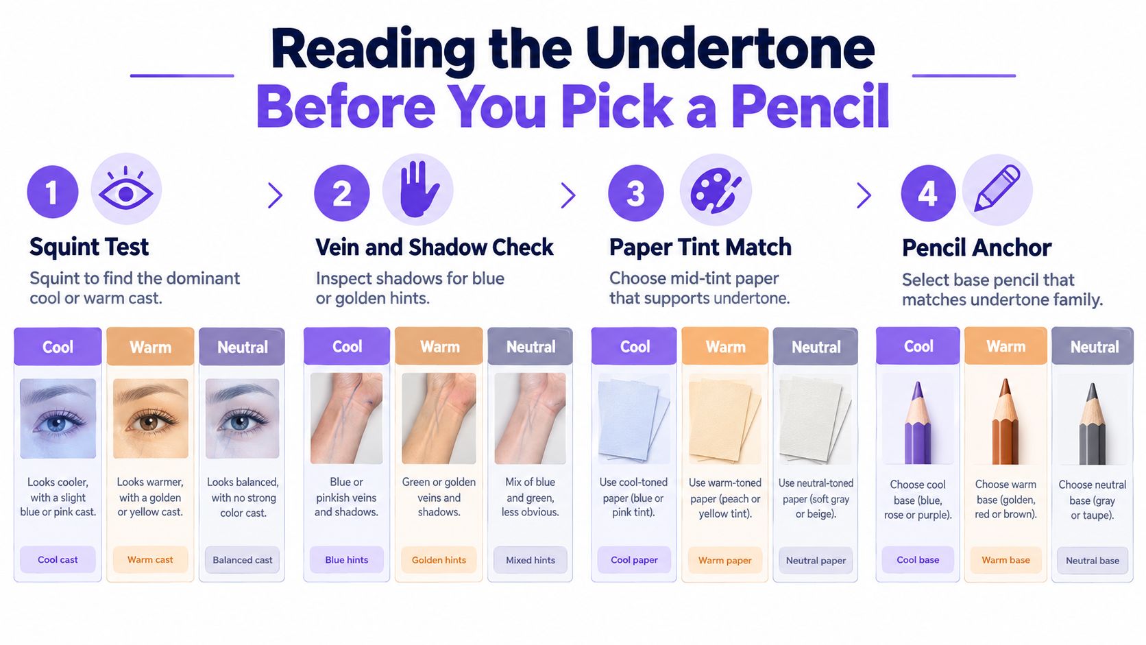
Four observations to make first
- Squint at the reference. Reduce the face to broad shapes and ask whether the overall cast feels golden, peach, blue, red, grey or green. Squinting suppresses distracting details and helps you see the dominant temperature.
- Inspect the jawline and ear. Cheeks often contain reflected colour from clothing or nearby objects. The jaw and ear shadow usually reveal the underlying cool, warm or neutral direction more reliably.
- Compare neck and sleeve. Look at the skin beside the clothing. If the neck appears more yellow than the sleeve, the difference is probably part of the reference lighting rather than a reason to colour the whole face yellow.
- Test the paper relationship. Place small swatches on the paper you intend to use. A pencil that looks balanced on white may become too warm on cream or too dull on grey.
Light cool skin often needs a restrained pink, rose or cool beige foundation, with blue-grey or muted violet appearing in the deeper planes. Light warm skin may begin with a soft yellow, peach or warm beige, but the shadow still needs cooler variation. Olive skin can look yellow-green in the half-tones and grey-green around the jaw, nostril and eye socket. Deep complexions aren't darker brown. They may carry red, violet, blue, golden or neutral shifts that become visible when the light crosses the forehead, cheekbone or bridge of the nose.
Use a cool-first triage rule when two base pencils seem possible. Lay the cooler option lightly beneath the face, then warm only the cheekbone, nose or forehead where the reference supports it. Don't spread the warm adjustment across the whole face, or the portrait will lose its temperature structure.
Layering and Burnishing for Believable Skin
Layering and burnishing work best as a connected sequence. Layering builds optical depth through light applications, while burnishing presses selected colour into the tooth so the surface becomes unified. If you burnish at the beginning, you close the surface before the portrait has developed enough variation.
Start on mid-tint paper with a light contour and a simple value map. Let the paper provide part of the middle value rather than covering every area with pencil. This is particularly useful for portraits where the light side, turning plane and shadow need to remain visibly distinct.
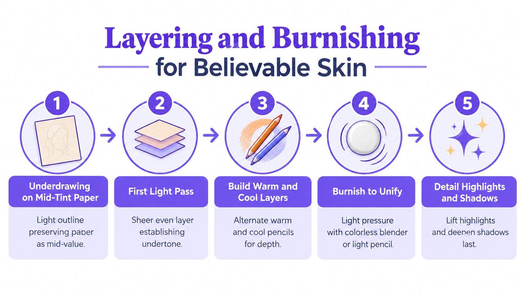
Build the surface in passes
- Underdrawing: Use a hard, controllable pencil for the contour and essential landmarks. Keep the pressure light enough that later layers can soften the line.
- First pass: Map the undertone with a sheer, even application. Follow the direction of the form, and leave highlights close to the paper.
- Second pass: Introduce local colour and shape. Add warmer colour to supported areas such as the cheek or nose, and cooler colour to the side plane, eye socket or jaw.
- Third pass: Deepen only the shadows visible in the reference. Several restrained passes are safer than one dark application because you can stop before the surface becomes muddy.
- Final burnish: Use a colourless blender or a light pencil on selected mid-tones. Apply firmer pressure only where the form needs to settle into the paper tooth.
The pressure curve matters. The first two passes should feel almost too pale. The third pass can be more assertive, but the darkest accents belong around specific features rather than across the entire face. Burnishing should unify an area, not erase every change in temperature.
Paper changes the result. A hot-pressed smooth sheet suits a polished, porcelain-like finish and accepts detailed transitions, although heavy work can quickly become dense. A lightly textured surface supports soft, multi-pass colour and gives glazes something to catch. Rough paper needs a lighter hand. Aggressive burnishing crushes its grain and makes the next layer slide across the surface instead of settling into it.
For mixed-media learners, the same principle applies when comparing coloured pencil with soft pastel drawing techniques. Pastel can establish broad atmosphere quickly, but coloured pencil usually provides more controlled edges and small facial details. Choose the medium according to the surface and the finish you want, not because one promises an instant skin colour.
Choosing Paper, Pencils and Tools That Work Together
Choose the surface before the shopping list. A portrait built from soft glazing needs available tooth, while a wax-rich polished finish needs enough smoothness to support controlled burnishing. Pencil hardness, paper tint and blending tools should all serve the same method.
Harder cores lay down thin, manageable glazes. Softer cores place more pigment quickly, fill the tooth sooner and punish heavy pressure. A compact working palette might include a light base, a middle value, a shadow neutral, a blush or red modifier, a cool complement, a warm complement and a burnishing pencil. That combination teaches mixing decisions instead of allowing a labelled pencil to do all the thinking.
| Goal | Paper | Pencils | Blending Tool |
|---|---|---|---|
| Polished, porcelain-like skin | Smooth hot-pressed sheet | Hard and medium cores for fine glazes | Colourless blender used late |
| Soft multi-pass mid-tones | Lightly textured paper | Mixed hardness, with soft pencils used sparingly | Tissue or clean blending stump |
| Olive or neutral complexions | Grey, cream or muted mid-tint paper | Yellow-green, grey, rose and brown modifiers | Light pencil burnishing |
| Deep skin with luminous highlights | Toned paper with visible mid-value | Transparent warm and cool layers, plus a restrained light pencil | Small stump for transitions, electric eraser for lifts |
| Mixed-media portrait | Surface chosen for both media | Pencils that can reinforce edges after the first medium | Odourless solvent only if tested on a scrap |
White paper keeps highlights bright but can make a pale complexion appear colder or more contrasty. Cream paper contributes warmth, so a yellow or peach base may need reducing. Grey or toned paper helps you plan the middle value and can make reserved highlights more deliberate.
Tools alter the surface response. A blending stump moves pigment without adding colour, tissue softens larger transitions, and an electric eraser can lift a small highlight after the surrounding layers have settled. A guard sheet protects the drawing from hand oils and stops the edge of your hand from polishing areas unintentionally. If you use odourless solvent, test it first because it can alter the paper and spread pigment farther than expected.
When Inclusive Skin-Tone Sets Help and When They Hold You Back
A dedicated skin-tone set solves an access problem, not the whole realism problem. In the UK, the Royal Academy Shop's current 12-colour skin-tone pencil set moves beyond a narrow peach-and-brown palette and presents skin colour as a family of tones. That's a meaningful shift in representation, particularly for learners who previously had to improvise with a limited standard set.
The practical limitation is that a pre-labelled shade still behaves like a local colour. “Umber”, “cocoa” or “skin tone” won't tell you whether the reference needs a cool violet shadow, a golden reflected light or a grey-green half-tone. The BBC Bitesize resource on mixing skin tone, published on 14 August 2017, supports the more useful principle that skin should be observed, mixed and adapted rather than matched to one fixed hue.
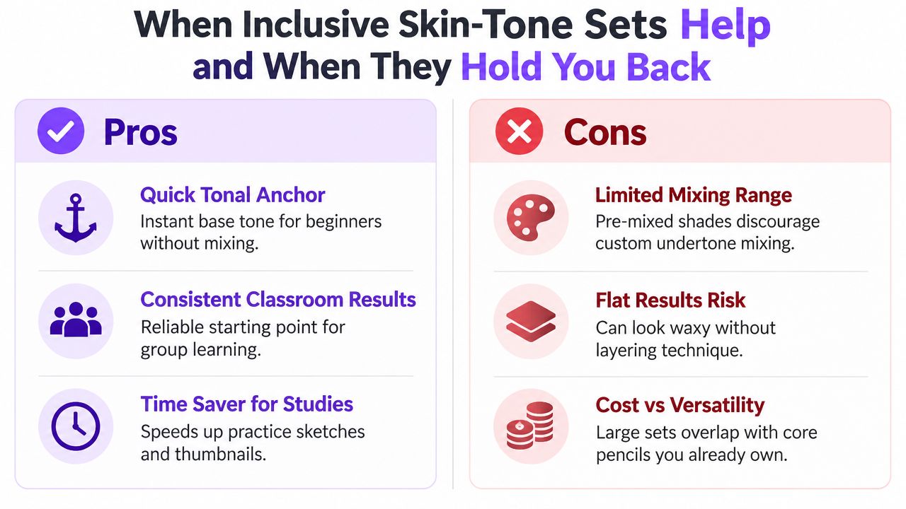
Two situations, two different choices
In a school workshop, a labelled set can help pupils begin quickly. It gives each learner an immediate tonal anchor and makes representation visible on the page within the session. The tutor can then ask pupils to modify the base with a cooler shadow or warmer reflected light, turning the set into a starting point rather than a finish.
For a portfolio portrait, relying on the tin is more limiting. Admissions work needs observation, experimentation and evidence of decisions. A smaller palette that shows how you adjusted undertone, paper colour and pressure will usually communicate more learning than a large pack used as a series of flat fills.
UK guidance remains heavily product-led, with ranges from Faber-Castell, Derwent, Giotto and Shore & Marsh available through UK-facing sellers, including Faber-Castell's skin-tone pencil set. The stronger question isn't “How many colours are in the pack?” It's “Can I explain why this layer is warm, cool, light, dark, transparent or burnished?”
A Short Portrait Study From First Mark to Final Highlight
Take a head-and-shoulders photograph with one clear light source. Don't begin by searching for the perfect skin colour. Begin with the shape, the light direction and the value pattern. A good reference gives you enough information to decide where the forehead turns, where the cheek receives light and where the jaw drops into shadow.
The working sequence
Start with a hard, non-waxy pencil and a sparse contour. Mark the eye line, nose base, mouth axis and the outside shape of the head, but avoid tracing every hair. Add a simple value map for the light side, core shadow and reflected bounce. If the drawing doesn't resemble the reference at this stage, colour won't repair the structure.
Lay the dominant undertone across the light-facing skin with very light pressure. For warm light, a muted cool layer beneath the warmth can prevent the face from becoming uniformly orange. For cool light, a warm sienna or muted red in selected shadow areas can keep the skin from looking lifeless. These contrasting temperatures should remain subordinate to the value pattern.
Let the tooth tell you when to stop
Build local mid-tones through slow glazes. Watch the paper rather than trying to reach a finished colour immediately. If the tooth remains visible in the turning planes, you still have room to adjust. If the surface begins to look shiny or waxy, stop adding pressure and move to another area.
Use the softest pencil only in the final passes, mainly for deeper accents and transitions that need weight. Burnish the middle values selectively, then sharpen a white or cream pencil for the smallest highlights on the lips, nose tip and lower eyelid. Applying those marks after burnishing keeps them clean instead of burying them in earlier layers.
A useful portrait sketching in pencil exercise can help you separate construction from surface finish. Keep asking two questions as you work:
- Does the value structure read from across the room?
- Does the skin sit in the light, or does it look pasted on top of the head?
If the answer to the first question is no, return to the shadow pattern. If the answer to the second is no, adjust the surrounding planes and reflected light before adding more facial detail.
Building a University-Ready Portrait Into Your Practice
For Level 3 students, skin-colour work becomes more valuable when it demonstrates process rather than just a pleasing finish. UAL's Foundation Diploma in Art and Design awards 80 UCAS points for a Pass, 96 for Merit and 112 for Distinction, as stated on its qualification information page. Applicants who meet the standard entry requirements must submit a digital portfolio through PebblePad.
A university-facing portfolio should show how you think. UAL asks for recent work in a portfolio of no more than 25 pages, including observational drawings, work in progress, annotations about development and techniques, and experimentation across methods such as collage, model making, photography, video and fabric manipulation, as described in its Foundation Diploma portfolio guidance. Nottingham Trent's creative admissions guidance likewise emphasises creative research, development, life drawing, mixed media, digital work and evidence of the working process.
Four benchmark pieces to develop
- Frontal portrait: Keep the lighting simple and show proportion, edge control and a coherent value structure.
- Three-quarter study: Use a reference with a clear undertone shift, so your annotations can explain the warm and cool decisions.
- Hands-and-face crop: Demonstrate that your palette can describe related skin under the same light without flattening either subject.
- Full-colour bust: Work on A3 or A2, using a single light source, a plain mount and a one-page annotation covering layering order, paper choice and time taken.
A practical week might look like this:
- Monday: Gather references and complete undertone swatch tests.
- Tuesday: Block in the first layered study.
- Wednesday: Complete a second layered study with a different complexion or paper tint.
- Thursday: Review tooth saturation and correct temperature shifts.
- Friday: Make one burnished finisher.
- Saturday: Photograph, crop and organise the work with process notes.
- Sunday: Write a reflection connecting technique to your artist statement.
Ask a peer to identify the warmest area, coolest area and strongest light before you explain your choices. Record whether their reading matches your intention, then keep a simple habit tracker for references, swatches, layers, burnishing and reflection. For SEND learners and students using flexible routes, UK providers already offer Level 3 and foundation pathways designed around portfolio-based progression, as outlined in this foundation art course overview.
The Online College of Art & Design (OCAD) offers flexible, tutor-led Level 2 and Level 3 art and design study, including foundation pathways, portfolio workspace and feedback that can help you turn skin-colour practice into assessed evidence. Visit The Online College of Art & Design (OCAD) to explore a route that fits your university plans, home-study needs or SEND support requirements.