

You've spent an hour mixing swatches for a Level 3 project, yet every sample looks the same: dull, greyish, and nothing like the warm brown in your reference image. The problem usually isn't your brush control. It's the assumption that brown is one fixed colour with one correct recipe.
A successful colour brown mix is better understood as a controllable family of neutrals. You can build it from complementary pairs or from all three primaries, then steer it towards russet, chocolate, umber, chestnut, mocha, or a cooler shadow. That control matters beyond one painting. A labelled swatch, a repeatable ratio, and a short process note can become useful evidence in coursework and a university-ready portfolio.
Table of Contents
- Why Brown Trips Up Even Confident Artists
- The Two Core Rules Behind Every Brown Mix
- A Repeatable Paint Mixing Workflow
- Adjusting Brown Across Different Media
- Naming and Matching Your Browns
- Common Mistakes That Send Brown Muddy
- Turning Mixing Skills Into Portfolio and Progression Wins
Why Brown Trips Up Even Confident Artists
A sketchbook full of muddy swatches can make a capable student feel as though they've missed a basic lesson. You may have tried red and yellow, then added blue, then reached for black when the result looked too light. Each adjustment seems reasonable, but the mixture gradually loses its colour identity.
The common misunderstanding is that brown sits on the colour wheel as a flat secondary colour, somewhere between orange and purple. In practice, brown is a dark, desaturated orange-like neutral that can be created in several ways. It may come from two near-complementary colours, or from red, yellow, and blue pulled away from equal balance.
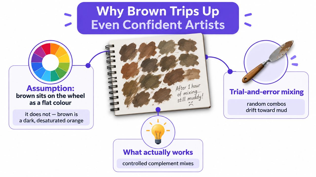
Brown is a family, not a target
UK teaching materials make this distinction practical. BBC Bitesize's colour-mixing guidance shows that blue with a small amount of orange can produce grey-brown, while red with a small amount of green can produce red-brown. CCEA's colour-mixing guidance also identifies red and green, yellow and purple, and blue and orange as complementary routes to brown.
The slip isn't a lack of skill. It's a framing problem. If you treat brown as one colour to find, you'll keep searching for a perfect recipe. If you treat it as a neutral family to control, you can ask more useful questions:
- Is the brown warm or cool?
- Should it sit in a background, or carry visual attention?
- Does it need to look earthy, reddish, yellowed, violet, or almost grey?
- Can you reproduce it later in the same coursework piece?
Practical rule: Don't ask, “What makes brown?” Ask, “Which brown does this artwork need?”
This guide builds a small vocabulary of mixable browns that stay rich instead of collapsing into grey. The same thinking transfers to paint, pastel, coloured pencil, and digital work. You'll finish with a repeatable habit for coursework, portfolio studies, and progression routes, rather than a collection of one-off guesses.
The Two Core Rules Behind Every Brown Mix
Start with the two rules that explain nearly every useful brown mixture.
Rule one is the complementary-pair rule. A complementary pair contains colours that sit opposite each other on a colour wheel. When you combine them, each colour reduces the intensity of the other and the mixture moves towards a near-neutral brown.
The starting pair still affects the result:
- Blue and orange can produce a cooler, deeper earth brown.
- Red and green can create a brown with a noticeable red or umber character.
- Purple and yellow can lead to a more muted, earthy brown.
The result changes because the colours rarely have identical strength. A forceful blue may dominate a weaker orange, while a bright yellow may pull a purple mix towards a warmer, lighter neutral. UK curriculum guidance supports this variable approach. CCEA explains that complementary pairs and all three primaries can create a range of browns, depending on which primary dominates.
Use dominance to steer the family
Rule two is the three-primary rule. Mix red, yellow, and blue, but don't assume equal amounts will give the most useful result. A slightly uneven balance lets one colour lead while the others reduce its intensity.
For a cleaner, more directed brown, begin with two colours and introduce the third sparingly. A red-led mixture can feel warmer and more russet. A blue-led mixture can move towards a cooler chocolate or shadow brown. A yellow-led mixture can produce a golden, ochre-like earth colour.
The exact ratio depends on the pigments, but the working principle is stable: use mostly two colours, then add a small amount of the third. Colour-mixing guidance for artists warns that adding too many saturated or contaminated pigments can push the mixture towards mud, while a restrained three-way mix keeps the result more intentional. This colour-theory guidance explains why pigment saturation and a small third-colour addition affect the cleanliness of a brown.
Choose the rule before touching the palette
Use a complementary pair when you need a quick, readable neutral and want the starting colours to influence its character. Use the three-primary method when you need to refine a brown through temperature and value without committing to a single obvious pair.
Your decision prompt is simple:
- For warmth, start with orange and blue, then let orange lead.
- For depth, begin with red and green or blue and orange, then let the darker pigment dominate.
- For neutrality, use a near-balanced complement mix and adjust in tiny additions.
A Repeatable Paint Mixing Workflow
A good paint mixture should be reproducible after the palette has been cleaned. The following routine works especially well for acrylic and oil because it separates the act of mixing from the act of judging.
Prepare the test area first
Lay out your chosen pair with a generous neutral area between them. Put a piece of scrap paper or primed card beside the palette, and pre-wet it if your medium requires that. The test surface should resemble the surface you will paint, because paper, gesso, and canvas can make the same mixture appear different.
Start with the larger base colour. If you want a blue-led brown, place more blue on the palette and add orange in small amounts. Don't squeeze equal quantities together automatically. Equal parts may be a useful starting point, but the pigment strength and visual effect still need judging.
Use a palette knife rather than a brush for the first mix. A knife keeps the colour cleaner, spreads the paint across the palette, and makes it easier to see whether streaks of unmixed pigment remain.
Tune temperature in small moves
Once the mixture reaches a near-neutral brown, adjust its temperature with a very small amount of a third colour. Keep the addition no larger than a fingernail. A trace of red can warm the mixture, while a trace of blue or violet can cool it.
Test the mix on your scrap surface. Acrylic and oil mixtures can look different when wet, so let the swatch dry before making a final judgement. If you alter the palette while the swatch is still wet, you may correct a problem that was not present.
Record what you did
Put a strip of masking tape beside the palette and write down:
- The dominant pigment.
- The secondary pigment.
- Any third-colour addition.
- The approximate ratio.
- The date.
The record doesn't need laboratory precision. “Mostly ultramarine, orange added gradually, a small red adjustment” is already more useful than relying on memory.
Before applying the colour to your artwork, compare the dry swatch under the same lighting used to view the work. If the reference image is under daylight, don't judge your match under a warm tungsten lamp. This routine turns a lucky brown into a repeatable coursework decision.
Adjusting Brown Across Different Media
The same colour logic behaves differently once the material is on the surface. Paint lets you mix physically before application, pastel allows partial layering, coloured pencil builds slowly, and digital tools give you more opportunities to undo or isolate changes.
| Medium | Adjustment Method | Rework Tolerance | Best For |
|---|---|---|---|
| Acrylic or oil paint | Mix a dominant base with its complement, then tune with a small third-colour addition | Moderate before the paint dries, lower once applied | Organic variation, studies, and painted coursework |
| Soft pastel | Lay down the dominant stick, then add short strokes from the complementary colour | Moderate, because some pigment can be lifted or blended | Expressive surfaces and visible colour relationships |
| Coloured pencil | Layer complementary colours lightly before burnishing | Low to moderate, because dense pigment is difficult to remove | Studied portraits and controlled tonal rendering |
| Digital art | Build separate layers, sample colours, and use clipping masks for temperature changes | High, because layers can be adjusted without changing the base artwork | Portfolio-ready illustrations and precise colour studies |
With soft pastel, keep the secondary colour subordinate. Short strokes of a warmer or cooler stick can shift the brown without covering the base completely. If you blend too aggressively, the surface may lose the broken colour that gives pastel work its life.
Coloured pencil rewards patience. Layer complements with light pressure, assess the direction of the colour, and delay burnishing until the brown is close. Heavy early pressure fills the tooth of the paper and leaves little room for correction. For portrait work, a controlled sequence of undertone, midtone, and shadow usually gives you more useful variation than pressing harder with one brown pencil.
Digital work offers the greatest flexibility, but that doesn't remove the need for colour judgement. Sample the main tones before blending, keep temperature changes on clipping masks, and lower layer opacity while testing whether the brown should move warmer or cooler. The watercolour techniques guide is also useful when you're translating this logic into transparent washes, where the surface colour contributes to the final result.
Naming and Matching Your Browns
A named brown is easier to remember than an unnamed patch on a palette. Naming doesn't turn a mixture into a standard commercial colour, but it gives you a practical language for comparing decisions across a project.
Record each swatch using four details:
- Dominant hue, such as red, yellow, blue, or violet.
- Secondary hue, usually its complement or a nearby colour.
- Approximate ratio, written in plain language if exact measurement isn't practical.
- Memorable name, such as raw umber, Van Dyke brown, mocha, cocoa, chestnut, walnut, or sepia.
These names are reference points, not promises that your handmade mixture exactly matches a manufactured pigment. The National Gallery explains that natural brown pigments come from earth rich in iron and manganese oxides, while artists have also mixed brown from blues, oranges, reds, and yellows. It notes that Cassel earth became associated with Van Dyck and is now commonly called Van Dyck Brown, which shows how material history can shape colour vocabulary. The National Gallery's pigment resource gives useful historical context for earth browns and artists' mixtures.
Build a swatch card
Paint small chips on heavyweight watercolour paper, allow them to dry, and ring-bind the cards. On the back of each chip, write the pigments, ratio, surface, lighting conditions, and date. Add a short note describing where the colour might work, such as “cool background shadow” or “warm skin half-tone”.
When you need to remix the colour, compare the new swatch with the old one in daylight. Squint to judge the value without getting distracted by small hue differences. If the replacement is too cool or too warm, make a small adjustment towards the missing direction rather than rebuilding the entire mixture.
A consistent naming system also helps when colour carries a message in a design project. For broader decisions about how colour associations work in visual identity, use this guide to brand colour psychology alongside your swatch notes.
For portrait coursework, colour matching becomes more demanding because skin contains layered undertones rather than one flat brown. Keep your swatch cards beside your reference studies and compare them with the skin colour coloured pencil techniques before choosing a shadow or warm reflected tone.
Common Mistakes That Send Brown Muddy
Muddy brown usually appears after a series of understandable but poorly controlled corrections. The most common mistake is reaching for black to darken the mixture. Black can flatten warmth and reduce the richness that made the brown useful in the first place.
White causes a different problem. It can make a brown look grey, milky, or chalky rather than just lighter. UK paint-mixing guidance specifically warns about white turning browns grey or milky and recommends introducing black cautiously when darkening tans and browns. This UK paint-mixing resource explains the risks of using black and white when adjusting brown.
Use this palette checklist
| Do | Don't |
|---|---|
| Deepen the mixture with a darker complement of the dominant hue | Add black automatically |
| Soften a strong brown with more of the lighter base colour | Add white to make it lighter |
| Keep the mix to three pigments at most | Stack a fourth or fifth pigment to chase tiny shifts |
| Test on scrap and judge the dry colour | Commit while the paint is still wet |
Over-stacking pigments is another fast route to mud. Each additional colour may seem to solve a small gap, but the combined mixture can lose clarity. Start again with a clean base pair if the colour has become confused. It's usually faster than trying to rescue an overloaded pile of paint.
If you want to study how restricted palettes can support tonal control, this monochrome portrait in oils guide offers a useful comparison. A limited palette encourages you to judge value and temperature deliberately instead of adding colour whenever the result feels uncertain.
Turning Mixing Skills Into Portfolio and Progression Wins
A brown swatch can become more than a colour test. For A Level, BTEC, and Access to HE Art and Design work, a labelled sequence shows how you investigated material, changed a decision, and evaluated the result. Photograph the palette, keep the dry swatch, and add a short note explaining why you chose a warm, cool, or muted brown.
Level 3 qualifications can also support university progression. RSL lists its Level 3 Creative and Performing Arts qualifications as carrying up to 168 UCAS points, with the Extended Diploma worth 1050 hours and the Diploma worth 570 hours. The value of your portfolio still depends on the qualification and course requirements, but consistent technical development gives tutors stronger evidence than a final image alone.
Keep the evidence easy to assess
Name the pigment combination, save process photographs, and connect each brown to a visual purpose. Your record can support assessment objectives around material understanding, experimentation, refinement, and reflection. It can also give you something concrete to discuss in interviews for a foundation course, BA application, or apprenticeship.
Students who need flexible or SEND-friendly learning can break the process into shorter, repeatable tasks. In England, a young person's EHC plan normally ends on entry to higher education, but universities still have duties under the Equality Act 2010 to make reasonable adjustments, with possible support including flexible seminar times, study-skills help, specialist software, and Disabled Students' Allowance. Sense outlines these higher-education support arrangements.
For further education, support can include one-to-one help, small-group teaching, assistive technology, mentoring, and accessible materials, and a college must not refuse admission solely because a learner has SEN without an EHC plan. Buckinghamshire's SEND information explains the graduated approach and examples of support. In England, tuition is free for 16 to 18-year-olds in further education, and it can also be free for 19 to 25-year-olds with an EHC plan when the course meets the plan's outcomes and is below Level 4. Contact gives the relevant post-16 education guidance.
Start this week with one simple task:
- Mix three recipes: Make a warm, cool, and near-neutral brown.
- Label every swatch: Record pigments, ratio, surface, and date.
- Photograph the process: Keep the palette and dry results together.
- Save the sheet: Add it to your portfolio evidence folder.
The Online College of Art & Design (OCAD) offers flexible, tutor-led courses from entry level through Level 3, including art, design, photography, foundation pathways, and dedicated SEND options. If you want structured colour practice, feedback, and portfolio development alongside your progression plans, visit The Online College of Art & Design (OCAD) to explore the available courses.