

You've mixed red, yellow and white for a portrait, but the result looks like beige card rather than living skin. You add more red, then more white, and soon the face is either orange, chalky or muddy. This is a common point of frustration for Level 2 and Level 3 students, especially when a first portrait needs to become evidence for a university portfolio.
The problem usually isn't a lack of talent. It's the assumption that skin colors paint means finding one tube or one recipe. A convincing portrait depends on observation, value, temperature, surrounding light, material behaviour and the choices you make about representation. Once you treat skin as a changing family of colours rather than a fixed “flesh” shade, your experiments become easier to understand and your portfolio begins to show genuine development.
Table of Contents
- The Reality of Mixing Skin Tones
- Understanding Pigment History and Terminology
- A Stepwise Method for Portrait Matching
The Reality of Mixing Skin Tones
A student once brought a half-finished portrait to a foundation tutorial. The drawing was carefully proportioned, the eyes had character and the composition was promising. Yet the face looked flat because every area had been filled with the same warm beige. The student had copied a premixed colour from a tube, then tried to create form by adding white to the forehead and brown to the cheeks.
The difficulty became clear when we placed the reference beside the canvas. The forehead was warmer than the jaw, the eye sockets were cooler, and reflected light introduced subtle changes along the shadow edge. The paint wasn't “wrong” in isolation. It was wrong in relation to the other colours and the light falling across the sitter.
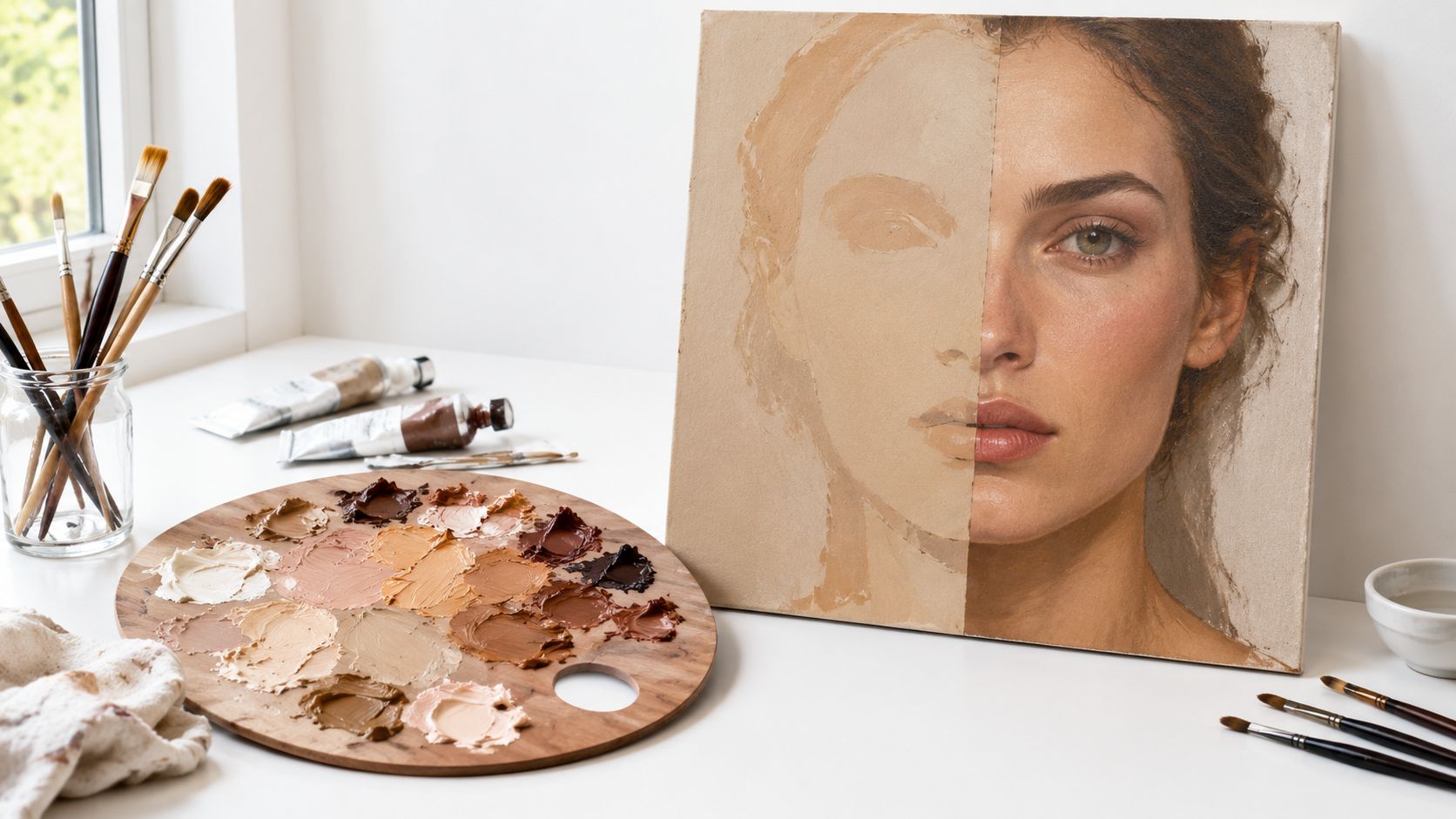
Skin is a changing colour family
Skin contains warm, cool and neutral passages. A cheek may appear warmer because of the light, while the temples or lower face may lean cooler. Highlights can lose saturation as they approach a strong light source, and shadows can carry blue, violet, green or red influences from nearby surfaces.
This doesn't mean you need a complicated formula for every brushstroke. It means you should avoid treating the whole face as one flat mixture. Start by looking for relationships:
- Value: Which areas are lightest, middle in value or darkest?
- Temperature: Does a passage look warmer or cooler than the area beside it?
- Saturation: Is the colour vivid, muted or close to neutral?
- Context: Is the apparent colour affected by clothing, background or reflected light?
Practical rule: Match the colour you can see under the current light, not the colour you assume human skin ought to be.
The idea of a universal skin colour is also historically recent in UK art materials. Jackson's Art's account of flesh and skin colours notes that “Flesh Tone” appears in sources from the seventeenth century, at a time when Western European portraiture was largely commissioned by wealthy white sitters. Ready-made flesh-tone oil paints developed in the twentieth century, so the tube labelled as a standard skin colour isn't an ancient artistic truth.
Why this matters in assessed work
University tutors don't expect every first portrait to look polished. They do want to see how you investigate a problem. A page of colour tests, notes about lighting and comparisons between warmer and cooler mixes can demonstrate more than a single overworked face.
If your first mixture looks flat, don't hide it. Photograph the stage, annotate what failed and make a controlled variation. That record shows that you can observe, evaluate and refine, which are essential habits for progression from Level 2 or Level 3 study into higher education.
Understanding Pigment History and Terminology
Before changing your colour recipe, look at the pigments inside the paint. Commercial skin-tone products were built from a relatively small group of traditional materials, not from a naturally occurring universal pigment called “skin”.
Jackson's Art identifies combinations including yellow ochre, cadmium red, alizarin crimson, and zinc or titanium white in premixed flesh-tone oils. These materials offer different behaviours. Yellow ochre can provide an earthy warmth, cadmium red gives strong opaque colour, alizarin crimson introduces a deeper transparent red, and white raises value while also changing opacity and temperature.
From pigment sets to premixed products
Historical British portrait painters worked within a broader materials economy. Research from the National Portrait Gallery on making art in Tudor Britain describes imported and domestic pigments such as ultramarine, azurite, malachite, red and yellow earths, and chalk. England was identified as a good source of earth pigments and an exporter of red ochre.
That history helps explain why earlier artists didn't depend on one dedicated tube of flesh paint. They adjusted available pigments according to the sitter, the support, the recipe and the intended effect. Tate's research into nineteenth-century British oil painting also describes paint formulation as unstable and continually changing, with artists and suppliers often dissatisfied with commercial products.
| Material choice | What it can contribute | What to watch |
|---|---|---|
| Yellow ochre | Earthy warmth and muted yellow | Too much can make a mix look dull or greenish beside cool colours |
| Cadmium red | Strong, opaque warmth | A small amount can dominate a pale mixture |
| Alizarin crimson | Deep, cooler or transparent red | It can darken a mix quickly |
| Zinc or titanium white | Lighter value and increased opacity | White can make a colour appear chalky if added without checking temperature |
| Burnt sienna or umber | Warm brown structure | Brown shouldn't replace careful observation of the shadow colour |
Language shapes classroom practice
In the UK, the term “Flesh Tint” became a documented concern in art-materials retail. The name was criticised as exclusionary in 2020, and major British brands responded by renaming products. A well-known example is the move from “Flesh Tint” to “Pale Terracotta”, alongside broader skin-tone ranges intended to represent more ethnicities.
This isn't a demand to avoid historical terminology when studying an artwork or catalogue. It's a reminder to use descriptive language in your own practice. “Warm ochre and muted red”, “cool brown shadow” or “pale terracotta highlight” tells the viewer what you observed without implying that one complexion represents everyone.
For university work, that distinction matters. Inclusive practice begins with accurate observation and responsible language, then continues through the references, artists and people you choose to represent.
A Stepwise Method for Portrait Matching
A portrait session can shift from window light to studio light, so use a repeatable mixing routine:
- Start with a mid-tone mixture. Review this brown colour mixing guide before choosing its warmth.
- Test the paint against the back of your hand.
- Compare it with the sitter under the same light. Portrait references, including high school senior portraits in Atlanta, can help you study varied complexions.
- Adjust temperature and value in small stages.
- Record each variation, so successful mixtures can be reproduced and compared rather than guessed.