

You've spent hours drawing an apple, but the shadow still looks patchy and the highlight has disappeared under colour. Beside your stronger coursework, it looks unfinished, even though you've worked hard on it. Before you press harder or buy more pencils, look at the decisions underneath the surface: paper, pressure, colour order and when you stopped.
Table of Contents
- Why Coloured Pencil Technique Matters Now
- Building Layers on the Right Paper
- Burnishing Blending and Saving Highlights
- Rendering Texture That Reads as Real
- Choosing a Study Route for Portfolio Work
- From Studio Practice to Your Next Application
Why Coloured Pencil Technique Matters Now
A carefully coloured drawing can still leave a tutor asking what you observed. Perhaps every edge is equally sharp, the darkest area looks flat, or the apple's skin has the same marks as the cloth underneath it. For portfolio practice, I'd treat those as decisions to investigate, not reasons to abandon the medium.
Coloured pencil is a completely dry medium. You build the image through pressure, repeated applications, blending and selective burnishing. More colours won't automatically solve a weak value structure, which is the arrangement of light and dark that makes an object look solid.

A fine-art practice you can learn
The medium has an organised educational community. The UK Coloured Pencil Society, founded in 2001 to promote coloured pencil and educate artists and the public, recorded 100 members in September 2001 and more than 500 by 2018, at least a fivefold increase, according to Jackson's account of the society's development.
That's a membership measure, not a count of everyone drawing with coloured pencils. Its significance for a student is the infrastructure around the medium: peer learning, exhibitions and a shared commitment to developing technique.
You don't have to imitate highly polished realism to take that practice seriously. An expressive study can also demonstrate deliberate pressure, selective detail and a thoughtful response to materials.
Studio principle: Judge a drawing by the decisions you can explain, not just the hours you've spent filling the paper.
What should your coursework demonstrate?
For a Level 2 learner, I'd prioritise recognising a problem and testing a practical response. For a Level 3 learner, I'd encourage more independent decisions about how the medium serves a project and the course you're considering.
Those are teaching priorities, not universal assessment criteria. Always work from your own assignment and qualification requirements.
Useful questions beside the drawing include:
- Observation: Do the light, shadow and edges describe the object?
- Control: Can you vary pressure rather than use the same force everywhere?
- Development: Have your tests changed what you did in the final piece?
- Purpose: Does this study contribute something relevant to your proposed portfolio?
Technique matters because it gives you choices. Your task isn't just to make the sheet look finished, but to understand which marks deserve to stay and which habits prevent further work.
Building Layers on the Right Paper
Smooth paper can suit crisp marks, but it gives you less room to build a heavily layered surface. More texture offers grip, although that texture may remain visible. Choose the paper for the drawing you intend to make, rather than expecting every sheet to behave alike.
Test a corner or an offcut before beginning. Apply your intended colours lightly, overlap them, then check whether the surface still accepts another clear mark.
Match the support to the drawing
Tooth means the small irregularities that catch pigment. A lightly textured sheet is a sensible starting point for repeated thin applications; avoid a slick surface when your planned method needs more grip.
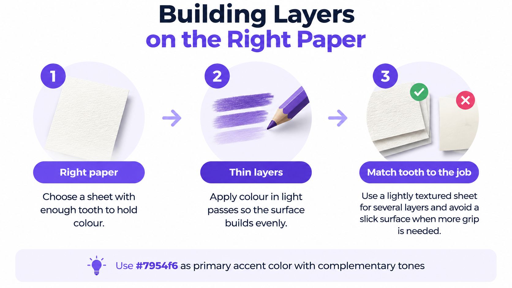
Keep the test alongside your coursework, with a developing swatch record. It's more useful than a loose colour chart because it shows how your pencils behave on the actual support.
Build colour in controlled passes
Begin with a value map. Use a light monochrome or complementary underlayer to locate shadow shapes and reserve the lightest areas, without trying to reach the final darkness immediately.
Then introduce local colour, meaning the object's main colour before you account for lighting. On a red apple, place small, overlapping red strokes around the curved form rather than colouring across it as though it were flat.
For the next pass, introduce chromatic modulation, small shifts in colour within that main colour. Try a restrained complementary colour in a shadow test rather than repeatedly adding black. Compare the result with your object before committing.
Leave surface finish until the relationships are working. At this point, your drawing should already describe the form, even if the paper texture remains visible.
- Rotate the sheet: Bring the curve into a comfortable drawing direction instead of forcing your wrist.
- Keep early pressure light: Let repeated applications build colour.
- Pause at resistance: If fresh pigment won't catch, adding force may make the problem worse.
Early burnishing compresses the tooth, can create patchy wax buildup and makes corrections difficult. That's why a light underdrawing matters more than a dramatic first layer.
Choose permanence before the final sheet
Derwent states that its complete 100-colour Lightfast range is tested to ASTM D6901, rated LF1 or LF2, and offers up to 100 years' stability under museum conditions, as described in its Lightfast pencil information.
That's a controlled-display benchmark, not a promise for a sunny bedroom. For assessed work you intend to retain, choose materials with documented ratings and keep the product information with your tests.
At Level 2, use the workflow to compare paper responses. At Level 3, record why the chosen support suits your project, rather than writing only that you preferred it.
Burnishing Blending and Saving Highlights
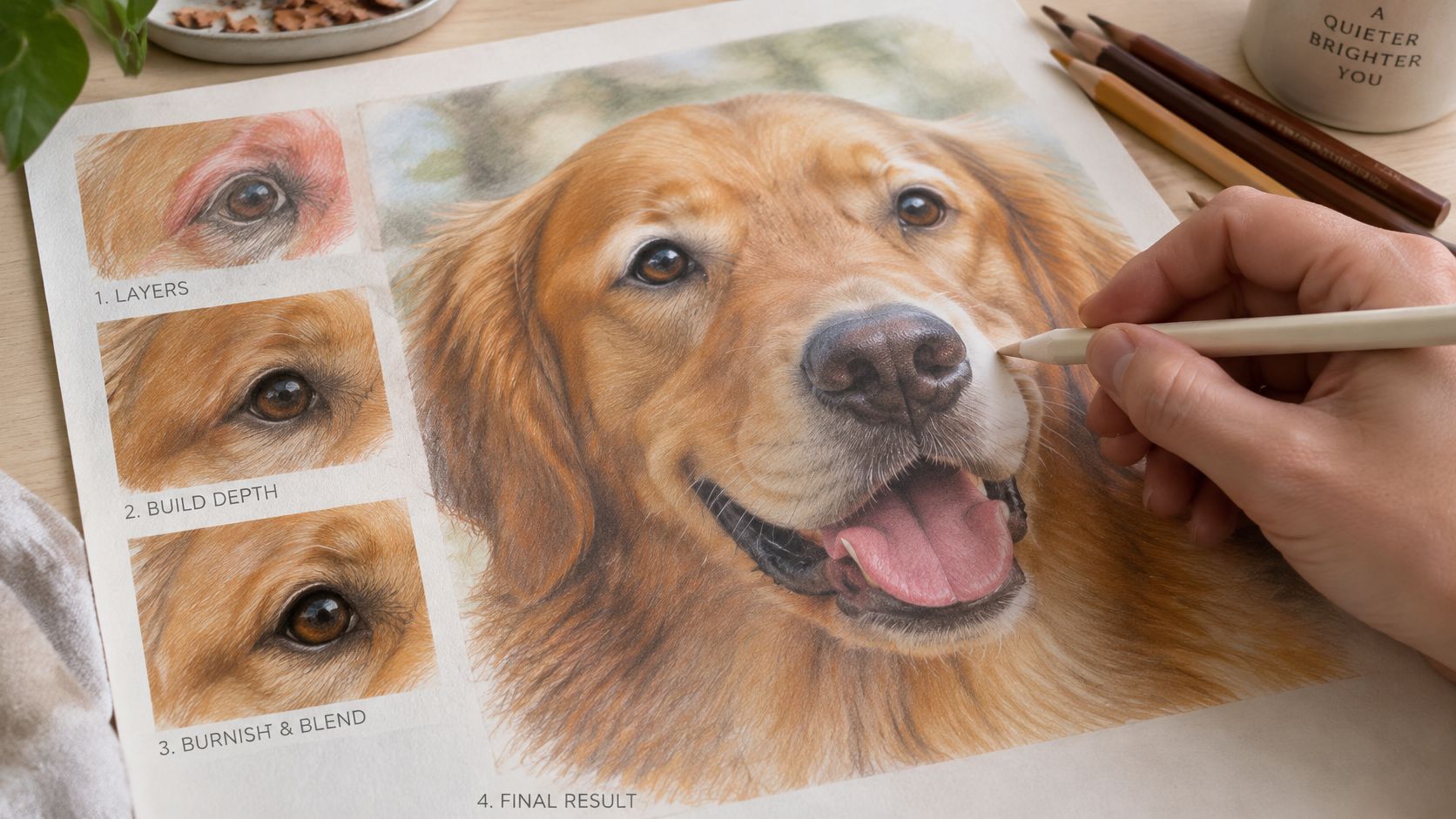
A drawing can look polished under the lamp and still lose strength at assessment distance. The trade-off is simple: heavy blending can calm a noisy passage, yet it can also close the paper tooth before the colour and edge decisions are settled. Treat smoothness as a choice for specific passages, such as a hard highlight on glass, while leaving breathable marks where the surface needs life.
Blending describes the transition you want. Burnishing is pressure that forces pigment into the tooth and can make later correction stubborn. You can get a gentle join while the paper grain still reads, and that restraint often looks more convincing than a uniform shine.
Decide what kind of blend you need
Use optical blending when separate strokes can sit side by side and mix in the eye at normal viewing distance. It suits colour that should stay lively, because the marks keep their direction and the drawing keeps evidence of your hand.
Use solvent-free pressure blending when a passage needs a calmer field, such as a shadow turning away from the light. A colourless blender can compact pigment already down; a pale opaque pencil can soften a join too, though it may lighten or cool the passage more than expected.
Keep marks that explain the surface. Remove only the marks that confuse it.
Wait until hue, value and edge are believable, then test the pressure on your matching swatch. Work one contained area at a time and stop before the sheet turns glossy; greasy shine usually means the tooth has been closed early, rather than the form being finished.
Protect the light before adding colour
On a glass jar, the brightest rim is often a small shape with a clean edge. If mid-value pigment crosses it, a white pencil may pale the area but leave a milky veil, so the safest highlight is the paper you never had to rescue.
- Find the brightest note: compare it with the nearest lights, not with the white of the page alone.
- Guard the boundary: keep the surrounding colour up to the edge while leaving the shape open.
- Judge the edge: sharp where the form turns hard, softer where light diffuses.
For a Level 2 study, show one reserved highlight and one recovered highlight on the same object and record which stayed cleaner. At Level 3, connect the choice to intent: a crisp reserved light may support observational realism for a portfolio, while a softened edge may suit a quieter, flattened image for a course that values interpretation over finish.
If a project needs a second dry medium for comparison, plan it separately with this guide to soft pastel drawing rather than expecting the same pressure decisions to transfer. Fixative deserves the same caution: test it on a spare swatch first, because it can shift appearance and may affect how well the work ages.
Rendering Texture That Reads as Real
A sleeve beside a ceramic cup gives you two different surfaces to solve. If both receive the same strokes and pressure, their colours may be accurate, yet the materials will look alike. The trade-off is between enough texture to identify each surface and so much detail that the object's form disappears.
Begin with the sleeve's folds, not its individual fibres. The shadow beneath a fold gives the wool volume; scattered marks alone can make it look flat.
Let marks follow the material
Use short, slightly irregular strokes to suggest wool. Let some marks break at the edge, rather than outlining the sleeve with a fuzzy border.
For the cup, use smoother strokes that follow its curve. Add harder, darker accents only where observation supports them, such as a narrow contact shadow or a sharply turning edge.

The same principle applies to wood and skin. Let wood grain follow the surface, varying the darkness of each line. Build skin with subtle shifts in colour and value, rather than laying a repeated pattern over the face.
For portrait work, this guide to skin colour in coloured pencil can help you explore colour choices. Keep your own observations beside the exercise so the study stays connected to your subject.
Check whether the texture serves the form
If a textured area looks dull, use the complementary-shadow test from your earlier layering practice. Identify whether the issue is value, colour or mark placement before adding more pigment. Black may deepen a passage, but it can also flatten colour.
The paper's tooth affects the result. If earlier layers have filled much of its surface, the final marks that suggest a weave, grain or stray fibre may not hold.
Review the drawing from arm's length:
- Stroke direction: Do marks follow the form and material?
- Pressure: Are stronger accents limited to specific observations?
- Hierarchy: Does the object read before the texture?
- Difference: Can a viewer tell the sleeve from the cup without a label?
At Level 2, make a comparison study that shows how mark-making changes across materials. At Level 3, select the amount of texture that supports your intended outcome, then explain those choices in your portfolio. This shows control and observation, rather than a collection of techniques.
Photograph or scan the finished sheet for portfolio evidence, then compare the image with the original. Check that pale marks, darker passages and surface differences remain visible. Keep a full-sheet image and a detail view, without editing the image to make the drawing look materially different.
Choosing a Study Route for Portfolio Work
A coloured-pencil still life can show careful observation, but it cannot replace an entry qualification. Your portfolio and your academic record answer different questions: the work shows how you think and make decisions; the qualification helps a university assess your preparation for degree-level study.
Start with the course you hope to take. Check its published entry requirements, then compare them with the qualifications you hold and the support you need. If an award's title or level is unclear, ask the course provider or university admissions team before enrolling.
Is Level 2 enough for university?
A Level 2 creative qualification can demonstrate practical study at GCSE-equivalent level, but it does not usually replace the Level 3 study many degree courses expect. UK government guidance places GCSEs, including grades 9–4 and the former A*–C grades, at Level 2 alongside other Level 2 awards. Check the government guide to qualification levels and each university's course requirements. Ask admissions staff how they assess your particular qualifications if the wording is unclear.
What Each Study Level Shows a University
| Route | What it demonstrates | Typical next question |
|---|---|---|
| Level 2 creative study | GCSE-equivalent study, with practical work shaped by the qualification | Which Level 3 route suits my intended subject? |
| Level 3 creative study | Further preparation, with relevance depending on the award and degree requirements | Does this qualification meet the course's entry requirements? |
| Tutor-led online study | A way to develop and present assessed work, depending on the course and award | What qualification is awarded, and how are feedback and assessment organised? |
Which route fits the work I want to make?
A Levels, foundation diplomas and other creative qualifications differ in subject focus and assessment. Choose by matching those demands to your intended degree, rather than treating every course involving drawing as interchangeable.
For example, a coloured-pencil still life could test close observation for fine art, surface pattern for textiles or visual communication for illustration. The project can help you build relevant evidence, but no single drawing guarantees admission.
The Online College of Art & Design (OCAD) offers entry and Level 1 study, Level 2 Certificates in Art and Design, iGCSE and A Level Art and Design, and Level 3 Foundation Diplomas with specialist routes. It also offers SEND versions of its Level 2 and Level 3 foundation pathways. Its tutor-led online courses use Microsoft Teams for Education and include an online studio, video tutorials, portfolio workspace, lessons and BA application guidance. Compare this format with local college or school options, especially the feedback and study routine each provides.
Turn your application goal into manageable tasks with Kohru's guide to how to set achievable study goals. For presenting your work, follow this guide to making an online art portfolio, then check the submission instructions for your chosen degree.
From Studio Practice to Your Next Application
At a portfolio review, a tutor asks why you chose a particular pencil and paper. A strong answer links your material choices to the drawing's purpose, the evidence you tested and the course you hope to study.
For your next piece, investigate a question that supports your intended degree. A fine art applicant might test how colour describes form; an illustration applicant might examine how texture helps tell a story. Agree with your tutor what tests and process evidence to keep.
Record the brand, colour name, lightfastness rating, paper tone and whether each pencil is wax- or oil-based. Use the same paper planned for the finished work, so your tests match the conditions of the portfolio piece.
How do I choose colours for lasting portfolio work?
Check the lightfastness of each colour. The pencil lightfastness guidance explains the Blue Wool 1–8 scale and identifies ratings of 6 or above as suitable for professional work. It also describes LF1 and LF2 as fully lightfast categories under the cited ASTM system.
A range name does not guarantee that every pencil has the same rating. Check individual colours, especially reds, purples, pinks and some blues. For a piece intended for long-term display, choose rated colours for the main areas and reserve less stable ones for temporary studies or small accents.
Use your tested process for the assessed piece. Keep the rating information with your material tests, and note the display conditions you expect. UV-filtering glazing can help protect framed work, but keep the drawing away from direct sunlight and heat.
Before submission: Store the finished drawing, material tests and a short explanation of your decisions together.
Can students with SEND get support at university?
Disabled Students' Allowance in England depends on eligibility. Applicants generally need to qualify for both a Tuition Fee Loan and a Maintenance Loan, and study an eligible course lasting at least one year or carrying at least 30 credits under the Lifelong Learning Entitlement. Check the government's DSA eligibility guidance for current requirements.
Eligible conditions can include dyslexia, ADHD, mental-health conditions, physical or sensory disabilities, and long-term health conditions. Evidence must show a substantial, long-term effect on everyday activities. It may include a professional report, disability evidence form, SEN statement or Education, Health and Care Plan.
Previous SEND support does not automatically establish eligibility for university funding. Check the evidence requirements while planning your progression route.
What should I do next?
Choose one drawing question to investigate, then check how your current qualification relates to your intended degree. Bring your drawing, swatches and course questions to a tutor for feedback.
The Online College of Art & Design (OCAD) offers tutor-led creative qualifications with portfolio development and assessed coursework. Review its study routes and consider whether its teaching format and course level suit your university progression plans.