

The most repeated advice on mixing skin tones is to memorise a recipe, or to squeeze a tube labelled flesh. That advice fails as soon as the light changes, the sitter turns, or the next face is not the one the recipe was built for. A mix that looks right on the palette can go grey, orange or chalky on the support because you matched a label instead of diagnosing the colour in front of you.
Treat every mix as a test with three questions. Is the value wrong, the hue wrong, or the chroma wrong? Fix the cause you named, not a vague sense that the colour is off. The same checks work in oil, acrylic, watercolour, coloured pencil and digital, and they work when a learner cannot, or does not want to, paint their own face.
Table of Contents
- Set Up Lighting and Viewing Before You Mix
- Starter Pigments That Cover Most Complexions
- How to Mix a Skin Tone in Three Stages
- Medium-by-Medium Adjustments for Skin Tone Mixing
- Fixing Mixes That Look Grey, Orange or Flat
- Making Skin Tone Practice Accessible and Inclusive
- Frequently Asked Questions About Mixing Skin Tones
- Check Your Mix Before You Finish the Painting
Set Up Lighting and Viewing Before You Mix
A skin mix that looked right under a desk lamp at midnight will sit orange by a window at noon. The pigment stayed the same. The light changed what you saw. Most mixing errors are lighting errors, so fix the viewing conditions before the brush touches the paint.
UK colour-imaging research measured skin heterogeneity under six light sources from 2850 K to 9000 K. Variation was greater under lower correlated colour temperatures, and smaller from 5000 K to 9000 K. Set your working light near neutral daylight, about 5000–6500 K.
| Lighting condition | Approx. colour temperature | Effect on the skin reading | Studio response |
|---|---|---|---|
| Neutral daylight from a north-facing window | 5000–6500 K | Most stable reading of hue and value | Start every mix here |
| Warm domestic bulbs | Lower end, near 2850 K | Pushes readings toward orange; hides cool shadows | Do not judge mixes here; recheck later |
| Cool LED or fluorescent light | 6500–9000 K | Exaggerates blue and greys midtones | Compare with daylight before accepting a mix |
| Low light or dusk | Varies | Shadows merge; value is misread | Use a lamp set near 5000 K |
| Coloured surroundings | Not applicable | Clothing or walls tint the reference | Cover surroundings with a neutral grey card |
Warm domestic bulbs are the usual trap in a home studio. They hide cool shadows, so a correct violet-brown reads too cold and you warm it until it is orange. Cool LEDs do the opposite, dulling warm midtones until you overcompensate with yellow. I have watched students chase a correction across three palettes before anyone thought to check the lamp.
One cheek patch is not a face. Skin shifts across a single head, so keep the reference and the painted swatch in the same field of view and compare forehead, cheek, nose, chin, hands and neck. Take three independent comparisons of every critical mixture, and write down whether the mismatch is mainly value, hue or chroma. A written verdict beats a hunch.
Practical rule: If the light is wrong, do not "fix" it with pigment. Move the lamp, then mix again.
Judge relationships, not apparent brightness. Do not build darker skin by adding black; it suppresses chroma and pulls hue away from the sitter. Use an earth colour with a controlled blue, red or violet bias, and check the shadow still belongs to the local tone. How a form casts a shadow changes the reading as much as the pigment does.
Recheck the painting under a second light before you call any mix finished.
Starter Pigments That Cover Most Complexions
A tube labelled "flesh tint" matches almost nobody in a real classroom. The 2021 Census for England and Wales recorded 81.7% of residents within the high-level White category, 9.3% within Asian, Asian British or Asian Welsh groups and 4.0% within Black, Black British, Black Welsh, Caribbean or African groups. A starter palette has to reach that whole range, so pick pigments by what they do to a mix rather than by which face they are supposed to produce.
Each pigment below earns its place by moving one part of the colour: lightness (L*), the red–green axis (a*) or the yellow–blue axis (b*). Diagnose the gap between your mix and the sitter, then reach for the tube that closes it.
| Pigment | Role in the mix | Pushes the mix toward | Watch for |
|---|---|---|---|
| Titanium white | Raises lightness | Chalky, grey tones | Overuse drops chroma; add a warm lighter mix instead |
| Cadmium red light | Adds red (a*) | Flushed, pink or hot tones | Small amounts; easily turns orange-red |
| Cadmium yellow light | Adds yellow (b*) | Warm, golden tones | Shifts fast; add in tiny steps |
| Yellow ochre | Warm, muted yellow | Olive and earthy warmth | Lowers chroma in midtones |
| Raw sienna | Warm, slightly greenish yellow | Sallow or olive undertones | Can look dull in lights |
| Burnt sienna | Warm red-brown | Warm brown shadows and deep midtones | Strong staining in watercolour |
| Burnt umber | Dark, cool-leaning brown | Depth in shadows | Turns muddy when overused |
| Ultramarine blue | Cool blue, leans violet | Neutralises orange; cool shadows | Very small amounts; drops chroma quickly |
| Alizarin crimson | Cool red | Cool pink undertones | Check lightfastness before using in final work |
Read the table as a set of diagnoses. A mix that sits too dark takes titanium white, yet white also drops chroma, so pale skin that has gone chalky needs a warm lighter mix instead. A midtone that reads too green takes cadmium red light in small steps. Orange that has run away is cooled by a touch of ultramarine, which is also what turns a warm brown into a believable shadow colour. Alizarin crimson supplies the cool pink undertone that cadmium red cannot reach, though its lightfastness deserves a check before final work.
You can also work from a narrower set: red, yellow, white and a warm brown, with blue held back for corrections and cooling. That four-tube approach roughs out lighter and mid skin tones quickly, which suits fast classroom exercises. It runs out of depth at darker complexions, where burnt sienna, burnt umber and a controlled blue bias take over.
Test the palette before you trust it. Mix swatches for two different reference faces side by side and compare value, hue and chroma separately. The pigments stay the same. The relationships change. If a brown goes dull in the process, the notes on how to mix brown show which earth pigment is doing the damage.
How to Mix a Skin Tone in Three Stages
Treat every skin mix as a diagnosis, not a recipe. Match lightness first, then the red–green axis, then the yellow–blue axis. That order follows CIELAB, where a colour reads as L* (lightness), a* (red–green) and b* (yellow–blue). Colour-imaging work on skin colour distributions by Wang, Xiao, Wuerger, Cheung and Luo places measured skin colour inside exactly this space, so checking three axes separately keeps each error visible instead of letting one mistake hide behind another.
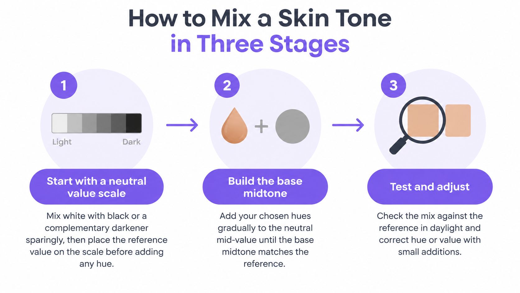
Seven studio steps
- Build a short neutral value scale as a measuring tool, kept separate from every skin pile. Mix white with a little black for a grey ramp, then place your reference value on it before any hue goes in. Black is allowed on the scale because it never touches the face. In a skin mixture it suppresses chroma, so darken skin with complements or burnt umber instead. If the value reading is already wrong, every later pigment hides the error.
- Build the base midtone by adding red or orange to raise a*. Check against the reference after each addition and stop while the mix still reads slightly dull. You can always add more red. You cannot easily take it out.
- Tune b* with yellow, ochre, blue or violet in minute amounts. Yellow warms. A speck of ultramarine cools an orange that has run away.
- Test each mixture as a thin dried swatch beside the reference. Paint often shifts in chroma and value as it dries, especially acrylic and watercolour.
- Mix light, halftone, shadow and reflected light as separate piles. One base colour lightened with white is not a face.
- Produce at least five local mixtures per portrait. Label them by place and light, for example "cheek, north window" or "shadow under the jaw".
- After a short break, recheck the set and adjust the worst mismatch first. One variable at a time.
Why lightness comes first
Value controls how every other decision reads. A strong hue can disguise a value error, which is why the neutral scale in step 1 exists and why it stays off the palette once judging begins.
Measured skin colour also changes across forehead, cheeks, nose, chin, hands and arms, not only between people. In the CIC2015 measurements, the colour distributions of different ethnic groups overlapped even where their averages differed. Follow the sitter's observed colour. A label on a paint box tells you nothing about the face in front of you.
Overusing white raises L* and cuts chroma, which is how mixes go grey and chalky. Raise value with a warmer, lighter mixture, and save complements for controlled neutralising.
Medium-by-Medium Adjustments for Skin Tone Mixing
The three-stage order stays the same in every medium. What changes is how you build the pile and how you test it.
| Medium | How you build the mix | Key difference | Common trap |
|---|---|---|---|
| Oil | Blend wet on the palette; glaze shadows thinly | Slow drying allows adjustment over hours | Heavy white over-lightens and chalks the surface |
| Acrylic | Mix batches quickly; use a retarder to extend open time | Often dries a shade darker than it looked wet | Judging a wet swatch and trusting it |
| Watercolour | Dilute pigments; layer transparent glazes | White comes from unpainted paper | Mixing three or more pigments turns the skin grey |
| Coloured pencil | Layer light to dark; blend with pressure changes | Mixes optically through layers | Waxy build-up that flattens the reading |
| Digital | Set hue, saturation and value numerically | Screen brightness varies between devices | Trusting a single uncalibrated display |
What actually changes
Oil stays open for hours, so you can nudge a midtone on the glass palette and glaze a shadow instead of scrubbing opaque paint over it. Heavy titanium white is what chalks the lights.
Acrylic often dries a shade darker than it looked wet. Mix more than you think you need, paint a strip, and wait until it is dry before you accept it. A retarder buys time. It does not fix a bad value.
Watercolour gets its lights from bare paper. Plan those shapes before you paint. Two pigments usually stay cleaner than three. A third often greys the skin.
Coloured pencil builds the same value-first logic in layers. Start light, shift hue with pressure, and stop before wax fills the tooth and the skin goes flat. A coloured pencil skin method that separates undertone, local colour and shadow is the pencil version of separate piles.
Digital lets you type hue, saturation and value, which is useful for naming the error. Screens still disagree. Check a second display, or a print, before you lock the colour.
Watch how the demonstrator separates a midtone from the shadow rather than whitening one pile. That habit transfers. The medium does not.
Fixing Mixes That Look Grey, Orange or Flat
The complaint that arrives first is a grey or chalky face. White was added to raise value, or a complement was pushed until the colour died. Put warm chroma back with a little red or yellow ochre. Do not add more white.
| Symptom | Likely cause | Fix |
|---|---|---|
| Grey or chalky | Too much white, or the complement neutralised too far | Add warm chroma such as red or yellow ochre instead of more white |
| Too orange | Yellow or ochre dominates the red | Add a touch of ultramarine or alizarin crimson |
| Flushed or too red | Red over-dominant in the midtone | Adjust with yellow or raw sienna |
| Too light | Value misjudged, or white used in place of a chromatic lighter mix | Recheck under daylight; lighten with a warm mix |
| Muddy or too dark shadows | Black added to the shadow | Use a transparent earth colour with a blue, red or violet bias |
| Flat face | One midtone used across all forms | Add separate halftone and reflected-light mixes |
| Right in one zone, wrong in another | Surrounding colour or lighting tint | Recheck under standard light and grey card |
Name the fault before you touch the pile
Too orange means yellow or ochre is beating the red. A touch of ultramarine, or alizarin if you want a cooler pink, pulls it back. Stop at the first change you can see.
Flushed is the reverse. Red is running the midtone. Yellow or raw sienna cools that heat without jumping to blue.
Too light is usually a value mistake, not a missing pigment. Recheck in daylight. If it really needs to be lighter, use a warm lighter mix, not a blob of white.
Muddy shadows almost always contain black. Switch to a transparent earth with a blue, red or violet bias so the dark stays related to the base tone.
A flat face is one midtone doing every job. You need a halftone and a reflected-light mix, even if they are close. When one zone is right and the next is wrong, the pigment is rarely the culprit. Clothing, a coloured wall, or the lamp is tinting the reading. Grey card, then daylight, then a new judgement.
Making Skin Tone Practice Accessible and Inclusive
The paint is rarely the barrier in a portrait class. The actual obstacles sit around it. A learner asked to label their own face in front of peers, hue shifts too small for their eyes to catch, a brush grip their hands cannot sustain, or a live model they never agreed to study. Any one of these stops the work before mixing starts.
Accessible practice keeps the diagnostic method and changes the conditions around it. The judgement stays the same for every learner: read the mix by value, hue and chroma under controlled light, then change one variable at a time. Tutors adapt the reference, the tools and the route to that judgement, and grade the reasoning rather than the result.
Adaptations that keep the method
- Chosen reference: Let the learner work from a selected photo or cast rather than their own face. The skill being assessed is observation, and any face will teach it.
- Neutral words: Say hue, value, temperature and saturation. Drop "flesh". It smuggles in a default complexion.
- Several routes: Acrylic, coloured pencil, digital and even a monochrome value study can all run value first. Offer the route that matches the hands and the tools in the room.
- Large print and audio: Read the steps aloud and print swatch labels large. A learner who cannot judge a 2 mm shift can still compare big patches.
- Tutor review of reasons: Ask what was wrong and which variable they changed. The explanation is the evidence, not a perfect cheek.
Accurate portraiture measures colour relationships, and lighter skin is only one case among them. Shadows, highlights and nearby colours shift perceived value on every complexion. A dark face with a cool reflected light and a light face with a warm shadow are both colour studies. Teach the relationships, and you stop ranking skin by how close it sits to a peach recipe.
Frequently Asked Questions About Mixing Skin Tones
Three questions come up in almost every portrait session I run.
Why does a tube labelled "flesh" never match the sitter?
One tube cannot cover the range. Pre-mixed flesh colours target a narrow, light, pink-leaning average, so they sit wrong on most faces before you add a single note of shadow. They also fix the chroma for you, which removes the one variable you most need to control. Skin shifts toward orange, red, violet and grey depending on the light, the colours beside it and the sitter. Judge a mix the same way you judge everything else on the palette: value first, then hue, then chroma, under your working light. A labelled tube skips that diagnosis entirely.
My mix looks grey under one lamp and orange under another. What is wrong?
The light changed and the paint did not. A warm lamp pushes every mixture toward orange. Cool daylight then reveals how little chroma the indoor mix had, which is why it suddenly reads grey.
Fix the viewing before you fix the pile. Judge the mix under the light the finished painting will hang in, then confirm it under a second source. If it still looks dead, the usual cause is over-mixing or too much complement. Add back a small amount of the dominant hue rather than reaching for more white.
How do I mix darker skin without using black?
Use dark pigments that still carry hue. Burnt umber, ultramarine blue and a deep red build shadows with temperature, where black leaves flat holes in the face.
Start with the local value, darken with the complement or a cool brown, and keep chroma alive in the shadow shapes. Darker skin still shows warm lights and cool half-tones, so it needs the same range of relationships as lighter skin, shifted down the value scale. Test the shadow mix next to the light mix at full size before it goes on the painting, because a value that reads right in a small swatch can collapse once it sits beside a stronger colour.
Check Your Mix Before You Finish the Painting
Before you finish, compare each critical mixture with the reference at three zones under neutral daylight. Then look again under a second light, such as a warm lamp. You are checking whether the relationships hold, not whether one swatch still flatters you.
Confirm that every label matches its place and its light, and that shadows still belong to the local base rather than to black. If one mismatch remains, change one variable. Value first, then hue, then chroma. Write the change down.
When the swatch is right and the painting still reads wrong, leave the pile alone. Check the colours around the head and the value structure of the whole face. A correct cheek next to a dead background will look false.
For a Level 3 or foundation portfolio, the swatch sheet and the written reason are what a tutor can assess. Online tutor-led courses, including those from The Online College of Art & Design, can review those records alongside the painting. A mix is finished when its relationships survive more than one light.
The Online College of Art & Design (OCAD) runs flexible, tutor-led art and design courses from entry level through Level 3, including routes where portrait mixing, swatch records and portfolio feedback sit inside the coursework. If you want structured practice on mixing skin tones, with a tutor who will check your value, hue and chroma notes, visit The Online College of Art & Design (OCAD).