

You're halfway through a portrait, the face is looking promising, and then the eyes make the whole thing feel pasted on. That happens a lot in first studies, because the eye is often treated like a tiny decorative shape instead of a form that sits inside the skull and changes with light, angle, and expression. In eyes in watercolor, the quickest fix is usually not more detail, but better structure.
Table of Contents
- Why Eyes in Watercolour Start with the Socket, Not the Iris
- Wet-on-Wet Techniques for Soft Iris Blends and Socket Shadows
- Wet-on-Dry Methods for Crisp Lid Edges and Lash Detail
- A Three-Colour Palette for Convincing Eye Tones
- A Value-Mapping Exercise to Lock in Realistic Form
- Common Mistakes That Flatten Watercolour Eyes
- Building a Portfolio-Ready Eye Study for Level 3 and Beyond
Why Eyes in Watercolour Start with the Socket, Not the Iris
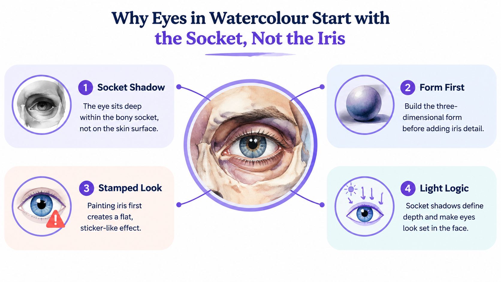
A student can draw a neat iris and still end up with an eye that floats. The reason is simple: the eye never exists on its own. It sits inside the orbital socket, and the brow bone, lid planes, and cheek all decide how much of it you see.
Map the form before the feature
Start by lightly placing the eye line, then block in the surrounding planes around it. The upper lid casts a shadow into the socket, the brow adds a heavier plane above, and the tear trough softens the lower edge. That small map is what makes the eye feel built into the face rather than drawn on top of it.
The historical tradition helps explain why this approach matters. British watercolour grew into a distinct and highly influential art form in the 18th century, and the “Golden Age” of the medium ran roughly from the mid-18th to the mid-19th centuries, when artists were already using watercolour for portrait miniatures and intimate studies from nature (The Met). That legacy includes the tiny lovers' eyes, almost always painted in watercolour on ivory in late 18th- and early 19th-century England, where the eye was handled as a serious portrait subject, not a quick outline.
Practical rule: if the socket shadow doesn't make sense, the iris won't save the painting.
For a first study, think in this order, socket shadow, lid plane, then iris and pupil. That sequence keeps the eye tied to the face, which is exactly what tutors look for when they assess whether the portrait holds together. A useful visual reminder is the way related drawing problems are handled in portrait study, where the cast shadow and surrounding planes matter before the inner detail. A simple reference like this cast-shadow guide can help you think in those terms.
Wet-on-Wet Techniques for Soft Iris Blends and Socket Shadows
Wet-on-wet is useful when the eye needs softness, not edges that shout at the viewer. In a real face, the iris rarely reads as a hard flat disc, and the socket shadow usually needs a gentler fall-off than a line can give. That makes this method ideal for the first pass over the eye structure you mapped in the section above.
Soft iris blends in one sitting
Wet the iris area until the sheen has just started to leave the paper, then touch in two diluted pigment pools with a size 8 mop. Let one pool drift toward the pupil and the other ease toward the limbal ring, so the colour shifts without a visible seam. If the paper is too shiny, the paint races. If it looks dull and nearly dry, you'll get patchy blooms.
A rigger can help only at the edge of that damp stage, especially if you want a soft radial suggestion without carving every line. That kind of restraint is also why portrait painters often recommend building the eye from planes rather than linework. For a broader brush-handling reminder, these watercolour technique tips sit well beside this exercise.
Socket shadows need moisture control
Pre-wet the socket plane, then drop in a shadow wash so it settles around the orbit instead of stopping at a hard border. The shadow should feel like it belongs to the skull, not like a sticker placed beside the nose. A soft wash like this lets watercolour do the heavy lifting for you, because the paper edge creates the transition.
If you want a reference that shows how patient layering can build believable eye life in another subject, the dog watercolour portrait guide is useful reading. The species changes, but the discipline doesn't. You still watch moisture, pull light out carefully, and let form come before finish.
Wet-on-Dry Methods for Crisp Lid Edges and Lash Detail
Wet-on-dry is the choice when the eye needs certainty. A lid crease, a wet line along the lower lid, or the dark rim of the iris all depend on a clean surface if you want them to stay sharp. If you try to force those details into a damp wash, they blur, spread, and turn the eye muddy.
Choose the method by the problem
| Eye Feature | Wet-on-Wet | Wet-on-Dry |
|---|---|---|
| Upper lid crease | Too soft for a clear fold | Best for a crisp structural edge |
| Lower lid wet line | Can blur into the sclera | Best for a controlled, narrow line |
| Limbal ring | Helps only for a hint of softness | Best for a defined iris boundary |
| Lash negative space | Smudges quickly | Best when you need clean gaps |
Load a fine brush with a slightly stronger mix than you think you need, then test the edge on scrap paper before touching the portrait. If a line lands too hard, touch it with a clean damp brush and soften only the outer edge, not the whole mark. That small correction keeps the eye readable without turning it into a stain.
The crispest marks should usually be the last ones you add.
That discipline matters because it protects the softer work underneath. The wet-on-wet socket and iris handling already gave the eye volume, so wet-on-dry becomes the part that names the lid, lash root, and dark boundary with confidence. In practice, that means the brush is doing less drawing and more deciding.
A Three-Colour Palette for Convincing Eye Tones
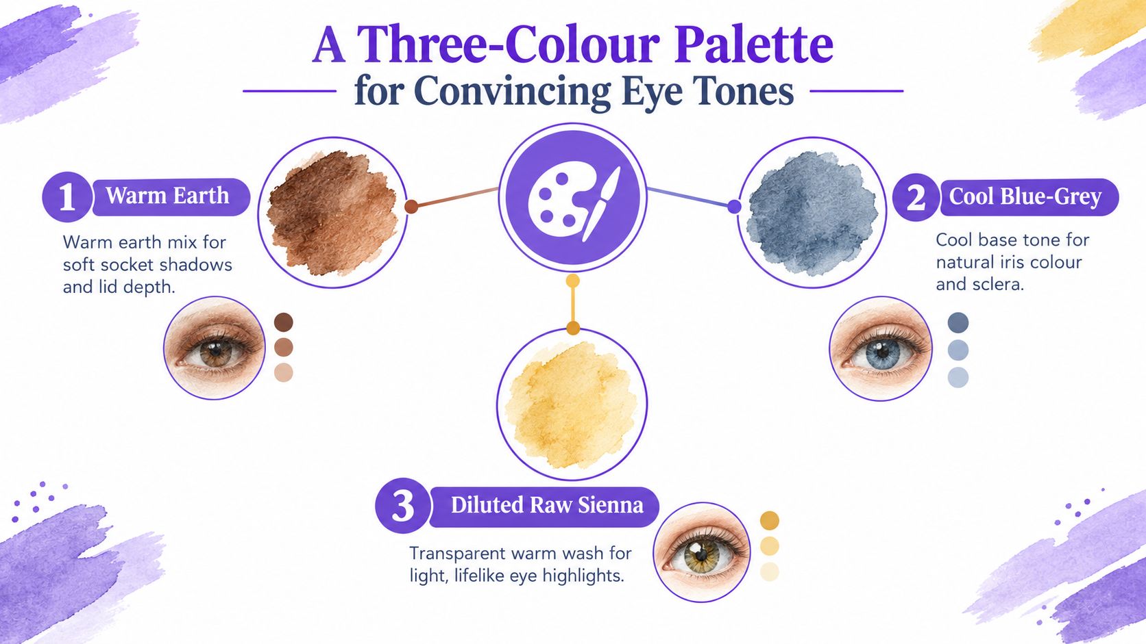
A realistic eye doesn't need a crowded palette. For most student studies, three core mixes are enough: a warm earth for socket depth, a cool blue-grey for the iris base, and a diluted raw sienna wash for the sclera warmth. That's a useful correction for the Level 2 habit of reaching for ten tubes when the issue is usually value, not hue.
Mix for temperature, then judge value
The eye reads through light and shadow first. A warm earth can sink into the lid crease, a cool blue-grey can carry the iris, and a diluted raw sienna can warm the sclera without making it look chalky. Once those three are on your palette, most of the rest comes from adjusting water, not adding new colour.
Optional upgrades help later. Burnt umber strengthens lash roots, and a touch of cerulean can cool the sclera shadow when the face lighting calls for it. A helpful classroom-style way to practise this is to make a small swatch strip, then see how the same three mixes look at different strengths before you paint the final eye. If you want a clean practice format for that kind of mixing, the color mixing worksheet for teachers is a straightforward prompt to adapt.
Keep the palette small on purpose
The point isn't fewer colours for the sake of minimalism. It's control. When two eyes sit in the same portrait, they can share the same three mixes and still look different because the lightness, edge, and temperature shift from side to side.
That's the lesson to keep in mind when the iris feels dead. If the form is correct, the paint usually needs a value adjustment, not another tube squeezed onto the page.
A Value-Mapping Exercise to Lock in Realistic Form
A convincing eye study can start as a grey thumbnail before any colour appears. That sounds unglamorous, but it's the quickest way to stop the eye from looking flat. If the value sketch reads well, the colour stage becomes glazing rather than rescue work.
Build the eye in five values
Use a size 6 round and spend about 20 minutes on a small study. First, sketch a small eye shape lightly in pencil. Then reserve the brightest highlight untouched, block the light sclera as a soft mid-light value, place the mid-tone in the iris and lid shadow, and finish with the darkest value in the pupil and lash line.
After that first thumbnail, repeat it twice more. Change the edge between socket and brow each time, because that's where many eyes go wrong. One version might need a softer brow transition, while another needs a firmer lid crease to support the expression. A size 1 rigger can wait until the final pass for lashes, because it's easier to control dark accents when the value map already works.
Let the grey study do the diagnosing
Useful test: if the grey version doesn't read as an eye, colour won't fix it.
That test matters for a Level 3 portfolio because it shows process, not just outcome. Tutors can see that you're making decisions about form, edge, and hierarchy instead of guessing at the finish. If you want to build that kind of record into your practice, a guide like how to make an online art portfolio can help you organise the work visually afterwards.
Once the strongest map is on the final sheet, glaze the three-colour palette over it in thin passes. Keep the lash line and lid edge for the dry surface, and leave the highlight untouched. That's how a study keeps its structure instead of becoming a wash of corrections.
Common Mistakes That Flatten Watercolour Eyes
The most common mistake is not a lack of skill, it's a lack of restraint. Students often paint the iris first, then chase the lid and lashes until the whole eye turns stiff. A tutor will usually ask three questions before anything else, where is the light coming from, what is the deepest value, and what shape does the shadow make on the sclera.
Diagnose the problem before repainting it
- Flat iris disc: if the iris looks like a sticker, break it with value variation and a softer upper shadow.
- Early lid outline: if the eye feels trapped, remove the heavy outline from the start and rebuild it from the socket planes.
- Hard black pupil: if the stare looks lifeless, use a deeper dark only after the surrounding tones are in place.
- Ignoring the socket: if the eye floats, add the shadow that anchors it to the face.
A second trap is the urge to add white highlights at the end. In watercolour, preserving the paper is usually safer than painting opaque white over the top, because a misplaced touch is harder to recover than an untouched spot. That's why planning the highlight early matters, even if you don't mark it loudly.
The restraint check is simple. Before you call the study finished, ask whether you could remove one brushstroke without losing the form. If the answer is yes, the eye probably still has clarity. If the answer is no, the painting may already be leaning on one or two marks too many.
Building a Portfolio-Ready Eye Study for Level 3 and Beyond
A strong eye study can do more than prove you've learned a technique. It can show observational drawing, controlled materials, and a sensible working process, all of which matter in UK creative assessment. That applies whether you're at Level 2 and building confidence, or at Level 3 and preparing work that can support university applications.
What markers and admissions tutors notice
Level 2 creative qualifications can support progression into further education, employment, and apprenticeships, but UCAS tariff points do not apply at Level 2. UCAS states tariff points apply only to Level 3 or SCQF Level 6 qualifications, not Level 2 qualifications such as GCSEs (UCAS). By contrast, Level 3 creative qualifications carry explicit tariff values, including UAL's Level 3 Diploma in Creative Practice: Art, Design and Communication at 36, 60, and 84 UCAS points for Pass, Merit, and Distinction, and the Extended Diploma at 72, 120, and 168 UCAS points (UAL).
That distinction matters in portfolio work. A level assessor, or a university admissions tutor, wants to see evidence that you can repeat a process, refine a study, and explain your choices. A single polished eye is useful. Three or four studies showing different ages, eye colours, and light directions tell a better story.
Build the evidence trail
Photograph each stage, from the first value map to the final dry details. Then arrange the studies side by side so the progression is visible, not hidden. If you're applying to illustration, fine art, or concept art, that sequence shows how you think as much as what you can finish.
For learners needing a structured route, UAL's Level 3 Applied General Diploma in Art and Design is a one-year qualification with 780 total qualification time hours and 600 guided learning hours, while the Extended Diploma is a two-year qualification with 1,620 total qualification time hours and 1,160 guided learning hours (UAL). Those routes are built around sustained creative development, which is exactly why a sequence of eye studies can be more persuasive than a single finished piece.
Before you submit, check that your study shows a clear light source, a believable socket, controlled soft and hard edges, and a highlight that feels planned rather than patched on. If those four things hold together, the eye doesn't just look realistic. It looks ready for the next stage.
If you want structured, tutor-led practice in portraits and watercolour control, The Online College of Art & Design (OCAD) gives you flexible study that fits around school, work, or home learning. For learners building an eye study for a portfolio, The Online College of Art & Design (OCAD) can help you turn repeated practice into organised coursework, confident technique, and a stronger next step.