

You've probably done this already. You sketch a face, place the eyes well enough, then reach the nose and everything stiffens. Suddenly the drawing looks younger, older, flatter, or wrong, and the fix often makes it worse.
That usually happens because students try to draw a nose symbol instead of a nose form. For portfolio work, especially if you're aiming at Level 2, Level 3, Foundation, or university progression, that approach won't carry enough observational strength. A convincing nose sketch comes from structure, proportion, and tone. You build it. You don't decorate it.
If you're learning how to draw a nose sketch for a coursework page, sketchbook study, or final portrait, treat the nose as one of the main anchors of the whole head. In UK GCSE guidance, the base of the nose is commonly taught as sitting halfway between the eyebrow line and the chin, and the width of the nose aligns with the inner edges of the eyes in a front view, which gives you a practical measuring system rather than guesswork (BBC Bitesize facial proportion guidance).
Table of Contents
- Mapping Proportions and Facial Landmarks
- Constructing the Nose as a Three-Dimensional Form
- Layering Tone and Blending Shadows
- Overcoming Common Sketching Mistakes
- Building a University-Ready Art Portfolio
Mapping Proportions and Facial Landmarks
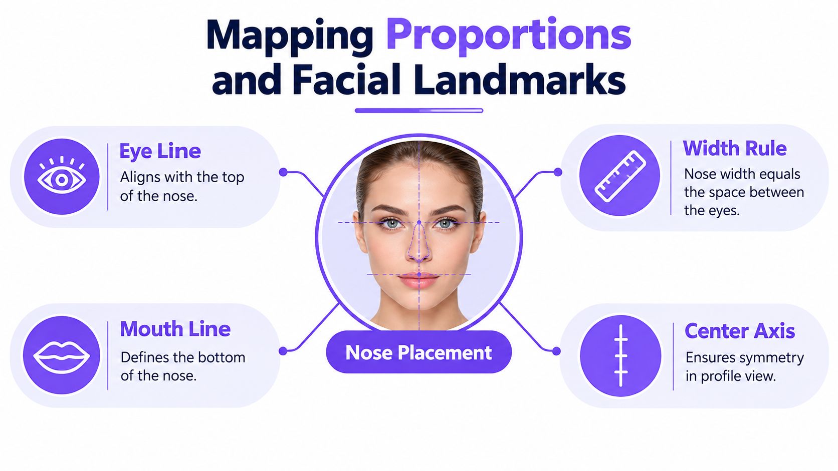
A nose goes wrong long before the shading does. In portfolio studies, the problem usually starts in the map. If the centre axis slips, or the base of the nose is placed too high, every tone you add later will sit on a weak structure.
Start by treating the nose as part of the head's framework. You are locating a form in space, not decorating the middle of the face with a familiar symbol. For observational drawing, that shift matters because tutors look for measured looking, steady correction, and evidence that you can build a feature from relationships across the whole face.
Start with placement, not detail
Set out a light centre line first, then mark the brow line and the chin. As noted earlier, the base of the nose is commonly taught as halfway between the brow line and the chin, and in a front view the nose width usually relates to the inner corners of the eyes. Those guides are not a formula for every face. They are starting checks that stop the feature drifting before you commit to darker marks.
That gives you three useful tests:
- Vertical check. Does the base of the nose sit near the midpoint between brow and chin?
- Width check. Does the nose spread too far past the inner eye corners, or fall too narrow for the face?
- Axis check. Does the bridge follow the facial centre line, or has it tipped slightly left or right?
If the whole head structure still feels uncertain, this guide to human proportions for drawing made simple and accurate gives you a clearer framework before you narrow your attention to the nose.
A simple habit helps here. Measure once with your eyes, place lightly, then compare the left and right sides before drawing nostrils or outlining the tip. Students often rush into the nostrils because they seem distinctive, but they are small parts attached to a much larger form. If the scaffold is off, the details only make the mistake look more definite.
Practical rule: If the nose looks wrong, recheck the head axis, brow-to-chin distance, and eye spacing before changing the nostril shapes.
Use proportion systems as a scaffold
Proportion systems work like the first lines of scaffolding around a building. They do not tell you every surface detail, but they give you a stable structure to build on. In a university portfolio, that underlying order often reads more clearly than polished blending on top of inaccurate placement.
Historical drawing instruction in the UK treated anatomy and proportion as part of formal visual training, alongside perspective and other core disciplines, as shown in this history of drawing at the Royal Academy Schools. That background helps explain why tutors still value measured construction. They are looking for observation guided by structure.
You will often see three simple systems used in classroom portrait drawing:
| Proportion idea | What it helps you do | When to use it |
|---|---|---|
| Facial thirds | Place features vertically | Early block-in |
| Quarter guide | Estimate where the nose sits on an egg-shaped head | Quick head studies |
| Central fifth | Judge nose width against the whole face | Front-facing portraits |
Use these as adjustable guides, not fixed rules. Real noses vary with age, bone structure, expression, and viewpoint. Your job is to begin with proportion, then correct it through observation until the feature sits convincingly in the head and feels ready to be built into solid tonal form.
Constructing the Nose as a Three-Dimensional Form
The biggest shift in quality happens when you stop asking, “What line is the nose?” and start asking, “What planes are turning toward or away from light?” A nose in a frontal portrait often has very little strong outer outline. Its realism comes from form.
Break the nose into parts you can observe
A useful structural breakdown in UK portrait-study guidance is the bridge, ball, nostrils, and septum. Thinking in these parts helps because each catches light differently, and each can be adjusted for age, angle, and character instead of defaulting to one generic nose.
One UK-based drawing resource points out a gap that many students feel straight away. They're often taught where the nose goes, but not how to understand it as separate forms with different shadow masses. That's why it helps to study the bridge, ball, nostrils, and septum as distinct tonal structures rather than one contour shape (facial feature study approach).
Think in planes, not symbols
Try this comparison when you draw from a photo or mirror:
- Flat-symbol thinking says “draw two nostrils and an outline”.
- Structural thinking says “the bridge turns forward, the ball rounds outward, the wings wrap sideways, and the underside drops into shadow”.
That second approach is what gives your page authority. It also makes correction easier. If the ball of the nose feels too bulbous, you can soften the turning plane. If the bridge looks too narrow, you can widen the side planes before deep shading locks the mistake in.
The lower nose is usually explained more clearly by the shadow underneath it than by a dark line around it.
Current UK-relevant art instruction also leans more openly into reference-based, digital-friendly workflows, including drawing from a reference photo and refining through stages rather than memorising a formula (Adobe UK drawing resource). If you want to review your process after drawing, you can even turn your drawing into a video to study how your construction and shading developed from one stage to the next.
If construction drawing still feels unfamiliar, practise with simple solids first, then return to facial features through drawing in construction.
Layering Tone and Blending Shadows
You have the structure in place, but the drawing still looks flat on the page. That usually happens at the tonal stage. A nose starts to feel believable when the light explains its form better than the outline does.
Treat shading as sculpture with graphite. You are not filling shapes. You are showing how the bridge turns, how the side planes recede, and how the ball of the nose projects forward. For students preparing observational portfolio work for university, that difference matters. Admissions tutors want to see that you can describe form through measured tone, not just copy a familiar nose symbol.
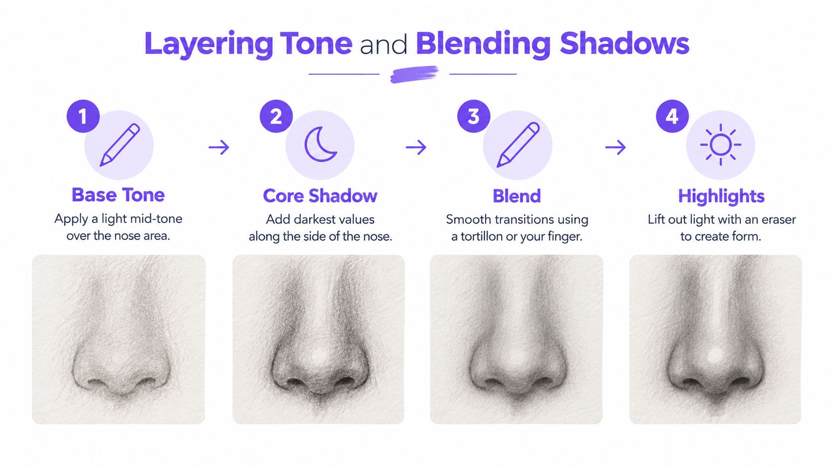
A useful approach is to organise the values into large masses first. Squint at your reference. The tiny details drop away, and the main pattern becomes clearer: light across the upper bridge, a mid-tone on the side planes, and a connected shadow mass beneath the lower nose. If you chase nostrils too early, you interrupt that larger pattern and the drawing starts to fragment.
A workable tonal sequence
Use this order when you shade:
- Keep the guidelines pale. They should stay adjustable under later layers.
- Place the main shadow mass under the nose. This gives the form lift straight away.
- Add a light tone to the side planes. Keep it even at first so you can judge the turn of the form.
- Model the bridge with small value shifts. In many views, the bridge is defined by soft transitions rather than a visible edge.
- Reserve the darkest accents for the end. Usually these sit inside the nostril openings and in the tight occlusion shadow where forms overlap.
If smooth shading feels difficult, practise on a simple round form before returning to portrait study. A sphere teaches the same visual logic you need here: highlight, halftone, core shadow, reflected light, and cast shadow. That is why drawing a sphere as a tonal exercise remains such a strong warm-up for nose studies.
Blending also needs restraint. If you rub every area to softness, the planes merge into one vague grey shape. Keep some pencil strokes visible on the turning planes. The slight change in direction can help describe the surface, much like contour lines on a map help explain the rise and fall of land.
As noted earlier in UK classroom guidance, students usually get cleaner results when they work lightly at first and avoid dragging the hand through finished graphite (GCSE Art knowledge organiser).
A quick check during shading can prevent muddy results:
- If the bridge disappears, separate the light plane from the side plane more clearly.
- If the nostrils dominate, reduce the contrast around their rims and reconnect the larger shadow mass.
- If the nose looks pasted on, soften any contour that should be created by tonal turning.
- If the whole form looks dull, widen the value range between the lit planes and the deepest shadows.
Build tone in layers. Let the nose turn in space through value changes, edge control, and connected shadow shapes.
Overcoming Common Sketching Mistakes
Many students believe the mistake is poor neatness. It usually isn't. The deeper problem is that they trust memory more than observation.
A nose drawn from memory becomes a formula very quickly: two commas for nostrils, one line for the bridge, one curve for the tip. That symbol can survive in cartoons, but it weakens an observational portfolio page because it hides what you saw.
The most common errors
Here are the habits I correct most often in sketchbooks and coursework sheets:
- Starting with nostrils. This pulls attention to the smallest dark shapes before the larger form is established.
- Outlining the whole nose. In many frontal views, the edge is soft or lost.
- Making both sides identical. Real faces aren't mirror-perfect, and neither are good observational drawings.
- Ignoring viewpoint. A tilted head changes what you see of the septum, wings, and underside.
- Using one generic nose for every sitter. Age, bone structure, expression, and lighting all change the result.
What to do instead
Use reference with a specific question in mind. Don't just copy the photo. Ask where the form turns, where the shadow joins, and which edge is sharp or soft.
A useful UK education gap appears here. Some school resources give broad guidance on placement but less on how to adapt method for realism, viewpoint, age, or different learner needs. That leaves many beginners, home-educated students, adult returners, and SEND learners needing more scaffolded, stepwise support than a simple “place the nose here” instruction provides (primary portrait lesson context).
That matters because confidence in drawing often grows from clear sequencing, not speed. If you need more support, work through the same subject in stages:
| Problem | Better question to ask |
|---|---|
| Nose looks flat | Where is the underside shadow? |
| Nose looks pasted on | Which edges are soft enough to lose? |
| Nose looks crooked | Is the centre axis straight relative to the head tilt? |
| Nose looks generic | What is unique about this sitter's bridge, tip, or wings? |
Draw what changes from sitter to sitter. That's where observation begins.
Building a University-Ready Art Portfolio
You are standing in a portfolio interview, and the tutor pauses on a page of nose studies. They are not looking for a neat symbol of a nose. They are looking for evidence that you can observe a form in space, measure it against the face, build it with tonal masses, correct it when it drifts, and explain your decisions. A careful nose study can show all of that on one page.
For university preparation, that matters. A portfolio page built from structure rather than outline shows stronger habits than a polished but copied result. It tells tutors that you understand how form turns, how light describes volume, and how your drawing develops from first mapping to final refinement.
For students planning progression after Level 2 or Level 3, portfolio expectations in the UK are quite specific. UAL's Foundation Diploma guidance explains that applicants need a portfolio, a personal statement, and either a full Level 3 qualification or equivalent plus GCSE passes including Maths and English at grade 4 or above. It also states that the portfolio should be no more than 25 pages and should include observational drawings, work in progress, and annotations that explain development and technique (UAL Foundation Diploma entry guidance).
What one nose study can prove
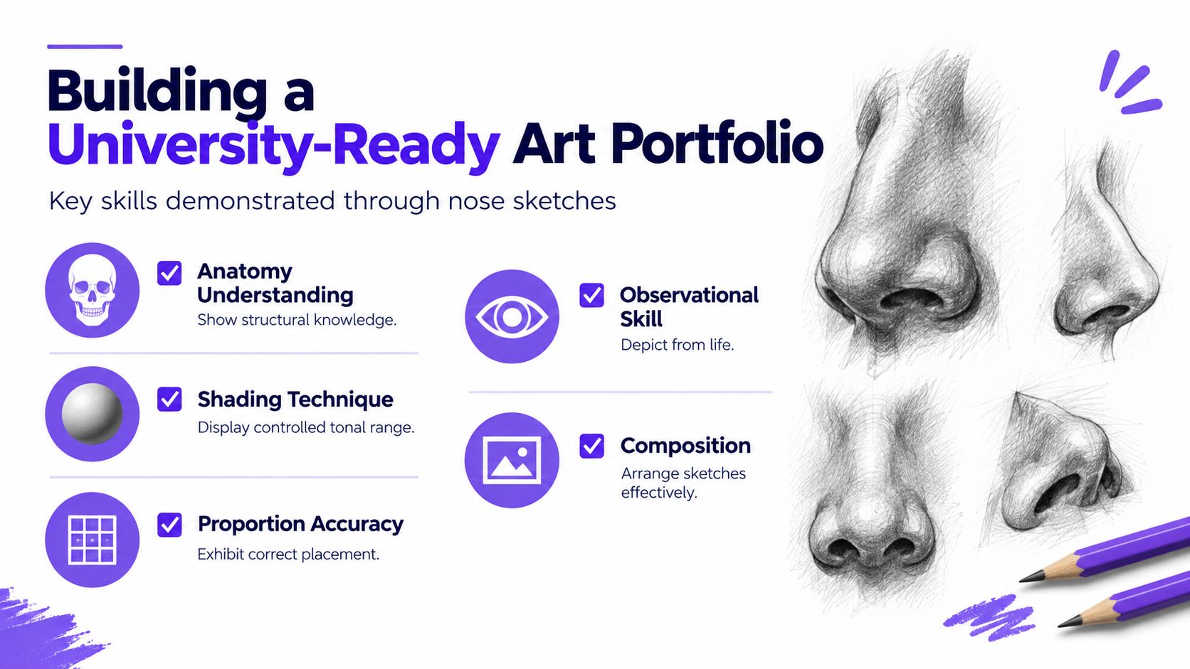
A strong study page often does more than students expect. If your goal is a university-ready portfolio, one feature study can demonstrate:
- Measured construction from the first block-in, with centre line, width checks, and clear landmark placement
- Three-dimensional thinking by building the bridge, ball, side planes, and nostril wings as connected forms rather than tracing an outer contour
- Tonal development from a simple shadow map to fuller modelling, showing how value creates volume
- Visible corrections that prove you checked the drawing against observation and adjusted proportion
- Written annotation that explains what changed, where the form flattened, or how the light source affected your decisions
- Variation in viewpoint such as front, profile, or three-quarter studies, which helps show that you can adapt structure rather than repeat a memorised formula
That last point is especially useful for portfolio selection. Tutors often respond well to pages that show a process of seeing. A row of quick studies comparing different nose angles, age groups, or lighting setups can reveal more skill than a single overworked drawing.
If you are still deciding your route after Level 3, one practical detail is progression value. An Edinburgh College UAL Foundation Diploma listing notes that the qualification can carry UCAS tariff points and is recognised for progression into art and design degree pathways, subject to institutional requirements.
Questions students ask when shaping portfolio pages
Do universities care about process or just finished outcomes?
They care about both, but process often carries more evidence. A page that shows your first construction lines, tonal tests, and short notes about revision gives tutors something to assess. They can see whether you understand how the nose sits on the face as a structure, not just whether you can polish a final surface.
Can a Level 3 creative qualification lead to higher education?
Yes. UAL's Level 3 Diploma and Extended Diploma in Creative Practice guidance states that these qualifications provide industry-relevant skills and can support progression to related higher education courses, employment, or further training.
What if I need flexible or adapted support?
That affects portfolio development directly. Analysts at the Cultural Learning Alliance report uneven representation patterns for SEND learners in arts education attainment subjects. That makes adapted teaching, flexible pacing, and clear portfolio evidence especially important for students staying on creative pathways.
Professional context can help too. Looking at how top creative agencies present visual thinking, process, and specialism gives you a clearer sense of what strong creative communication looks like beyond the classroom.
One more useful reference point is practical demonstration. This video is worth studying for pacing, mark-making, and tonal restraint:
If you want structured, tutor-led support while building observational studies and portfolio pages, one option is The Online College of Art & Design, which offers online creative courses from entry level to Level 3, including GCSE-equivalent, A Level, Foundation, and SEND-specific pathways.
If you want to turn feature studies into stronger coursework and portfolio evidence, The Online College of Art & Design (OCAD) offers flexible, tutor-led online art pathways that support observational drawing, annotation, and portfolio development. If this nose-sketch process is exactly the kind of skill you want to strengthen for Level 2, Level 3, or university preparation, visit The Online College of Art & Design (OCAD).