

You've drawn the mug's handle, added a convincing shadow and started polishing the rim. Then you notice the whole mug is too wide. Rubbing it out leaves a grey patch, and you wonder whether you needed better pencils or more talent.
Usually, you needed a different order of work. If your search for “how to pencil drawing” brought you to a blank sheet, start with observation and light construction, not shading tricks. A small, repeatable routine will teach you more than a drawer full of equipment.
Table of Contents
- Choosing Pencils, Paper and Erasers for Beginners
- Seven Steps From Blank Page to Finished Pencil Drawing
- Line Quality and Pressure Control
- Proportion, Perspective and Construction Lines
- Shading Techniques and Building Value
- A Four-Week Pencil Practice Plan
- Build Your Pencil Portfolio Before You Apply
Choosing Pencils, Paper and Erasers for Beginners
Graphite pencil grades and their best uses
| Grade | Hardness | Best use | Watch for |
|---|---|---|---|
| 2H | Hard | Faint construction lines and clean outlines | Hard to darken later; grooves if pressed |
| HB | Medium | General sketching and first description | Can look grey if used alone for shadows |
| 2B | Soft | Mid-tones and initial shading layers | Smudges easily when your hand passes over it |
| 4B | Very soft | Deep shadows and strong dark accents | Pits smooth paper if pressed hard |
| 6B | Extra soft | Darkest accents and rich blacks | Heavy smudging; use sparingly and on textured paper |
Start with HB, not a complete graded set. You can use its point for a clear line and its side for a broad mark. Keep it sharp enough to control, but don't spend every exercise chasing a needle-like tip.
Softer grades deposit graphite more readily, giving richer darks. They also smudge more easily, and excessive pressure can pit the paper and make crisp edges harder to maintain. A darker pencil should reduce the effort needed to make a dark mark, not encourage you to press harder.
Match the paper to the task
Printer paper suits short exercises because you won't feel obliged to make every sheet precious. For longer studies, try cartridge paper. For example, a pad labelled 120 to 160 gsm is a sensible starting choice; gsm describes the paper's weight per square metre, not its surface texture.
Smooth sheets suit fine detail. Textured sheets have tooth, the small surface irregularities that catch graphite and support layered tone. Very rough paper can interrupt delicate lines, so test a corner before committing to a detailed subject.
Buy additions when they solve a problem
A kneaded eraser lifts graphite when pressed and lifted, rather than scrubbed. Use a firm eraser for crisp corrections, and add a blending stump or tortillon, a tightly rolled paper tool, when you begin softening shading.
Choose a route that matches your practice:
- Minimal route: Use an HB pencil and printer paper through the opening fortnight, including your first tonal experiments.
- Full first-month route: Add a 2B for mid-tones, a 4B for deeper shadows, a kneaded eraser and cartridge paper when shading becomes a regular task.
If you choose the fuller route, the value-strip exercise is a useful point to test those additions. They're optional tools, not permission to begin.
Seven Steps From Blank Page to Finished Pencil Drawing
A drawing can look promising early on, then become less convincing as detail accumulates. The usual problem is committing to small features before checking the larger shapes.
Use this sequence to keep changes manageable:
- Test the composition. Make small thumbnail sketches to compare crops and placement. For example, try three to five sketches about 3 to 4 cm wide. The common slip is choosing the first arrangement without testing alternatives.
- Establish the outer envelope, the simplest shape around the subject, and its main axes with faint HB or 2H lines. Pressing hard here leaves grooves that interrupt later shading.
- Check proportion. Compare empty spaces around the subject and alignments between features. Don't perfect the handle while ignoring the mug's overall width.
- Place the large light and dark areas. This establishes the lighting before you model curved surfaces; beginners often mistake local detail for the main shadow pattern.
- Build tone gradually with parallel strokes, crossing layers and selective softening. Darkening everything together removes the differences that describe form.
- Preserve the brightest highlights. Leave those areas as untouched paper. Relying on an eraser to recover heavily worked highlights often gives a dull result.
- Annotate what changed and why. Write something useful, such as “narrowed the rim after comparing it with the base”, rather than “improved drawing”.
England's national art-and-design curriculum requires learners to use sketchbooks to record observations, review and revisit ideas, and improve their handling of materials, including pencil.
Review before adding more
Step back and check whether the subject still reads through its biggest shapes. If it doesn't, more detail won't repair the structure.
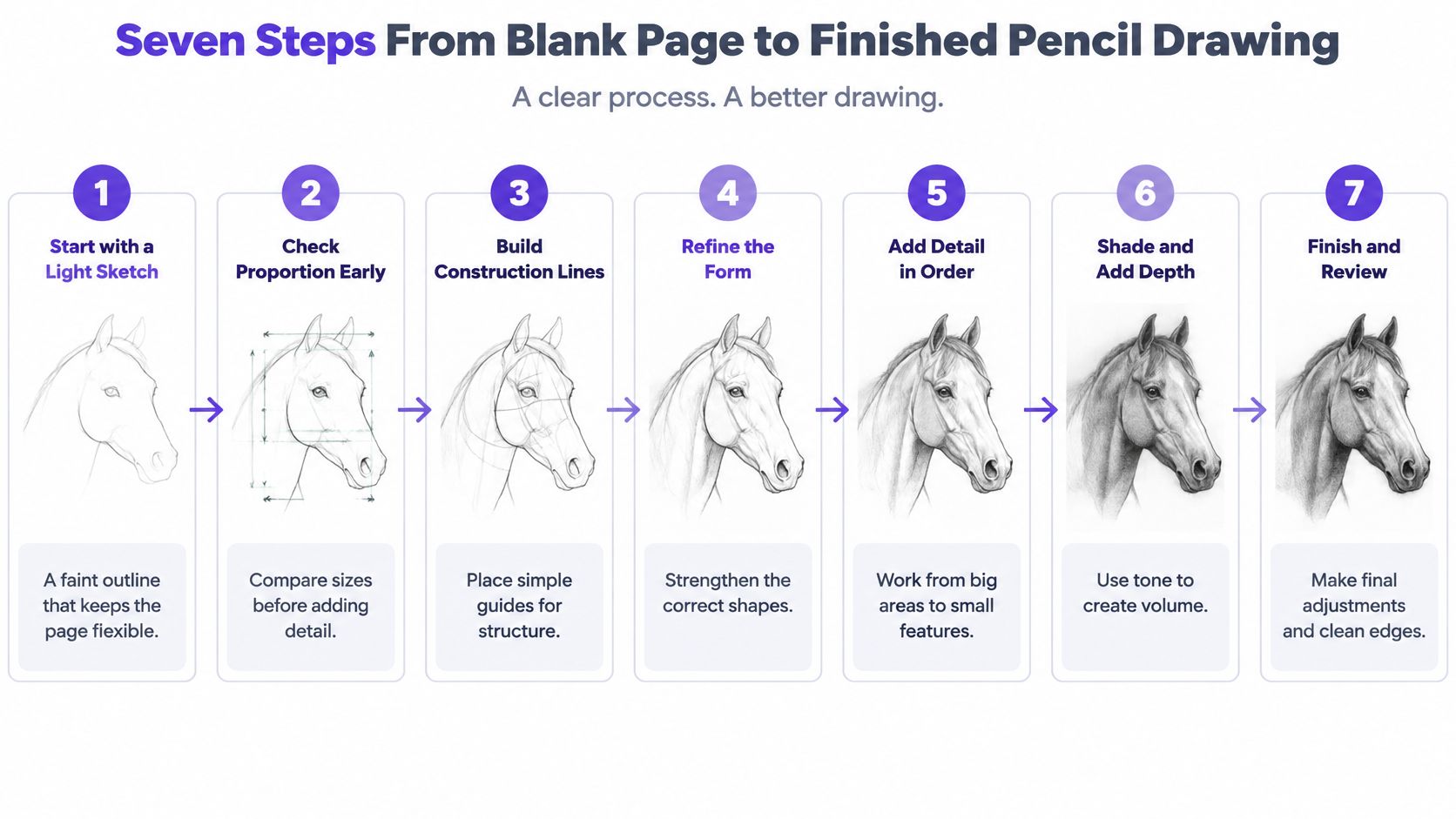
The horse example illustrates how a drawing develops through successive decisions rather than a single finished outline.
Line Quality and Pressure Control
A recognisable outline can still look hesitant. Your marks also need to describe which edges matter, how surfaces turn and where the viewer should look.
Test pressure and movement separately
Pressure controls how firmly graphite meets paper. Try holding the pencil a little farther from its tip than you would for handwriting, with a loose wrist. On scrap paper, draw a line that begins faintly, strengthens and fades again without stopping.
A crisp dark edge can emphasise a decisive turn or overlap. A fading edge can suggest a surface disappearing into light. Don't outline every part equally heavily, or a rounded object may look like a cut-out.
Direction changes the character of a stroke. Compare a short wrist-led movement with a longer movement from the elbow. The wrist offers compact control; the elbow helps you draw longer sweeps without repeatedly joining short marks.
Consistency makes intentional texture distinguishable from accidental scribbling. Repeat short strokes at a similar angle and length, then inspect their spacing rather than their darkness.
A short pressure experiment
Use a ten-minute practice session to compare marks rather than finish an object:
- Begin lightly: Draw a row of parallel lines without trying to make them perfectly straight.
- Increase gradually: Repeat the row with firmer pressure across the page.
- Inspect the surface: Note where graphite begins to shine, skip or leave an indentation.
Heavy construction marks can compress the paper's grain, leaving less texture for later graphite to catch. A shiny patch isn't necessarily a successful dark; it may be a polished, overworked surface.
Practical rule: If a construction mark won't soften or erase cleanly, treat that as a warning to reduce pressure.
If gripping causes fatigue, try a larger barrel or an adaptive grip and shorten the exercise. Stop when discomfort develops; practising through pain isn't a drawing skill.
Proportion, Perspective and Construction Lines
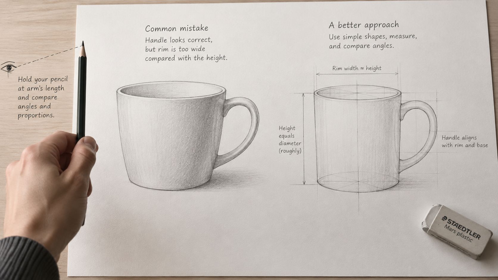
A mug's handle may look convincing while its rim is much too wide for its height. This happens when you draw the idea of a mug instead of comparing the particular shapes in front of you.
Measure relationships, not centimetres
Sighting means using your pencil as a visual measuring tool. Hold it vertically at arm's length, align its tip with the subject's top and slide your thumb to mark the bottom. Keep your arm extended and your viewing position unchanged when comparing that distance with the width.
For example, suppose your mug appears 1.2 times as tall as it is wide. Your drawing should preserve that relationship whether it fills a sketchbook page or occupies a small corner. Don't transfer the pencil measurement directly onto the paper as though it were a ruler.
This guide shows the measuring position and the relationships to check.
Build boxes and curved rims
For a box seen from a corner, place the horizon at your eye level. In two-point perspective, the horizontal edges of each visible side converge towards separate vanishing points on that horizon, while vertical edges remain upright in a level view.
Try a cereal box. Draw its nearest vertical corner first, then lightly guide the side edges towards their vanishing points. Those points may need to sit beyond the sheet; forcing them close together can exaggerate the box's distortion.
A mug's circular rim appears as an ellipse, a flattened circle. Draw a faint enclosing rectangle and centre lines before shaping its continuous curve. Avoid pointed ends.
As a hypothetical geometric guide, a circle tilted 45 degrees away from a face-on view has a short axis about 0.7 of its long axis; at 60 degrees, it's about half. Real objects still require observation because your viewpoint and perspective affect their appearance.
For further structural exercises, use this guide to drawing in construction. If you later explore AI rendering from hand-drawn concepts, Nim's guide offers context for that digital workflow, but judge your original construction before accepting a rendered interpretation.
Finally, turn your sheet upside down. Compare it with the reference in the same orientation so familiar subject labels don't distract you from mismatched shapes.
Shading Techniques and Building Value
Shading techniques compared
| Technique | How it works | Best for | Common mistake |
|---|---|---|---|
| Hatching | Parallel lines placed close together; quick to establish | Flat planes, drapery folds | Uneven spacing that reads as stripes |
| Cross-hatching | Layers of lines at different angles; slower to build | Mid-tones and woven texture | Muddy build-up from too many layers |
| Blending | Graphite softened with a stump or tortillon; quick after laying a base | Smooth skin, sky and soft fabric | Using a greasy finger and disturbing earlier layers |
| Stippling | Small dots built in clusters; time-intensive | Stone, bark and rough surfaces | Dots of inconsistent size or spacing |
| Scumbling | Loose circular marks over a light base; gradual coverage | Foliage, fur and fabric | Losing the overall shape in the texture |
Value means how light or dark an area appears. Before drawing your subject, make a strip with distinct steps from untouched paper to your darkest usable graphite. A useful exercise is a five-step strip: white, light grey, middle grey, dark grey and the darkest accent.
Judge the steps beside one another. If the middle patches look identical, change your layering or pencil choice rather than making the entire strip darker.
Build volume before texture
On a rounded object, begin with a light overall shadow shape, then strengthen its darker parts. Keep edges firm at clear overlaps and soften transitions across gently turning surfaces. A cast shadow can also soften as it extends away from the object.
Use a sphere-drawing exercise to practise these changes without the distraction of handles, patterns or facial features. Check the result at arm's length or in a reduced photograph: can you still distinguish the main light, middle and dark areas?
A smooth drawing isn't automatically a well-shaded drawing. Clear light relationships matter more than an evenly smudged surface.
Finish without overworking
Use light construction, middle-tone layering and selective dark accents, then lift highlights with a clean kneaded eraser and correct edges. Avoid rubbing across the entire sheet, which can spread graphite into areas you intended to keep clean.
Keep your test strip and unsuccessful trials. The GCSE subject-level guidance for art and design treats recording as an ongoing process that can include visual and written evidence.
For a digital comparison, MyImageUpscaler's guide to create pencil sketches in Photoshop can help you examine simplified tonal effects. Label digitally altered images clearly and keep your observational drawing separate.
A Four-Week Pencil Practice Plan
You may be fitting drawing around home education, work or caring responsibilities. Keep the materials within reach and choose a task small enough to begin without rearranging the day.
The National Literacy Trust's report on parents' support for learning at home found that, in 2025, only 27.9% of surveyed parents reported painting, drawing or making things with their child every day. A manageable routine gives families a practical alternative to waiting for a long, uninterrupted session.
Choose a repeatable session
Treat these timings as suggested practice slots, not completion standards.
Four-week pencil practice plan
| Week | Exercise | Time | Skill built |
|---|---|---|---|
| 1 | Blind contour drawing of a mug | 5 to 10 minutes | Line control without looking at the paper |
| 1 | Parallel stroke rows with rising pressure | 10 minutes | Pressure consistency |
| 2 | Five-step value strip | 10 to 15 minutes | Value range and pencil response |
| 2 | One object lit from one side | 10 to 20 minutes | Light and shadow placement |
| 3 | Sighting and proportion check | 10 minutes | Measuring relationships by eye |
| 3 | Ellipse and box in perspective | 10 to 20 minutes | Angled circles and convergence |
| 4 | Resolved drawing with annotation | 20 minutes | Full sequence from construction to finish |
During the opening week, follow the mug's edge with your eyes while drawing without watching the paper. Accept the odd-looking result; you're practising attention and movement, not producing a display piece.
For the next week, keep the lamp and object still while comparing shadow placement. Then use the construction week to correct relationships before adding any surface pattern.
The final project should be manageable enough to resolve, such as a plain mug beside a box. Annotate a change you made and the observation that prompted it.
Adapt the duration
- Five-minute version: Isolate a single task, such as the rim or shadow boundary.
- Ten-minute version: Complete the main exercise and add a brief note.
- Twenty-minute version: Repeat with a deliberate change, then compare results.
Track pressure consistency, line confidence, comfort and time to finish, alongside observation, construction, tone and reflection.
A drawing made during a short session is complete practice, even when it isn't a finished artwork.
Build Your Pencil Portfolio Before You Apply
Pencil practice can remain a hobby, or you can organise it as evidence for a university application. For admission, select work that shows how you investigate and develop an idea, not merely which drawings look most polished.
De Montfort University's Art and Design Foundation portfolio guidance includes observational studies of objects, people and scenery alongside conceptual drawings, initial sketches and development. Connect those studies to a project outcome through material tests, perspective work and annotated revisions.
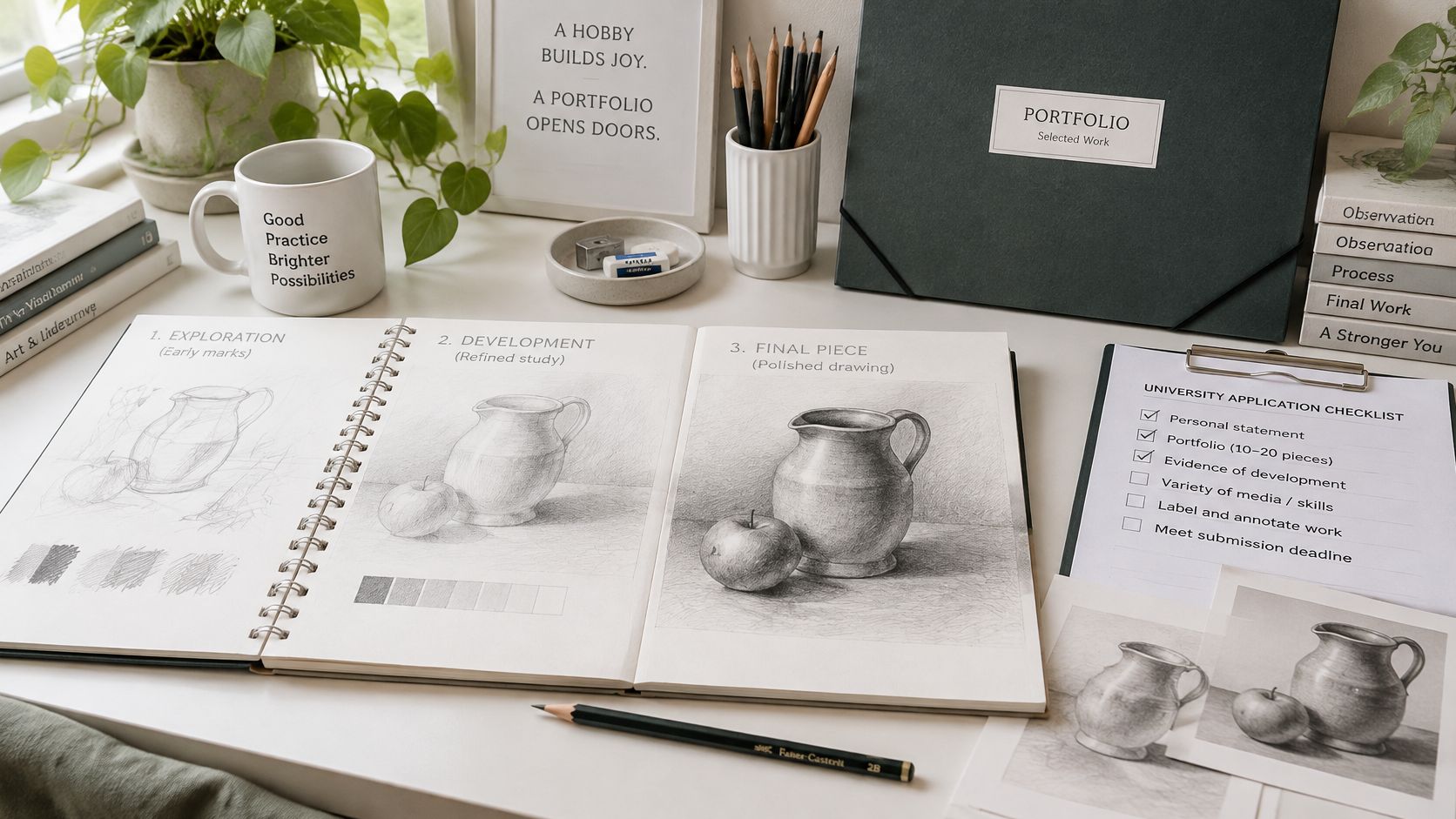
Keep the development visible when organising your application material.
Does Level 2 count towards university preparation?
Yes, as a foundation, not an automatic university entry qualification. The Civil Service qualifications guidance describes Level 2 as broadly equivalent to GCSE grades A* to C or 9 to 4, and Level 3 as equivalent to AS or A levels.
Use foundation study to build observational skills, sketchbook habits and confidence responding to feedback. The more advanced stage should develop an application-ready body of work and address your chosen degree's academic requirements.
Do I need polished final drawings?
Not exclusively. Birmingham City University's portfolio guidance welcomes experiments, ideas in progress and playful tests alongside sketches and other media.
Include unfinished work when it explains a decision. Use this guide to making an online art portfolio to organise images so tutors can follow each project.
Which qualification route should I choose?
Compare target universities' published entry requirements with course assessment details before committing. At OCAD, our Level 2 Certificate in Art & Design with SEND Support Package is equivalent to GCSE/BTEC in good schools, has no exam or written essay, and is 100% online, studied in the student's own time; our Level 3 Diploma in Fine Art with SEND Support Package is equivalent to 2 A Levels in UCAS points and earns up to 112 UCAS points.
Neither points nor a portfolio guarantee admission. This week, choose three target universities and copy their portfolio and entry requirements into your sketchbook.
We offer flexible, tutor-led online creative study, with drawing practice, assignments and feedback to help you develop a purposeful portfolio. Visit The Online College of Art & Design (OCAD) to compare creative study routes and find a course that fits your starting point and university ambitions.