

You're probably staring at a blank page, a reference photo, and a trunk that looks harder than the rest of the animal put together. That's normal. A good illustration of elephant starts by making the big job feel small, and the quickest way to do that is to treat the drawing as four separate decisions, block the shapes, check the proportions, add texture, then choose a style.
If you want a reminder about using references without copying them line for line, a helpful starting point is this guide on working from references carefully. Keep that idea in mind while you sketch, because the point is to observe structure, not trace a photo into a flat copy.
Table of Contents
- Getting Ready to Draw an Elephant
- Building the Basic Shapes and Proportions
- Spotting and Fixing Proportion Mistakes
- Adding Skin Texture and Tonal Depth
- Choosing a Style for Your Elephant Illustration
- Turning Your Sketch into Portfolio Work
- Practising the Workflow Beyond This Drawing
Getting Ready to Draw an Elephant
The first time you sit down to draw an elephant, the bulk can feel intimidating. It helps to stop thinking of it as one huge subject and start treating it as a series of manageable parts. The four-stage approach, blocking shapes, correcting proportions, adding texture, and choosing a stylisation, gives you a clear path instead of a vague hope that the drawing will “work out”.
Start with the right reference and tools
Collect reference photos of both African and Asian elephants before you begin. That comparison makes the differences easier to see, especially the ear shape, back arch, and head size. Historical elephant studies show why this matters, because observed drawing has long been more reliable than guessing from memory, from Matthew Paris's live elephant drawings in 1255 to later studies like Rembrandt's drawing of Hansken, now held by the British Museum (Matthew Paris and the Tower elephant, British Museum record for Rembrandt's elephant study).
For materials, keep it simple. An A3 sketchpad gives you room to build the animal at a sensible scale, a 2B pencil is ideal for construction lines, a kneaded eraser keeps corrections clean, and a blending stump becomes useful later when you start modelling tone. Before the full study, warm up with five-minute thumbnail sketches of the trunk in different positions. That loosens your hand and stops you from locking into one stiff pose too early.
Practical rule: if the trunk and ear feel wrong in the first minute, fix them then. The longer you leave a wrong proportion, the harder it is to recover the drawing cleanly.
A reliable sequence for your study is: first, collect reference and warm up. Next, draw the basic structure. Then, correct the proportions. After that, build texture and shading. Finally, decide whether the piece should look realistic, graphic, line-based, or painterly.
Building the Basic Shapes and Proportions
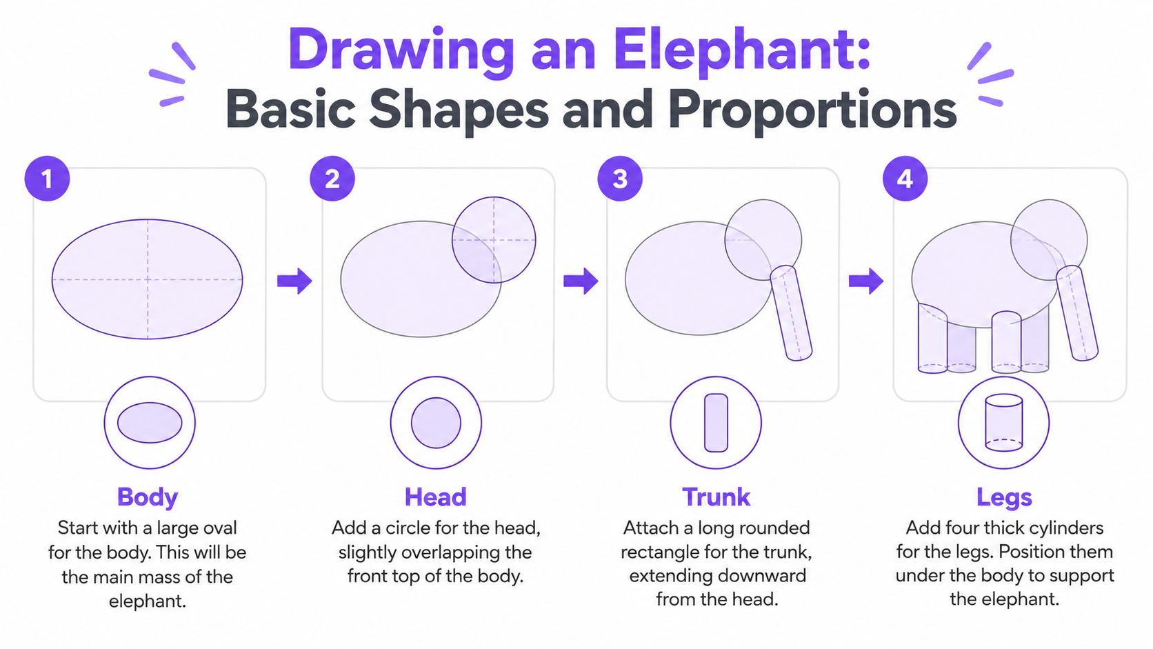
Start with a large oval for the body. Make it roughly twice as long as it is tall, and place it lightly on the page so you still have room to adjust the head and legs. Then add a smaller circle for the head, set low and forward so it overlaps the front of the body shape. That overlap matters because elephants don't look like separate parts stacked together. They read as one weighty form.
Next, attach the trunk as a rounded cylinder angled slightly downward. Add four thick columns for the legs. At this stage, don't worry about knees, toes, or wrinkles. You're trying to solve the animal's mass first, because the overall shape tells the viewer far more than detail does.
Check your measurements before refining
Use these checkpoints as you work. The head should sit at about one-third the height of the body oval. The legs should feel close to the body depth, not flimsy or short. The trunk should reach the ground when you drop its tip from the chin area, even if you later bend it into a more natural curve. The ear can be blocked in as a flat rounded triangle attached to the side of the head.
Keep your construction lines light. That lets you correct the silhouette without fighting heavy graphite. Once the main parts are in place, connect them with a single flowing contour so the elephant starts to read as one animal rather than a collection of shapes. Don't erase the guides yet. They're still doing useful work, especially when you compare your drawing to the reference and ask whether the weight feels believable.
| Common Elephant Proportion Errors and Corrections | ||
|---|---|---|
| Common Error | Visual Symptom | Correction |
| Body oval too small | The elephant looks cramped and toy-like | Enlarge the torso so the head and legs can sit naturally within it |
| Head circle placed too high | The neck area feels stiff and unnatural | Drop the head lower so it overlaps the front of the body |
| Trunk drawn as a straight tube | The pose looks rigid and artificial | Rebuild it as a rounded form with a gentle bend |
A clean block-in gives you something solid to work from. Once that base is right, the drawing becomes much easier to finish.
Spotting and Fixing Proportion Mistakes
Most beginner mistakes show up early, which is useful because early mistakes are easier to fix. The trick is to learn what each error looks like before you've committed too much detail. With elephants, the three big problems are ear scale, trunk angle, and leg spacing.
Ear scale, trunk angle, and leg spacing
An ear that's too small makes the animal look timid or anonymous. In African elephants, the ears are a major visual feature, and they need enough size to sit over the shoulder area instead of hugging the head. If you notice the ear only covers part of the cheek, enlarge it until it clearly helps define the silhouette.
A stiff vertical trunk is another common problem. Real trunks curve with weight and flexibility, so a straight line makes the whole figure feel mechanical. Rebuild it as a soft S-curve or a hose-like bend, and taper the tip so it narrows naturally instead of ending like a tube.
Leg spacing causes a different kind of error. If the legs sit too close together, the elephant loses its stable, grounded stance. Widen the foot placement and check that the front legs and back legs feel like they support the same heavy body. That one correction often fixes the posture more than any other adjustment.
Compare your sketch to the reference from a few steps back, not nose-to-paper. Distance makes proportion problems easier to see.
| Common Error | Visual Symptom | Correction |
|---|---|---|
| Ear too small | Head looks oversized and unbalanced | Widen the ear until it reaches across the shoulder area |
| Trunk too vertical | Pose feels stiff and lifeless | Bend the trunk into a natural curve with tapering at the tip |
| Legs too close | Elephant seems unstable or cramped | Spread the feet and make the stance wider |
Once you've fixed these three areas, your sketch will usually look much more convincing, even before shading. The goal isn't perfection. It's a believable structure that can carry later detail without falling apart.
Adding Skin Texture and Tonal Depth
With the structure in place, you can start giving the elephant weight, softness, and surface character. Begin with a light pencil layer to map the main shadow planes along the flank, belly, ear, and underside of the trunk. Don't chase every wrinkle straight away. If the broad light and dark areas aren't right, texture alone won't rescue the drawing.
Build tone before detail
Traditional draftsmen often used charcoal to block in larger mid-tones before lifting highlights with a kneaded eraser, and that method still works well for elephant skin. You can follow the same logic with pencil. Use HB for light structure, 2B for softer gradients, and 4B or 6B for the deepest crevices. The key is to reserve your darkest values for the folds that sink back, not for every line on the skin.
Criss-cross hatching works well around the eyes, behind the ears, and at the leg joints, where the skin is more compressed. Keep the forehead and shoulder calmer, because those areas usually read as smoother planes. If you like a more granular surface, stippling can also work, but use it sparingly. Too much stippling can make the elephant look dusty instead of solid.
If you want to compare your tonal decisions with a drawing method that uses charcoal and shadow mass effectively, this note on casting a shadow in drawing is a useful companion. It's not about elephants specifically, but the principle is the same, shadow creates form.
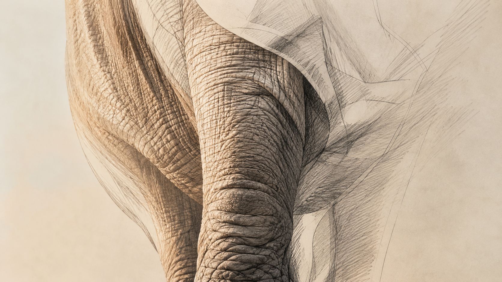
Step back every few minutes and squint at the drawing. If the darks and lights still separate clearly at a distance, your texture pass is probably doing its job.
That simple habit stops you from overworking tiny wrinkles while ignoring the bigger tonal structure. The best skin texture supports the form, it doesn't bury it.
Choosing a Style for Your Elephant Illustration
Not every elephant drawing needs the same finish. Some briefs want realism, some want clarity, and some want personality. The right style depends on who will look at the piece and what it needs to do for your portfolio or project.
Match the style to the purpose
A realistic rendering suits observational study, wildlife work, and portfolio pieces where you want to show patience and control. It asks for strong reference use, careful tone, and more time. Graphic stylisation reduces the elephant to bold flat shapes and a limited palette, which works well for editorial illustration or poster work, but it demands confidence in shape design and colour choices.
Line-art strips away shading and depends on strong contour drawing plus selective crosshatching. It's good for sketchbook pages, book illustration, and cleaner design-led outcomes. Painterly treatment loosens the edges and welcomes expressive brushwork, which is useful for concept art, album covers, and more atmospheric projects, though it usually needs more varied materials and stronger paint handling.
A reference collection can help here too. If you browse a range of visual approaches, such as the Galleryy elephant collection, you'll notice how differently artists can interpret the same animal without losing recognisability.
| Four Stylisation Options for an Elephant Illustration | |||
|---|---|---|---|
| Style | Best For | Materials Needed | Portfolio Fit |
| Realistic | Wildlife study, observational drawing | Pencil, charcoal, reference photos | Strong for fine art and foundation work |
| Graphic | Editorial, poster, branding | Flat colour, digital tools, clean shapes | Good for design-focused portfolios |
| Line-art | Sketchbooks, books, illustrative work | Fineliners, pencils, selective hatching | Useful for drawing-led portfolios |
| Painterly | Concept art, expressive covers | Brushes, paint, looser surfaces | Good for experimental or mixed-media work |
If you're building a fine art portfolio, choose the style that shows observation and control. If you're aiming at applied design, graphic or line-led work may say more about your eye for communication. If this is a practice page, pick the style that teaches you the most this week.
Turning Your Sketch into Portfolio Work
A finished elephant should not stay hidden on the back of a sketchbook page. Scan or photograph it evenly, make only light colour corrections in Photoshop or Affinity, then crop it into a clean rectangle. Add a plain background, your name, and the medium so a tutor can read the piece at a glance. That presentation matters because admissions staff often review many images quickly and need to understand yours without effort.
Why one strong subject can help more than many weak ones
A single subject drawn well can say more than a stack of half-finished ideas. For UK art and design applicants, that matters because portfolios sit inside the selection process and interviews often follow. Loughborough University's portfolio guidance for shortlisted Fine Art applicants, for example, asks for a portfolio of around 20 individual pieces, plus sketchbooks, submitted as a PDF or PowerPoint file no larger than 20MB, and shortlisted applicants attend an online interview (Loughborough University portfolio guidance).
That structure rewards students who can show process and finish together. It also reflects a wider progression problem. A Cambridge study reports that 42% of 14-year-olds preferred a creative subject, 24.7% had made a creative subject choice at age 16, 16.9% were still on that pathway post-16, 12.2% reached university with a creative subject choice, and only 3.8% of students in higher education had chosen creative subjects at every possible stage (Cambridge research on creative subject progression). For many students, especially those trying to build confidence between GCSE and university, every serious portfolio piece has to carry weight.
If you are organising a digital portfolio, how to make an online art portfolio gives a useful framework for layout, sequencing, and presentation. You can also make a portfolio with taap.bio to see how digital curation can stay tidy and clear.
The smartest move is to place the elephant beside two contrasting pieces. That keeps the portfolio purposeful, not repetitive.
Practising the Workflow Beyond This Drawing
Once you've drawn one good elephant, don't stop at the single result. Carry the same block, refine, texture, stylise method into a rhinoceros, a horse, and a draped figure. A rhinoceros will test bulk and hide, a horse will push leg mechanics, and a draped figure will train your eye for tonal folding. Each one stretches a different part of the same visual muscle.
Try rotating styles too. If the elephant was realistic, make the rhinoceros graphic. If the elephant was line-based, make the horse painterly. That keeps the lesson from becoming repetitive and helps you see how structure survives different finishes.
A sensible weekly rhythm is one blocked study, one textured study, and one stylised study. That pattern gives you repetition without monotony. After two weeks of other subjects, return to the elephant drawing and compare it with your newer work. You'll usually notice better line control, calmer shape-making, and more confidence in how you place shadow.
If you want structured support while you build that kind of portfolio habit, The Online College of Art & Design (OCAD) offers tutor-led creative study that fits this exact kind of progression, from first serious drawings to portfolio-ready outcomes. If you're ready to turn practice into a stronger body of work, take a look and see how it can support your next stage.