

A Level 3 student opens a blank document with a university portfolio deadline six weeks away. They can make drawings, models, material studies and digital images, but they don't yet know what a reviewer should care about when the finished room appears on screen. That uncertainty is common. A polished image shows taste, but it doesn't automatically show observation, experimentation, spatial reasoning or the ability to respond to another person's needs.
These seven interior design portfolios examples come from established UK and international practices. Each one reveals a different piece of portfolio mechanics, from project taxonomy and caption writing to image sequencing and process visibility. The useful question isn't, “Can I copy this studio's style?” It's, “What decision has this studio made about information, and what evidence is missing from my own project?”
The answers to questions Level 2 and Level 3 creative students ask about university portfolios are built into each analysis. Use the studios for presentation mechanics, then add the drawings, iterations and reflections they often leave out. You can also browse AI-powered furniture design software when you need to test furniture ideas before developing a spatial proposal.
Table of Contents
- 1. Elicyon Projects portfolio
- 2. David Collins Studio Projects
- 3. Studio Ashby Projects
- 4. Conran and Partners Interior Design projects
- 5. B3 Designers hospitality case studies and portfolio
- 6. 2LG Studio Projects
- 7. ArchDaily Interiors categories
- 7 Interior Design Portfolios Comparison
- Turning These Examples Into Your Own Application Portfolio
1. Elicyon Projects portfolio
A strong taxonomy for varied work
Elicyon's Projects portfolio is useful because it doesn't ask the visitor to understand the studio's whole practice at once. The work is organised through Residential, Development and Commercial categories, allowing someone interested in a particular commission type to narrow the field quickly. For a student, that structure offers a direct answer to the question, “How should I organise different projects?”
Don't arrange work only by the order in which you completed it. Create a meaningful taxonomy, such as residential refurbishment, hospitality, workplace, retail or experimental study. A reviewer should understand your range before opening every project page.
Individual projects pair concise narratives with carefully selected imagery. The writing gives enough context to establish the setting and character of the commission, while the photography carries most of the visual argument. The connected World of Elicyon editorial area also shows how a studio can express ideas beyond completed rooms. That editorial voice could become a student's short reflection on colour, material sourcing, adaptive reuse or spatial atmosphere.
Copy this: Label each project by typology, location and status before showing the first image.
The limitation is equally instructive. Elicyon's public presentation prioritises finished, editorial-grade photography, so process drawings and technical development aren't prominent. A student shouldn't imitate that omission. Pair the strongest final image with a measured plan, one rejected option, a material test and a caption explaining the decision that changed the proposal. Guidance on how to make an online art portfolio can help translate coursework into a clearer digital sequence.
2. David Collins Studio Projects
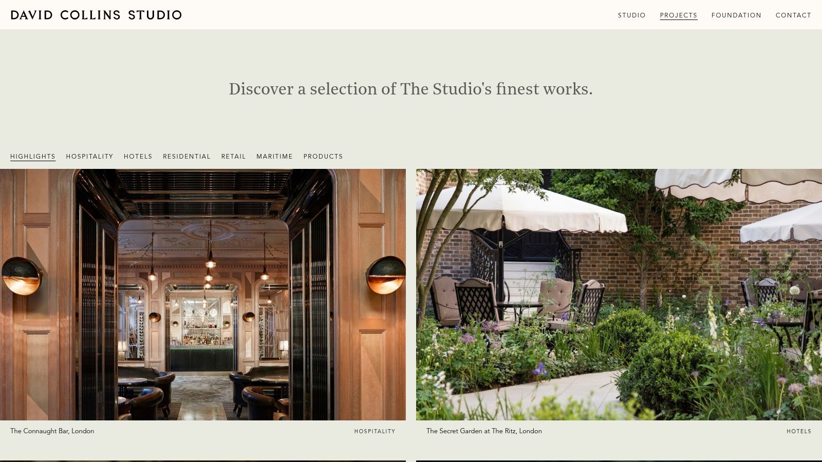
David Collins Studio demonstrates how a portfolio can balance a broad body of work with a curated entry point. Its Projects page combines sector filters with a Highlights selection. That choice matters because a reviewer rarely needs to see everything first. They need to see the work most relevant to their question.
Hospitality and retail projects communicate their setting immediately through strong thumbnails. A bar, hotel interior or department-store environment has a recognisable visual identity before the visitor reads the page. Project titles and categories do practical work, helping the audience connect a finished image with a venue type and brand context.
The thumbnail is a promise
Students often treat the project grid as decoration. It should work more like a sequence of promises. Choose a lead image that explains the spatial character, then make the project title specific enough to distinguish it from the rest of the portfolio.
A useful project caption might state:
- Brief: Convert a compact entrance zone into a welcoming shared space.
- Design decision: Use a continuous material palette to connect reception, circulation and seating.
- Evidence: Include the plan, a circulation diagram and a final visualisation.
David Collins Studio's About and philosophy content also gives the work a position. A student can achieve a similar effect with a short introduction explaining an interest in inclusive housing, hospitality atmosphere, sustainable materials or the relationship between art and architecture.
The trade-off is that the public portfolio is dominated by finished results and provides limited process documentation. That makes it a strong model for selection and hierarchy, but a weak model for proving how a student thinks. Don't fill every page with equally dramatic images. Put the visual impact first, then slow the sequence down with development work.
3. Studio Ashby Projects
A reviewer lands on your portfolio, scans six project titles, and remembers only one. That is usually a naming problem before it is a design problem. The Studio Ashby projects archive handles this well by giving projects distinct identities tied to place, character, or client context, rather than generic labels. For a student, that is a practical lesson in project taxonomy. If two schemes could swap titles without changing meaning, rename them.
The archive also shows how image sequencing shapes the argument. Studio Ashby often leads with atmosphere, then tightens the frame. A room view establishes mood and spatial intent. Detail shots of art, textiles, joinery, and objects then show what is doing the work. That choice matters if your project depends on material judgment. One wide image says how the space reads. One close image proves the palette was designed, not decorated.
What it leaves out matters too.
Public-facing pages give limited space to drawings, access decisions, and working process. That makes the archive strong on editorial curation and weaker as a full model for an application portfolio. Copy the clarity, not the omission.
A better student sequence is simple:
Start with the hero view. Follow it with one plan or diagram that explains layout. Add one material test, model, or iteration that shows a decision in progress. End with the resolved image and a caption that names what changed.
Studio Ashby's link to Sister by Studio Ashby is useful for another reason. It connects interiors with objects and craft, so the space does not appear as a shell filled at the end. Students can use the same move by showing a chair study, lighting prototype, textile sample, or built furniture detail beside the interior where it matters.
The takeaway is precise. Name projects so they stick. Sequence images so each one earns its place. Then add the process pages the studio archive leaves out, because reviewers need to see not just taste, but judgement.
4. Conran and Partners Interior Design projects
A reviewer opens your portfolio and sees a house, a hotel lobby, a shop fit-out and a workplace study. The risk is obvious. The work can feel scattered before anyone gets to the drawings. Conran and Partners' Interior Design projects show how to avoid that problem by keeping residential, hospitality, retail and workplace projects inside one consistent project taxonomy.
The useful move here is editorial, not stylistic. The category stays stable, the page structure stays familiar, and the project changes. That helps the reader compare unlike jobs without re-learning how to read each case study. Students can copy that by naming projects by type and context first, then using the same order of information every time.
Their pages also handle captions well. Instead of drifting into mood language, they usually give a compact account of the brief, concept and outcome. That sequence works because each line does a different job. The brief sets the constraint. The concept names the design decision. The outcome explains what improved.
A student caption can do the same work in three sentences:
Project and user. One clear design move. One result visible in the final image.
For example, if you are showing a café interior, write the user or operating problem first. Then name the exact choice, such as a banquette that clears circulation or a materials palette that separates front-of-house from back-of-house. End with the effect on use, comfort, legibility or identity. That is stronger than writing about inspiration on its own.
The practice also shows why typology range matters. A portfolio that includes domestic work, commercial space and a scheme with public-facing access decisions reads as broader and more employable, which fits the mix described within the sector assessment.
What is missing is just as instructive. Development drawings, testing and process visibility are light, so the archive is polished but incomplete as a student model. Add what the studio leaves out. Put one plan beside the hero image, include a section or material schedule, and show one iteration that proves the concept was developed rather than announced. If you are also thinking about progression routes, becoming a professional interior designer without A levels is a useful related read.
5. B3 Designers hospitality case studies and portfolio
B3 Designers makes the case for writing about what a design changes, not just what it looks like. Its portfolio and case studies are divided into Restaurants, Hotels, Homes, Workspaces and Branding. That structure connects the visual work with the commercial context in which the studio operates.
The strongest lesson is the attention to constraints and performance. Hospitality design has to support movement, service, identity and customer experience at the same time. A student doesn't need a commercial client to demonstrate that kind of thinking. A simulated brief can ask how a small café handles queueing, seating, staff circulation, acoustic separation and step-free access.
Practical rule: Connect every major design intervention to the user problem it solves.
B3's case-study format also encourages a more accountable caption. Instead of writing “A warm, modern restaurant inspired by local materials,” write: “A flexible dining room that could shift between quick daytime use and evening service. A continuous banquette defines the edge of the room, preserves a clear route and creates different seating conditions without adding partitions.”
The site provides credibility through client and project context, but its pages can be long. Important information may appear several scrolls below the opening imagery. Students should take the narrative ambition without copying the length. Put the brief, role, key decision and outcome near the top, then support them with drawings and tests.
The hospitality emphasis is another limitation. It won't provide many residential precedents for a student building a home-focused application. Use the structure anyway. A residential project can document household routines, storage needs, privacy, adaptability and material durability with the same seriousness.
6. 2LG Studio Projects
A reviewer opens your portfolio and sees polished images, but no clear sense of who the room is for or why any decision matters. Projects archive shows a better balance. The archive is easy to sort by Residential, Commercial and Styling, but it still feels authored. That combination matters because project taxonomy is part of presentation, not just website housekeeping. If your work spans homes, retail concepts and self-initiated studies, group it so the reviewer can read your range in seconds.
What 2LG does well is keep captions short while still giving the project a point of view. Students often either label an image too vaguely or bury it under design theory. A stronger caption names the user, the spatial move and the effect. For example: a family home that needs shared time without constant exposure, a reworked threshold that creates privacy, a colour decision that makes circulation legible. Copy that structure.
The studio also sequences images in a way that keeps mood and use close together. You are not only shown a finished room. You are shown enough to understand how colour, joinery and furniture placement build the atmosphere the text promises. That is useful, but it also reveals what is missing. Public-facing studio portfolios rarely give much process, drawing depth or revision history.
So add the evidence 2LG leaves out.
Put one annotated plan beside the hero image. Add a small colour test. Show one process page that tracks a design change from first idea to final layout. If you are applying through a degree pathway in interior design, this matters even more because reviewers need to see both authorship and development across academic and personal work.
2LG is especially good on tone. The writing is clear, personable and specific without sounding casual for the sake of it. Copy the accessibility, not the aesthetic. If you use strong colour, explain what it does in the project. If you show a highly styled photograph, pair it with something that proves the space works.
7. ArchDaily Interiors categories
Open an ArchDaily project after looking at polished studio portfolios and the difference is immediate. The House Interiors category works as a project archive rather than a single practice's brand portfolio, so it exposes the mechanics students usually need but studio sites often hide, classification across types, longer captions, drawings, credits, and multiple image sets from different contributors.
Use that difference properly. ArchDaily is less useful as a mood board and far more useful as a way to study how professional projects prove an idea. On stronger pages, you can track one design decision across several forms of evidence: the plan sets up circulation, the section explains light or compression, the photo shows what the user experiences, and the credits tell you who shaped the outcome. That sequence is worth copying in your own portfolio.
A simple method helps:
Start with project taxonomy. Note whether the work is filed as housing, apartment, retail, or hospitality, and ask why that label matters.
Then read the captions and short descriptions for the design move, not the styling language.
Then sequence the material yourself. Put plan, section, one detail, one wide image, and one close image in an order that explains cause and effect.
The limitation matters too. ArchDaily documentation is uneven. Some projects give you enough to understand construction, environmental intent, and layout logic. Others give you attractive photography and very little else. That inconsistency is useful because it teaches selection. If a reference only shows surface, do not copy its surface. Copy the filing logic, the caption precision, or the image order, then add the process work it leaves out.
For technical precedent, stronger housing case studies can also show how performance and spatial quality sit together. The Greater London Authority connects layout, daylight, overheating, ventilation, and envelope decisions in its published housing evidence. Use that standard in your own pages. Show the room, then show why it works.
7 Interior Design Portfolios Comparison
| Example | Implementation Complexity 🔄 | Resource Requirements ⚡ | Expected Outcomes ⭐ / 📊 | Ideal Use Cases 💡 | Key Advantages ⭐ |
|---|---|---|---|---|---|
| Elicyon, Projects portfolio | Medium 🔄🔄, curated editorial layout | High ⚡⚡⚡, professional photography & editing | High-quality luxury presentation; strong visual cohesion ⭐⭐⭐ 📊 | High-end residential/commercial portfolios; portfolio curation training | Clear taxonomy, studio voice, consistent art direction ⭐ |
| David Collins Studio, Projects | Medium‑High 🔄🔄🔄, curated highlights + cross‑linking | High ⚡⚡⚡, extensive imagery, brand assets | Prestigious hospitality showcase; strong brand association ⭐⭐⭐ 📊 | Hospitality/retail case studies; emulating large varied portfolios | World-class hospitality examples; curated "Highlights" ⭐ |
| Studio Ashby, Projects | Medium 🔄🔄, narrative-led project pages | Medium‑High ⚡⚡, deep image sets, styling | Strong storytelling and material focus; cohesive brand feel ⭐⭐⭐ 📊 | Art-led residential portfolios; presenting narrative + craft | Consistent brand voice, deep material/styling imagery ⭐ |
| Conran and Partners, Interior Design projects | Medium 🔄🔄, category organisation and summaries | Medium ⚡⚡, mixed photography and copy | Broad typological showcase; concise brief→concept→outcome pages ⭐⭐⭐ 📊 | Comparative study across sectors; adaptive reuse examples | Wide typology coverage; client-facing synopses ⭐ |
| B3 Designers, Hospitality case studies | Medium‑High 🔄🔄🔄, case studies with metrics | High ⚡⚡⚡, collecting performance data & testimonials | Outcome-driven case studies showing operational impact ⭐⭐⭐ 📊 | Hospitality projects requiring business/operational evidence | Measurable results, client credibility, clear positioning ⭐ |
| 2LG Studio, Projects | Low‑Medium 🔄🔄, simple filters and microcopy | Low ⚡, concise photography and captions | Approachable, personality-driven presentations; clear microcopy ⭐⭐ 📊 | Accessible residential work; practicing engaging microcopy | Strong personality, inclusive messaging, concise captions ⭐ |
| ArchDaily, Interiors categories (global) | Medium 🔄🔄, large archive, category navigation | Low ⚡, user research requires time but minimal creation cost | Extensive technical/reference material; plans and details often included ⭐⭐⭐ 📊 | Research, technical references, comparative typology studies | Breadth of projects, frequent updates, technical documentation ⭐ |
Turning These Examples Into Your Own Application Portfolio
The seven examples point to one practical conclusion. A university portfolio shouldn't behave like a gallery of finished rooms. It should behave like a compact argument, where every image helps the reviewer understand your observation, decision-making and ability to resolve a brief.
Start with a clear project taxonomy. You might use residential, hospitality, workplace, public space and experimental work, or organise projects by themes such as reuse, inclusive design, colour and material research. The category system should help a reviewer find the work that answers their interests.
Then write a short case summary using the strongest habits from Conran and Partners and B3 Designers. State the brief, identify the main design decision and describe the outcome without claiming evidence you haven't measured. Add project date, location, scale, your role, software and collaborators where relevant. Captions should distinguish your contribution from a group result.
Most studio websites hide the process that university selectors need to see. Add at least one spread showing research, one showing development and one showing resolution. The University of Edinburgh asks applicants for a single PDF of up to 20 pages, with a maximum of five pages for each of four assessment criteria, and a file size no larger than 50MB in its interior-design portfolio guidance. Its requirements include initial research, investigative work, idea exploration, finished pieces and short text about process, critical thinking and reflection.
That structure answers several Level 2 and Level 3 questions at once. You don't need only professional commissions. Personal projects can sit alongside school work, provided you label concept work clearly and explain the decisions. You also don't need to hide unsuccessful experiments. UWE and Middlesex both emphasise sketchbooks, models, handmade and digital processes, annotations and analytical reflection, with Middlesex specifically recognising that an unsuccessful experiment can show creative risk-taking through its undergraduate selection guidance.
A technically aware project can include accessibility audits, user profiles, measured plans and alternative iterations. Inclusive design is more convincing when the portfolio shows the brief and constraints, not just a finished image. For environmental work, connect interventions to outcomes such as daylight access, thermal comfort or cooling demand. A retrofit case study from CIBSE records a 1.1 kWp photovoltaic array producing an average of 801 kWh annually, equivalent to approximately 16% of the dwelling's annual electricity demand in its Passivhaus retrofit case study. You don't need to reproduce that project, but you can copy its evidence-led structure.
OCAD's portfolio-centred coursework, tutor feedback and Level 3 Foundation Diplomas, including the Interior route, offer one structured way to develop and refine application work. Draft one complete case study from your own project, compare its captions and image sequence with the examples above, then revise the weakest caption first. If the reviewer can't tell what changed, why it changed or who benefited, that caption is where your portfolio is losing value. You can also explore AI-powered interior makeover steps as a way to test early visual directions, but keep your own design reasoning visible.
The Online College of Art & Design (OCAD) offers flexible, tutor-led courses from entry level through Level 3, including a Foundation Diploma in Interior Design with portfolio-focused projects and guidance for degree applications. Visit The Online College of Art & Design (OCAD) to explore a structured route for building, reviewing and presenting your interior design portfolio.