

You've painted the outline of an eye, added a dark pupil, and stepped back expecting realism. Instead, the eye looks flat, the white of the eye looks harsh, and every eyelash seems to pull attention away from the face. This is a familiar stage for Level 2 and Level 3 art students, but it's also a useful diagnostic moment.
Watercolour painting eyes demands more than accurate drawing. You need to control transparent layers, observe how light describes a rounded surface, and make material choices you can explain in a sketchbook or portfolio review. Those decisions can turn a single eye study into evidence of observation, experimentation, reflection, and technical development, the qualities that support a university-ready creative portfolio.
Table of Contents
- Why Eye Studies Elevate Your Creative Portfolio
- The Historical Power of Watercolour Portraiture
- Mapping the Socket and Facial Planes
- Layering and Glazing for Realistic Depth
- Choosing Between Pure Watercolour and Hybrid Media
- Progressing to University with Level 3 Qualifications
Why Eye Studies Elevate Your Creative Portfolio
A convincing eye study shows whether you can see relationships rather than symbols. Beginners often paint “an eye” as an almond shape, a circle for the iris, and a line of lashes. A stronger study records the brow plane, the recessed socket, the upper-lid shadow, the changing temperature of the surrounding skin, and the small areas where the paper remains bright.
For a Level 2 or Level 3 student, that difference matters. A university portfolio isn't just a gallery of attractive finished images. It should show how you investigate a subject, test materials, respond to mistakes, and refine an idea. A watercolour eye can provide all of that if you present the process alongside the final painting. Your portfolio-building guidance can help you organise those stages into a coherent body of work.
What the study demonstrates
A carefully developed eye painting can provide evidence of:
- Observation: You've measured placement, angle, proportion, and tonal changes instead of relying on a memorised symbol.
- Material control: You've allowed transparent washes to build gradually rather than covering the paper with opaque correction.
- Spatial understanding: You've shown that the eyeball is rounded and sits inside a shaped socket.
- Editing: You've decided where crisp edges and fine detail are useful, while leaving less important areas quieter.
- Reflection: You can annotate what worked, what failed, and how the next study will differ.
Watercolour is particularly revealing because the paper supplies the light. If you scrub away every pale area or apply dark paint too early, you can lose the luminosity that makes the medium distinctive. That limitation becomes an advantage in assessment because the viewer can see whether you planned your values and protected your highlights.
Portfolio principle: A realistic eye isn't valuable only because it looks realistic. It's valuable when the finished image and the development work explain how you achieved that result.
Start with a small series rather than one isolated attempt. Paint the same reference under different lighting, compare a cool and warm palette, or use one study to test pure watercolour and another to test watercolour pencil. Label the paper, pigments, brush sizes, and changes you made. That record gives the assessor a reason to look beyond surface polish.
The Historical Power of Watercolour Portraiture
Your choice of watercolour has a strong British context. The Royal Watercolour Society traces its origins to 30 November 1804, when the Society of Painters in Water Colours held its first meeting at the Stratford Coffee House on Oxford Street in London. The society treats this event as the foundation of the first professional exhibiting body created specifically to advance watercolour artists in Britain. Its founder members included Samuel Shelley, William Frederick Wells, William Sawrey Gilpin, and the Varley brothers. The organisation received a Royal Charter in 1881, an institutional milestone that confirmed watercolour's growing status in British art. You can explore this history through the Royal Watercolour Society's account of its origins.
The period between the society's foundation and its charter was 77 years, a useful historical frame for a portfolio timeline, not proof that the medium became established overnight. The society's movement through London exhibition venues and its arrival at Bankside Gallery in 1980 also show the continuity of watercolour's public presence in the UK.
Why eyes suited the medium
Watercolour's transparency makes it well suited to small shifts in skin, reflected light, and expression. Thin layers can suggest warmth around the eyelid without hiding the paper, while a carefully placed darker wash can describe the socket without drawing a heavy contour around it. The medium asks you to build form through value and colour relationships.
A related British tradition is the miniature portrait of the eye, often called a “lover's eye”. Art-history material from the Metropolitan Museum of Art describes these intimate portraits as nearly all painted in watercolour on ivory during the late eighteenth and early nineteenth centuries, with the genre commonly dated around 1790 to 1810. That creates a peak fashion window of roughly 20 years, within Britain's wider Golden Age of watercolour, generally understood as the period from the mid-eighteenth to the mid-nineteenth century. The same historical account notes that miniature portraits were already widespread by the 1770s, helping explain the demand behind this specialised form. Read the broader context in the Metropolitan Museum of Art's history of watercolour painting in Britain.
For contextual research, you could compare a lovers' eye miniature with a contemporary close-up study. Ask what the two artists emphasise, how each handles scale, and how the material affects the viewer's sense of intimacy. A short visual comparison, supported by sketches and your own observations, can make your portfolio feel analytical rather than merely imitative.
Students interested in historical approaches can also browse art studio releases as a source of visual prompts. Use references critically, recording what you borrow, what you alter, and why your own watercolour process needs a different solution.
Mapping the Socket and Facial Planes
Before touching the paint, draw the head as a structure. The eye isn't a sticker placed on the face. It's a rounded form held inside a concave socket, with the brow, cheek, nose, and upper lid changing the way light reaches it.
Begin with a light construction drawing. UK artists' guidance places the eyes about halfway down the head and roughly one eye-width apart, useful starting relationships rather than rigid rules for every face. Check them against your reference, because a tilted head, a close crop, or a distinctive expression will change the visible proportions. The graphite eye time-lapse demonstration is useful for seeing how structure can be tested before colour complicates the drawing.
Build the map in stages
- Establish the head direction. Mark the centre line of the face and the brow line. These guides help you judge whether the two eyes share an angle.
- Place the eye sockets. Use broad, light shapes around the eyes instead of immediately drawing the almond contours. The socket is a plane change, not a decorative outline.
- Indicate the brow and cheek planes. Notice where the brow projects and where the cheek turns away. These areas often carry more influence over the eye's appearance than the iris itself.
- Mark the upper-lid shadow. The upper lid usually casts a useful band of shade over the eyeball. Keep this shape soft enough to follow the rounded form.
- Reserve the light. Decide where the eye surface, lower lid, or nearby skin will remain pale before you begin washing.
The central correction is to stop treating line as the main description of form. The eye is read through light and shade, so a dark outline around the entire sclera can make it look graphic and flat. The lower lid may be indicated by a soft tonal transition, a small edge, or a change in the surrounding skin rather than a continuous line.
Structural check: Squint at the reference and your drawing. If the socket, brow, and upper-lid shadow still read as connected shapes, your map is doing useful work.
Keep the first drawing light enough to disappear under washes. Avoid pressing hard into the paper, particularly if you're working on a smooth surface. A deep graphite groove can collect pigment and remain visible after you've corrected the proportion.
Finish this stage by checking the negative spaces. Look at the shape between the eyes, the distance from the brow to the lid, and the wedge beside the nose. These spaces often reveal proportion errors faster than staring at the eye itself.
Layering and Glazing for Realistic Depth
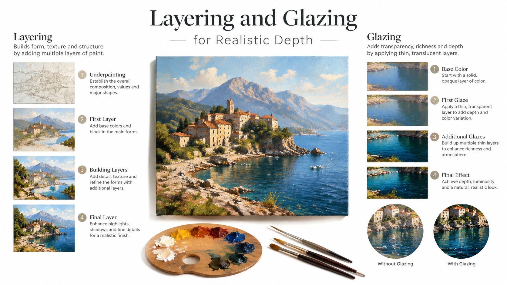
Watercolour becomes convincing when each layer has a clear job. The first wash establishes the large value relationships. Later glazes deepen selected areas, and small dry-brush marks describe texture only after the form is secure. If you try to solve everything in one pass, you'll usually produce hard edges, muddy mixtures, or an iris that looks pasted onto the face.
Start with the surrounding skin
Mix a restrained skin wash from the colours available in your palette. You might combine a warm earth colour with a cooler violet or blue influence, but test the mixture on scrap paper first. Keep the wash lighter than you think you need. The paper should remain active through the transparent layer.
Paint around the eye socket before concentrating on the iris. Soften the transitions across the brow, temple, and cheek, then allow the paper to dry completely. This first stage creates the atmosphere in which the eye sits. Without it, the sclera can look like a stark white shape cut from the face.
Next, add the upper-lid shadow with a diluted mixture. Follow the curve of the lid and let the tone fade as it moves away from the crease. The shadow shouldn't form a thick stripe. It needs to describe the lid's overhang and the rounded surface beneath it.
Develop the iris without losing clarity
Use a light base wash for the iris, keeping the pupil and strongest accents for later. While the surface is damp, you can introduce subtle colour movement with wet-on-wet blending. Don't flood the paper. A controlled amount of moisture lets pigments merge without turning the shape into an indistinct stain.
Once dry, glaze the darker outer ring and the upper section of the iris. The upper lid often reduces the light reaching the top of the eye, so a carefully placed darker passage can create depth. Add radial marks sparingly, directing them towards the pupil while varying their length and strength.
The pupil should be dark, but it shouldn't be the only dark shape. Balance it with the upper-lid shadow, the socket, and selected areas of the lashes. This keeps the eye embedded in the portrait rather than making it look like a diagram.
Soften the sclera and place highlights
The sclera is rarely pure white in a painted portrait. A faint cool or warm wash can suggest its curvature, especially near the corners and beneath the lid. Keep this colour quieter than the iris. If the sclera becomes more saturated than the surrounding skin, it may pull attention away from the focal point.
Use dry-brush carefully for small transitions, broken texture, or restrained lash marks after the main washes have dried. Reserve the lightest highlights for the eye surface. If you lift or paint over every pale area, you'll lose the sense that light is moving across a convex form.
Avoid the common muddy finish
Rinse your brush between colour families and allow layers to dry before glazing. If you mix several pigments directly on the paper without a clear plan, the result can lose transparency. Test a small colour chart that records the mixture, dilution, and whether it was applied wet-on-wet or dry.
Use the watercolour technique guide alongside your own experiments, then annotate the outcome in your sketchbook. University assessors don't need every experiment to succeed. They do need to see that you can identify why a passage became muddy and make a more informed choice in the next study.
Material rule: Build the form with transparent value changes first. Add texture only after the viewer can already feel the eye's roundness.
End by editing. Sharpen the focal details around one eye if the composition calls for it, while allowing surrounding facial areas to remain less resolved. A finished painting needs hierarchy, not equal intensity everywhere.
Choosing Between Pure Watercolour and Hybrid Media
Pure watercolour gives you the clearest demonstration of transparent wash control, but it isn't the only sensible route for an eye study. Watercolour pencils can support accurate placement and controlled texture, while markers may provide confident linear structure when used selectively. The important portfolio question is not which medium is universally superior. It's whether you can explain the choice and show what the material contributes.
| Medium | Best For | Portfolio Impact |
|---|---|---|
| Pure watercolour | Transparent washes, soft socket transitions, layered iris colour, and value-led portrait studies | Demonstrates control of water, pigment, paper, edges, and glazing |
| Watercolour pencils | Drawing precise iris patterns, testing colour relationships, and building confidence before activating pigment with water | Shows a hybrid process and gives you clear evidence of material experimentation |
| Watercolour with dry-brush | Broken texture in lashes, brows, and selected skin passages | Demonstrates restraint when texture supports form rather than replacing it |
| Watercolour and suitable marker accents | Planning expressive contours or combining controlled linear marks with transparent washes | Can show an individual visual language, provided the marker doesn't overpower the wash |
| Mixed-media combination | Comparing outcomes and developing a personal method across a connected series | Strengthens a portfolio when annotations explain the purpose and limitations of each material |
Choose according to the learning question
If your question is, “How can transparent washes describe a rounded eye?”, pure watercolour gives you a direct test. If your question is, “How can a drawn line and a transparent wash work together?”, a pencil or marker experiment may be more appropriate.
Watercolour pencils are especially useful when the iris pattern is intimidating. You can place directional marks dry, soften selected passages with water, and leave other marks visible. That process can preserve the evidence of drawing while still exploring watercolour behaviour. It also helps you compare a controlled pencil texture with a softer wet-on-wet passage.
Markers need more caution. A strong waterproof line can lock you into an outline before you've resolved the socket. Try it on a separate study first, or keep the line broken and subordinate to the value structure. Admissions tutors are likely to learn more from a thoughtful comparison than from a hybrid image that hides uncertainty beneath heavy contours.
Turn experimentation into portfolio evidence
Create paired studies using the same reference and similar composition. Photograph or scan both stages, then annotate:
- Purpose: What were you trying to find out?
- Process: Which areas were painted wet-on-wet, glazed, lifted, or drawn dry?
- Result: Which method preserved transparency or produced the clearest form?
- Next decision: What will you keep, remove, or combine in the next piece?
This approach answers the beginner's real concern, achieving believable eyes without abandoning the character of watercolour. It also makes your material choice academically defensible. A polished hybrid study can be stronger than a technically awkward pure-watercolour piece if the hybrid method is intentional, well tested, and connected to your wider practice.
Progressing to University with Level 3 Qualifications
A successful eye study becomes more valuable when it sits inside a documented project. Save the initial proportion drawings, colour tests, failed washes, reference analysis, and final image. Then write a short evaluation that identifies a specific problem, such as a hard lower-lid edge or an over-dark pupil, and explains the practical change you made.
That process aligns naturally with the purpose of the UAL Level 3 Diploma in Creative Practice: Art, Design and Communication. The qualification is designed for post-16 students and provides industry-relevant skills, knowledge, and understanding for entry-level roles, training programmes, apprenticeships, or progression to related higher education courses in the UK. The Diploma carries 540 Guided Learning Hours and is typically completed over one year, while the Extended Diploma carries 1080 Guided Learning Hours over two years. Details are available from the UAL Level 3 Diploma information.
Connect your study to progression evidence
The UAL Diploma awards UCAS points at Pass, Merit, and Distinction grades of 36, 60, and 84, while the Extended Diploma awards 72, 120, and 168 respectively, as stated by UAL in the same qualification guidance. Treat those points as one part of your application planning, not a substitute for a strong portfolio or course-specific admissions check.
Creative universities accept more than one Level 3 route. The University for the Creative Arts lists A levels, T levels, the International Baccalaureate, Level 3 Extended Diplomas, Level 3 or Level 4 Foundation Diplomas in Art and Design, NVQ Level 3, Functional Skills at Level 3, and the Creative and Media Diploma at Level 3 among accepted qualifications. Review the University for the Creative Arts accepted qualifications and check the exact tariff and portfolio conditions for the degree you're considering.
A college entry model can make expectations more concrete. York College requires a minimum of 5 GCSE subjects at grade 4 or above, including English and/or Maths, and considers a Level 2 Art and Design Diploma at Merit grade for its Level 3 creative pathway. Applicants also provide a digital portfolio, and the course identifies progression into degree areas including Graphics, Illustration, 3D Design, Fine Art, Fashion, and Textiles. Its Level 3 creative practice pathway shows how qualification readiness and portfolio evidence work together.
Plan support around your circumstances
Flexible study can matter as much as course content for home-educated learners, adults, career changers, and students with SEND. A UK online Level 2 SEND certificate states that it has no specific entry requirements, although learners should have at least Level 2 literacy and numeracy or an equivalent. Another UK online SEND certificate sets eligibility at age 19 or over and requires learners to have lived in the UK for the last three years, or to meet an accepted residency condition such as indefinite leave to remain, settled status, or asylum-seeker status in the UK for more than 6 months. Check the provider's current SEND certificate entry guidance before applying.
When you review your portfolio, ask whether each project shows a question, a process, and a decision. A watercolour eye study can demonstrate technical control, but a sequence comparing washes, watercolour pencil, and dry-brush can also demonstrate research and critical judgement. That combination gives a university admissions tutor a clearer view of how you learn and how you might develop in a degree environment.
The Online College of Art & Design (OCAD) offers flexible, tutor-led online study across Level 2 and Level 3 art and design pathways, with assignments, video tutorials, portfolio workspace, and individual or group tuition through Microsoft Teams for Education. If you want structured feedback while developing watercolour eye studies and a university-ready portfolio, visit The Online College of Art & Design (OCAD) to explore the available courses.