

Painted purple is red mixed with blue, and the usual starting point is roughly equal quantities of each. A screen builds purple by a different route entirely: it adds red and blue light while holding green down, which is why a typical brand purple lands near RGB 84, 49, 159 rather than at anything a tube of paint could hand you.
The advice most colour wheels give, mix equal parts red and blue and there's your purple, is a first test and nothing more. Follow it with a warm scarlet and a greenish turquoise and the puddle turns brown-grey. Follow it with a magenta-leaning red and a violet-leaning blue and the purple comes out clean and bright. Same instruction, opposite outcomes, and beginners blame their brushwork for a problem that lives in the pigments.
What decides the result is pigment bias, tinting strength, and which colour system you're working in: paint, ink, dye, or emitted light. Equal parts is the swatch you try first. It isn't the recipe you follow.
Table of Contents
- What Colours Make Purple
- How Pigment Bias Changes Purple
- Purple Mixing Ratios You Can Copy
- Purple on Screens and in Print
- When Mixed Purple Turns Brown or Grey
- Level 2 and Level 3 Questions Before University
- File Your Purple Tests for a Portfolio
What Colours Make Purple
In paint, ink and dye, purple is a secondary colour, made by mixing red with blue. The UK Science and Media Museum describes purple as a mixture of red and blue that reflects both red and blue light, which is the cleanest one-line definition you can give a beginner.
The physics sits behind that sentence. Paint is subtractive: each pigment absorbs part of the visible spectrum and bounces the rest back. A red pigment swallows most greens and blues, a blue pigment swallows most reds and greens, and where their reflections overlap, red and blue light survives to your eye. Green is the region both pigments suppress hardest, which is why a good mix looks saturated and a careless one looks like mud.
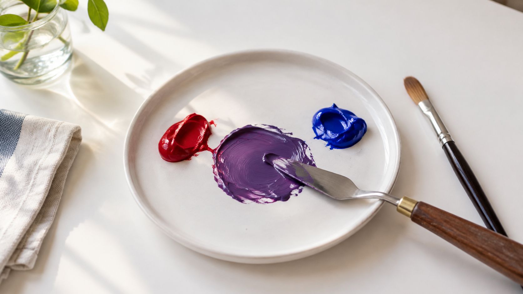
Proportions move the hue. Lean on the red and you get a warm red-violet; lean on the blue and you land on a cooler, bluer violet. Neither is more correct than the other, and a single tube labelled "violet" has already made that choice for you.
Coloured light runs the opposite way. Red, green and blue are the primaries on a display, and adding light makes a result brighter until it approaches white. A screen produces purple by emitting red and blue light with green kept low, which is why screen purples look luminous and painted purples look solid. None of this makes a spoon-for-spoon formula universal either, because pigments differ enormously in strength. A phthalo blue will overwhelm far more red than a cobalt will, in the same volume.
If loading a brush and blending on the palette are still new, the painting techniques for beginners guide from MaxiJournal covers brush loading, washes and blending before you start testing purples.
Purple also hasn't always needed mixing at all. In 1856, the British chemist William Henry Perkin, then 18, accidentally produced mauveine while working on coal-tar chemistry, and by 1858 he had a rich purple dye known as mauve, which the Royal Albert Memorial Museum describes as more affordable than natural purple.
Mix red and blue for purple, but name whether the material is paint, ink, dye or light.
How Pigment Bias Changes Purple
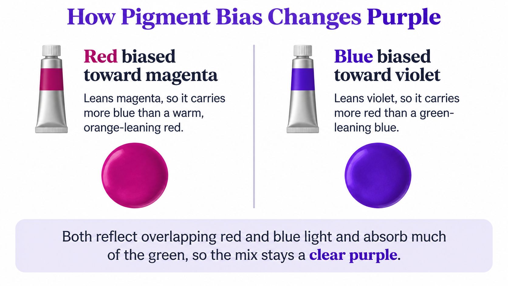
Purple isn't one colour, it's a zone, and the two tubes you pick decide which part of the zone you land in. Red pigments aren't neutral reds. A red leaning toward magenta already carries some blue inside it; a blue leaning toward violet already carries some red. Pair those two and both pigments reflect overlapping red and blue wavelengths while absorbing most of the green region, which is exactly what keeps a mixture clean and high in chroma.
Go the other way and the mix collapses. A yellow-biased red, the sort that behaves like scarlet or cadmium, plus a green-biased blue that behaves like turquoise, pulls extra absorption across the spectrum. The purple sinks toward dull, dark or brown-grey, and no amount of stirring rescues it.
| Pair | Bias | Result | What to do |
|---|---|---|---|
| Magenta-type red + violet-leaning blue | Both lean toward red-blue | Cleaner, higher-chroma purple | Use as the default pair |
| Magenta-type red + ultramarine | Red toward magenta, blue toward violet | Bright violet | Good first clean mix |
| Cadmium-type or scarlet red + greenish or turquoise blue | Yellow bias plus green bias | Dull brown-grey | Don't start here if you want brilliance |
| Any red + a complementary yellow | Yellow neutralises purple | Olive, brown or grey | Start a fresh puddle |
| Phthalo-type blue + equal red | Blue has much higher tinting strength | Blue overwhelms the red | Add the blue in pinches |
| Clean purple + opaque white | White scatters light | Paler and less saturated | Use only for a tint |
Tinting Strength Beats Volume
Equal volume is not equal colour power. Phthalo-type blues stain so strongly that a pea of blue will drag a whole puddle of red toward the cool end before you've noticed. Cobalt and ultramarine are gentler and forgive a heavier hand. When you swap brands, expect to relearn the balance, because the same colour name from two manufacturers can hide different pigment loads.
Layering Watercolour, Mixing Acrylic
Transparent watercolour lets you build purple optically: a red wash, dried, then a blue glaze over it, with white paper doing the lifting. Opaque acrylic and gouache decide the colour on the palette, and once the paint is down, the decision is close to final. Add opaque white to either and you raise light scattering, which lightens the mixture and kills saturation, so a tint reads chalky rather than airy.
England's art and design research review treats colour mixing, layering and the difference between transparent and opaque media as practical knowledge, and it recommends experimenting with primary colours and layered washes rather than relying on verbal colour rules alone.
One more distinction worth taping to your easel: a shop tube already named purple or violet is a single colourant, not a fresh red-blue mix. Label it separately from your mixed swatches or the notes become useless later.
Run three pairs on one sheet. Start with a magenta-type red and ultramarine or a violet-leaning blue. Then a warm cadmium-type red with a greenish blue, to see the failure for yourself. Finally, the clean pair plus a speck of opaque white. If you paint figures, those swatches earn their keep quickly, because shadow on skin is usually a desaturated violet rather than a grey, and mixing skin colours in paint shows how far to push one before it reads as a bruise.
Purple Mixing Ratios You Can Copy
| Mix | Balance | Result | Best used for |
|---|---|---|---|
| Paint starting point | About 50:50 by volume | Mid purple | First test swatch |
| Warmer purple | About 2 red to 1 blue | Red-violet | Warm florals and skin notes |
| Cooler purple | About 1 red to 2 blue | Blue-violet | Cool shadows and distance |
| Tint | Purple plus a little white | Paler, less saturated purple | Pastel passages |
| Digital check for the 50:50 idea | RGB 128, 0, 128 | Mid screen purple | Web comparison only, not a paint recipe |
The 50:50 row isn't folklore. A 2026 colour mixing calculator from AllCalculators.co.uk gives the same split, 50% red plus 50% blue produces purple, and represents it digitally as RGB 128, 0, 128. Treat that as confirmation that equal parts is a sane place to begin, not proof that every pair of tubes behaves alike.
A strongly tinting blue can still betray you by overwhelming an equal amount of red, so add the stronger colour in pinches, not spoonfuls. If you're working with phthalo, start with red and add blue a touch at a time. If you're on cobalt, an equal mix is close.
The two warm-and-cool rows are the ones you'll use most. Roughly twice as much red as blue gives a red-violet that suits warm florals and the shadow notes around skin. Roughly twice as much blue as red gives a blue-violet that recedes, so it belongs in distance, cool shadow and anything that needs to sit back in the picture.
The white row deserves suspicion. A little opaque white makes a tint that looks lighter, and it also flattens saturation in a way that reads as chalk rather than light. In watercolour, thin with water instead and let the paper do the work.
RGB 255, 0, 255 shows up in every chart of "purple". It's a bright screen violet made from full red and full blue light, not a paint recipe, and no pigment mixture will match it on paper.
Mix It in Five Steps
- Use the clean magenta-leaning red and violet-leaning blue you've already chosen, not whatever red happens to be nearest.
- Mix a pea-sized amount at about 50:50 by volume, the same balance a 2026 calculator maps to RGB 128, 0, 128 on screen only.
- Swatch it on the paper the finished work will use, and label the ratio while the paint is still wet.
- Move to about 2 red to 1 blue for a warm red-violet, or about 1 red to 2 blue for a cool violet.
- If the blue floods the mix, discard the puddle and add that blue in pinches to fresh red, rather than stirring more red into a losing battle.
Mixing a pea at a time matters more than beginners expect. A puddle the size of a thumb dries before you've judged it, and a puddle the size of a saucer tempts you to keep correcting it until it's mud.
Purple on Screens and in Print
| Medium | What you combine | Reference value | Hue control |
|---|---|---|---|
| RGB screen | Red and blue light, green low | RGB 84, 49, 159 or #54319F | Increase red to warm or blue to cool |
| Bright display violet | Red and blue at full, green off | RGB 255, 0, 255 | Luminous magenta-violet, not a match for most paints |
| CMYK print | Magenta and cyan, no yellow, black for depth | CMYK 47, 69, 0, 38 | Black darkens; any yellow dulls the purple |
Digital colour is additive and print is subtractive, so "what colours make purple" has a different answer in each. The UK Government Digital Service gives a reproducible benchmark that students can type straight into a file: its primary purple is RGB (84, 49, 159), hexadecimal #54319F, where blue is the strongest channel, red sits in the middle and green is suppressed, according to the GOV.UK Design System colour specification.
Read those three numbers and the hue logic becomes obvious. Raise red and the purple warms toward magenta-violet. Raise blue and it cools toward a deeper violet. Green is the channel doing the quiet work by staying low, and pushing green up is how you accidentally turn a purple grey.
On a display, RGB 255, 0, 255 sits at the far end of that logic: red and blue at full with green off. It's luminous and it's closer to a bright magenta-violet than to anything coming out of a paint tube. Screens emit light, so a purple can glow. Ink on paper subtracts light from white stock, so the printed patch is usually duller and darker than the file, and that gap is physical, not a mistake in your settings.
For print, the same government palette defines its primary purple as CMYK (47, 69, 0, 38). Magenta and cyan carry the colour, yellow sits at zero because yellow is the fastest way to dull a purple, and black controls the darkness. If you're building a palette around purple, the principles in this guide to setting a colour hierarchy across a brand palette apply whether the output is a poster or a webpage.
Practical exercise: paint or print one purple swatch, photograph it in flat daylight, sample the photo, and write down how far the sampled RGB sits from #54319F. That number is the honest distance between your screen and your medium.
If you're new to working on a display at all, a beginner's guide to digital painting covers the basics of picking and checking colour before you commit to a file.
One warning for remote learners: don't judge a submitted purple on an uncalibrated laptop. Two screens in the same room can disagree about the same hex code, so compare against a printed or painted reference when the colour matters.
When Mixed Purple Turns Brown or Grey
Beginners ask it in almost these words: why did red and blue make mud. There are four usual culprits, and each has one fix rather than a rescue attempt.
Brown or olive means a yellow bias crept in, either through a warm scarlet-type red or through a greenish blue, or through a touch of yellow you added hoping to darken the mix. Yellow doesn't darken purple, it neutralises it. Start again with a magenta-leaning red and a violet-leaning blue rather than stirring more of the muddy pile.
Grey and lifeless purple usually comes from too much of a strong staining blue, or from working the palette until both pigments cancel each other out. Add a speck of the weaker colour to a fresh puddle and stop mixing sooner.
Chalky pastel is opaque white doing what white does, scattering light. Use less of it, or in watercolour thin with water instead.
Right when wet, dull when dry is a drying shift, and acrylic is the worst offender. Judge the dry swatch, not the wet one, and keep a dried sample beside the palette.
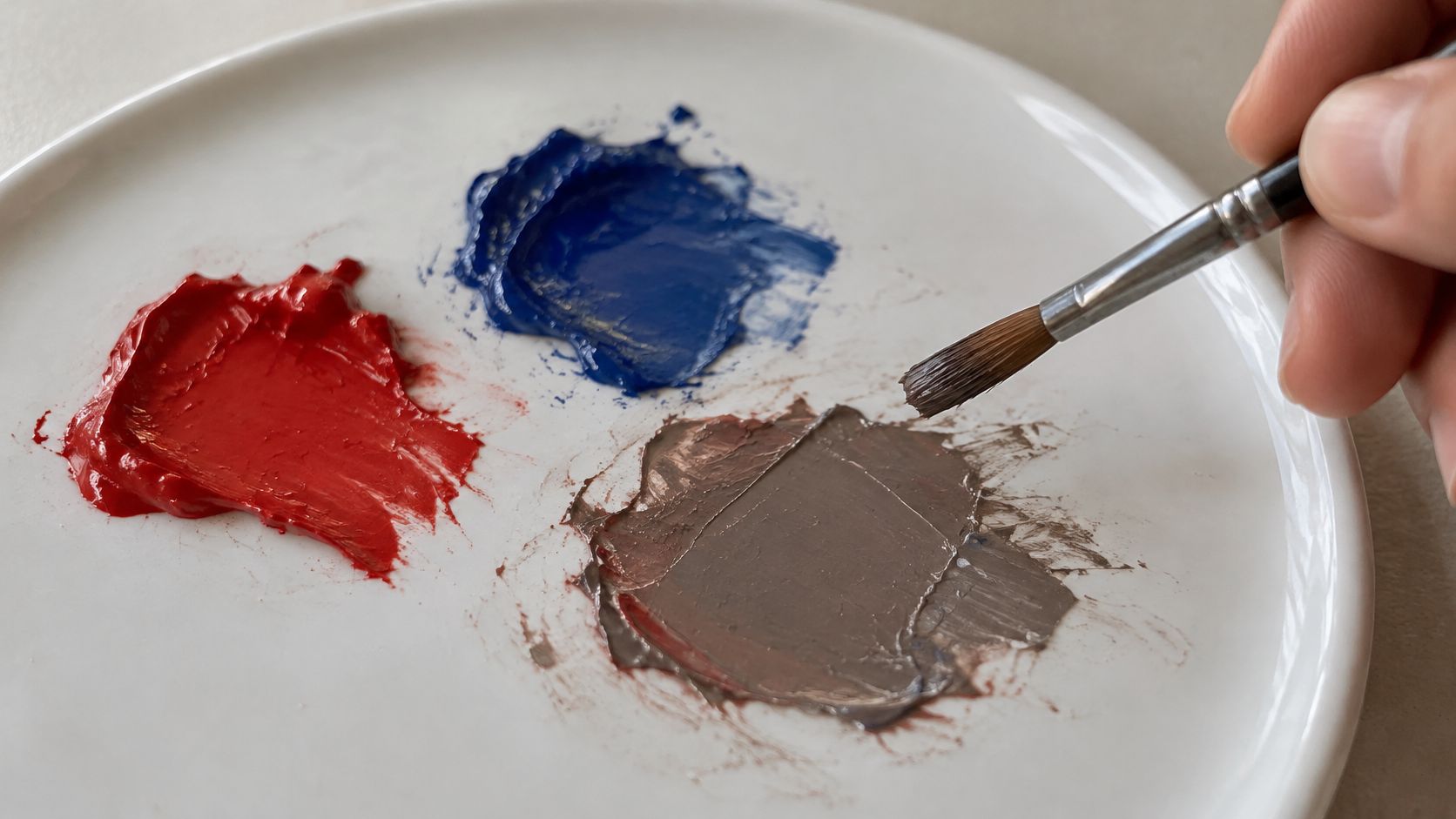
One change per failed swatch: swap the red, swap the blue, cut the white, or stop mixing earlier. Changing two things at once teaches you nothing.
Names trip people up as well. Violet leans blue. Magenta leans red. A shop purple may already contain white or black, which is why it behaves like a tint rather than a mixing colour. If you're trying to pull a failed purple back toward a usable neutral, the approach in how to mix brown paint is more reliable than adding more pigment to a puddle that's already lost.
The fix that lasts is documentation. One page, tube names, approximate parts, whether the swatch was judged wet or dry, and two lines on what you'd change. That page is what a tutor can mark.
Level 2 and Level 3 Questions Before University
University entry requirements are easier to understand when you check the qualification level first, then the course's grades and portfolio requirements.
Does a Level 2 qualification get me onto a degree? GCSEs graded 9 to 4, or A* to C under the previous grading system, are Level 2 qualifications in England, Wales and Northern Ireland, according to UK government guidance on qualification levels. A Level 2 art and design qualification sits at the same regulated level. Many degree providers also ask for Level 3 study, such as A levels or an equivalent diploma, but each university sets its own subjects and grades. Check the awarding organisation and the course's entry requirements before building a plan around one qualification.
How do UCAS points translate? UCAS tariff points can help compare some Level 3 qualifications, but points do not guarantee a place. A course asking for 120 points is broadly asking for attainment around BBB at A level; 96 points is broadly around CCC. Check the course page, because a provider may also require a particular subject, a minimum grade or a portfolio. Some creative qualifications do not carry a tariff value. The government's higher education statistics methodology describes how entrants and qualifiers are grouped by Level 2 and Level 3 attainment, rather than setting UCAS tariff point-to-grade conversions.
When do I apply? For 2027 undergraduate entry, Discover Uni's application guidance lists 15 October 2026 at 18:00 UK time for Oxford, Cambridge and most medicine, dentistry and veterinary courses. The equal-consideration deadline for most undergraduate courses is 13 January 2027 at 18:00 UK time.
For 2027 entry: art, design, photography and music applicants usually fall under the January deadline, unless the course states otherwise.
Equal consideration means applications submitted by the deadline are assessed on the same basis. It does not make the final day a good target. References, a personal statement and interviews take time, and a course may set its portfolio deadline earlier than the UCAS date. Check both dates when planning your application.
File Your Purple Tests for a Portfolio
Equal red and blue are only a starting swatch. Pigment bias, tinting strength and the medium all affect whether purple stays vivid, so a labelled test sheet can show how your choices change the result. Make three mixes on one page: near-equal red and blue, a warmer red-violet at about 2 parts red to 1 part blue, and a cooler violet at about 1 part red to 2 parts blue.
Add a tint with a little opaque white, or thin the paint with water if you are using watercolour. Include one deliberately muddied swatch with a touch of yellow, so you can compare the neutralised colour with the cleaner mixes. Label each swatch with the tube names, approximate parts, medium, and whether you judged it wet or dry.
Photograph the sheet in daylight. If you sample the photograph, note its RGB value beside a target such as #54319F, then write two lines about what you would change next time. The photo and the paint may differ, so keep the physical swatches as evidence too.
A page showing your process can support an application. The National Careers Service advice on further study notes that art and design applicants may need a portfolio alongside a personal statement and references. Requirements vary by provider, so check the format each university asks for before submitting.
Home-educated students, adults returning to study and others seeking tutor feedback can use this kind of page in online study. The Online College of Art & Design offers tutor-led Level 2 certificates, iGCSE and A Level courses, and Level 3 foundation diplomas, with a portfolio workspace and tutor feedback. Check university entry rules before treating any course as an offer.
A labelled sheet of purple swatches, with tube names, rough ratios and an honest note about what went brown, makes your decisions easier to follow than unlabelled finished pieces. To explore OCAD's course pathways, visit The Online College of Art & Design.