

In art, form means a three-dimensional object, or the illusion of three-dimensionality in a flat image. In UK teaching, it's treated as a core formal element from KS2 onward, and Tate Britain lets you trace changing ideas of form across more than 480 years of British visual culture.
You're probably here because you've drawn something that should look solid, a mug, an orange, a face, and it still looks oddly cut out. The outline may be correct, but the object doesn't seem to sit in space. It doesn't feel as if you could pick it up.
That's the point where most students ask what is form in art, and the honest answer is much more useful than the textbook version. Form is not just the opposite of shape. It's the sense of weight, volume, turning surfaces and occupied space, built up through shading, tone, shape and observation. If you can understand why one drawing feels flat and another feels touchable, you can improve your sketchbook work, your written analysis, and your portfolio pages fast.
In UK art education, that matters because form isn't a side topic. Curriculum materials commonly teach it as one of the formal elements alongside line, tone, colour, texture, pattern and shape, and describe it as the 3D element that gives artwork volume and takes up space. The 2014 National Curriculum in England strengthened formal analysis in art and design by requiring pupils to use and evaluate the elements of art across Key Stages 1 to 3, as outlined in this UK art curriculum reference.
Table of Contents
- Why a Flat Circle Looks Flat and a Ball Looks Real
- Shape Versus Form in Plain English
- The Toolkit That Builds Form on a Page
- Form in Action Across Sculpture, Painting and Digital Work
- How to Write About Form in a GCSE or A Level Analysis
- Five Exercises to Practise Building Form Tonight
- Three Common Mistakes That Keep Form Looking Flat
- From Sketchbook Page to Portfolio and University
Why a Flat Circle Looks Flat and a Ball Looks Real
A lot of form problems begin at a kitchen table. You draw a neat circle in your sketchbook, maybe even a very accurate one, and it still looks like a symbol rather than an object. Meanwhile the orange or ping-pong ball next to you has weight, depth and surface.

The simple difference
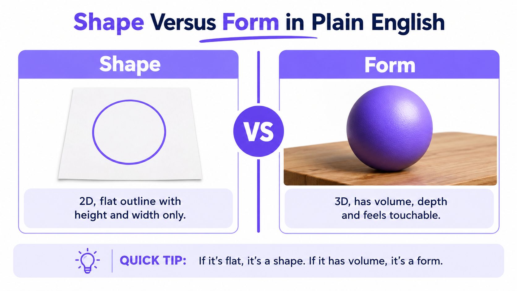
A shape is flat. It has height and width.
A form has height, width and depth. It occupies space.
The easiest analogy is this. A circle is like a shadow on the wall. A ball is the thing casting it. One is a flat sign of something. The other is a physical thing with volume.
That's why your circle looks flat. It hasn't yet told the viewer how the surface turns away from the light. It doesn't show where the object swells, where it falls into shadow, or where it meets the table. If you want a practical warm-up, this guide to drawing a sphere with light and shadow is useful because the sphere is the clearest place to learn how form appears on paper.
What form can mean in art
In plain English, form usually means one of two things:
- A real 3D object such as sculpture, ceramics, installation, model-making or a found object.
- An illusion of 3D on a flat surface such as drawing, painting, print or digital image-making.
Practical rule: If it looks as though you could walk around it, touch it, or feel its weight, you're dealing with form.
If you're interested in how artists and designers think about comparing 2D to 3D methods, that comparison can sharpen your eye. It makes you notice that a flat outline only becomes convincing form once depth cues start doing the work.
Once you spot what the circle is missing, you stop guessing. You start building volume deliberately.
Shape Versus Form in Plain English
If shape and form blur together in your head, don't worry. They blur together for lots of students because both begin with visible edges. The difference is what those edges are doing.
Put them side by side
| Shape | Form |
|---|---|
| Flat | Has volume |
| Described mainly by outline | Described by light turning across a surface |
| Lives in two dimensions | Occupies three dimensions |
| Can stay symbolic | Must feel physical or convincingly solid |
A circle on paper is a shape. A ball on a table is a form.
A triangle on a road sign is a shape. A pyramid in a museum is a form.
A square window frame is a shape. A cubic teapot body is a form.
The mistake students make
Students often think form is just a more advanced word for shape. It isn't. Shape tells you the boundary. Form tells you the body inside that boundary.
That's why a drawing can have accurate shapes and still fail. If the tones don't explain how the surface turns, the object stays flat. In sketchbook feedback, I often write something like: “Good outer shape. Now describe the turning form.”
There's another useful layer here. Tate's art glossary treats form in UK art theory as the arrangement and purely visual structure of a work, and notes that formalist criticism prioritises colour, brushwork, line, composition and mass over story. It also explains that British formalism was developed by Roger Fry and Clive Bell, who argued that “significant form” can convey feeling even when detached from realistic appearance, as discussed in Tate's entry on form in art theory.
The sketchbook margin version
Write this in the side of your page if you need a memory hook:
Shape is the flat outline. Form is the solid thing the outline belongs to.
That sentence is simple, but it's enough to stop a lot of weak analysis and a lot of hesitant drawing.
The Toolkit That Builds Form on a Page
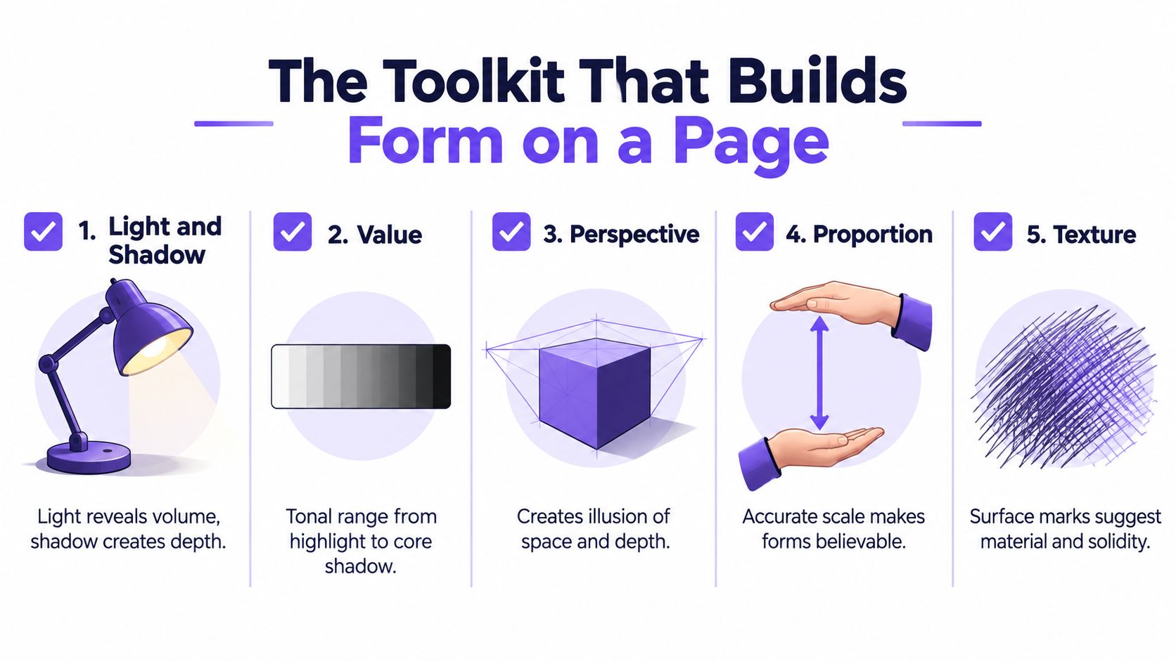
Form doesn't appear because you press harder with the pencil. It appears because each mark explains structure. If you're asking what is form in art in practical terms, this is the answer: it's the result of several small decisions working together.
Start with light and shadow
Light is what reveals volume. Before you shade anything, ask one question. Where is the light coming from?
Once you know that, look for the turning point where light gives way to shade. Many students call this “the dark side,” but it helps to think of it as the moment the surface starts facing away from the light. That shift creates the illusion of roundness far more than the outline does.
A practical explanation of how form is built through tonal turning, and how artists connect it to making, appears in Tate's form coursework guide.
Use marks that follow the surface
Flat colouring kills form. Directional shading describes it.
Try these approaches:
- Parallel hatching: Run lines along the curve of the object, not across it randomly.
- Cross-hatching: Layer one set of directional marks over another to deepen shadow without losing structure.
- Blending: Soften transitions where the surface turns gradually.
- Pressure control: Keep your hand lighter in the half-tones and firmer where the form drops away.
If your marks wrap around the object, the form starts to turn. If your marks ignore the structure, the drawing looks pasted on.
A short video can help if this still feels abstract:
Build underneath before adding finish
Good form usually starts with simple construction. Artists block in spheres, cylinders, cones and boxes because complex objects are easier to understand when reduced to basic volumes.
Then comes observation. Hold up a pencil to check width, height and angle. That old-fashioned measuring habit, often called sighting, stops mugs becoming wonky and heads becoming stretched. A useful companion read on this is how cast shadows support the illusion of volume, because even a well-drawn object can float if its shadow is missing or confused.
Don't shade because the page feels empty. Shade because the surface is turning.
Each tool has a job. Shadow reveals volume. Hatching describes curve. Construction lines organise the object. Sighting keeps proportion believable. Put together, they turn a flat outline into form.
Form in Action Across Sculpture, Painting and Digital Work
The quickest way to understand form is to watch artists handle it in different media. The materials change. The problem stays the same.
Sculpture makes form literal
In sculpture, form isn't implied. It's physically there. Henry Moore's figures feel powerful because their swelling masses catch light across broad curves. Barbara Hepworth's pierced forms do something equally useful for students to notice. They make you see outside and inside at once, so form becomes an experience of edges, openings and voids, not just bulk.
If you ever need to think about how three-dimensional work is presented in space, these sculpture display ideas are worth browsing. Display changes how viewers read form because height, lighting and spacing all affect the silhouette and shadow.
Painting and photography make form through light
Caravaggio could make a figure feel carved out of darkness with light alone. He didn't need a contour around every shape. The contrast did the sculpting.
Cézanne is useful for a different reason. His apples don't rely only on smooth blending. He builds form through planes, with brushstrokes that tilt and shift so the object feels constructed. Students who over-blend can learn a lot from that.
Photography can teach form just as well. A side-lit portrait turns cheeks, eye sockets and jawlines into visible planes. Rachel Whiteread's casts push the idea further by making negative space feel solid, which is a brilliant reminder that form includes hollows, gaps and interior volume.
Digital work still uses the same logic
Digital media may look different, but the visual problem hasn't changed. In 3D modelling, you still need to understand volume. In rendering, you still need believable light. In stylised animation, artists often simplify forms into bold, readable masses first, then add surface detail later.
That matters now because art-making and digital engagement are active parts of contemporary UK culture. Creative PEC reports that the share of the 16+ population making art increased by 5 percentage points, and the same report notes significant digital participation, including watching pre-recorded music or dance events at 19%, in recent UK engagement data.
Whether you're drawing a teapot, carving plaster or building a render, form becomes visible where light meets structure.
How to Write About Form in a GCSE or A Level Analysis
A strong analysis paragraph doesn't just say an artwork is “3D” or “realistic”. It explains how form is created and what that does to the viewer.
The language examiners reward
In UK course guidance, students are taught to discuss form alongside line, shape, tone, colour, texture, pattern and space, then connect those elements to expression, mood and making process. OCR's delivery guidance is especially clear on this habit in its formal elements support material.
Useful sentence stems include:
- The artist uses form to suggest weight, protection, fragility or tension.
- The three-dimensional quality is heightened by tonal contrast, contour or cast shadow.
- Shadows gather in the recesses, creating depth and a more enclosed mood.
- The rounded forms make the subject appear softer, calmer or more human.
- Angular forms give the work a sense of rigidity or unease.
Move from description to meaning
Students often stop too early. They identify the formal element but don't say why it matters.
Compare these two sentences:
- “The figure has strong form.”
- “The figure's swollen, rounded form makes it feel sheltering and heavy, which gives the work a protective mood.”
The second one is better because it links observation to effect.
When you write about form, always finish the sentence. Form creates what feeling, what atmosphere, what response?
Here's a model you can adapt:
The artist uses form to make the figure feel physically present. Broad curved volumes catch the light while deeper shadows sit in the recessed areas, so the body appears heavy and stable. This three-dimensional quality gives the work a protective, almost monumental mood.
That's the level of specificity tutors want. You're naming the visual evidence and linking it to meaning.
Five Exercises to Practise Building Form Tonight
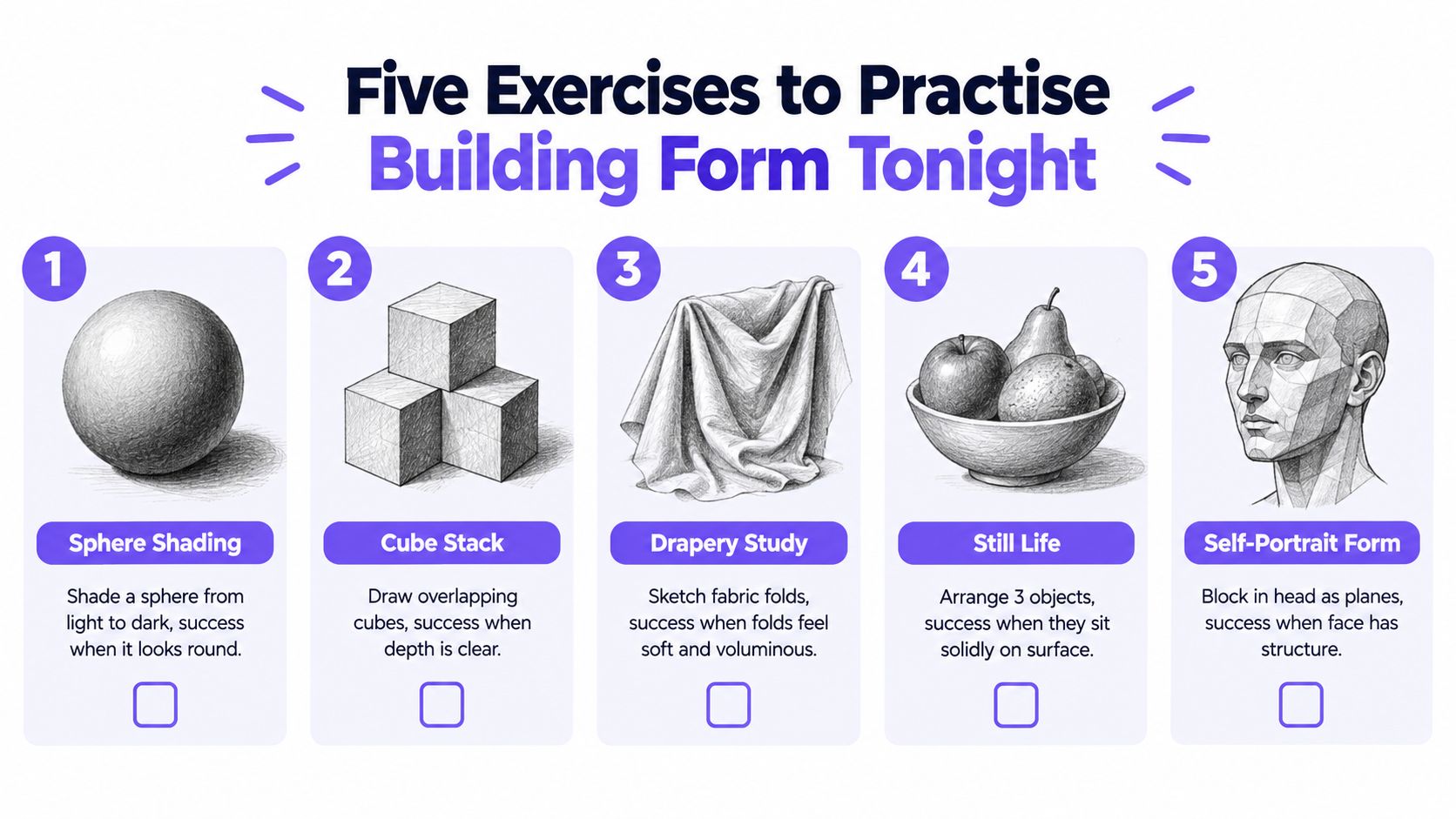
If your understanding of form stays theoretical, it won't help much in your sketchbook. You need a few tasks that are small enough to do tonight and clear enough to judge.
Start simple and get stricter
Shade one sphere
Put one object under one lamp. Add highlight, mid-tone, shadow side and cast shadow. Success means the sphere looks round even from across the room.Draw four basic solids
Line up a sphere, cylinder, cube and cone. This forces you to handle different kinds of turning surfaces. A cube teaches planes. A cylinder teaches curved shadow. A cone makes you judge taper and direction.Study draped cloth
Throw a tea towel over a mug or box. Cloth folds often behave like cylinders, tubes and hanging cones. Success means the folds feel like they hang in gravity instead of becoming random zigzags.
Push beyond neat outlines
Make a still life with contrast
Pair something hard with something soft, such as a mug and a piece of fruit, or a shoe and a folded sock. The point isn't decoration. It's noticing how different surfaces catch light differently while still needing solid form underneath.Try a lost-and-found edge self-portrait
Use a mirror and crop in close. Let one edge disappear into shadow instead of outlining everything. This teaches you that form can be stronger when some contours soften.
Here's a useful self-check list:
- Light source clear: Can you tell where the lamp or window is?
- Shadow side organised: Are the darker tones grouped logically?
- Cast shadow believable: Does the object sit on the surface?
- Edges varied: Are some softer and some firmer?
- Volume convincing: Does the object feel touchable?
If you want an extra challenge, photograph your best drawing under angled light rather than flash. Flat areas show up quickly when you compare the drawing with the object.
Three Common Mistakes That Keep Form Looking Flat
Most flat drawings don't fail because the student “can't draw”. They fail because one habit keeps interrupting the illusion.
Mistake one confuses shape with form
If you shade any enclosed outline and call it form, you'll end up with decorative patches rather than solid objects. Ask yourself whether the thing has depth, not just boundary.
Try a fifteen-minute test. Draw a circle, then make it sit on a table with a clear cast shadow and a shadow side. If it still looks like a badge or sticker, the volume isn't convincing yet.
Self-check question:
Could this object exist in space, or have I only drawn its edge?
Mistake two treats shading like wallpaper
Students often spread tone evenly because they want the page to look finished. But even shading doesn't describe turning form. It just coats the object.
Use one lamp. Squint. Find the divide between light and shade, then keep the darker values on the side turning away from the light. That one correction usually improves a study immediately.
Mistake three copies photos as outlines
Photos tempt students to trace what they think they see instead of observing how planes change. The result is often tidy and lifeless.
A better method is to block in the mid-tones first, then push darker shadows later. Save your sharpest edges for the forms closest to you or most directly lit. Soften the rest. If you work from life whenever you can, you'll understand form much faster than if you only copy flat references.
From Sketchbook Page to Portfolio and University
Strong form studies do more than improve one drawing. They become evidence that you can observe, analyse and develop work. That matters at GCSE, A Level, foundation and degree interview level.
What tutors look for in portfolio pages
A good page on form usually shows more than one stage of thinking:
- Observational studies: drawings from life under consistent lighting
- Development work: retries, tonal tests, cropped studies, material experiments
- Written notes: comments on light source, surface, mood and what changed
- Selection: not every attempt, just the ones that show growth
If you're building a digital submission, this guide to making an online art portfolio is helpful because presentation matters almost as much as the work itself.
How form connects to progression
Form sits right in the middle of the journey many students take. GCSE still life work leads naturally into A Level studies of structure, mood and material. From there, foundation courses often expect broader experimentation with physical and visual form.
For students thinking ahead to university, one current UK foundation diploma provider states that the qualification carries UCAS points at Pass = 80 points, Merit = 96 points, and Distinction = 112 points, and says successful completion supports progression to undergraduate study, with possible progression support including a guaranteed BA place subject to portfolio review, as outlined in this foundation diploma course information.
Portfolio expectations can also be very concrete. One UK provider asks for a digital portfolio of 15 to 20 images or slides with developmental and completed work, contextual references and a short sentence for each image. Another sets a cap of 25 pages and asks for observational drawing, work in progress, annotation, experimentation and research evidence, according to UK portfolio application guidance.
If you're taking a further education route first, some entry requirements are equally specific. One arts college states a threshold of at least 72 UCAS points and asks for 10 to 15 examples of work showing interest and ability in art, design or technology, in its further education entry requirements.
There's also a practical access point worth knowing. If you need adaptations because of disability or long-term impairment, the UK government says reasonable adjustments must be made so learners aren't placed at a substantial disadvantage, and JCQ states that access arrangements must be agreed before assessment and must not change the academic standard being assessed, as explained in UK SEND support guidance.
Choose one object tonight. Do the five exercises. Photograph the strongest results and annotate what changed when the form finally started to turn. That's how a single study becomes the start of a portfolio unit, not just another page in a sketchbook.
If you want structured help with drawing, analysis and portfolio building, The Online College of Art & Design (OCAD) offers UK-based online courses from Level 2 and Level 3 through to foundation routes, with tutor-led study in art, design and related creative subjects. If form is the part of your work that still feels uncertain, it's a sensible place to get guided practice and feedback before interview or submission time.