

How do you draw a figure that looks right before you've finished the details? The answer is usually not “better shading” or “more anatomy”, it's proportion. If the head, torso, pelvis, arms and legs are measured against one reliable unit, you can build a figure that reads correctly on the page, in a sketchbook, and in a portfolio.
For UK art students, that unit is often the head. British GCSE figure-drawing guidance uses the heads-high method as a practical scaffold, with a standing adult figure typically landing at about 7 to 8 head-lengths tall, and landmark checks such as the belly button around 3 heads down, elbows aligned with the belly button, and wrists level with the top of the legs (BBC Bitesize figure proportion guidance). That same proportional logic helps you work faster, make fewer false starts, and show admissions tutors that you can construct a believable figure rather than copy a silhouette.
Table of Contents
- Why Body Proportion Matters in Drawing
- The Historical Roots of Measured Figure Drawing
- The Heads-High Method Explained Step by Step
- Comparing Common Units of Measurement
- Proportions Across Different Ages
- Adjusting Proportions for Different Body Types
- Applying the Grid to Foreshortening and Sitting Poses
- From Measured Grid to Expressive Figure
- Using Proportion Studies in Your Art Portfolio
- Quick Reference Sheet and Self-Check Checklist
Why Body Proportion Matters in Drawing
A figure looks convincing when the parts relate properly to each other. If the head is too large, the legs too short, or the shoulders drifting off-line, the drawing can feel wrong even when the shading is careful. Drawing proportions of the body gives you a measuring system, so every limb and landmark can be checked against something fixed instead of guessed.
The easiest way to think about it is simple. Use the model's own head as the unit, then compare everything else to that head. On a standing adult, the body often reads at about 7 to 8 heads high in British teaching, which means the whole figure can be mapped before you commit to outline or detail (BBC Bitesize GCSE guidance). That's why a quick block-in often looks better than a rushed outline, because you've already placed the big relationships.
What this gives you in practice
A measured method helps in three ways. First, your first sketch is faster because you're not redrawing every limb from scratch. Second, your corrections are smaller, because you can see which section is out of scale. Third, your final figure reads more cleanly at portfolio size, where poor proportion becomes obvious very quickly.
Practical rule: start with the biggest relationship, not the eyelashes. If the head count is right, the rest of the figure is much easier to place.
Proportion also changes with age and body type, so you can't apply one rigid template to every figure. A child, a teenager and an older adult all need different head counts and joint placements, and that's exactly why the heads-high method works as a framework rather than a cage.
The Historical Roots of Measured Figure Drawing
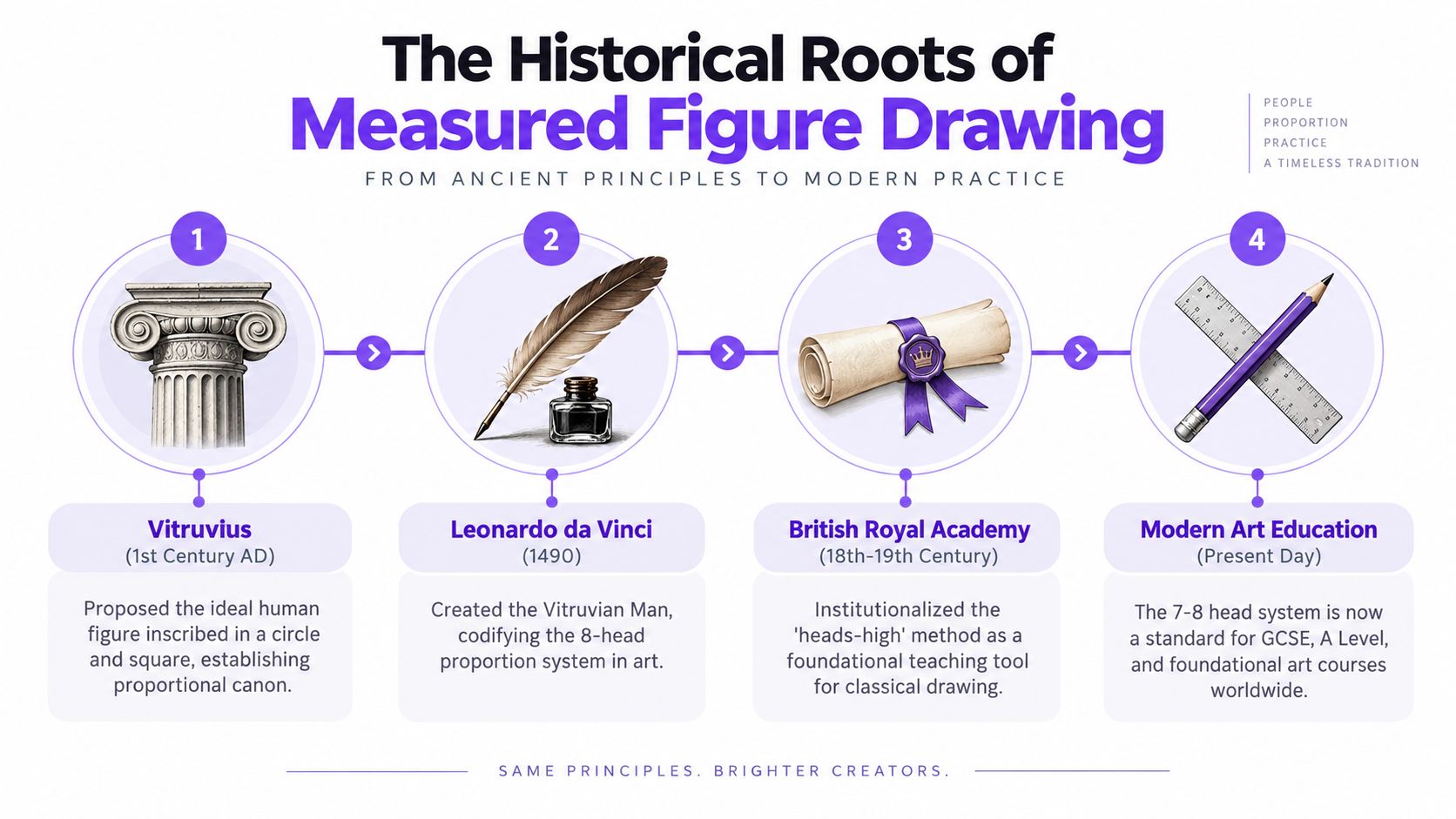
Measured figure drawing didn't appear out of nowhere. British teaching sits inside a long line of proportional study that runs back through Renaissance thinking, especially the work associated with Vitruvius, Leonardo da Vinci and Albrecht Dürer. Tate records Leonardo's Proportions of the Human Figure (After Vitruvius) as dating to around 1492, while Dürer's Four Books on the Proportions of the Human Body was published in 1528 and later informed teaching diagrams used by J. M. W. Turner at the Royal Academy (BBC on British art history and proportion).
The important idea is not just that these artists studied the body. It's that they treated the body as something that could be broken into repeatable units. That shift, from observation alone to measured structure, still shapes classroom figure drawing now. British exam and portfolio work rewards that discipline because it shows planning, comparison and control, not just enthusiasm.
Why this history still matters in class
When you use a heads-high scaffold in a sketchbook, you're not copying a random classroom trick. You're working inside a teaching tradition that values structure, comparison and measured relationships. That's why the method still makes sense in GCSE and A Level contexts, where tutors want to see how you build, check and refine a figure rather than just trace what you see.
The continuity is useful. Leonardo and Dürer helped establish body measurement as a drawing method, and British academy teaching turned it into a classroom habit. The modern heads-high rule is the working descendant of that tradition, and it's still one of the clearest ways to build a figure that looks observed instead of guessed.
The Heads-High Method Explained Step by Step
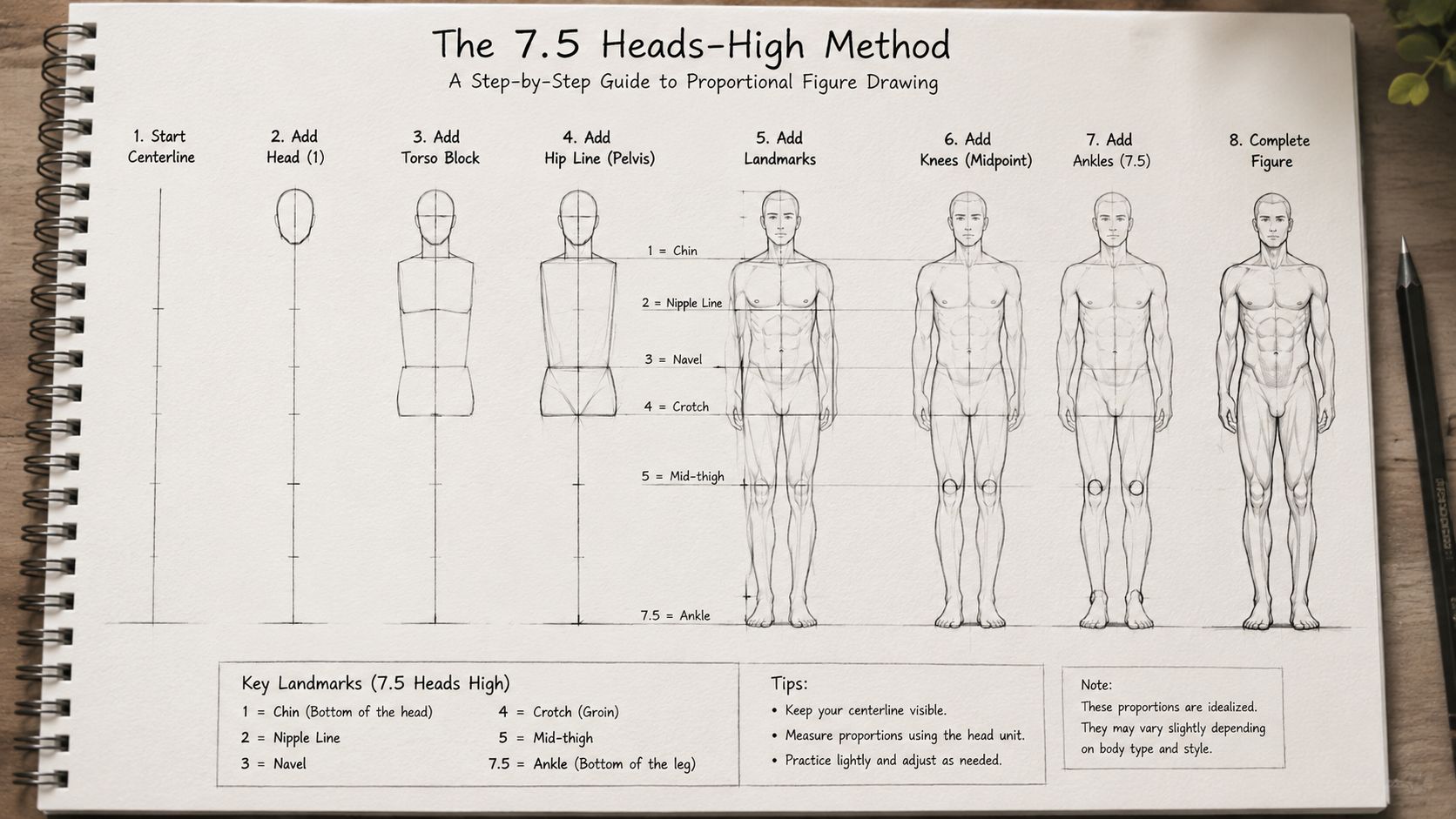
Start with a vertical line. That line is your spine of measurement, and it stops the figure drifting while you're still deciding pose and stance. Divide that line into equal head-length units using the model's own head as the measuring unit, then build the rest of the body around it.
A standing adult figure usually sits at about 7.5 heads high, with some figures closer to 7 and some stretching toward 8. Mark the chin at the first head, the nipples around the second, the navel around the third, and the pubic area around the fourth. The knees usually sit near the lower half of the figure, while the elbows, wrists and ankle positions help you keep the arms and legs in scale.
A simple construction sequence
- Block the head first. Keep it light and simple, because this unit controls the whole figure.
- Drop the body line beneath it. Mark equal head-length divisions down the page.
- Place the major landmarks. Chin, chest line, belly button, pelvis, knees and ankles.
- Check the limbs against the grid. The arms should not float or stretch past the frame unless the pose demands it.
- Refine only after the scaffold feels right.
A standing figure can look heroic at 8 heads, while a more compact adult often sits nearer 7. The point isn't to chase one perfect number, it's to use the count as a correction tool while you draw. If the elbows miss the belly button line, or the wrists don't line up near the top of the legs, something in the block-in needs adjusting.
For a cleaner practice sheet, try copying the same scaffold into your sketchbook and layering different poses over it, much like a structured pencil study. If you want a visual companion for that kind of practice, this portrait sketching in pencil resource sits well beside proportional studies because it reinforces careful observation and controlled line.
Comparing Common Units of Measurement
Different units help at different moments in a drawing. The head is best for the overall build, because it gives you a fixed, repeatable scale. Fingers, can-openers and foot lengths are useful when you need a quicker check or when the pose is too compressed for a full head count to be practical.
| Unit | What It Measures | Best Use Case | Typical Ratio in an Adult |
|---|---|---|---|
| Head heights | Full figure height | Main construction and block-in | About 7 to 8 heads high |
| Finger widths | Small details and spacing | Drapery folds, hand spacing, tighter studies | Smaller local measure, used informally |
| Can-openers | Arm span from nose-tip to thumb-tip with arm outstretched | Fast height checks in life drawing | Useful as a quick comparison tool |
| Foot lengths | Grounding the figure on a horizon line | Placement of stance and balance | Helpful for anchoring the figure |
Head height stays dominant because it gives you the cleanest structure. Finger widths are handy when you're drawing smaller sketchbook studies and the larger grid would crowd the page. Foot length works well when you need to judge how firmly the figure stands on the ground, especially if the pose leans or twists.
Studio habit: if you lose the full grid mid-sketch, switch to one local unit and finish the comparison with that. A smaller unit is better than no unit at all.
Can-openers are useful in life drawing because the arm span gives you a fast external check when the figure is too dynamic for neat counting. The main thing is to stay consistent within one sketch. If you change units, do it deliberately and use the new unit to confirm the old one, not replace it by accident.
Proportions Across Different Ages
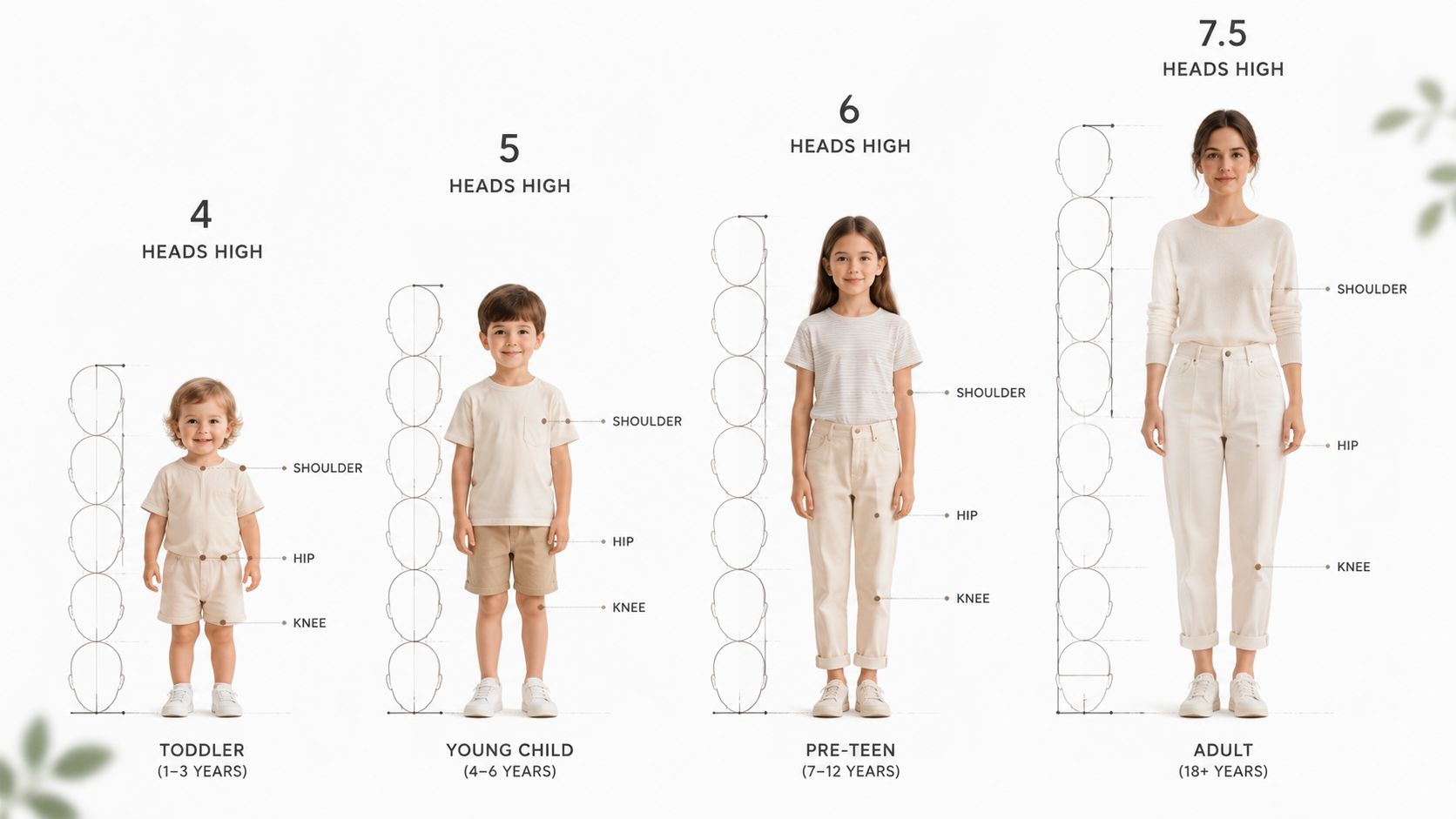
Children do not look like small adults, and that's where many student drawings go wrong. A toddler often reads at around 4 heads, a young child at about 5, a pre-teen at about 6, a teenager around 7, an adult at 7.5 to 8, and an elderly figure can shorten again to around 7 as the spine compresses and posture changes. These counts are not decorative facts, they're working decisions that alter the whole silhouette.
How the body changes as it grows
The reason children seem top-heavy is straightforward. The head and pelvis are proportionally large, while the legs haven't fully lengthened yet. That means the chin-to-pubis distance looks compressed, the knees sit higher relative to the total height, and the limbs feel shorter compared with the torso.
At the other end of life, the centre of gravity often drops visually. The shoulders may round, the spine may curve, and the body can read slightly shorter even when the person is still tall. That is why a standing older figure usually needs a softer, more compressed construction than a younger adult.
| Age band | Head count | Chin to pubis | Knee position | Limb to torso feel |
|---|---|---|---|---|
| Toddler | About 4 heads | Very short | High relative to total height | Limbs still compact |
| Young child | About 5 heads | Short | Above the adult midpoint | Legs still catching up |
| Pre-teen | About 6 heads | Moderate | Closer to adult placement | More balanced, but still youthful |
| Teenager | About 7 heads | Approaching adult spacing | Near adult placement | Lengthening into adult form |
| Adult | About 7.5 to 8 heads | Standard adult spacing | Around the lower half of the figure | Balanced and elongated |
| Elderly | Around 7 heads | Often visually compressed | May read slightly higher because of posture | Shortened by spinal compression |
A useful comparison is to place a five-year-old and a thirty-year-old on the same vertical grid. The child's torso will dominate more of the height, while the adult's legs will take a larger share. Once you see that difference, you'll stop forcing children into adult proportions and start drawing age more accurately.
Adjusting Proportions for Different Body Types
A good proportional grid doesn't erase body type, it gives you a way to control it. An ectomorph usually reads taller and narrower, often closer to 8 heads with long limbs and a slimmer ribcage. A mesomorph sits nearer the classic 7.5-head adult balance, while an endomorph tends to compress the vertical count toward 7 heads, with a broader torso and heavier thigh mass.
Keeping the same scaffold while changing the shape
The trick is to keep the same landmark system and change the spacing around it. For a leaner figure, stretch the leg sections slightly and slim the ribcage. For a broader figure, keep the head count similar but reduce the apparent distance between shoulder, waist and hip landmarks.
| Body type | Visual effect | What to adjust |
|---|---|---|
| Ectomorph | Tall, narrow, lengthened | Extend limb sections, narrow torso shapes |
| Mesomorph | Balanced, athletic | Keep landmarks evenly spaced |
| Endomorph | Wider, more compact | Shorten vertical spacing, broaden torso and thighs |
A measured life model can be translated into each body type without redrawing from scratch. Start with the accurate scaffold, then change only the proportions that support the silhouette. If the neck feels too short or the shoulders too square, adjust those local relationships while preserving the overall head count.
Keep the bones believable, then let the surface shape do the character work.
That approach matters in student portfolios because it shows control. Tutors can see that you understand the difference between structural proportion and body variety, which is a more mature drawing habit than forcing every figure into the same build.
Applying the Grid to Foreshortening and Sitting Poses
Foreshortening looks difficult when students try to redraw the whole figure from scratch. It becomes manageable when you keep the original scaffold in mind and compress what's moving away from you. The nearest joint should read largest, the receding parts should shorten, and cross-contour ellipses can suggest depth without losing the measured structure.
For a seated pose, the base changes. The pelvis becomes the support instead of the feet, the torso folds at the navel line, and the knees often sit around the level of the navel in a standard chair. That means the standing grid doesn't disappear, it rotates into a new relationship with the chair and floor.
A practical way to redraw the same measure
- Standing pose: use the feet as the base line and count upward from the soles.
- Seated pose: use the pelvis and chair contact points as the new anchor.
- Foreshortened limb: keep the nearest section larger, then shorten each section as it moves back.
- Trunk twist: mark the chest line and pelvis line separately, then connect them with a gentle turn.
A seated study works especially well when you transfer the original head marks into the new orientation rather than inventing fresh ones. That keeps the body consistent even when the legs bend and the torso collapses into the chair. For another useful sketchbook prompt on proportion and posed drawing, this doll for drawing resource can support practice with simplified forms before you move back to life study.
The goal is not to preserve the standing figure at all costs. It is to preserve the logic of measurement while the pose changes shape. If the grid survives the pose change, the drawing will usually survive it too.
From Measured Grid to Expressive Figure
A proportional scaffold should stay light. It helps you build the figure, but it should not trap the final drawing inside stiff outlines and ruler-like edges. Once the landmarks are right, begin replacing the construction marks with contour, gesture and weight.
Loosen the line without losing the structure
A figure gains life when the spine has rhythm, the shoulders and hips tilt a little differently, and the limbs don't mirror each other too neatly. You can still keep the head count and joint checks in place. You just stop drawing every part with the same hard pressure.
That's where many students hesitate. They worry that any deviation from the grid is a mistake, when in fact subtle asymmetry often makes the body feel real. A longer leg, a stronger shoulder, or a slightly heavier line around the standing foot can improve the pose if the underlying measurement is sound.
Key idea: the grid tells you where things go. Gesture tells you how they move.
Examiners and tutors usually respond best to drawings that are both measurable and alive. If the figure looks constructed but not rigid, you've used proportion properly. If it looks decorative but unsupported, the measurement stage wasn't strong enough.
Using Proportion Studies in Your Art Portfolio
Proportion work pays off because it proves you can observe, record and refine. In GCSE terms, that links neatly to AO3, where you show recording and refinement through drawing. In A Level work, it also supports AO2, because analytical figure studies demonstrate how you develop ideas through looking carefully and making decisions from observation. For university portfolios, this kind of page helps admissions tutors see process, not just finished images.
A strong portfolio section could include three pieces. The first is a standing heads-high construction with clear labels. The second is an age-comparison sheet showing how a child, teenager and adult differ. The third is a seated or foreshortened study, because that proves you can adapt the same method to a more complex pose.
| Proportion Study | GCSE AO | A Level AO | Portfolio Use |
|---|---|---|---|
| Standing heads-high construction | AO3 | AO2 | Shows measured observation and refinement |
| Age-comparison sheet | AO3 | AO2 | Demonstrates understanding of changing proportion |
| Seated or foreshortened study | AO3 | AO2 | Proves adaptation and control in harder poses |
Annotate the page lightly. Write the head count, mark the landmark lines, and note any changes you made from the life model. Tutors often prefer a sheet that shows your thinking to a polished drawing with no evidence of process.
If you're transporting work to interview or assessment, protect it properly, because a bent page can distract from good drawing. A practical option for keeping sketchbook pages or mounted sheets clean in transit is a protective mailer such as luxury padded postal bags UK, which is the sort of packaging students sometimes use when work needs to arrive flat and intact.
For more on building a coherent body of work, this why every artist should keep a sketchbook piece sits well alongside proportion studies, because it reinforces the habit of recording ideas, tests and revisions as part of your development.
Quick Reference Sheet and Self-Check Checklist
Use this as a one-page review before you hand work in or choose pages for a portfolio. Keep it beside your sketchbook while you draw, because a quick check often saves a full redraw later.
| Body Region | Adult (7.5-8 heads) | Teen (7 heads) | Child (5-6 heads) | Elderly (7-7.5 heads) |
|---|---|---|---|---|
| Head to body | Standard adult ratio | Slightly compact | Head reads larger in relation to body | Can shorten with posture |
| Head to pubis | Around the midpoint of the figure | Slightly higher than adult | Much shorter | May appear compressed |
| Crotch to knee | Lower half of the figure | Balanced but shorter than adult | Short relative to torso | Often affected by posture |
| Shoulder to wrist span | Broad, full-length arm | Similar but less extended | Smaller span overall | May narrow visually with age |
Self-check routine
- Count the head units. If the total figure is drifting outside your intended age band, correct it before detail.
- Check the pubis line. It should sit near the centre in an adult figure.
- Measure the shoulders. They usually span roughly two head-widths in an adult.
- Confirm the legs. Each leg should contain about four head-heights in an adult figure.
- Audit elbows, wrists and knees. These landmarks should sit in relation to the grid, not float independently.
Common pitfalls and fixes
- Head too large: redraw the head smaller before refining the body.
- Unequal legs: compare both leg lengths against the same vertical unit.
- Shoulders slumping off the grid: re-establish the shoulder line before adding arms.
- Knees placed too low: mark the mid-leg points again and rebuild the lower limb.
- Stiff mannequin look: keep the measurements, but soften the contour and adjust the gesture.
Keep this checklist near timed class work and portfolio review sessions. It's a fast way to stop small proportional errors from turning into big ones.
If you want structured support with figure drawing, sketchbook development and portfolio-building, The Online College of Art & Design (OCAD) can help you turn measured studies into stronger coursework. Visit The Online College of Art & Design (OCAD) and use this body-proportion method to build work that looks controlled, thoughtful and ready for assessment.