

You're probably staring at a horse sketch that looked promising in the first five minutes, then went strange the moment you tried to “finish” it. The head feels copied, the legs look too thin or too short, and the whole animal sits on the page like a cut-out rather than a living body. That's the point where many Level 2 and Level 3 students decide they're “bad at horses”, when the issue is usually structure, observation, and proportion, not talent.
Realistic horse drawing is one of those subjects that exposes everything. If the body is off by a little, the mistake shows up everywhere, because a horse has a long spine, strong joints, and a very readable silhouette. That makes it frustrating, but it also makes it a brilliant subject for portfolio development, because every correction teaches you something useful about anatomy, stance, and control.
Table of Contents
- Why Drawing Realistic Horses Feels So Hard for Creative Students
- Setting Up the Right Proportions Before You Touch the Pencil
- Understanding the Anatomy Beneath the Coat
- Capturing Gesture, Stance, and Weight
- Rendering the Head, Eyes, and Coat in Real Detail
- Building Portfolio-Ready Studies Through Practice
- Turning Your Horse Drawings Into a University-Ready Portfolio
Why Drawing Realistic Horses Feels So Hard for Creative Students
A lot of students bring me the same drawing problem in different forms. They've spent hours on a horse, added a neat mane, shaded the body, and still the animal looks stiff, flat, or strangely small in the legs. The work isn't lazy, it's just missing the structural checks that make the whole thing hold together.
The usual trap is copying the outline
When a student draws the outer edge of a horse first, the page can look convincing for a moment. Then the outline starts fighting the underlying form, especially at the shoulder, the chest, and the hind leg joints. That's where copied contour usually breaks down, because a horse isn't a simple outline, it's a body built from masses, angles, and weight-bearing parts.
The national picture matters here too. In Great Britain, a 2012 peer-reviewed analysis estimated a conservative horse population of approximately 842,653 animals, with a likely maximum in the region of 1.35 million horses, and it also noted how weak equine demographic data had been historically in Britain (BMC Veterinary Research). That scale explains why a realistic study can't rely on one neat template. Ponies, cobs, sport horses, and racehorses don't share identical proportions, so if your drawing looks “wrong”, the issue may be that you've used one fixed idea of a horse instead of a real reference.
Practical rule: if the horse only makes sense as an outline, it'll usually fail as a believable body.
The students who improve fastest stop guessing
The students who move forward usually do one thing differently. They slow down long enough to compare the reference with what they've drawn, then they adjust the big shapes before they chase detail. That shift matters far more than polishing the mane or adding extra shading.
UK-facing art teaching has long favoured observation over decorative simplification, and that's exactly why horse drawing is such a good training ground. Once you start thinking in measured shapes, joints, and balance, the drawing becomes less mysterious. You stop asking whether you have “natural ability” and start asking whether the shoulder angle, leg placement, and body mass match the animal in front of you.
Setting Up the Right Proportions Before You Touch the Pencil
Start with the horse's head length as your measuring unit. That simple choice keeps the whole body from drifting, because you can compare the back, chest, legs, and neck against the same benchmark instead of eyeballing everything separately. A standing cob and a standing Thoroughbred won't share identical proportions, but both become much easier to control when you measure from one clear unit.
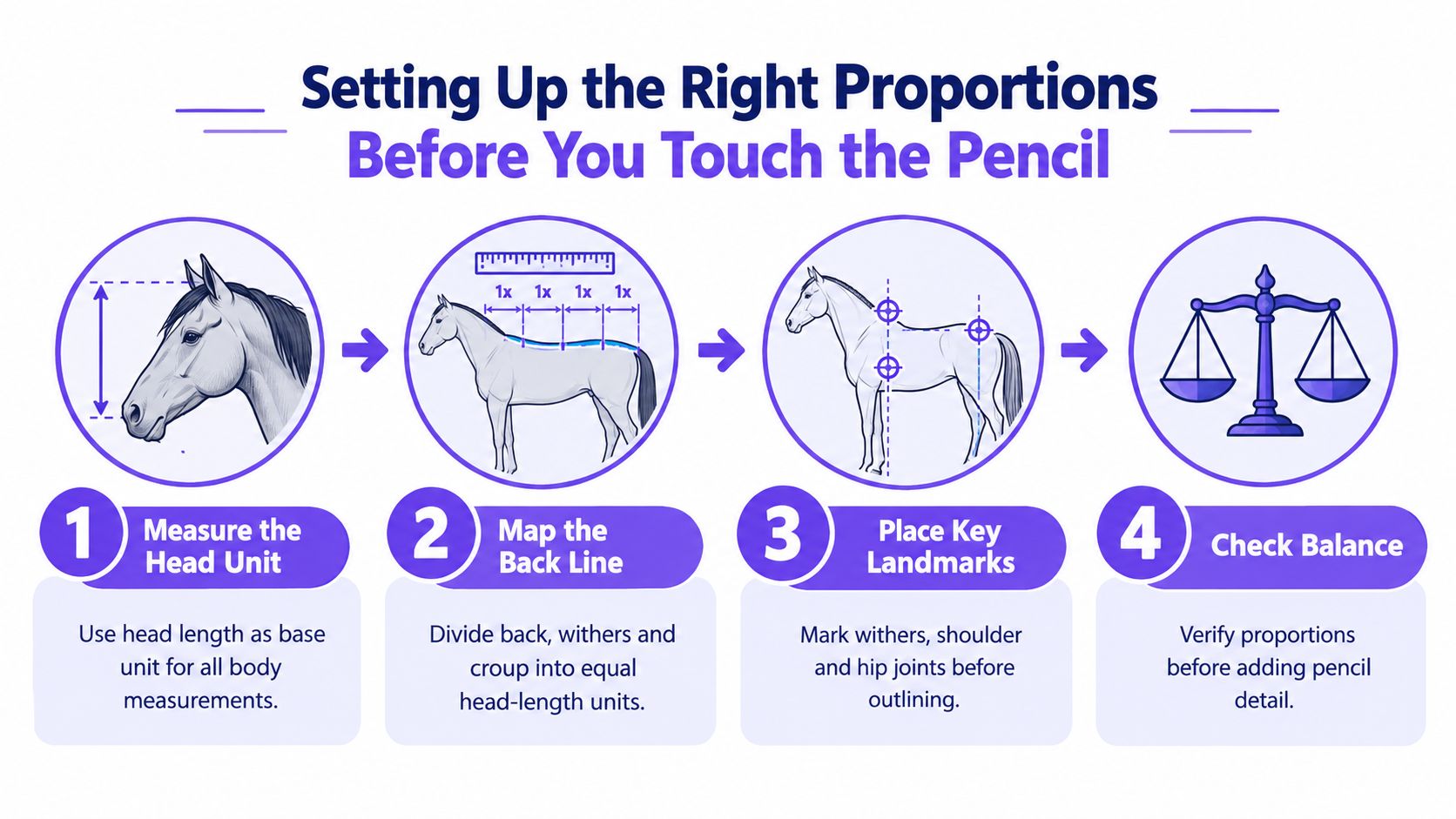
Build the drawing from simple shapes first
Block the body with a square or rectangle scaffold, then add overlapping circles for the barrel, a cylinder for the neck, and long rectangles for the legs. That method sounds basic, but it stops the common problem of drawing a horse that looks like it was assembled from separate, disconnected parts. The source guidance on horse construction is clear that this measured approach fits most horses, with breed and type variation changing the ratios, so the head-length system should stay a starting benchmark rather than a universal rule (Ruth Buchanan's horse drawing guide).
That same logic is exactly why sketchbook evidence matters for university applications. Admissions tutors want to see that you can think through a form, not just copy a finished image. If your page shows the first scaffold, the measurements, and the corrections, it reads like development, not luck.
The Royal Collection's horse-drawing guidance also centres proportion-based construction and using photographs as a control layer, which is useful because it keeps your eye honest when perspective starts to distort the body (Royal Collection horse drawing guidance). If you're working from life, use your pencil as a measuring tool and compare the head against the torso before you commit to line.
Don't rush to the outline. If the scaffold is wrong, the finished horse will be wrong in a more expensive-looking way.
Use the head as a measuring stick
A good habit is to compare the head to the distance from withers to croup, then from chest to hip, then down into the leg structure. You're not hunting for absolute sameness, you're checking relative size and alignment. That keeps the horse from shrinking into a pony shape or stretching into something awkwardly long.
If you want a simple support page for this kind of measuring practice, this drawing proportions resource sits neatly alongside your horse studies. Use it as a reference point, then come back to live observation so the numbers don't replace the animal.
Understanding the Anatomy Beneath the Coat
A horse looks smooth from a distance, but the surface only makes sense when you know what's underneath it. If you can name the major masses, you'll stop drawing decorative curves and start drawing the body that exists. That's the difference between a copied horse and an observed one.
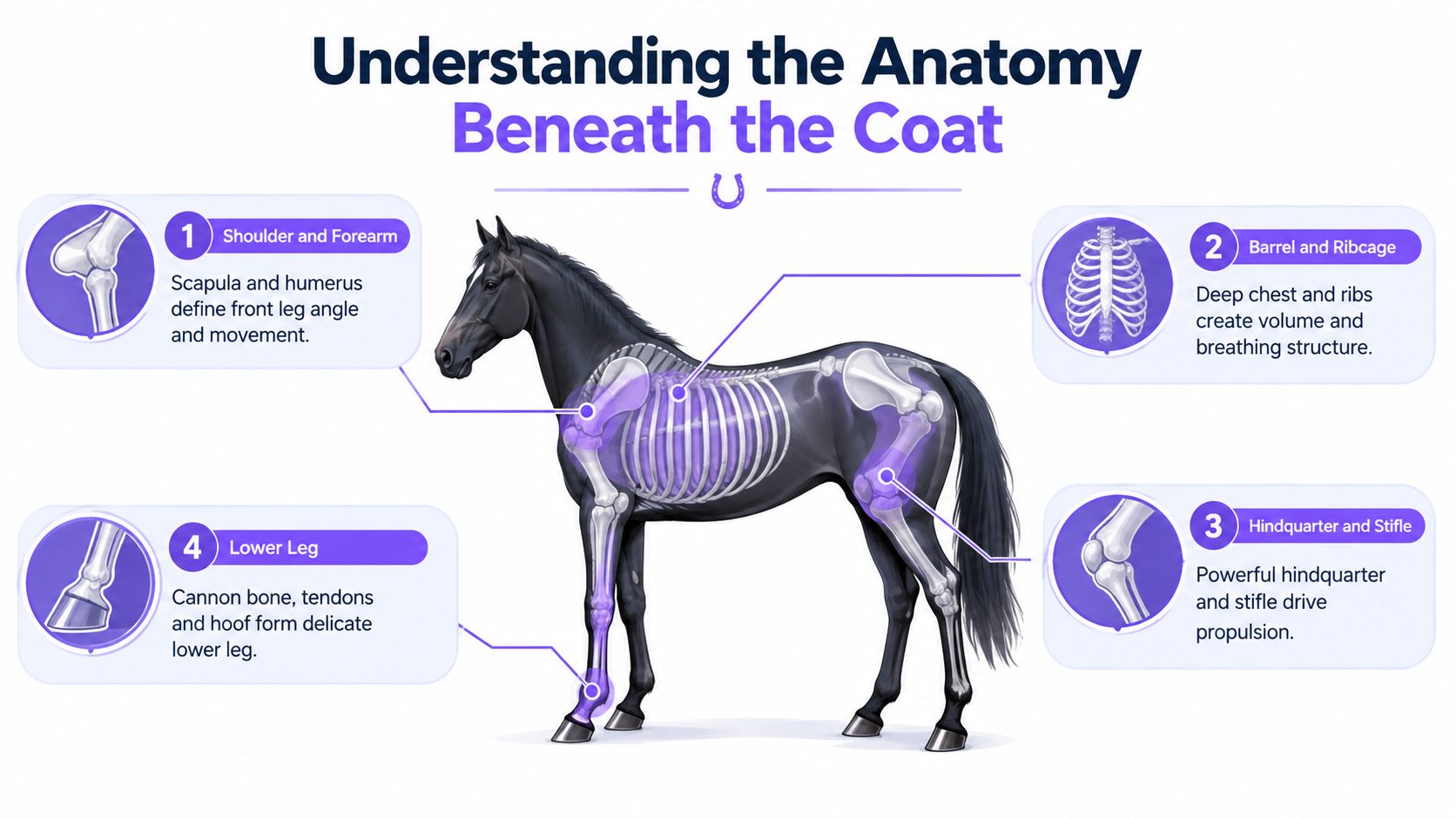
The shoulder and forearm need a clear angle
The scapula changes the front line of the horse more than most beginners realise. When it rotates, it shifts the shoulder angle and changes how the front leg meets the body, which is why the front end can look rigid if you ignore it. The humerus and forearm then pull that structure down into the leg, so the front limb needs to read as a connected mechanism, not a straight stick.
The barrel and ribcage shape the middle
The ribcage gives the horse its volume, and that volume controls the belly curve. If you draw the belly as a random sag or an over-tight curve, the body loses its weight and breathing space. Think of the barrel as the volume that anchors the chest to the hindquarters, because that's what stops the horse looking hollow.
The hindquarter carries the force
The hindquarter is where the power sits. The gluteal and hamstring masses shape the croup, while the stifle helps explain how the back leg bends and pushes. When students over-simplify this area, the horse looks like it's standing on borrowed legs instead of driving from the rear.
The lower leg needs restraint
The lower leg is lean, bony, and easy to overdraw. The cannon bone, tendons, fetlock, and hoof should feel delicate compared with the heavier masses above them. If you load too much shading into the lower leg, the anatomy gets muddy very quickly.
A useful mental checklist is simple. Ask yourself whether the shoulder has room to move, whether the ribcage has enough depth, whether the hindquarter shows propulsion, and whether the lower leg stays narrow and efficient. That kind of checking turns reference study into real understanding.
Capturing Gesture, Stance, and Weight
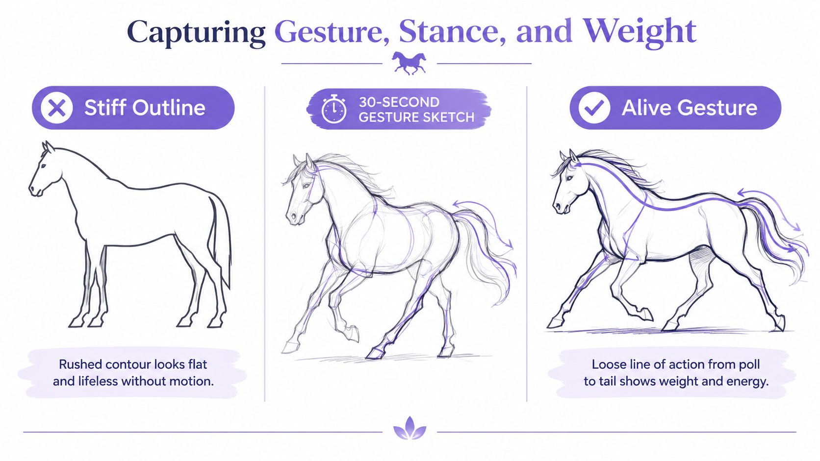
A horse can be anatomically correct and still feel dead if the gesture is wrong. I've seen plenty of students draw every joint carefully, then place the animal in a pose that ignores balance completely. The result looks tidy, but it doesn't feel alive.
Start with a line of action
Give yourself about 30 seconds and draw a loose line from the poll through the chest and into the hindquarters. That line tells you whether the pose is grazing, alert, moving forward, or resting. A grazing horse bends low through the neck, an alert horse lifts more through the front, and a trotting horse stretches the body in a more dynamic rhythm.
The frequent Level 3 mistake is placing all four legs straight down, as if the horse were standing on four posts. Real horses distribute weight, so one leg often carries more of the body while the others relax into subtle bends. The supporting leg locks more firmly, and the resting leg softens at the pastern, which is why even a still horse has internal tension.
Standing horses need believable weight shifts
In a relaxed standing pose, use the diagonal-pair rule as a guide. The horse rarely loads both front legs and both back legs in the same unthinking way, so you need a slight asymmetry to keep the body believable. One hind leg may carry more, while the other sits back a touch, and the front end should echo that natural offset.
The UCL Slade example makes the point that drawing a horse quickly is difficult, even in serious studio conditions, and that's a good reminder for students working under pressure (UCL Slade animal art news). If you can catch the gesture before you chase detail, you'll save yourself from a stiff result. A horse built on clear weight and movement will always look more convincing than a carefully outlined one with no body language.
Quick test: if you erased the legs, would the body still suggest motion or balance? If not, the gesture needs more work.
If you want a simple reference habit for this stage, this figure and pose support page can help you practise reading movement before you apply it to horses.
Rendering the Head, Eyes, and Coat in Real Detail
The head is where many drawings lose their realism, usually because the student starts with the eye and builds outward from there. That often leads to a cute or expressive horse, not a believable one. If you want the head to read properly, start with the skull structure and let the features sit on top of it.
Compare your rendering choices before you commit
| Feature | Graphite | Charcoal | Pen |
|---|---|---|---|
| Head structure | Soft modelling of cheekbone ridge and jaw line | Strong contrast around planes and sockets | Clear contour and directional hatching |
| Eye | Controlled value shifts, avoid making it oversized | Dark focal point with careful edges | Fine line emphasis, keep the socket shape visible |
| Nostril | Gentle shading for soft cartilage | Deepen the flare without turning it into a hole | Line-led form, then minimal tone |
| Mane | Chunky pencil clusters | Separated dark locks | Directional stroke layering |
| Coat | Follow hair growth with light pressure | Use tonal blocks, then refine texture | Use short strokes that follow the body |
Build the head from the skull first
The cheekbone ridge, jaw line, and eye socket shape do more for realism than a neatly outlined eye ever will. A horse's eye often reads biggest in foals, so oversizing it on an adult horse becomes a common amateur shorthand. The eye should sit inside the skull structure, not replace it.
The nostril also needs care. It isn't two flat holes, it's soft cartilage that expands and relaxes with breathing. If you darken it too evenly, the muzzle can look cut out rather than fleshy.
Match the coat to the medium
Mane handling changes with the tool in your hand. In graphite, chunky clustered marks can suggest thickness without turning every hair into a separate line. In charcoal, separated dark locks work well because the medium already gives you strong value contrast. In pen, the best results usually come from directional stroke layering, not from outlining each strand one by one.
Coat texture follows the body too. The growth direction over the shoulder, flank, and fetlock helps the form turn in space, so your mark-making should echo the anatomy rather than sit on top of it. If you're working in softer media and want to compare texture options, this soft pastel drawing resource can give you a useful contrast in surface handling.
Building Portfolio-Ready Studies Through Practice
Practice stops feeling like homework the moment you treat it as portfolio evidence. UK universities don't just want a final polished horse, they want to see how you think, how you test ideas, and how your drawings improve over time. That's why repeated studies matter so much more than a single impressive piece.
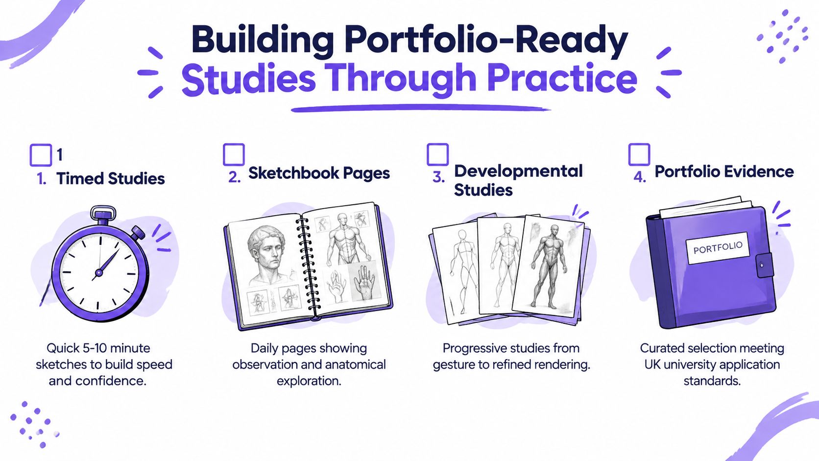
Build three kinds of study pages
- Timed gesture sheets show speed and confidence. A page of quick horse poses tells an admissions tutor that you can observe under pressure and avoid freezing when the subject changes.
- Anatomical studies show understanding. A page that isolates the skull, shoulder, or hindquarter proves you're looking beneath the coat, not just tracing a silhouette.
- Developmental studies show process. When you show a rough sketch, then a corrected version, then a more resolved drawing, you're giving evidence of decision-making.
The University of Edinburgh's portfolio guidance notes that some art and design courses ask for around 15 to 20 pages/images of work, including sketchbook pages and developmental studies, so progression evidence really does matter in admissions practice (portfolio preparation and requirements guide). That's why a page of attempts can be more valuable than one isolated finish.
Use a routine you can actually keep
Try this week's set of studies: two gesture pages from life at a riding centre, one skull-and-muscle study from a veterinary anatomy book, and one developmental drawing that begins with a rough scaffold and ends with refined line. Keep the pages honest. Don't redraft every mistake until they disappear, because the visible changes show growth.
Portfolio truth: tutors often learn more from a page of corrections than from a polished image with no process.
If you're a Level 2 or Level 3 student, this kind of work also prepares you for interview questions about observation, material choices, and problem-solving. A tutor can ask why you changed the leg angle, how you checked proportion, or what you learned from the anatomy study, and your sketchbook will already hold the answer.
Turning Your Horse Drawings Into a University-Ready Portfolio
Realistic horse drawing becomes much easier when you link four things together, proportion, anatomy, gesture, and rendering. When those parts work together, your horse looks believable. For university applications, your sketchbook starts to show control, enquiry, and improvement rather than just finished pictures.
That matters for Level 2 and Level 3 students aiming at art school, because admissions tutors look closely at progression. A strong portfolio usually includes observational sketches from life, developmental pages, and finished pieces that show you can move from rough study to resolved outcome. If you're deciding your next route, A Level Art, a BTEC Diploma, or a foundation year can all support this kind of portfolio building, especially if you keep collecting primary reference from a local life-drawing class or an equine event.
A few practical moves can tighten your current work quickly:
- Refine two existing horse studies and correct the proportions before adding any more detail.
- Label the anatomical landmarks on one finished piece, including shoulder, withers, rump, and lower leg.
- Photograph the work in even daylight so the values read clearly and the drawing doesn't get distorted by colour casts.
- Write a 150-word artist statement that covers subject choice, technique, and what the horse drawing taught you about observation.
For online or remote learners, UK guidance for 16 to 19 study programmes says providers shouldn't assume every student can study successfully remotely, and if online learning is used, learners need suitable access to a learning environment, device, and connectivity (16 to 19 study programmes guidance). The SEND Code of Practice also supports appropriate provision for learners aged 0 to 25, with online learning offering benefits in some cases (SEND Code of Practice). That flexibility matters when you're building a creative pathway around school, work, or support needs.
Consistency beats flair every time. Keep making the studies, keep checking the structure, and keep revising what doesn't look right. That's how a horse drawing stops being a classroom exercise and starts becoming a portfolio that can earn a conversation in an interview.
If you want structured feedback, portfolio guidance, and tutor-led support while you build your horse studies, The Online College of Art & Design (OCAD) offers flexible online art learning from entry level through Level 3, including portfolio-centred courses. It's a practical option if you want to keep developing realistic horse drawing alongside wider sketchbook work and university preparation.