

You're trying to draw a figure that looks right on the page, but one leg keeps running long, the waist sits too high, and the head never quite matches the body. That's a common stage in human proportions drawing, and it usually means the drawing needs a measurement system before it needs more detail. A clear head-count method gives you that system, and it also gives you a way to check your work quickly when you're building sketches for class, portfolio pages, or online study.
For students who learn best from structure, this topic gets easier when you treat it like a reference chart rather than a mystery. You can compare a photo, a life-drawing pose, or even a study made from a digital reference, then measure the body in consistent units instead of guessing. If you want a simple way to turn a photo into a drawing reference before you practise proportions, turn photos into sketches can help you create a starting point for study.
Table of Contents
- Introduction to Human Proportion as a Drawing Foundation
- The Head Count System and Core Measurement Rules
- Mapping the Body in Head Units From Shoulders to Feet
- Age and Growth Variations for Children and Teenagers
- Applying Proportions in Different Poses and Viewpoints
- Stylisation and Idealisation While Keeping Structure Believable
- Common Proportion Errors and How to Correct Them
- Quick Reference Toolkit for Study Portfolios and Next Steps
Introduction to Human Proportion as a Drawing Foundation
A figure can have strong shading and still feel off if the head, torso, arms, and legs do not relate properly. Proportion is the framework that makes the drawing read as a body before anyone studies the details. For students working through UK coursework or online lessons, that framework also makes it easier to practise, record progress, and present studies for Level 2 and Level 3 portfolios. If you want a simple way to turn a photo into a drawing reference before you practise proportions, turn photos into sketches can help you create a starting point for study.
A head-count system gives you a practical starting point. In BBC Bitesize GCSE Art and Design revision, the standing adult figure is commonly measured at seven to eight heads high, with landmarks such as the belly button around three heads down, the elbows aligned with the navel, and the wrists level with the top of the legs in classroom practice and exam preparation for AQA, Edexcel, and Eduqas (BBC Bitesize GCSE Art and Design revision). Once you know where those markers sit, you can check a pose much faster than by eye alone.
That matters when a sketch starts to drift. A head that is too large, shoulders that sit too narrow, or knees that land too high usually means the body's measurement pattern has slipped. Correcting the structure first is like fixing the frame of a building before you add windows and paint. The drawing settles more naturally when the major parts are anchored in the right place.
Who benefits most from a measured approach
GCSE and A Level learners often need a repeatable method they can use under time pressure. Adult returners and SEND learners studying online often need a slower version they can revisit without getting lost. The same framework works for all of them because it breaks a complicated subject into clear visual landmarks.
Practical rule: measure the figure first, polish it later. If the skeleton of the drawing is right, the finished work has a far better chance of holding together.
This is why proportion studies matter for portfolio development as well as classroom exercises. A head-count chart makes it easier to compare references, spot errors, and build a sequence of studies that show progression. It also supports university preparation, because admissions teams usually want to see process, not just a finished image.
The historical side matters too. Tate's human figure resource links the figure to a long tradition of art-school study in Britain, including teaching methods from Hogarth's Academy in St Martin's Lane and the use of live models, mannequins, and sculpture (Tate human figure resource). That history explains why proportion still sits at the centre of figure drawing.
The Head Count System and Core Measurement Rules
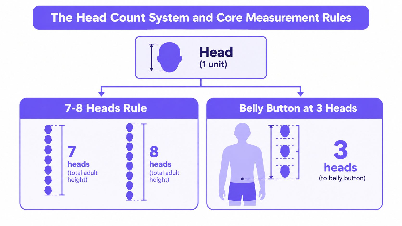
A standing adult figure is easier to handle if you start with the head as one unit. In UK classroom guidance, the body is often read as seven to eight heads tall, which gives you a quick check before you worry about clothing, gesture, or facial detail (BBC Bitesize GCSE Art and Design revision). Set the head first, then repeat that unit downward with care.
Build the scaffold first
Start a full-figure study with a stick-figure scaffold. Draw a vertical line for the spine, then add simple lines for the arms and legs, with horizontal guides for the shoulders, hips, and feet. That scaffold is a planning tool, not a shortcut. It keeps the body from drifting as you add volume, and it is especially useful when you need clean evidence of process for portfolio development.
A practical first pass is straightforward:
- Mark the head height. Decide how tall one head is on the page.
- Step that unit downward. Repeat the same measure seven or eight times for an adult figure.
- Place the landmarks. Put the belly button about three heads down, the elbows at navel level, and the wrists at the top of the legs.
- Check the balance. Make sure the shoulders, hips, and feet still make sense as you add shape.
If you are working from a photo or life pose, use your pencil to compare lengths at arm's reach. Measure the head against the torso and leg sections, then transfer those steps into the sketch. That method fits well with portrait sketching in pencil, because both portrait and figure studies depend on careful measuring before refinement.
Why the rule works
The head-count method gives you landmarks that stay readable even when the pose changes. You do not need to memorise every bone in the body to draw a convincing standing figure. You do need a repeatable system that shows where the torso starts, where the hips sit, and how the legs relate to the head.
A useful check is simple. If the head and torso are correct but the legs are too short, the figure still feels wrong. If the legs are right but the shoulders are too narrow, the body can seem unstable. The scaffold helps you catch those problems early, before the drawing becomes harder to fix.
It also gives students a clear way to practise, document, and present proportion studies for Level 2 and Level 3 progression. A neat sequence of measured studies shows how your observation improves, even when the final drawing is still in progress.
Mapping the Body in Head Units From Shoulders to Feet
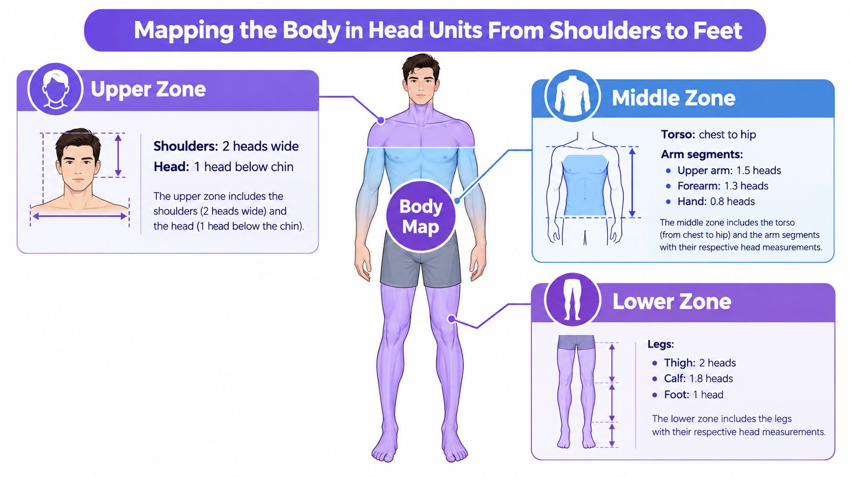
A full figure study becomes easier to correct once you stop reading it as one shape and start reading it in zones. The head gives you the measuring unit, then the body can be checked in upper, middle, and lower sections, like matching parts of a scaffold before the whole structure goes up. That approach helps in portfolio work because you can show how each landmark was placed, corrected, and refined for Level 2 and Level 3 progression.
Upper zone checks
Start at the shoulders. In the UK educational benchmark, the shoulder line sits only a little below the head, which helps prevent the upper body from shrinking too much (Maths Careers figure drawing). If the shoulders are too narrow, the body can look folded inward. If they sit too high, the neck vanishes and the pose becomes stiff.
Compare shoulder width to head width before you add detail. Then check the elbow line. In a standing figure, the elbows often meet the navel area, so a quick look at that relationship tells you whether the torso is drifting out of balance.
Middle and lower zone checks
The torso should read as a clear bridge between chest and hips. In head-length mapping, the arms and legs can be split into segments, which makes it easier to spot when one side has slipped. The same UK guidance notes that adults are usually about 7 to 8 heads high, while more idealised figures extend beyond that for fashion or elegance (Maths Careers figure drawing). That comparison helps you decide whether a study should stay natural or move toward stylisation.
Use the head count as a simple ladder.
- Head unit one: top of head to chin.
- Head units two and three: neck and upper torso, with the belly button around the third mark.
- Head units four to five: hips and upper legs.
- Head units six to eight: lower legs and feet, depending on body type and pose.
Keep checking the knees and ankles against those marks. If the legs start to feel stunted, the issue is often a hip or knee placed too high, not the feet themselves. If the feet feel too small, compare them with the forearm before redrawing the outline.
A simple worked example
Mark a standing reference photo in equal head lengths first, not by tracing the contours. Place one mark at the top of the head, then step downward in even intervals. Locate the shoulders, elbows, waist, knees, and ankles against those marks. If the knees sit too close to the hips, the legs will look short. If the feet seem undersized, compare them with the forearm length before you change the drawing.
This method keeps the figure open and flexible. The landmarks give you the structure, then you can soften angles, adjust curves, and add clothing or muscle without losing the underlying proportion.
Age and Growth Variations for Children and Teenagers
A child figure drawn with adult proportions usually looks strained. The head reads too small, the limbs stretch too far, and the waist and navel sit where they would on a mature body. In a portfolio sketch, that mismatch can hide an otherwise clean line drawing.
Why children need a different scaffold
A toddler does not need a seven-head framework. Younger bodies use a shorter head-count system, then change again through the teen years as the legs lengthen and the torso settles into a different balance. If you place adult landmarks on a child, the pose often looks awkward even when the drawing is tidy.
Use this quick comparison while planning character studies or school project figures.
| Age Group | Heads Tall | Key Proportion Marker |
|---|---|---|
| Toddler | 4 heads | Large head, short limbs, high waist |
| Child | 5 to 6 heads | Longer legs than a toddler, still compact torso |
| Teen | Transitional between child and adult | Limbs lengthen, torso begins to settle into adult balance |
How to avoid the “small adult” problem
Start by asking what the figure should communicate. A school-age child should feel light, compact, and less angular than an adult. A teenager may still keep a slightly youthful head-to-body balance, but the figure should begin to read taller and less top-heavy than a child.
Use these checks as you sketch:
- Head size first. If the head dominates too much, the figure may read younger than intended.
- Waist placement next. In younger figures, the waist usually sits higher than in adults.
- Leg length last. Shortening the legs is the quickest way to make a child look unconvincing, so compare leg length carefully against the torso.
Gesture also changes with age. Younger figures often look compact because the joints sit closer together. Teens start to stretch vertically, so you get more space between the shoulder line, waist, and knees. A simple way to test this is to mark those points lightly before refining the contour, the same way a tutor might ask you to block in a figure before shading. It gives you a clearer scaffold for Level 2 or Level 3 study sheets, and it also makes online practice easier to record and review.
If you are drawing from imagination, keep the head-count sketch loose at first. The measurements guide the body, they do not flatten it into a formula. Once the age band is clear, refine the posture, hair, clothing, and facial features so the whole figure fits the story you want to tell.
Applying Proportions in Different Poses and Viewpoints
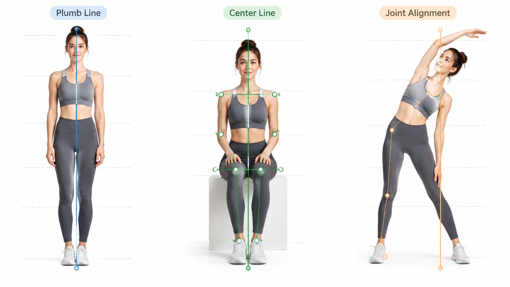
A proportion system has to survive movement. A body bends, turns, sits, and twists, yet the main landmarks still need to hold together. If you can keep the head count and centre line clear in one pose, you can usually transfer them into the next without losing structure.
Use plumb lines to keep balance
A plumb line is a straight vertical check. It helps you test whether the figure is balanced on the page. In a standing pose, it shows whether the head, torso, hips, and supporting foot sit in one structural chain. In contrapposto, one hip lifts while the other lowers, so the centre line shifts, but the figure still needs to feel steady.
Shoulders can tilt, the pelvis can tilt, and the legs can carry different amounts of weight. The drawing still needs a clear relationship between those parts. If the figure looks as if it will topple, the alignment needs correcting.
Side view and three-quarter view
Side views compress the body into a narrow profile, so depth is easy to lose. Three-quarter views ask for more judgement because one side of the body opens towards the viewer while the other side recedes. Heavy perspective theory is not required here. Near forms read larger, and farther forms sit behind them.
A simple workflow helps:
- Sketch the head unit and centre line.
- Drop a plumb line through the body to check balance.
- Mark the shoulders, hips, knees, and ankles against that line.
- Compare the visible side of the figure with the hidden side before you commit to contour.
Seated poses need extra care. Standing proportions do not carry across unchanged, because the torso can fold, the thighs can compress, and the lower legs can change angle quickly. Landmarks matter more than the silhouette.
The guidance on using references without copying helps here. Pose studies work better when you observe structure instead of tracing every contour. That keeps your drawing honest and still lets you build your own line work.
Foreshortening follows the same logic. If an arm points towards the viewer, it looks shorter on the page, but the arm has not changed length. Measure the limb as it exists in space, then allow perspective to compress what the eye sees.
For UK portfolio work, this kind of study is useful because it shows process as well as outcome. A Level 2 or Level 3 sheet can include front, side, and three-quarter views from the same head-unit plan, plus brief notes on balance, overlap, and compression. Online learning makes that easier to record, because you can save each stage, compare revisions, and show how your proportion checks changed the result.
Practise the same figure from different angles, then review the landmarks on each version. The aim is not to memorise a single pose. It is to understand how proportion behaves when the body turns in space.
Stylisation and Idealisation While Keeping Structure Believable
Once you can draw the body accurately, you can change it on purpose. That matters in fashion, heroic, comic, and editorial work, where the brief often asks for a figure that feels more elegant or more expressive than a plain life study. The rule is simple. Stretch the form, but keep the anatomy that holds it together.
Average and idealised figures
UK teaching often treats the adult figure as 7 to 8 heads high, while more idealised or fashion-led figures are pushed beyond that to create extra height and refinement. A useful reference point for this is Maths Careers figure drawing, but the main lesson is visual control, not memorising a single formula. If you lengthen the legs, slim the waist, or enlarge the head, the joints still need to line up in a way the viewer accepts.
How to alter the body safely
Start with the structure you already know. Then change one feature at a time, so you can see what each adjustment does.
- Longer legs: extend the lower body, but keep the knees and ankles in a clear chain.
- Narrower waist: reduce the middle section, while keeping the ribcage and pelvis readable.
- Larger head: useful for younger or more graphic styles, but the neck and shoulders still need to support it.
A good check is to mark the head units first, then compare the modified figure against that scaffold. If the waist drifts too high, the torso feels cramped. If the shoulders shrink too much, the body loses strength. If the legs are stretched without adjusting the pelvis, the pose can look unstable.
For observational portfolio work, accuracy usually matters more than exaggeration. For concept work, the brief may ask you to push height, attitude, or drama. The difference is control. A figure that is deliberately elongated still needs believable balance, a clear shoulder line, and joints that make sense.
That is why proportion charts stay useful even in expressive work. The chart gives you the baseline. The style comes after. If you skip the baseline, you are guessing instead of designing.
Common Proportion Errors and How to Correct Them
Most proportion mistakes start with one landmark placed too soon, then every later line is measured from that error. In sketchbooks and portfolio pages, that usually shows up as a torso that feels squeezed, legs that seem to sink, or shoulders that cannot carry the figure's weight.
Read the error before you fix the line
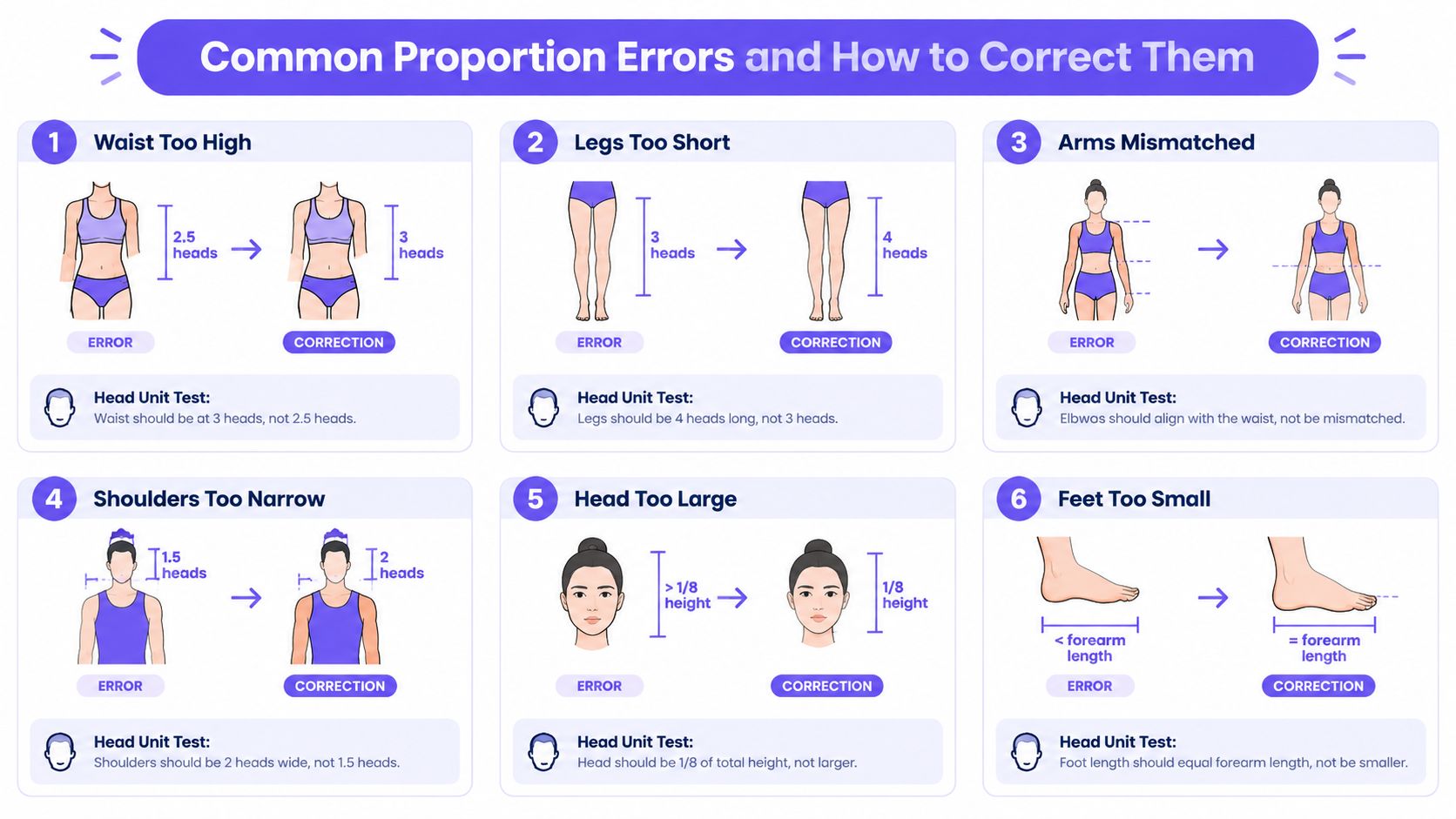
Start by naming what looks wrong. A waist that sits too high compresses the torso. Legs that run too short make the figure feel planted rather than balanced. Narrow shoulders can leave the upper body looking weak, especially in front view, because the frame no longer supports the rest of the drawing.
The correction test is simple. Return to the head units, then compare the landmark against the scaffold you built earlier. If the waist falls too high on an adult study, move it down. If the elbows miss the navel line, recheck the arm lengths. If the shoulders collapse inward, widen them against the head width before you refine the contour.
A correction checklist you can use on the page
- Waist too high: place the waist lower and compare it again with the three-head level for a standard adult figure.
- Legs too short: remeasure from the hip line to the ankle before you add foot shape.
- Arms mismatched: line up the elbows with the navel and compare both sides.
- Shoulders too narrow: widen the shoulder line so it supports the head and torso.
- Head too large: compare it with the full body height and reduce it if the figure feels top-heavy.
- Feet too small: check the foot against the forearm length so it can carry the pose.
These checks sit within the long studio habit of draw, assess, correct, and redraw. The Royal Academy's teaching context and Tate's human figure resource both place live observation and repeated study within that tradition (Royal Academy and Tate teaching context). For portfolio work, that matters because a correction is not a failure. It shows you can diagnose proportion and adjust it with control.
A mirror, a photo overlay, or a peer's eye can catch problems you have stopped noticing. If the figure still feels wrong after one correction, return to the scaffold and rebuild the landmark order before polishing the outline. That habit is useful for UK study folders too, because Level 2 and Level 3 work is stronger when the viewer can see the mistake, the fix, and the improved result.
Quick Reference Toolkit for Study Portfolios and Next Steps
A proportion study needs a clear place on the page. If you are building a portfolio, keep the working stages visible so the viewer can see how the figure moved from scaffold to finished drawing. UK university guidance often asks for process as well as results. The University of Edinburgh, for example, asks applicants to include initial research, investigative work, idea exploration, finished pieces, and short reflective text, with 1 PDF, up to 20 pages, and a maximum file size of 50MB in its portfolio guidance, and it gives a submission window from 1 December 2025 to 28 January 2026, with a 12pm deadline on 28 January 2026 (University of Edinburgh portfolio requirements).
What to keep in your folder
Keep a small set of pages you can return to each time you study figure proportions.
- Proportion checklist: head count, shoulder line, navel line, elbow line, knee line, ankle line.
- Head-unit ruler template: a page where one head length is marked repeatedly down the margin.
- Glossary notes: plumb line, contrapposto, foreshortening.
- Process pages: rough scaffold, corrected scaffold, finished drawing, short reflection.
For portfolio work, these pages matter because they show how you observe, check, and revise. Bath Spa University asks for portfolios around 15 to 20 pages or images and says sketchbook pages, ideas sheets, and samples should show how work developed from research to final pieces (Bath Spa portfolio advice). York St John University also accepts a broad range of media, including sketchbooks, notebooks, photography, 3D work, storyboards, short films, digital artwork, and written work, which makes process records useful for many kinds of applications.
A route for flexible study
The UAL Level 3 Foundation Diploma in Art and Design is designed as a progression route to higher education, employment, self-employment, and other training. The qualification information says successful learners are expected to progress into higher education, and that the level 3 route carries UCAS points (UAL Foundation Diploma information). For students who want a clear bridge into art and design degree study, that route gives structure without forcing a single style of practice.
Flexible learning can support the same aim. The Online College of Art & Design (OCAD) offers tutor-led creative courses and portfolio-based study, including routes that fit home-based learning. A practical reference such as drawing proportions of the body can sit beside those studies when you want a figure guide to check head counts, limb length, and body balance at home.
Keep your studies visible, even the awkward ones. A portfolio that shows correction, comparison, and development usually tells a stronger story than a folder of only polished final pieces.
If you are ready to improve your figure drawings for coursework, portfolio pages, or university preparation, start a proportion study today, keep the head-count scaffold in each sketch, and build a small set of corrected figure pages you can review and refine over time.