

Popular advice tells art students that the golden ratio is hidden everywhere, from Renaissance paintings to famous buildings, and that using it will automatically make a composition beautiful. That advice is too confident. The golden ratio is a useful way to think about proportion, but many historical examples are debated, and research doesn't support the idea that it has a universal claim on human taste.
You don't need to choose between believing every golden-ratio story and rejecting the idea completely. You can learn the proportion, test it in your own drawings, annotate real artworks carefully, and explain what the evidence does and doesn't prove. That combination of practical skill and critical thinking is far more useful for Level 2 and Level 3 work than drawing a spiral over a photograph.
Table of Contents
- Why the Art Golden Ratio Deserves Your Attention
- A Short History of the Golden Ratio in Art
- Understanding Phi and the Golden Rectangle
- Applying the Golden Ratio in Sketches and Digital Work
- Annotated Case Studies of Famous Artworks
- Golden Ratio Myths and What the Evidence Says
- Student Questions Answered and Your Next Steps
Why the Art Golden Ratio Deserves Your Attention
A successful artwork does not need a golden-ratio grid. That may sound surprising after seeing the proportion attached to celebrated paintings, buildings, and designs, but it is a useful starting point for better questions, not a certificate of artistic quality.
Suppose your still-life study contains carefully drawn objects, a considered tonal range, and several layout experiments. A tutor introduces the golden ratio, and you wonder whether your next page must follow a mathematical rule. You do not need to rebuild the whole composition around phi. You can test the proportion beside other arrangements and explain what changes.
A compositional language, not a rulebook
The art golden ratio gives you terms for discussing relationships between a whole image and the spaces within it. In a portrait, you could test where the eye sits inside the crop. In a still life, you might examine the meeting point between an object and negative space. In a poster, you could compare the area given to an image with the block reserved for text.
This makes the idea practical. You can draw a simple guide over a sketch, move one focal point, and observe whether the balance becomes clearer or less interesting. The result is evidence from your own making, not proof that one proportion controls visual beauty.
A symmetrical composition may suit your subject. Deliberate awkwardness may create tension, while repeated shapes may establish rhythm. The golden ratio is one option in your visual vocabulary, alongside symmetry, modular divisions, cropping, scale, and empty space.
For an accessible classroom reference, BBC Bitesize's art and design revision material places proportional discussion in an art and design context. Use that kind of material as a prompt for observation, then check any claim about an artist's method against the artwork and the available evidence.
The practical question is not whether every great artwork was built on phi. Ask what this proportion helps you notice, test, or explain in a particular design.
What you can do with the idea
A confident student should be able to:
- Explain the history: Place Euclid, Luca Pacioli, and Leonardo da Vinci in a clear account without presenting every popular story as established fact.
- Use the proportion: Construct a simple rectangle, mark a possible focal zone, and test the result in a sketchbook or digital layout.
- Annotate evidence: Add measurement lines to an artwork and separate an observed relationship from an assumption about the artist's intention.
- Discuss limitations: Explain that claims about a universal preference for golden-ratio rectangles remain open to challenge.
- Build portfolio evidence: Show experiments, alternatives, notes, and revisions instead of presenting one decorative spiral as proof of ability.
Portfolio reviewers can learn more from your decisions than from a perfectly placed grid. Explain why you tested the ratio, compare it with another arrangement, and record what changed. That process shows observation, judgement, and willingness to revise, the habits that make a compositional language useful.
A Short History of the Golden Ratio in Art
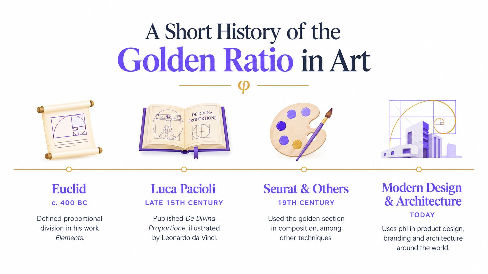
The history begins with Euclid's work on proportional division around 400 BC. The basic idea is that a line can be divided so the relationship between the whole and the larger part matches the relationship between the larger and smaller parts. You don't need to memorise a complicated proof to use the idea in art. You need to recognise that the ratio began as a question about relationships between lengths.
The concept then travelled through mathematical and philosophical writing. Luca Pacioli's late-15th- and early-16th-century writings helped carry the proportion from classical mathematics into Renaissance artistic theory. Pacioli's work is important in a contextual studies paragraph because it shows that artists and thinkers discussed proportion through texts, workshops, geometry, and ideas about harmony. BBC Bitesize's historical guidance provides a useful route into this wider history.
From Euclid to Renaissance practice
The journey from Euclid to Renaissance art covers roughly 2,400 years, but it shouldn't be presented as a straight line in which every artist obeyed one formula. Ideas change as people reuse them. A mathematical relationship can become a philosophical symbol, a teaching example, or a practical method for organising a picture.
Leonardo da Vinci's The Annunciation, dated 1472, gives students a specific artwork to study. In UK GCSE and National 5 teaching, the work is used to show how proportional relationships can be discussed within a composition. That is much stronger coursework practice than writing that “the Greeks invented beauty” or that “Leonardo used the golden ratio everywhere”.
How to write the history in your coursework
Use the timeline as context, then connect it to what you can see. For example, you might write that the golden ratio developed from classical discussions of proportional division, was revisited in Renaissance theory, and is taught through The Annunciation as a relationship between measurements in a specific image.
Avoid claiming that the existence of the ratio proves Leonardo consciously constructed every part of the painting with it. Historical context tells you what ideas were available. It doesn't automatically prove an artist's intention. That distinction will make your writing more precise and will stop your contextual study from becoming a list of impressive-sounding names.
Understanding Phi and the Golden Rectangle
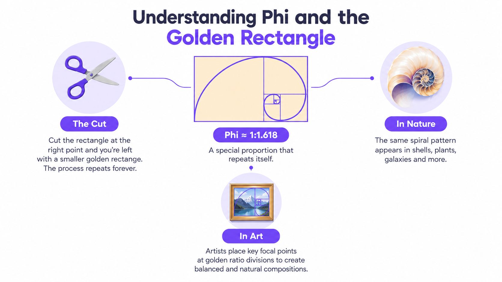
The golden ratio is often represented by the Greek letter phi, written as φ. For practical art work, you can treat it as a proportion of approximately 1:1.618, as shown in this practical explanation of the golden ratio for design. The important feature is the relationship between the parts, not the decimal itself.
Start with a rectangle. If its longer side relates to its shorter side in the golden proportion, you can remove a square from one end and the remaining rectangle keeps the same general proportion. Remove another square and the pattern repeats. It is a little like a set of Russian dolls, with a smaller version of the same relationship inside the larger one.
From rectangle to spiral
Draw quarter-circle curves through the nested square areas and you'll create the familiar golden spiral. In art and design, people use this spiral as a guide for the movement of the eye. The tight end can suggest a focal point, while the wider curve leads the viewer through surrounding shapes, gestures, marks, or text.
This doesn't mean the viewer's eye will follow the line mechanically. A dark value, sharp edge, human face, or strong colour contrast can interrupt the suggested movement. The spiral helps you test a route through the composition. It doesn't replace observation.
The same principle works without drawing a visible spiral. Mark a division along the width or height of your picture plane, then consider placing a focal feature near that division. In a horizontal composition, it might be the edge of a building against the sky. In a portrait, it might be the eye line or a hand. In a poster, it might be the relationship between the image block and the headline.
Golden ratio and rule of thirds
The rule of thirds divides a picture plane into a simpler grid. The golden ratio creates divisions that are closer to the centre in a particular proportional relationship. Neither system is automatically superior.
Use the rule of thirds when you want a quick, flexible starting point. Try the golden ratio when you want to investigate a more specific relationship between areas of different size. You can compare both versions and decide which supports the subject, mood, and visual hierarchy.
For ideas about how proportion can work across different visual subjects, you could also study music and football wall art styles, where geometry, repetition, and subject matter meet in a designed composition. If you need to strengthen your wider vocabulary, what form means in art will help you connect proportion to volume, structure, and the way an object occupies space.
Remember: The golden ratio is a relationship between parts, not a magic grid.
Applying the Golden Ratio in Sketches and Digital Work
You can test the idea tonight with ordinary drawing equipment. The aim isn't to produce a perfect mathematical diagram. The aim is to observe how a proportional guide changes your decisions.
A sketchbook method
-
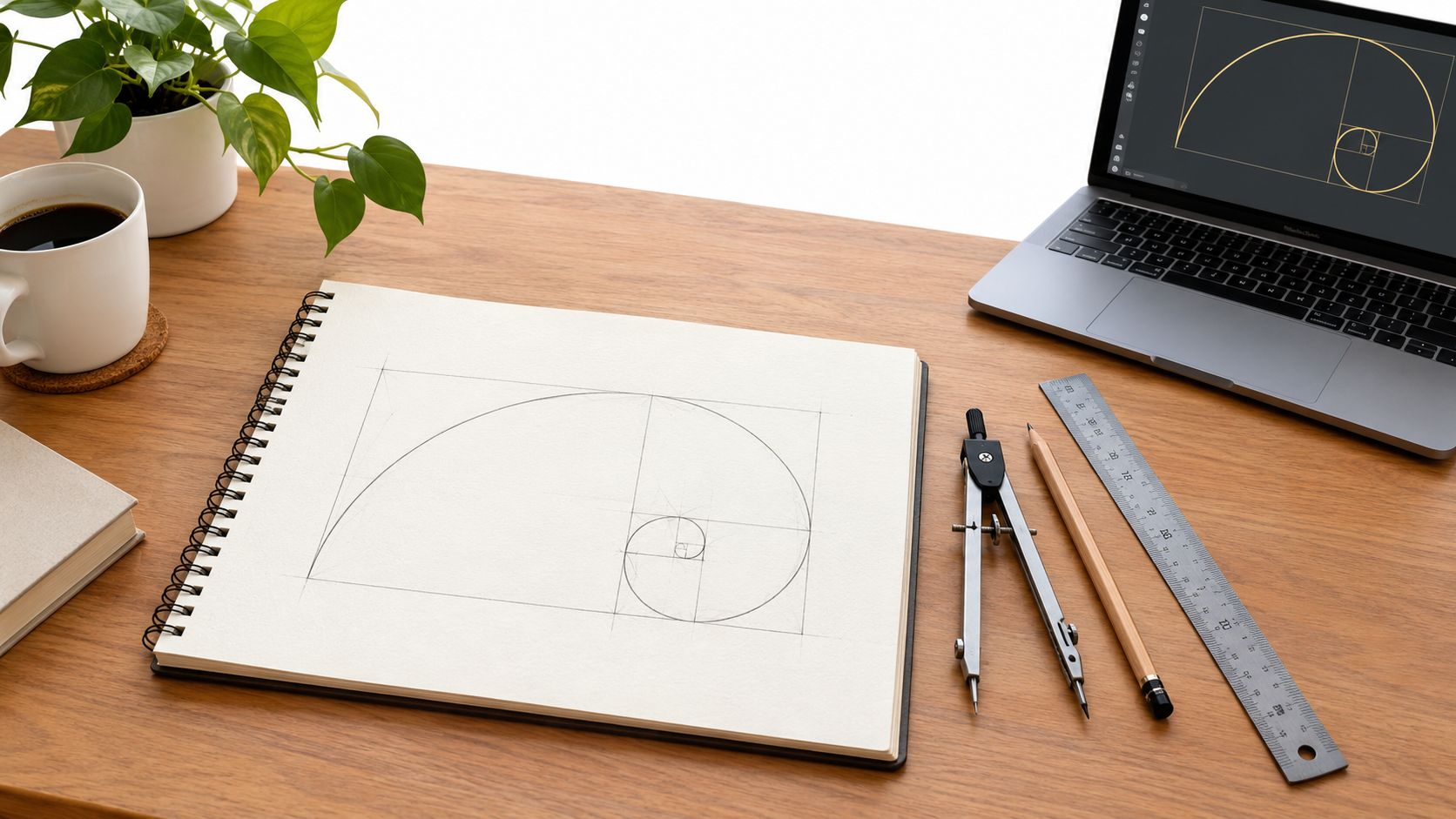
Choose a picture plane. Draw a rectangle on a page and decide what it will contain. A still life, a cropped portrait, or a small interior study will give you something concrete to place.
-
Construct a guide. Use a ruler to mark a longer and shorter side in an approximate 1:1.618 relationship. If you want a more formal construction, use a compass and ruler to divide a square and extend the relevant proportion. You can work approximately for an exploratory page, as long as you label it as an approximation.
-
Add the nested squares. Remove a square from one end of the rectangle, then repeat the process inside the remaining area. Draw light lines so the construction remains visible but doesn't overpower your artwork.
-
Trace the curve. Draw a loose quarter-circle through the nested squares. Don't worry if the curve isn't mechanically exact. You're identifying a direction and a focal zone.
-
Place a subject. Put the most important feature near the tight end of the curve. For a still life, this could be the rim of a vessel or the brightest object. For a portrait, it might be one eye, the mouth, or a hand.
-
Make a second version. Redraw the same subject without the guide. Compare the two pages. Look at balance, eye movement, empty space, and emphasis rather than asking which one is mathematically correct.
A digital workflow
In digital work, create the guide on a separate layer. Use a rectangle, line, or spiral overlay in software such as Adobe Photoshop, Affinity Photo, Procreate, or Canva, then reduce the layer opacity so you can see the artwork beneath it. If your software has a custom grid or guide function, enter proportional divisions based on approximately 1:1.618 rather than treating the overlay as a permanent part of the final image.
Use the guide for three practical decisions:
- Cropping: Test whether moving the crop places the face, object, or horizon near a stronger proportional division.
- Layout: Position a headline, image, or logo so the visual weight is shared between larger and smaller areas.
- Sequencing: In a portfolio page, let one dominant image lead towards supporting sketches and annotations.
You can find useful background on cinematic framing techniques explained when you want to compare the golden spiral with framing choices used in photography and moving image. Keep a version with the guide and a clean version without it. The comparison is evidence of experimentation, not a failure to commit.
Studio habit: Keep the construction lines in your process record, then remove them from the final artwork unless the visible geometry is part of your intention.
Annotated Case Studies of Famous Artworks
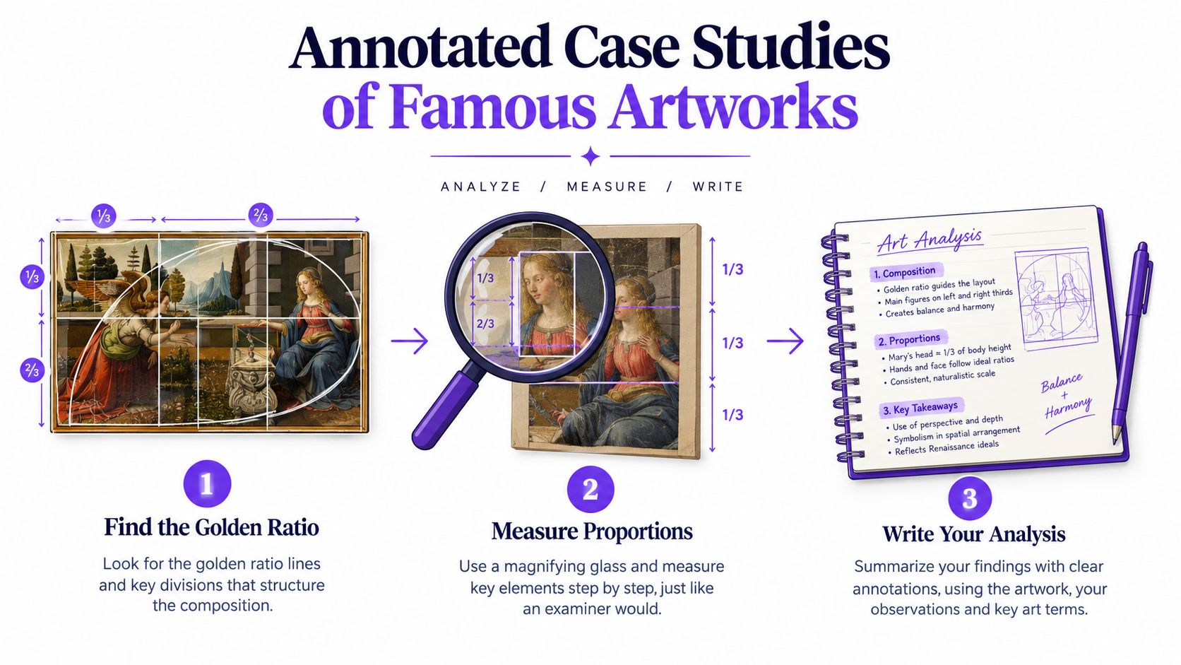
A convincing case study does not begin by declaring that an artwork uses the golden ratio. Begin with the image, a ruler, transparent paper or a digital overlay. Treat the proportion as a question you can test, not a magic formula you must prove.
Leonardo's The Annunciation
Use The Annunciation, dated 1472, as a practical exercise. BBC Bitesize's example shows how the golden ratio may describe relationships between measurements, including a stonework corner and the edges of the frame.
Print the reproduction or open it in an image editor. Place transparent paper over the print, or create a separate overlay layer digitally. Mark the full frame before adding any diagonal, spiral, or proportional division. Then measure from the frame edge to the stonework corner and compare that distance with the larger remaining section. Record the result, including whether it is only an approximate match.
Do not move the guide until it touches a convenient feature. That would turn the test into confirmation. Mark the position you selected first, then explain why it matters visually. Does the corner divide the space? Does it direct the eye towards a figure or architectural feature? Does a different division produce a stronger reading?
A useful annotation might say: “The stonework corner can be read as a proportional division in relation to the frame. This supports a discussion of compositional organisation, but the measurement alone does not prove Leonardo's intention.” Observation and interpretation remain separate.
How to test a second artwork
Apply the same method to another painting rather than copying an attractive internet diagram. Write down its title and date, identify the canvas edges, mark the proposed divisions, and list the features that align. Repeat the measurement with a slightly different crop or reproduction size. If the result changes easily, say so.
A line can be adjusted to meet a face, horizon, hand, or architectural edge. A neat overlay demonstrates a possible reading, not a documented construction method. Your annotation becomes stronger when it records both the match and the uncertainty.
What an examiner can learn from the page
Show one overlay using the proposed ratio, a second using another division, and a short note describing the visual effect of each. One version may give the figure more breathing space; another may create stronger directional movement. This comparison shows compositional thinking rather than faith in a formula.
For related drawing practice, human proportions for drawing helps distinguish measured relationships within a figure from larger relationships across the picture plane. In both exercises, measure carefully, name what you can see, and present interpretation as interpretation.
Golden Ratio Myths and What the Evidence Says
The most important challenge to the golden-ratio myth comes from the history of aesthetic preference. A University of Edinburgh-associated review reports that the original 1860s Fechner experiment found 76% of participants preferred one of the middle rectangles over the exact golden rectangle. The source also says that later studies failed to show much evidence of a clear preference for golden-ratio rectangles. The evidence review from Edinburgh Science is a useful reference when you want to write critically about the subject.
That doesn't make the proportion useless. It means you shouldn't claim that people universally prefer it because it is mathematically golden. Taste depends on context, culture, subject matter, scale, surrounding shapes, and the viewer's expectations. A rectangle can look appropriate because it suits a page, object, image, or building, not because it has a special power over every observer.
The Parthenon problem
The Parthenon is often used as proof that ancient architecture followed the golden ratio. The evidence is less secure than that popular story suggests. The UK scholarship discussed in the Edinburgh review states that the ratio was absent from the classical fifth-century architecture in the sample considered and appeared only rarely in third- and second-century BCE architecture.
For coursework, write “the Parthenon is often interpreted through the golden ratio, but that attribution is contested” rather than presenting the claim as settled history. This wording gives you room to discuss visual analysis without pretending that a later measurement proves the original architect's intention.
The canvas evidence
A statistical study of 565 works found an average canvas ratio of 1.34, rather than golden-ratio proportions, as reported in the same review. That result challenges the idea that major painters systematically selected golden rectangles for their canvases.
The balanced conclusion is strong and useful: the golden ratio works as a descriptive design language, but its universal aesthetic power and many historical attributions are overstated. Use it to generate a composition, compare alternatives, and describe relationships. Don't use it as a shortcut for proving that an artwork is harmonious or that an artist consciously followed phi.
Student Questions Answered and Your Next Steps
Did famous artists really use the ratio, or is it a myth?
Some artists and educators have discussed proportional systems, and The Annunciation is a legitimate teaching example. However, many claims about famous artworks were inferred later rather than confirmed through documentation. Say what your overlay demonstrates, then label intention as uncertain unless you have reliable evidence.
How can I use it without making my portfolio look gimmicky?
Show the decision-making, not just the spiral. Include a first composition, a proportional overlay, a version without the guide, and a short reflection on what changed. A portfolio page looks thoughtful when the ratio supports a clear visual question, such as whether a crop gives a portrait more balance or whether a poster's text hierarchy improves.
What do university routes expect?
Requirements vary. One UK foundation route asks for a good portfolio, normally one A level or equivalent in an art and design subject at grade C or above, and five GCSEs at grades 9-4, including English Language or Literature at grade 4 or above, as stated by De Montfort University's foundation diploma guidance.
Portfolio instructions can be specific. Manchester Metropolitan University's foundation guidance asks for a digital portfolio of 15 to 20 images or slides, while another published requirement specifies a maximum of 25 pages and asks for observational drawings, work in progress, and contextual references. Degree entry can range from 48 to 144 UCAS points, depending on the course, with published guidance including a minimum of 88 points at the lower end and around 120 points for an average course, according to Whatuni's art and design entry guidance.
This week, choose one sketchbook page, construct a proportional guide, test the composition with and without it, and annotate the result accurately. That single page can show practical drawing, visual analysis, critical judgement, and the confidence to question a popular claim.
The Online College of Art & Design (OCAD) offers flexible, tutor-led courses in art and design, including Level 2, A Level, and Level 3 foundation pathways with portfolio development and feedback. If you want structured support while developing proportional studies and university-ready work, visit The Online College of Art & Design (OCAD) to explore the available courses.