

You're a Level 3 art student, and you've layered the same pencils on two sheets. On the thin sheet, the colour looks streaky and the surface starts to scuff when you erase. On the heavily toothed sheet, the pigment grips immediately, but tiny details take longer and the first layers look grainy. Neither result means your pencils are wrong. You're asking different surfaces to do the same job.
Paper weight affects how substantial a sheet feels, tooth determines how pigment catches, and surface finish changes the marks you can make. A heavier sheet isn't automatically better for layering, and a smooth sheet isn't automatically better for realistic drawing. Erasing, burnishing and handling all need testing before you commit to a final piece.
The best paper for coloured pencils is the one that supports your working method and your intended finish. These seven choices suit different coursework and portfolio demands. If you're also comparing presentation materials, the art paper options from Striped Circle provide useful context, but test drawing performance separately from print appearance.
Table of Contents
- 1. Clairefontaine Pastelmat
- 2. Strathmore 400 Series Coloured Pencil Paper
- 3. Fabriano Accademia
- 4. Hahnemühle Nostalgie
- 5. Fabriano 1264 Bristol
- 6. Canson Mi-Teintes
- 7. Clairefontaine PaintOn
- How the Seven Coloured Pencil Papers Compare on Weight, Surface, Best Use and UK Price
- Turning Your Paper Choice into Stronger Portfolio Work
1. Clairefontaine Pastelmat
Choose Pastelmat for richly layered colour, not for the cheapest practice sheets. Its coated, velvety surface grips pigment firmly, making it useful for animal portraits, dense foliage and drawings where you need to develop colour gradually.
Clairefontaine's Pastelmat has a 360gsm surface and comes in coloured sheets, pads and boards. A coloured ground can remain visible around a subject or contribute to the colour beneath your pencil layers.
Where the extra grip helps
You can build colour with light pressure rather than trying to force a dark passage into place immediately. Keep your pencils sharp for edges, then use broader strokes for larger colour passages.
The trade-off is consumption. Specialist textured surfaces can wear pencil cores faster than smoother papers, a practical consideration discussed in Pencil Topics' specialist-surface guidance. Don't mistake a grainy early layer for failure and immediately press harder.
- Layering: Strong pigment grip suits sustained colour development.
- Erasing: Lift pigment gently with a kneaded eraser rather than scrubbing the coating.
- Burnishing: Build your colour first, then test pressure on a spare margin before compressing the surface.
Buying advice: Pay for Pastelmat when your drawing needs its layering capacity, not simply because it sounds more professional.
Single-sheet test: Draw a dark-to-light gradient, lift a highlight with a kneaded eraser, then burnish only part of it. Check whether you prefer the compressed finish or the softer, unburnished texture.
2. Strathmore 400 Series Coloured Pencil Paper
If you're buying your first dedicated coloured-pencil pad, Strathmore is the straightforward starting point. You don't have to adapt to a strongly abrasive coating or plan your whole drawing around a coloured background.
The Strathmore 400 Series Coloured Pencil Paper uses 163gsm white paper with a medium-textured vellum surface. Vellum here describes the drawing finish, not animal-skin parchment.
Its tooth makes more sense for gradual colour building than an extremely slick sheet. Our coloured-pencil technique guidance explains why lightly textured paper gives successive applications more grip, while smooth surfaces favour crisp marks but offer less room for heavy layering.
A balanced coursework surface
This is a useful choice for botanical studies, observational drawing and projects where you'll revise contours as you work. The surface is designed for layering and reworking, but that doesn't make repeated abrasive erasing harmless.
Keep a board beneath the sheet and use a light initial outline. Its lighter construction is less substantial than heavyweight alternatives, especially when you're pressing hard or carrying loose work between study sessions.
Burnishing belongs near the end. Flattening the tooth early reduces your room to adjust hue and value, even on purpose-made coloured-pencil paper.
Single-sheet test: Layer a curved object using pale, middle and dark colours. Erase a misplaced edge, redraw it, then burnish the shadow transition and check whether the corrected area accepts colour evenly.
3. Fabriano Accademia
Accademia makes sense when your coursework moves between coloured pencil, graphite, charcoal and ink. Buying a versatile drawing paper leaves you free to investigate a subject without changing pads every time you change medium.
Fabriano Accademia is available in 120gsm, 160gsm and 200gsm versions, with acid-free, lignin-free cellulose construction. Choose the sturdier versions for sustained pencil work; the lightest option is better reserved for exploratory drawing than forceful burnishing.
The important distinction is between useful everyday paper and specialist layering paper. Accademia suits studies, colour planning and resolved drawings with controlled application, but it isn't the substitute for Pastelmat when extensive pigment build-up is central to your method.
- What works: Large drawing-paper packs suit repeated studies and comparisons across dry media.
- What needs restraint: Heavy pressure on a lighter sheet can leave dents that affect later colour.
- What to avoid: Buying a large pack before checking whether you like its grain with your own pencils.
Particularly useful for portrait development
For skin studies, reserve the lightest areas and develop transitions gently instead of trying to erase back to clean paper after burnishing. Pair your tests with our guide to drawing skin colour with coloured pencils, keeping the same paper throughout each comparison.
For assessed work, retain an unsuccessful passage and explain what you changed. A specific material decision is more useful than an unsupported claim that another paper was better.
Single-sheet test: Draw a cheek-like gradient, erase a small highlight before burnishing, then repeat the correction after burnishing. Compare colour pickup and surface condition.
4. Hahnemühle Nostalgie
Small eyes, fine stems and carefully observed edges need a surface that doesn't interrupt every stroke. Nostalgie's fine grain makes it a useful detail-first choice, particularly if you also want a sketchbook for developing ideas.
Hahnemühle Nostalgie is a 190gsm, natural-white, acid-free and age-resistant paper, available in loose sheets, pads and hardback sketchbooks. Choose the format according to how you'll submit and photograph your work, rather than buying the most attractive binding.
Its restrained grain offers a compromise between pigment adherence and precise marks. It's less suited to a method that depends on continually adding thick colour over an already dense passage.
Plan the drawing before polishing it
Use a sharp pencil and light pressure to establish shapes, then develop colour gradually. If you're switching from Pastelmat, expect to make more deliberate decisions about which layers are necessary.
A fine-grained sheet suits economical mark-making. Don't keep adding colour just because another surface allowed it.
Erasing works best while the drawing is still lightly applied. Lift unwanted pigment, brush away debris and check the surface before drawing again; scrubbing a correction can create a patch that behaves differently.
For portfolio development, a bound sketchbook can keep material tests beside composition studies and annotations. Loose sheets are more convenient when you need to mount a resolved drawing.
Single-sheet test: Draw a small eye or leaf with a fine outline, layered mid-tones and a burnished dark. Lift an adjacent mark and check whether the surface still produces a clean edge.
5. Fabriano 1264 Bristol
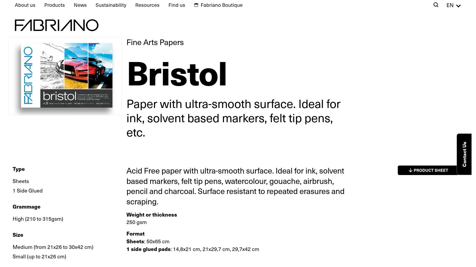
Choose Bristol for precise outlines and small details, where paper grain could disrupt a clean edge. Its smooth surface suits controlled illustration better than drawings that depend on many layers of pencil.
Fabriano's Bristol paper includes a 250gsm, extra-smooth, acid-free alpha-cellulose version described as resistant to repeated erasing. Check the product listing before ordering, since formats and weights vary by stockist.
The smooth finish gives you clear, crisp marks, but offers less tooth for holding successive layers of pigment. Paper surfaces range from smooth to lightly textured; textured sheets generally give coloured-pencil pigment more grip. On Bristol, keep early layers light and build colour deliberately. Repeated pressure can compress the surface and limit later adjustments.
Work lightly and reserve your highlights
Plan the value range before polishing a passage. Test colour mixtures on a separate area, then keep highlights clear rather than trying to recover them after heavy application.
- Best use: Fine linework, graphic illustration and carefully controlled detail.
- Main limitation: Less room for extensive layering than on toothier paper.
- Erasing caution: Resistance to repeated erasing does not mean impressed marks will disappear.
- Burnishing caution: A smooth, glossy passage can be difficult to adjust or layer over.
For Level 2 and Level 3 portfolio coursework, use Bristol when its crisp finish supports the visual decisions your work needs to show. A polished surface can help clarify detail, but it will not suit every layered approach.
Single-sheet test: Draw fine parallel lines beside a layered colour patch. Erase across one line, burnish half the patch, then add another colour layer to both halves. Check which marks stay crisp and whether either area still takes pigment.
6. Canson Mi-Teintes
A brown or grey background can remove the need to cover an entire white sheet. Mi-Teintes is the choice when the paper colour is part of the composition, especially for portraits, animal studies and exercises in light and dark.
Canson Mi-Teintes offers coloured grounds and different textures on opposite sides. Decide which side you'll use before transferring your drawing, because the more pronounced texture produces a noticeably different mark from the smoother reverse.
The textured side can remain visible through your pencil work. That's useful when you want an expressive surface, but frustrating when you want smooth, even skin or miniature detail.
Let the ground do some work
Start with a mid-tone that leaves room for both your highlights and shadows. Test the actual white pencil you intend to use rather than assuming it will completely cover a dark ground.
Tonal shortcut: Leave selected areas of the paper untouched instead of covering them and trying to recreate the same colour with pencil.
Erasing needs particular care because an overworked patch may stand out against the surrounding ground. Burnishing can also change the surface sheen, so test it under the lighting you'll use for portfolio photographs.
Individual sheets are useful here: you can compare background colours without committing to an assorted pad containing tones you won't use.
Single-sheet test: Make matching light-to-dark studies on the front and reverse. Lift a highlight from each, burnish a small area, then photograph both to see how strongly the texture appears.
7. Clairefontaine PaintOn
PaintOn is the practical mixed-media choice when your project combines coloured-pencil drawing with other techniques. Its appeal is a substantial working sheet, not a claim that every variant behaves like dedicated coloured-pencil paper.
Clairefontaine PaintOn includes 250gsm, acid-free, 100% cellulose paper, with white, natural, grey and other coloured options. Check the particular surface before ordering, because different PaintOn types don't all offer the same texture.
For dry coloured pencil, choose according to the marks you need. A smoother variant suits controlled contours; a more textured option gives pigment more purchase but makes even coverage slower.
Useful for mixed projects, with testing
The sturdy construction is helpful when you're handling, revising and presenting coursework. It doesn't prove that the surface will tolerate unlimited erasing or every wet medium.
If your project includes water-soluble pencils, our watercolour-pencil art guidance can help you plan the technique. Test water application on the exact PaintOn variant, let the sheet dry fully, then assess whether dry pencil still adheres as you want.
- Layering: Judge the actual surface, not the weight printed on the pad.
- Erasing: Lift lightly applied colour before trying stronger corrections.
- Burnishing: Save a separate swatch for pressure tests, particularly over dried mixed-media passages.
For a pencil-only final drawing, Strathmore is the more direct starting point. PaintOn earns its place when the broader project needs versatility.
Single-sheet test: Compare dry pencil on untouched paper with dry pencil over a fully dried wash. Erase and burnish a small passage in each, checking for roughening and uneven colour pickup.
How the Seven Coloured Pencil Papers Compare on Weight, Surface, Best Use and UK Price
| Paper | Weight | Surface | Best for |
|---|---|---|---|
| Clairefontaine Pastelmat | 360gsm | Coated, velvety surface with strong pigment grip | Rich layering and detail; the texture holds colour well but may resist crisp, smooth burnishing |
| Strathmore 400 Series Coloured Pencil Paper | 163gsm | White, medium-textured vellum | Layering, erasing and reworking; the tooth helps build colour, though heavy pressure can flatten it |
| Fabriano Accademia | 120gsm, 160gsm or 200gsm | Versatile drawing-paper surface | Practice, coursework and dry media; lighter sheets are easier to mark through with repeated erasing |
| Hahnemühle Nostalgie | 190gsm | Natural white with subtle fine grain | Everyday drawing, detail and portfolio work; the fine grain balances controlled marks with moderate layering |
| Fabriano 1264 Bristol | 250gsm | Extra-smooth | Fine lines and clean-edged illustration; smoothness favours precise marks but gives layers less tooth to grip |
| Canson Mi-Teintes | Weight varies by format | Coloured paper with a textured side and a smoother side | Toned-ground work and textured effects; the textured side takes more layers, while the smoother side supports finer marks |
| Clairefontaine PaintOn | 250gsm | Multi-technique surface; texture varies by type | Coloured-pencil and mixed-media work; surface differences affect pigment grip, erasing and burnishing |
Use the table to narrow your options, then judge the exact sheet by how it handles your pencils. A paper that takes many layers may make delicate corrections harder; a smooth sheet gives cleaner outlines but can run out of tooth sooner. For assessed Level 2 and Level 3 coursework, choose a surface that lets you control marks and present the work clearly.
Turning Your Paper Choice into Stronger Portfolio Work
Buy a single sheet or a small pad of your strongest candidates before buying in bulk. Use identical colours to compare layering, erasing and burnishing, then keep the samples with your sketchbook notes. Record the surface, pencil range, pressure and the point at which further colour stopped improving the result.
Paper choice doesn't guarantee a coursework grade. Its value lies in helping you control your materials and explain your decisions against the assignment criteria. Students building assessed portfolios through our tutor-led Level 2 and Level 3 courses can bring these test sheets to feedback sessions and connect material choices to the evidence they submit.
Does expensive paper make a portfolio university-ready?
No. Select paper that supports the project, then show investigation, development and purposeful decisions. UCAS's art-and-design application guidance advises applicants to connect their written application with portfolio work, explaining their approach and relevant influences.
Does a Level 2 qualification carry UCAS Tariff points?
Level 2 qualifications don't receive UCAS Tariff points, while eligible Level 3 qualifications can, as explained in the UCAS Tariff guidance. Check the university course's requirements for your exact qualification rather than assuming a portfolio or points total guarantees admission.
Can disabled students request university adjustments?
Yes. UCAS's disabled-student guidance explains the right to reasonable adjustments under the Equality Act and says applicants can disclose a condition without a diagnosis. Contact the university's disability adviser early to discuss support and any evidence needed.
How should finished drawings be stored?
Keep them protected from direct sunlight, unnecessary handling and unstable storage conditions. The Ashmolean's conservation guidance identifies light, display, storage, handling and environment as preservation concerns; good paper alone won't prevent damage.
Your next purchase should follow the test results. Choose the sheet that produces the finish you need, preserve the comparison, and explain why it belongs in your project.
We offer flexible, tutor-led online creative courses at The Online College of Art & Design (OCAD), including Level 2 and Level 3 pathways with portfolio development and feedback. Visit The Online College of Art & Design (OCAD) to explore a suitable course and develop your paper experiments into purposeful coursework and portfolio evidence.