

A mood board is a curated visual planning document that combines images, colours, typography, textures, materials and short text to show the atmosphere and direction of a project before it is made. It's a working tool rather than a finished piece, used by people across a sector that employed 2.4 million people in 2024, around 7.1% of the UK workforce.
If that's all a mood board is, why do so many Level 2 and Level 3 portfolios lose marks for boards that look polished but explain nothing?
The scale of the field makes the question worth taking seriously. Government analysis of the creative industries puts their contribution at more than £146 billion, about 5.5% of UK GVA, and counts 1.97 million people working in the design industry with a further 2.5 million using design skills in other roles. Every one of those people has to persuade someone else that a direction is right, and the board is usually where that argument starts.
Table of Contents
- What a Mood Board Is and Why Designers Use One
- The Parts Every Mood Board Needs
- Choosing Between Physical and Digital Boards
- Sourcing Images Safely with Copyright, Licensing and AI
- How to Build a Mood Board Step by Step
- Using a Mood Board in Coursework and Portfolios
- Mood Board Examples Across Creative Disciplines
- Start Your First Board This Week
What a Mood Board Is and Why Designers Use One
A shopping list isn't a meal. It's the plan that decides what ends up on the plate, and it lets you argue about dinner in the shop rather than in the kitchen. A mood board does that job for a design: it settles the direction while changing course is still cheap.
The method is older than the name. Designers have always gathered reference before producing a garment, a room, a graphic identity, a photograph or a moving-image concept. What's changed is that the gathering now happens on pinboards, in slide decks and inside shared files, and that it gets submitted, assessed and reviewed by people who weren't there when you collected it.
What the board is for. Four jobs, none of them decoration. It defines the visual brief. It lets you compare two directions side by side. It explains your intentions to a tutor or a client. And it keeps later decisions consistent, because every sketch and test can be checked against something visible.
The University of Huddersfield's study of the mood-board process goes further, modelling board development as a three-stage creative process in which each stage opens up deeper engagement, exploration and problem solving. The researchers analysed 13 individuals using observation and think-aloud methods and concluded that boards are qualitative design-research instruments rather than decorative collages, because they externalise tacit preferences and make an emerging concept discussable.
So is a mood board just a folder of saved images?
No, and the difference is what you can defend out loud. Left unedited, a folder shows what you looked at. A board shows what you chose and why, which is precisely what a tutor, an admissions reader or a client is judging. Treat it as a decision-control document: collect widely, cluster the recurring visual attributes, then remove everything that doesn't serve the brief.
That distinction, between looked at and chosen, is what separates a board that earns marks from a board that fills a page.
The Parts Every Mood Board Needs
A board works through its parts, not its pictures. Each component answers a question the viewer would otherwise have to guess at, and a missing part leaves that question hanging in the air.
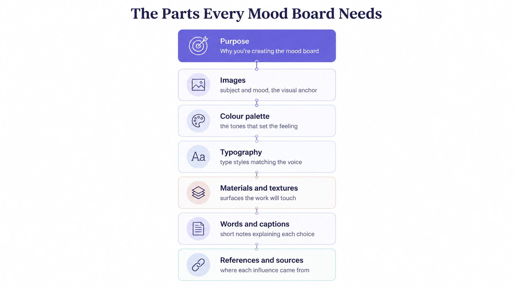
Six components carry the load, and they're worth building in this order:
| Component | What it communicates | Example |
|---|---|---|
| Images | Subject, setting and mood | Photograph of a limewashed wall in soft daylight |
| Colour palette | Relationships between colours and their mood | Five swatches with names and hex values |
| Typography | Tone of any text, headings or signage | Serif headline with a sans-serif body sample |
| Materials and textures | How surfaces should feel and look | Oak veneer sample, linen swatch, matt ceramic tile |
| Keywords | Emotional and functional direction in few words | Calm, natural, lived-in |
| Annotations | Why each item was chosen and what it changes | Caption explaining the wall finish sets the tone |
What goes missing when a part is left out
A palette without material samples tells you the colours but not how the surfaces will feel under light, so a scheme can look right on screen and cold in the room. Typography without a stated tone gives you a font but no voice. Keywords without images are a wish list, and images without keywords are somebody else's holiday photos.
Annotations are the part students skip and the part assessors look for. Birmingham City University's art portfolio requirements ask applicants to show initial ideas and detailed annotations explaining what they intended, what worked and what did not. That's exactly the register a good caption uses, one line at a time.
Say you're building a board for a living room. You pin a photograph of a limewashed wall in soft daylight, add a sage swatch beside it, pair a serif headline with a sans-serif body sample, tape down a square of oak veneer, and write three keywords: calm, natural, lived-in. One caption ties it together, stating that the wall finish sets the tone and the oak keeps it from feeling cold. Six parts, one direction.
Practical rule: if you can't write a one-line caption explaining why an item is there, take it off the board.
Then test it on someone. Give them thirty seconds, take the board away, and ask them to name the audience, the emotion and two materials. If all three come back correctly, the board is doing its job.
Choosing Between Physical and Digital Boards
Three formats cover almost every situation, and the right one depends on who has to read the board and what they need to judge.
| Format | Best for | Main strength | Main limit |
|---|---|---|---|
| Physical board | Studio critique, fashion and interior samples | Real scale, texture and colour | Hard to submit and share |
| Digital board | Online submission, remote tutors, editing | Easy to share, edit and caption | Can flatten texture and colour |
| Hybrid board | Projects with tactile materials and online submission | Physical samples with digital labels | Takes more time to assemble |
Three questions that settle it
- Must it be submitted online? If the board has to travel through an upload portal or reach a tutor in another time zone, digital wins by default.
- Does tactile material matter to the brief? For textiles, interiors, fashion and product work, a photograph of a linen swatch loses the weight and the weave. Build it physically, then photograph it well.
- Will anyone critique it in the room with you? Physical boards survive a critique better, because people can point, move items and pin a new sample over a weak one mid-conversation.
Digital boards cost nothing to revise and carry alt text, captions and a source log in the same file, which matters when a tutor is reading on a phone. Physical boards lose all of that unless you photograph and label the arrangement afterwards. The hybrid exists for exactly this reason: build with real materials, then rebuild the page digitally with your own photographs, written captions and each sample named.
The board that travels gets assessed; the board that stays on your bedroom wall gets admired.
Choose digital when the board must travel, physical when the material must be judged in person, and hybrid when both apply. Most Level 3 portfolios end up in the third category. If you're comparing digital tools for building one, this Acres versus Milanote comparison sets the two side by side on layout control, collaboration and export, which are the three things that decide whether a board survives submission.
Sourcing Images Safely with Copyright, Licensing and AI
Every image on your board falls into one of three categories: a reference you only use for private research, an image you can legally reproduce, and an image that needs permission before it appears in a submission, a client pack or a public portfolio. The same board can be assessed by a tutor, shown to a client, published online and used to guide commercial production, so the rights position has to hold for each use, not just the first one.
Keep a source log you can copy into any submission:
- Image name or file. Something you'll recognise when you revisit the board in three months.
- Where it came from. The website, book, shop or photographer, with a date.
- Licence or permission status. Your own photograph, public domain, licensed with attribution, or private research only.
- Where it appears on the board. Which cluster it sits in, so a reader can trace it.
Is a screenshot allowed on a mood board?
A screenshot is still a copy of somebody else's work, so it counts as private research unless you've confirmed permission. Safer routes are the boring ones: photograph your own materials, locations and textures, use public-domain or openly licensed images with the attribution they require, or replace a copyrighted reference with a sketch or a written description of its qualities. A sentence saying "soft, chalky finish, low sheen, warm grey" often communicates more than the picture did. The wider rules are set out in what art students should know about copyright.
AI-generated images need the same discipline: record the tool, the prompt and the date, and check whether your course allows AI output to be shown as research. If you use affordable AI research for students to explore a direction, keep that prompt log on the board itself. A board with a complete source log is easier to defend in critique and in any application.
How to Build a Mood Board Step by Step
The diagram below compresses the method into six moves; the eight steps that follow are the full sequence, with the slip that catches most students at each one.
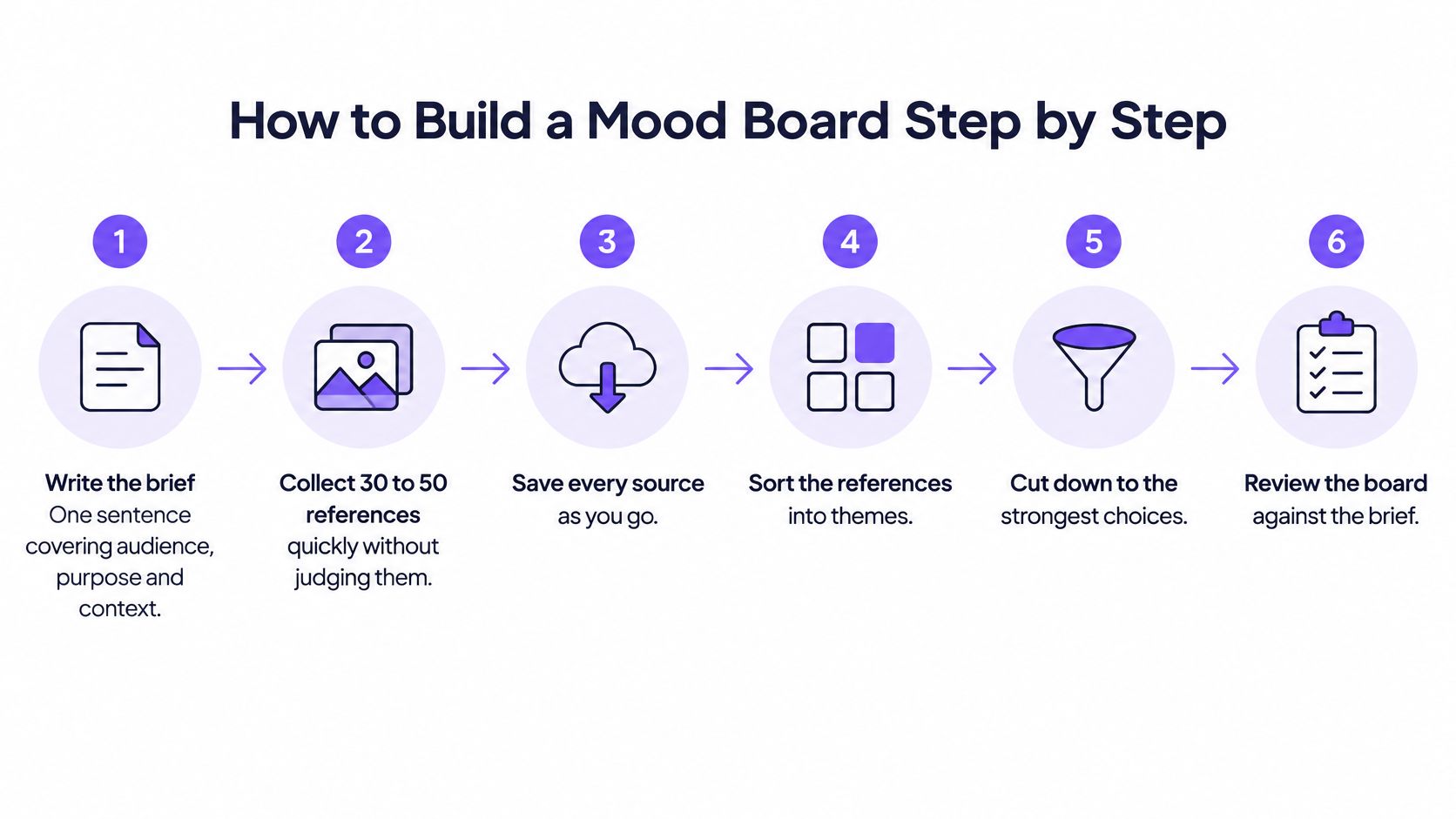
- Write the brief in one sentence. Cover the audience, the purpose and the context, because every later choice gets tested against it. Common slip: starting with images and inventing the brief afterwards, which produces a board with no argument.
- Collect 30 to 50 references quickly and without judging. Set a timer, save everything that feels aligned, and record the source of each image as you go. Common slip: saving without sources, then facing a submission you can't evidence.
- Group the references into three to five clusters by a shared quality such as colour, mood or form. This is the same move you make on an A Level art mind map, except the nodes are images rather than words.
- Cut down to 10 to 15 images, dropping any image you can't explain in one sentence. Common slip: keeping 40 images because each one is nice, which tells the reader nothing about direction.
- Add the palette, typography and material samples, recording each colour with a name and a value so someone else can reproduce it. Unnamed "sort of green" is not a decision.
- Write alt text and a one-line rationale for each cluster. UK Government Design System guidance says images should only be used where they meet a genuine user need, and that information conveyed visually must also be understandable to people who can't see it; its accessibility standards identify WCAG 2.2 Level AA as the required target. In practice that means concise alt text for every meaningful visual, readable contrast, and never relying on colour alone to carry a category.
- Lay out the board, add the keywords, and check it at small size. Zoom out to thumbnail scale: if the clusters stop reading, the layout is doing the work the annotations should be doing.
- Date the board, note what changed, and plan the next stage. A dated board with a revision note shows iteration; an undated one looks like it arrived fully formed.
The one-sentence test: if you can't explain an image in a single sentence, it hasn't earned its place.
Use your own photographs, licensed images or public-domain material wherever you can, and keep the source list in the same file as the board so the evidence trail never separates from the work.
Using a Mood Board in Coursework and Portfolios
A board earns its place in a portfolio when it does something no other page can do: it opens the project and shows the research that shaped every decision after it.
Loughborough University's Design and Creative Arts guidance recommends showing approximately three projects in detail, with each project explaining the opportunity or brief, contextual research, influences, iterative design process, experimentation, prototypes and final evaluation. It also asks for work at different stages of completion, which settles the board's position: it sits alongside sketches, tests, failed experiments and outcomes rather than replacing any of them.
How a caption turns a board into evidence
Take a textile project. The board carries a bark-like texture photograph and a sage palette of five swatches. The next page shows a dye test. The caption reads that the palette was kept because it reduced contrast in test three, and that the second dye batch was dropped because the fibre took the colour unevenly. In two sentences, a reader sees selection, testing, judgement and reflection.
That's the standard to aim for. A caption that only names an image adds nothing; a caption that records a decision makes the board assessable.
Universities don't share one rule, so check the course brief before you build. Goldsmiths' portfolio advice states that applicants may submit up to 12 portfolio items, accepts JPG or PDF for images and documents, MOV for video and MP3 for audio, and asks for process, experiments and early ideas. Those limits change how you prepare: a readable, compressed PDF page with labels beats a dense collage that technically fits.
A tutor reads the caption before the picture. Write for that order.
If your project is fashion-led, an AI fashion lookbook shows how a researched direction becomes a styled visual sequence, which is the natural next page after the board. Whatever the discipline, the board is one controlled component inside a larger argument about how a university portfolio is assessed, not a standalone artwork.
Mood Board Examples Across Creative Disciplines
The method stays the same; the references change. A board for fashion and a board for film both prove that you researched, selected and committed, but they prioritise different evidence.
| Discipline | Board focus | Typical references |
|---|---|---|
| Fashion | Silhouette, fabric handle and palette | Fabric swatches, runway stills, drape photographs |
| Interiors | Light, materials and spatial mood | Paint chips, furniture photographs, floor samples |
| Photography | Lighting, framing and location | Location photographs, lighting diagrams, graded stills |
| Graphic design | Type, grid and colour relationships | Typeface samples, poster layouts, print swatches |
| Fine art | Process, surface and subject | Paint swatches, artist studies, texture photographs |
| Film and animation | Mood, colour script and framing | Film stills, colour grades, storyboard thumbnails |
A photography board that knows what to leave out
Say you're preparing a series on a rainy harbour. The board collects six location photographs shot at different times of day, two hand-drawn lighting diagrams showing where the key light falls against the water, three colour-graded stills testing a cold blue against a warm sodium orange, and a note about the audience: people who live inland and rarely see working boats.
What you leave out matters as much. Finished images from the series don't belong here, because they repeat the work the portfolio's outcome pages already do. Neither do generic "moody sea" photographs pulled from a search engine, unless you can credit and justify them.
Does every discipline need a different board?
Yes, in emphasis rather than structure. Fine art boards lean on process and surface, so paint swatches and texture studies carry more weight than polished reference imagery. Graphic design boards are read for type and grid logic, so a typeface sample pair does more work than a photograph of a nice poster. Film and animation boards function as colour scripts, where the sequence of tones tells the story before a single frame is drawn.
In every case, selectivity is the skill. A handful of strong references with annotations that record decisions will always beat a crowded collage, because the reader can follow the reasoning.
Start Your First Board This Week
Pick a live brief from current coursework or a personal project and commit to one board this week. Split it into two sessions: one for collecting and clustering references, one for cutting, labelling and laying out. The second session is where the marks live.
Then take the finished board to a tutor or a peer with a single question: does this explain the decisions it records? That question tells you whether the research is working before you spend hours on development.
Next pages to plan: at least two sketches or tests that respond directly to one cluster, and a short evaluation noting which references changed your decisions and which you dropped.
Keep the board and its source list in one file so the trail stays complete for any later submission. Coursework at The Online College of Art & Design (OCAD) works the same way: students develop their own media portfolio for assessment with feedback and guidance from tutors, and upload photographs of completed work and assignments throughout the course to build that portfolio. Assignments are set and marked at OCAD, with constructive feedback at each stage.
Design work is a measurable part of the economy too. The design and designer-fashion subsector generated approximately £3.9 billion in gross value added, 3.1% of creative-industries GVA and 0.16% of total UK GVA, according to parliamentary analysis of the creative industries. Boards are how that work gets planned, argued for and approved.
At The Online College of Art & Design (OCAD), you build mood boards and the development pages that follow them inside a tutor-led course, with feedback on each stage rather than a single mark at the end. Whether you're working towards a Level 2 Certificate, an A Level or a Level 3 Foundation Diploma in fashion, textiles, fine art, interiors, graphics, photography or film and animation, the research and decision-making you document is what carries your portfolio. Visit The Online College of Art & Design (OCAD) to see the courses and start your first board.