

You've cleared a space at the table, opened your sketchbook and found an abstract painting you'd like to try. Then the practical questions arrive: which oil should you buy, can you work safely at home, and how will a university tutor understand what you've learnt from a board covered in colour?
Start with a small painting and a dated studio log, not a large canvas. Each material choice, scraped-out passage and drying check can become evidence of how you think, provided you record what you changed and why.
Table of Contents
- What Abstract Oil Paint Is and Why Learners Choose It
- Materials and Mediums to Choose First
- Safe Practice and Durable Surfaces
- How to Build Texture and Colour
- Composition Moves That Hold a Picture Together
- Project Ideas That Train the Eye
- Plan a University-Ready Painting Pathway
What Abstract Oil Paint Is and Why Learners Choose It
Say you're painting the view through a window. Instead of describing every roof and tree, you keep a pale rectangle, a dark mass and a narrow strip of warm colour. Keep a recognisable horizon and you're working semi-abstractly. Remove that cue and let colour, spacing and edges carry the picture, and you're moving towards full abstraction.
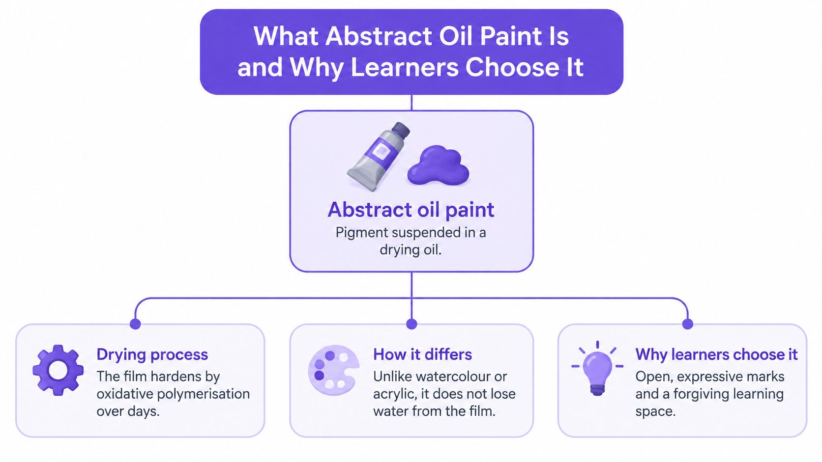
Abstract oil paint isn't a separate kind of paint. It's oil paint used to make abstract work: pigment suspended in a drying oil. Choose a manageable support and a limited palette before worrying about a personal style. A prepared board, a wide brush and a palette knife give you enough equipment to investigate relationships without filling your table with materials.
Oil paint gives you time to move an edge, lift a muddy mixture or scrape back to an earlier colour. That flexibility doesn't remove the need for drawing or observation. It lets you practise a different kind of judgement: deciding how much information a picture needs.
British artists have a substantial history of this experimentation. According to Tate's account of Vanessa Bell's Abstract Painting, Bell began the work in late August 1914, while Duncan Grant was also developing abstract work.
Start your evidence early: Record your intention before painting, then compare it with the result. A changed decision is useful evidence when you can explain it.
For a learner, the value lies in the sequence. A hesitant first arrangement, a stronger crop and a revised colour relationship can reveal more about your judgement than an isolated finished image.
Materials and Mediums to Choose First
Binders, thinners and supports for abstract oil paint
| Material | Role | Handling | Limit |
|---|---|---|---|
| Linseed oil | Traditional binder | Dries by oxidation; test dark mixes | Can darken and dry imperfectly |
| Stand oil | Heat-bodied binder | Smoother, more durable film | Viscosity encourages over-thick paint |
| Poppy or walnut oil | Paler historical binder | Note the brand on the log | Behaves differently from linseed |
| Mineral solvent | Thinning and brush cleaning | Smallest amount; lids on | Vapours accumulate in poor air |
| Water-mixable oil | Lower-odour home setup | Follow that product's data sheet | Not automatically risk-free |
| Rigid primed board | Support for heavy paint | Less flex than canvas | Still needs a sound ground |
| Final varnish | Protection after cure | Only after a stability assessment | Early varnish complicates cleaning |
Choose a binder approach, a thinning method and a support before opening a tube. For an initial study, commercially prepared oil paint on an oil-compatible primed board is easier to control than a collection of unfamiliar mediums. You don't need to add oil just because you're using oil paint.
National Gallery technical research explains that oil paint hardens through oxidative polymerisation, rather than simple evaporation, and discusses linseed oil's tendency to dry imperfectly and darken with certain pigments. The practical consequence is that a thick dark mixture deserves a test on the actual support, not an assumption based on its appearance on the palette.
Choose handling rather than a special effect
Stand oil can help paint level into a smoother film, but its body can tempt you to build more thickness than you intended. Use a restrained addition on a separate palette area and compare it with unmodified paint. Don't pour medium across the whole palette to make every colour equally slippery.
Poppy and walnut oils introduce another material variable. Keep packaging details, especially when changing brands, rather than recording only a familiar colour name.
For heavy passages, choose a rigid board with a sound, oil-compatible ground. Don't apply oil directly to an unprepared absorbent board and expect the support to remain unaffected.
Make the material record useful
Give each study an identifier and record:
- Paint: Brand, colour name and pigment code from the tube.
- Additions: Medium or thinner, including whether the paint was used unchanged.
- Construction: Support, ground, application order and relative thickness.
- Conditions: Date, room temperature and humidity if measured, or a clearly labelled description if not.
Your first lean layer can be a little earth-coloured paint brushed out firmly until the ground remains visible. Lean doesn't mean flooded with solvent. Choose any solvent addition only after assessing your working space and the product's safety requirements.
Safe Practice and Durable Surfaces
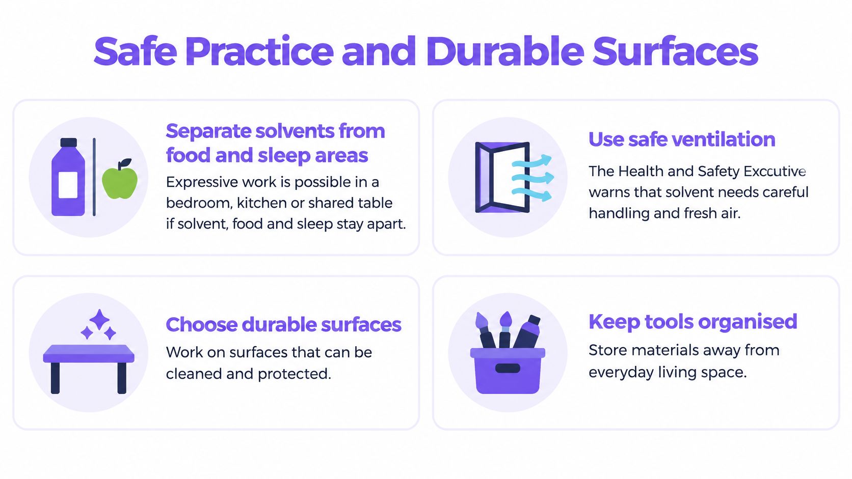
A shared table can work as a temporary painting area, but a kitchen or bedroom isn't automatically a suitable solvent studio. Keep painting, cleaning, food and sleeping arrangements separate. If you can't control exposure or store wet work safely, choose a different setup rather than relying on a faint smell as reassurance.
The Health and Safety Executive's solvent guidance warns that solvent vapours can cause headaches, drowsiness and unconsciousness, with greater risk from high concentrations and poor ventilation. Use the smallest practical quantity, close containers, clean brushes in labelled vessels and maintain fresh airflow or suitable extraction. Don't spray solvent-based materials in a home-learning setup.
Control exposure and waste
Solvent-free doesn't mean risk-free. Read the relevant sheets for colours, primers, mediums and varnishes, such as the product-specific documents in Michael Harding's safety data library. Pigments, oily cloths and sanding dust still need attention, particularly around respiratory or sensory sensitivities.
Keep solvent-contaminated waste in a suitable closed metal waste container, away from heat. Don't leave oily rags crumpled in a pile, and arrange disposal through your local authority's appropriate waste route. Paint residue and solvent don't belong in a shared sink.
Separate touch-dry from ready
A dry-feeling skin can conceal soft paint. Tate's conservation account of modern oils explains why formulation and materials complicate their behaviour. Fat-over-lean is a useful heuristic, not a guarantee against wrinkling, cracking or other changes.
When an abstract oil layer is ready for the next action
| Surface state | Reasonable now | Wait |
|---|---|---|
| Still open and glossy | Scrape, blend or lift paint | Any lean overpaint |
| Touch-dry in a thin area | A small corner test for the next layer | Varnish or rigid framing |
| Tacky, wrinkled or very thick | Stop and log thickness and medium | More paint on that passage |
| Even film, corner test holds | Plan varnish only if the whole work matches and product requirements are met | Food, solvent and storage in the same zone |
| Oily rags or waste solvent | Suitable sealed metal container, lid on | An open pile or a shared sink |
Use a companion test board for checks that might damage the painting. Neither a successful corner test nor an even-looking film establishes full cure.
Record the observation, not the conclusion you hope for: “Thin edge feels dry; central ridge remains tacky” is more useful than “Ready”.
For eventual display, Colorado Art Services' guide to planning office wall art offers a useful wider planning context. Decide placement and framing separately from whether a paint film is stable enough to handle.
How to Build Texture and Colour
Set up a small board with a deliberately restricted palette. For this exercise, choose two warm colours, two cool colours and a neutral, then keep those choices across your opening studies. These are working constraints, not a formula for every painting.
Write your intention before mixing: perhaps a quiet grey field interrupted by a warm accent. That gives you something specific to assess when the surface becomes busy.
A controlled painting session
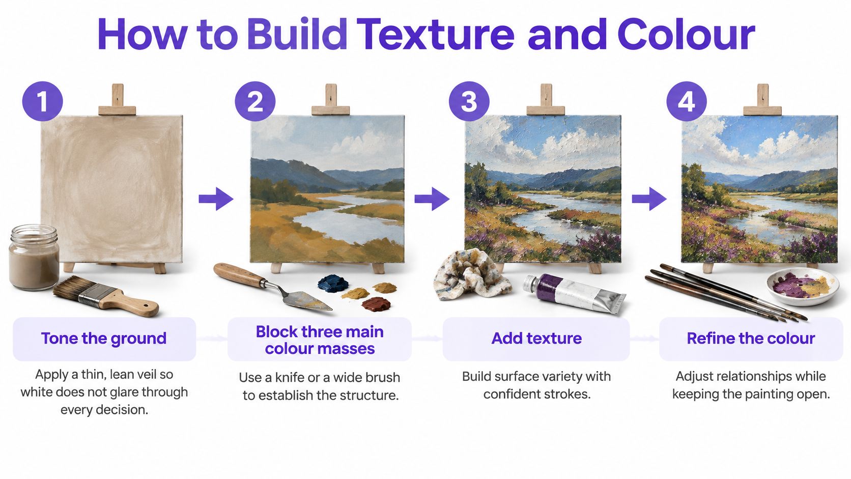
Tone the ground. Brush out a thin, lean veil of colour so exposed white doesn't dominate every judgement. Leave enough transparency to see the prepared surface. The common slip is making this first coat so wet that every subsequent mixture becomes contaminated.
Block three main colour masses. Use a wide brush or knife to establish a light area, a middle area and a smaller dark area. Their unequal sizes create a hierarchy before detail arrives. Don't divide the board into equally important patches unless that repetition is intentional.
Place a saturated accent beside a greyed neighbour. Mix the quieter colour deliberately rather than using accidental palette mud. The contrast makes the accent noticeable without covering the board in bright paint. If everything is saturated, you've removed the comparison that makes the accent useful.
Build texture in a single zone. Choose a short impasto ridge, a scraped reveal or a dragged brush mark. Leave adjacent passages quieter so the difference remains visible. The common mistake is repeating an enjoyable mark everywhere until texture stops helping you organise the picture.
Change the edges. Soften a boundary where you want continuity and keep another edge crisp where you want attention. Wipe the brush between mixtures rather than carrying unwanted colour across the join. Blending every boundary produces a different result from choosing where transitions belong.
Stop and document. Photograph the board in consistent daylight without glare. Note which mixtures remain movable and which intervention you resisted. Continuing because paint is still available isn't the same as making a useful decision.
Check whether texture earns its place
Use our guide to using texture to enhance your paintings when deciding whether a raised or scraped passage supports your intention. Don't add another layer over an unstable ridge merely to sharpen its appearance.
Finish the log with a comparison: does the accent still matter after the texture is added? If the ridge attracts all your attention, reduce its visual competition on a separate study rather than repeatedly disturbing the same wet passage.
Composition Moves That Hold a Picture Together
Composition is the route you arrange for a viewer's attention. A painting can contain energetic marks and still feel unresolved if every area demands the same response. Before adding paint, test whether cropping can make the existing relationships clearer.
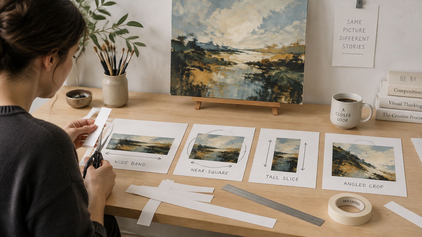
Place paper strips over a dry study or a printed photograph. Try a wide band, a near-square, a tall slice and an off-centre window. Don't cut the original while you're still comparing possibilities.
Read the crop before changing it
In each arrangement, locate the largest quiet interval, the sharpest edge and the strongest colour meeting. If they cluster tightly, you may have concentrated every event in a corner while leaving the remainder unconsidered. That isn't automatically wrong, but it should be a choice you can defend.
Move the window until the strongest meeting sits away from the centre, while preserving a substantial quieter area. Look at the resulting shapes, not just the subject you remember painting.
Cover the busiest part. If you can still follow relationships through the remaining picture, you've probably built more than a single focal effect.
Different structures need different checks
| Structure | What to examine | A useful adjustment |
|---|---|---|
| Gesture-led | Direction and visual speed | Add a quieter counterweight rather than another sweeping mark |
| Colour field | Area, proportion and value shifts | Alter the size of a colour area before adding detail |
| Geometric | Repetition, alignment and unequal scale | Change a dominant shape so the arrangement isn't merely a diagram |
| Semi-abstract mass | Balance between recognition and invention | Remove a descriptive detail that prevents colour from leading |
A gestural study might need a still, compact shape near an edge. A colour-field study might improve when a narrow band becomes broader, even though no new colour is introduced. A geometric arrangement can feel more deliberate when repeated shapes aren't all given equal weight.
For a semi-abstract room or setting, preserve the cue that matters and simplify the rest. A dark upright might be enough to suggest a doorway; painting its handle may add information without improving the composition.
Photograph the selected crop and write a sentence explaining where the viewer enters and what holds their attention afterwards. Avoid “It looks better”. Name the changed relationship, such as a larger pale interval giving a dark shape more separation.
Project Ideas That Train the Eye
Use boards no larger than A3 for these exercises so you can compare studies without committing to an unwieldy surface. Keep the failed attempts alongside the stronger ones. A useful portfolio sequence includes the evidence that caused you to change direction.
Match the exercise to the problem
A limited-value study
Work in a single hue with black and white, separating light, middle and dark mixtures before painting. Give the middle value more than half the surface as an exercise constraint. The pass test is whether the main masses remain distinct when you view a photograph in greyscale, not whether you've achieved an attractive colour.
An edge study
Arrange five shapes and allow only one clearly hard boundary. Blend or break the remaining edges without losing the shapes completely. Ask another viewer where they looked first, then compare their answer with your intention; agreement gives you something concrete to discuss, while disagreement identifies a revision.
A texture island
Place a restrained raised or scraped passage inside a thinly painted field. Judge whether the field still reads as space and whether the texture has a compositional purpose. Inspect and record its condition afterwards, but don't treat the absence of early cracking as proof of long-term durability.
A room translated into light
Choose an actual corner containing a wall, floor and an object. Reduce it to three masses of light, then remove descriptive outlines from the final arrangement. The pass test is whether the relationship between the masses suggests the space without relying on recognisable furniture.
Keep the evidence legible
If you're returning to painting after a long break, begin with the value study before attempting texture. It isolates a visual problem without asking you to manage a complicated surface at the same time.
Label the back only when you can handle the board without disturbing the face. Connect that label to your log using:
- Identity: Study title, date and the question you tested.
- Materials: Support, pigments and medium.
- Evaluation: What changed, what remained unresolved and the next experiment.
Leave these studies unvarnished while you're investigating them. Photograph stages before revisions, and keep rejected crop photographs beside the selected version.
Choose the weakest skill, not the most impressive photograph. The next exercise should answer a question your existing work has exposed.
Plan a University-Ready Painting Pathway
| Student question | Practical answer |
|---|---|
| What should my painting portfolio demonstrate? | Observation, experimentation, selection and explained decisions |
| What should I do during Level 2 study? | Develop reliable working habits and retain evidence of revisions |
| What should I strengthen during Level 3 study? | Connect investigations into a purposeful, edited sequence |
| Can flexible study receive financial support? | Check course eligibility, study intensity and personal circumstances |
| Can I take a foundation route instead of A Level art? | At OCAD, students can go straight to the Foundation Diploma |
Do I need a finished masterpiece?
No single painting can demonstrate your whole process. Build a concise sequence containing source observations, crop tests, colour studies, material records and selected outcomes. Follow each university's portfolio requirements rather than assuming that abstract paintings alone will satisfy them.
Ask your tutor to review the sequence, including an unsuccessful study and the work it prompted. For each selected image, explain the intention, the decision and what you'd change next.
Can part-time or online study receive student finance?
For Student Finance England, eligible part-time courses must have at least 25% of the equivalent full-time course intensity, calculated through annual credits, according to the government's student-finance eligibility guidance. Eligibility also depends on the course and your circumstances; this isn't a UK-wide promise of funding.
A Tuition Fee Loan and support for living costs are separate questions. The government's part-time student guidance states that distance-learning students can receive a Maintenance Loan only when a disability prevents attendance in person.
How long can a part-time degree take?
For students starting on or after 1 September 2012, the student-finance assessment guidance normally allows completion within four times the full-time duration, subject to a maximum of 16 years. Ask the university how the particular course distributes credits and accommodates your proposed pace.
Is a foundation diploma a practical route?
At The Online College of Art & Design (OCAD), we offer an Online Foundation Diploma in Fine Art Course, and students can skip A Level art and go straight to the Foundation Diploma. Our explanation of foundation courses in art can help you consider that pathway.
Students upload photographs of completed work and assignments throughout the course to receive feedback and build an art portfolio. Your dated abstract oil studies give that feedback a clear starting point: not just what you painted, but how you arrived there.
The Online College of Art & Design (OCAD) offers online art study covering oil painting, colour theory and composition, alongside a Foundation Diploma route. Visit The Online College of Art & Design (OCAD) to explore a course that fits your next step, and prepare photographs of your studies and studio-log entries for a discussion about your creative development.