

Forget the popular advice to start with a perfect oval, plant two almond eyes on a line, and shade until it looks smooth. That order is why so many portraits follow the rules yet look nothing like the sitter. Learning how to draw a face realistic means diagnosing likeness, working out whether proportion, values, edges or anatomy caused the mismatch, then fixing that cause first.
Table of Contents
- Pencil Grades, Materials and Shading Techniques
- Proportions and Landmarks to Check Before Shading
- How to Build the Head in Four Passes
- Drawing Eyes, Nose and Mouth as Planes
- Diagnosing Why a Face Looks Wrong
- Adapting Realistic Faces to Skin Tone and Light
- Build a Weekly Portrait Practice Plan
- Answers for Level 2 and Level 3 Students
Pencil Grades, Materials and Shading Techniques
Start with a small kit. Each grade has one job, and using the wrong one early makes correction harder.
Pencil grades and materials for realistic portraits
| Material | Best for | Watch out for |
|---|---|---|
| HB graphite pencil | Light construction lines | Hard to erase cleanly once pressed in |
| 2B to 4B pencil | Mid tones and skin planes | Smudges if overworked |
| 6B to 8B pencil | Dark accents, pupils and hair | Can look greasy on paper with little tooth |
| Compressed charcoal | Deep shadow masses | Hard to control at small scale |
| Kneaded eraser | Lifting soft highlights | Crumbles if not reshaped often |
Shade in the Order That Keeps Skin Clean
Lay a light, even tone across the whole head first. Build mid tones over the planes next, then add the darkest accents last. If you start with pupils and nostrils, you'll usually make everything else too pale to match.
A paper stump gives smooth transitions on cheeks, which is useful where light turns slowly. Tissue leaves a softer, more uneven finish, and that slight irregularity often reads better as skin. Don't blend everything. Skin stops looking like skin when every area is equally smooth.
Shape a kneaded eraser to a point to lift highlights on the forehead, cheekbone or lower lip. Use hatching to show direction in hair or the curve of the forehead, following the form instead of scribbling flat lines across it.
Leave a little texture where planes meet. Soften an edge only where the surface itself turns gradually.
If you also sketch digitally, a guide to the Best iPad pen can help you compare pressure control for tonal work. On paper, test the sequence on a small skin patch in three layers, then hold it at arm's length. If the three tones don't read clearly, they won't read on a face either. For pressure and grip basics, revisit how to pencil drawing before you start a full portrait.
Proportions and Landmarks to Check Before Shading
Treat the head as a block before you treat it as a face. It's roughly five eye widths wide, and the eye line sits halfway between crown and chin. Those two checks stop the most common beginner error, placing the eyes too high and stretching the lower face.
Facial landmark positions on a front-facing head
| Landmark | Typical position | Check against | Common error |
|---|---|---|---|
| Head width | About five eye widths | Eye spacing | Head drawn too narrow |
| Eye line | Halfway from crown to chin | Top of the ears and brow | Set too high, elongating the face |
| Eye spacing | One eye width between the eyes | Width of one eye | Eyes set too far apart |
| Nose base | About one-third from eye line to chin | Width of the nostrils | Placed too close to the eyes |
| Mouth line | About one-third from nose base to chin | Lines down from the pupils to the mouth corners | Mouth too wide or too high |
| Ear | Top aligns with brow, bottom with nose base | Position of the eye line | Ears placed too low |
Measure Your Sitter, Not the Average
These positions are averages for a front-facing adult head. Your sitter won't match every one, and that difference is often the likeness. Hold a pencil at arm's length, close one eye, and compare lengths on the reference itself. Is the nose base really one-third down, or a fraction lower?
Work down the face in order. Draw a light vertical centreline, mark the eye line, then check that the middle of the nose and mouth sit on that centreline. Next check eye spacing against one eye's width, because wide spacing instantly changes character.
Place the nose base, then the mouth line below it. Drop light verticals from the pupils to estimate mouth corners, then verify them against the reference rather than trusting the rule. Finish with the ears, from brow level to nose base.
Practical rule: If a landmark disagrees with both the table and the reference, believe the reference and note why.
Lay reference and drawing side by side before shading. If the landmarks don't line up now, tonal detail won't rescue them. The same measuring habit is covered in human proportions drawing, where you can practise comparing units across the whole figure.
How to Build the Head in Four Passes
Don't build a portrait feature by feature. Build it in passes, so each decision rests on a larger decision you've already checked.
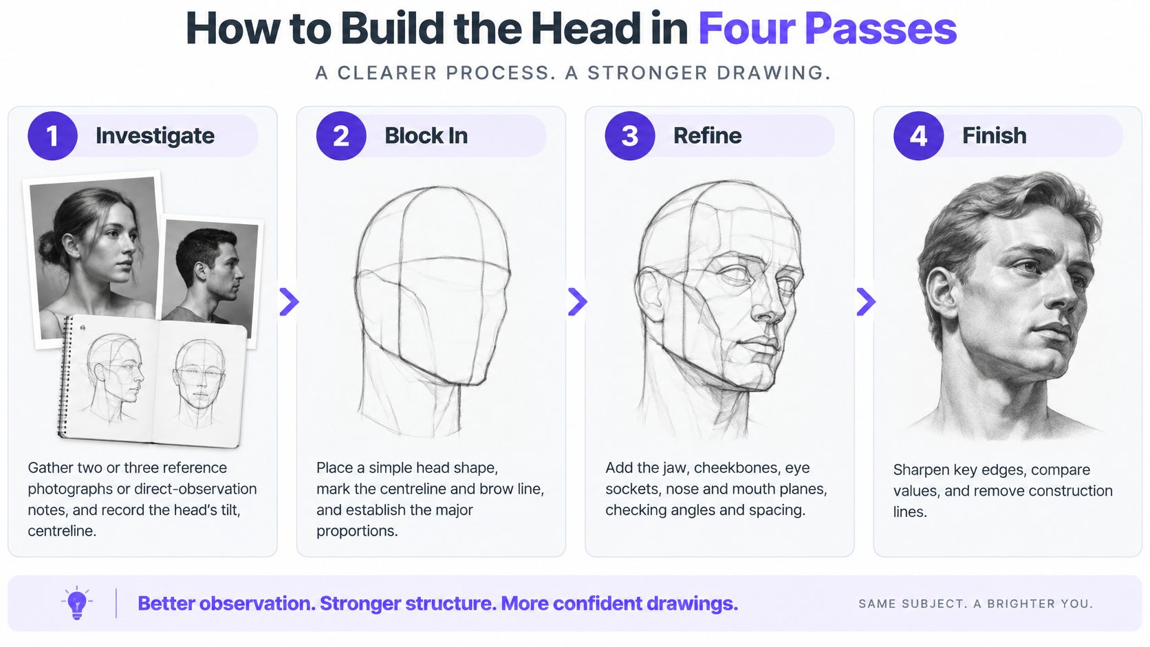
The Four Passes in Order
- Investigate: Gather two or three reference photographs or direct-observation notes. Record the head's tilt, centreline, eye line, main shadow shapes and distinctive asymmetries before you draw a feature.
- Block in and refine: Sketch a light envelope around the cranium and jaw. Establish the facial centreline and brow and eye axis in perspective, because a tilted head can't use level front-facing guidelines.
- Place planes and record: Put features in as interlocking planes, not symbols. Look for the brow ridge, nose wedge, muzzle, cheek planes, lips, chin and side plane of the head, comparing vertical and horizontal relationships by sighting or a proportional grid. Keep construction lines, measurement checks, tonal trials and short notes on what changed.
- Present: Group values into a few large masses before modelling edges and texture. Only then sharpen focal edges and remove construction lines that no longer help.
This sequence also matches assessed coursework. The Ofqual GCSE Art and Design conditions allocate 25% each to developing ideas, refining techniques, recording observations, and presenting a meaningful response. Keeping your trials isn't untidy, it's evidence.
The Error That Wastes the Most Time
Polishing an eye or a lock of hair before you've corrected the head's global tilt locks the error in. You'll defend the detailed area even when the whole head leans incorrectly.
Flip the drawing, view it in a mirror, or shrink both drawing and reference to thumbnail size. At that size, tilt, jaw width and eye-line errors show immediately, while eyelash detail disappears. Don't detail any feature until the head reads correctly as a thumbnail.
Drawing Eyes, Nose and Mouth as Planes
Ask a beginner why a portrait looks flat and they usually blame the shading. More often the features were drawn as symbols: an almond for the eye, two curved lines for the nose, a bow shape for the mouth. A real feature is a form turning in light, so the job is to draw the turn before the detail.
The breakdown below shows each feature reduced to its main planes.
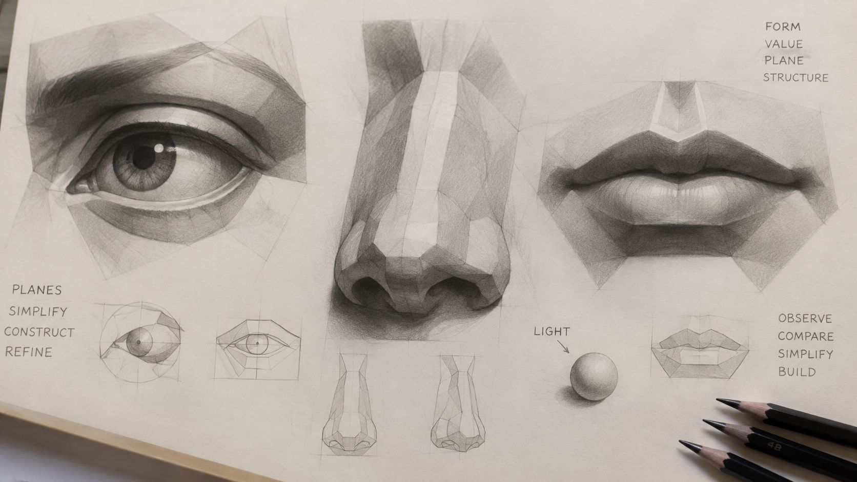
Eyes, Nose and Mouth in Light
Eyes sit recessed in sockets. Shade the socket and the shadow the upper lid casts on the eyeball first. The iris reads darkest under that lid shadow, and the catchlight is the lightest mark on the page, so leave the paper untouched there. Students who draw the iris first almost always make it too large, because the lid shadow that crops it hasn't been decided yet.
The nose works like a wedge. One side of the bridge catches light, shadow gathers beneath the tip, and the nostrils read as dark shapes inside that shadow. Outline the nostrils and they look pasted on. Group them into the underside shadow and they sit inside the form.
The mouth is a group of turning planes. The upper lip often sits in shadow below the nose, the lower lip catches light, and a soft shadow pools beneath it. The corners wrap gradually around the fullness of the mouth, so ending them in hard points flattens the whole lower face.
As the head turns, the far side of the nose and mouth compresses. The cheekbone and the side plane of the nose carry light from one plane to the next, which is why features drawn in isolation never sit convincingly on the head.
Contours alone fail to carry a likeness for the same reason. In a 2006 face recognition review by Sinha and colleagues (MIT), participants recognised only 47% of contour-only line drawings, compared with 90% for images with richer visual information. That 43 percentage point gap is your diagnostic clue: when a portrait refuses to resemble the sitter, check whether the planes and their values exist at all before blaming the outline.
Watch the same thinking applied across a full face.
Then run the test on your own work. Make one contour-only copy and one with tonal modelling, and shrink both side by side. Whichever version stays recognisable small has the stronger structure, however neat the other's outline looks large.
Diagnosing Why a Face Looks Wrong
When a portrait feels wrong, don't add detail. Name the symptom first.
Portrait symptoms, likely causes and fixes
| Symptom | Likely cause | Fix |
|---|---|---|
| Face looks older or wider than the reference | Head tilt or proportions off | Flip the drawing and recheck the eye line and centreline |
| Likeness lost at thumbnail size | Values grouped too finely or too many contours | Reduce to three or five value groups and rebuild the big masses |
| Face looks flat or grey | Mid tones overused, no dark accents | Add the darkest accents in pupils, nostrils and hair gaps |
| Every edge looks outlined | Equal-strength contours throughout | Sharpen edges only at focal areas and soften turning planes |
| Eyes look blank or staring | Symbolic eyes drawn before the eye sockets | Shade the lid shadow and socket before adding the iris |
| Expression feels wrong | Features exaggerated instead of observed | Compare brow and cheek tension with the reference |
Run Five Measured Checks
Record head width against height, eye-line position, spacing between the eyes, nose base to chin distance, and mouth-corner alignment against the centreline. Mark each accurate, slightly discrepant, or structurally wrong. Correct structural errors before any tonal work, because shading a misplaced eye only makes it harder to move.
Next, make a grayscale study in about five value families, light, light-mid, mid, dark-mid and accent dark. Reserve accent dark for selected pupils, nostril openings, hair gaps and contact shadows. If everything sits in the middle three, the face will look grey no matter how smooth it is.
The UK GCSE subject criteria for art and design require learners to explore resources and techniques, record observations, and review or modify work in response to evaluation. Your checklist is exactly that evidence, notes on what was wrong, what changed and why.
Finish with the thumbnail test. Reduce reference and drawing to three or five value groups. If likeness survives, your structure is sound. If it vanishes, rebuild the big masses, not the eyelashes.
Adapting Realistic Faces to Skin Tone and Light
A textbook face is only a starting average. Realism comes from watching how planes, edges and values change for the person in front of you.

Questions Learners Ask Most
How do I stop dark skin looking grey? Grey usually means a narrow value range and too much blended mid tone. Keep the range wide, look for warm and cool shifts inside shadows, and keep reflected light along the cheek and jaw edge. Practical guidance on mixing skin tones helps you separate value from colour temperature.
How does light change the drawing? Under cloudy UK daylight, shadows stay soft and mid-toned, so soften edges and compress contrast. Under a desk lamp or other indoor artificial light, shadow shapes fall harder with sharper edges, so place those shapes deliberately before modelling.
What if proportions differ from the averages? Keep the reference's own measurements and write that decision in your notes. As the Jerwood Visual Arts guide to drawing a realistic face acknowledges, cheeks, noses, ears and lips can catch light differently, and faces shouldn't be made too symmetrical.
Treat glasses, facial hair and ageing the same way. Draw the edges that turn the form, a frame casting a shadow, hair mass changing the jaw silhouette, a fold deepening where cheek meets muzzle. Don't apply texture everywhere.
Draw the same face under a desk lamp, then in window light. Compare which value groups moved. That comparison teaches adaptation faster than another generic template.
Build a Weekly Portrait Practice Plan
Use three short 30-minute sessions each week, each with a different job.
- Value-only copy: Copy one photograph in five value groups, no feature detail.
- Blind contour study: Draw without checking the page constantly, so you notice how much you rely on symbols.
- Review session: Rerun the five measured checks on last week's drawing and correct one structural error.
Add one longer session to build a full portrait through the four passes, keeping construction lines visible and dated. For each portrait, keep a practice sheet recording the reference, measured errors found, changes made and what to try next. That sheet becomes portfolio development evidence, not scrap paper.
Arrange a live tutor review at the diagnosis stage, before you've polished anything. Our interactive online art classes are taught live by a teacher, with students able to learn from the live teacher and peers, and our online art courses cover drawing, tonal and light studies, colour theory, composition and observational work among other subjects. A tutor will spot a tilted centreline you've stopped seeing.
Start today with the first value-only copy. Date the practice sheet when you finish.
Answers for Level 2 and Level 3 Students
How does portrait work fit GCSE assessment? Art and Design is marked against four objectives, each carrying 25%: developing ideas, refining work, recording observations, and presenting a personal and meaningful response. Your measured checks and annotations count alongside the final face.
Which Level 3 qualifications are recognised? The UK government qualification register entry lists the UAL Level 3 Extended Diploma in Art & Design as an approved Level 3 qualification, and the UAL Level 3 Foundation Diploma in Art and Design is also listed at Level 3. Check the exact title before applying.
Do I need a GCSE in art to study A Level? Entry rules differ by provider. At OCAD, students can take A Level art or design without a GCSE in art if they hold a Level 2 Certificate, BTEC, high school art or an Arts Award instead, or bring equivalent skills from a creative career.
Does Level 3 guarantee a university place? No. Universities set their own entry requirements, so approved status alone does not secure admission. Compare your portfolio against each course's stated requirements.
Does a portfolio need only a polished portrait? No. Keep the reference analysis, iterative studies, tonal trials, annotations and the sheet where you found an error and fixed it. Assessors mark observation and decision-making, and that trail shows both.
Can I study online? Yes. Compare routes on tutor feedback, qualification level and portfolio support, and choose the one that critiques your construction stage, where likeness is won or lost. OCAD student Sandy scored 100% on her IGCSE art exam with tutor support.
If you want live tutor feedback on proportion, values and edges before a final Level 2 or Level 3 piece, explore the drawing and foundation pathways at The Online College of Art & Design (OCAD). Bring your practice sheets to the first review and put the measured checks to work on your next portrait.