

You're probably staring at a blank sketchbook page, pencil in hand, with a still life on the table and that familiar thought in your head, what am I supposed to do first? That moment matters, because line definition in art is one of the first things UK art teachers ask you to handle with confidence, and it's also one of the easiest things to overcomplicate.
The good news is that line isn't just “an outline”. In UK GCSE and A level art language, it's a mark that joins different points, and contour lines are used to define shape or form, so line already does more than most students realise. In practice, that means you can learn to name line types, choose line for mood, build a personal mark-making vocabulary, and present line studies clearly in a UCAS portfolio.

If you keep a sketchbook, this topic becomes much easier to understand in context, because line shows up everywhere, from first observational drawings to finished portfolio pages. A good place to keep that habit going is this guide on why every artist should keep a sketchbook, especially if you're building work for Level 2, Level 3, or foundation study.
Table of Contents
- Starting with Lines You Already Know
- What Line Really Means in Art
- The Main Types of Line You Will Use
- Core Line Techniques for Your Sketchbook
- How Line Carries Mood and Meaning
- Practical Exercises to Build Line Confidence
- Showing Line Work in a University Portfolio
- Questions Students Ask About Line in Art
Starting with Lines You Already Know
The first time a Year 10 student picks up a pencil for a GCSE still life, they usually freeze for a second and ask the same question in different words, where do I begin? Start with the edges you can see. A bottle, a shoe, a plant pot, a face in a photo, all of them become manageable once you treat line as a way of finding structure, not as decoration.
What you should be able to do by the end
By the time you've worked through this, you should be able to name common line types, choose line for mood, build a small personal set of marks, and explain your choices in sketchbook annotations. That matters because UK art courses don't only want finished images, they want to see how you think, test, edit, and develop.
Practical rule: if you can explain why a line is thin, broken, heavy, or curved, you're already speaking the language of the sketchbook page.
Line is one of those basics that keeps coming back at every stage of study. In GCSE classrooms it appears in observation tasks, in A level it turns into more sustained experimentation, and in foundation work it starts to connect with personal visual research and presentation. The strongest students don't just copy a list of line types, they use line to solve a drawing problem.
A useful way to think about it is this. First you observe what's in front of you, then you decide what kind of line suits it, then you review whether that choice creates the effect you wanted. That simple movement from observation to intention is what tutors look for again and again.
What Line Really Means in Art
In UK GCSE and A level art guidance, line is usually defined as a mark made on a surface that joins different points. That sounds simple, but the definition gives you room to talk about real drawing decisions rather than vague “nice lines”. BBC Bitesize repeats this definition in its GCSE Art and Design resources, and the CCEA visual elements guidance adds that line can be outline, expressive, horizontal, vertical, diagonal, straight, curved, thick, thin, continuous, or broken. The same guidance also links line to composition, the viewer's eye, tone, form, and texture.
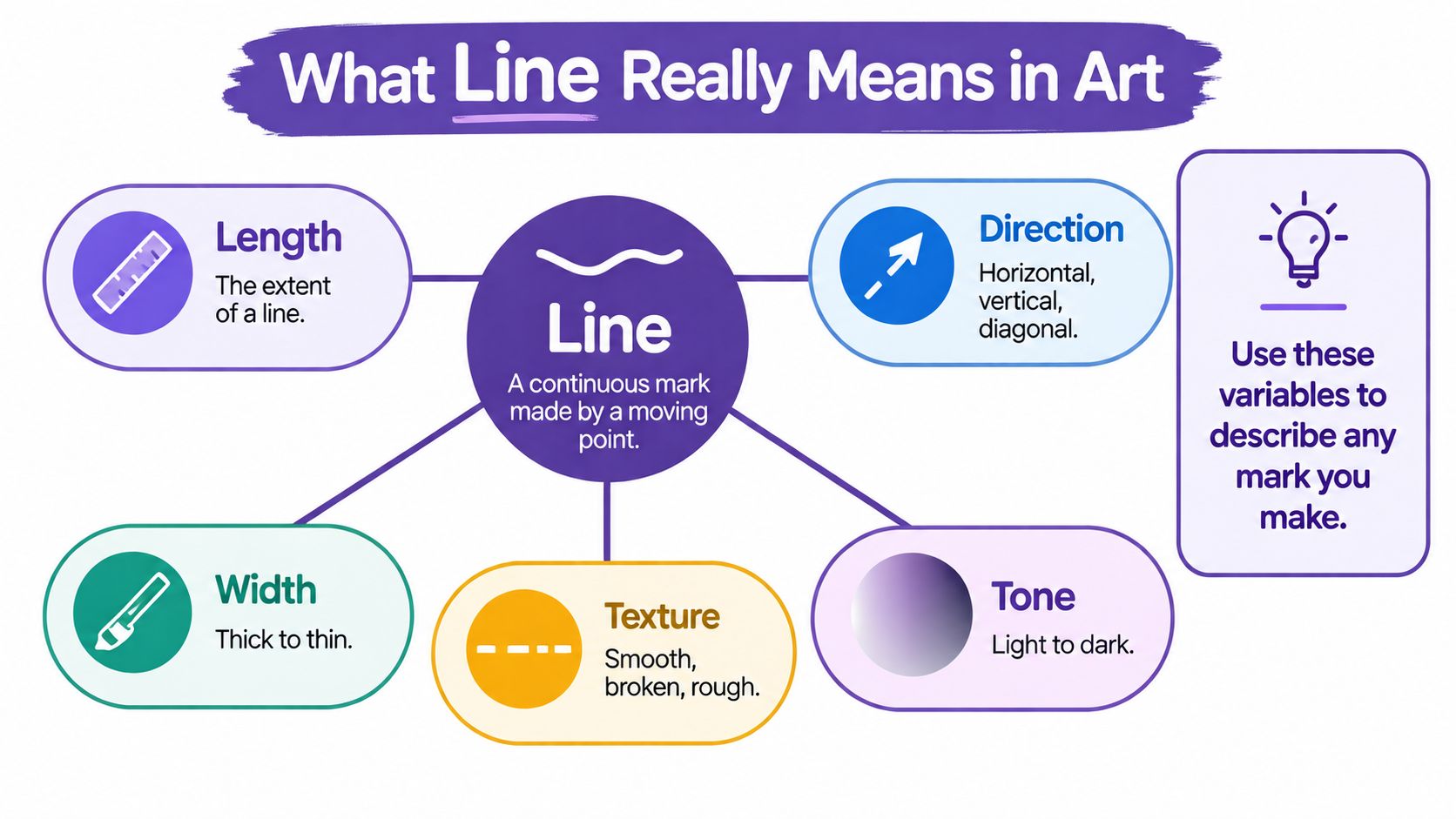
The useful variables to look for
A strong line has measurable qualities. Length tells you how far it runs, width tells you how much space it takes up, direction tells you where it travels, and shape tells you whether it feels straight, curved, jagged, or irregular. The same mark can feel calm, tense, delicate, or blunt depending on those variables.
Line also has character. A heavy graphite contour feels different from a dry, scratchy pen line, even if both describe the same edge. In curriculum language, that is why line is treated as a visual element, not just a border around an object.
Why tutors care about this
When you describe a drawing in sketchbook writing, these terms help you sound precise. You can say that a contour line defines form, or that broken line creates a sense of movement, or that changing line weight guides attention across the page. That kind of wording supports AO3 record and AO4 present, because it shows that you can observe, test, and present decisions clearly.
Practical rule: if a line changes the way the viewer reads depth, emphasis, or form, it's doing real work in the drawing.
The Main Types of Line You Will Use
It helps to group line by what it does on the page, not just by its name. In a Year 12 sketchbook, that usually means three broad families, structural, descriptive, and expressive. Once you see them that way, the subject matter matters less than the function of the mark.
| Line type | Appearance and use | Sketchbook example |
|---|---|---|
| Structural line | Horizontal, vertical, diagonal, or curved lines that organise space and shape. | Draw the frame of a window, then rebuild it using only the major directions you see. |
| Contour line | A line that follows the edge of an object and helps define form. | Draw a shoe from your desk by tracing the outer edge carefully and slowly. |
| Gesture line | Loose, fast lines that capture movement or energy. | Sketch a friend's walking pose from a photo in under a minute. |
| Implied line | A line your eye completes even when the mark isn't fully drawn. | Use repeated shapes in a plant study so the eye connects the forms. |
| Hatching | Parallel lines used to create tone. | Shade a mug by running fine, evenly spaced lines around the curved side. |
| Cross-hatching | Intersecting lines that build deeper shadow. | Darken the underside of a bottle with a second layer of angled lines. |
| Calligraphic line | Elegant, varied line with a clear sense of rhythm and flow. | Take inspiration from a museum visit and respond with expressive pen marks. |
| Scribbled line | Loose, restless, layered line that can feel energetic or raw. | Use it to show the texture of tangled hair or crumpled paper. |
How these groups help you
Structural line helps you map, descriptive line helps you record, and expressive line helps you communicate feeling. That distinction matters because students often think a “good” drawing is only about accuracy, when in fact the best work usually combines control with intention.
You'll also see these categories in UK classroom practice when teachers ask you to vary your marks across a page. A straight outline alone can look flat. Add contour, hatching, or a more restless expressive line, and the same object starts to carry tone, movement, and emphasis.
Core Line Techniques for Your Sketchbook
A lot of students want one “correct” way to draw, but sketchbook work gets better when you match the technique to the job. A shoe, a hand, a plant on the windowsill, and a portrait from a photograph all need different kinds of line control.
Five techniques worth practising
Contour is the most direct place to start, because it focuses on accurate edge description. Move your pencil slowly along the visible edge of the object and keep checking the relationship between one part and the next.
Gesture is different. Use it when the subject moves, or when you want energy rather than precision. A 30 to 60 second gesture sketch of a walking figure can loosen your hand and stop the page from looking stiff.
Parallel hatching builds tone with evenly spaced lines. It works well on rounded forms, like a plant pot or a folded sleeve, because repeated marks can suggest curvature without shading everything in solidly.
Cross-hatching deepens shadow by layering lines in a second direction. It is a strong choice when you need darker values under a chin, beneath a shoe, or inside the fold of a jacket.
Continuous line drawing keeps the pencil in contact with the page. It's useful for observation because it forces you to look closely and trust the movement of your hand instead of constantly correcting yourself.
Here's the short version. Contour records, gesture energises, hatching tones, cross-hatching darkens, and continuous line builds confidence. If your page feels weak, choose the technique that suits the drawing problem instead of forcing the same method onto everything. For more practice ideas that fit class and homework routines, this guide on how to get better at drawing is a useful companion.
Tutor move: if a student keeps overworking a page, I usually ask them to switch to a cleaner, simpler line technique for the next study, then compare the results.
How Line Carries Mood and Meaning
Aisha sat down with the word restless written at the top of her sketchbook page and drew the first thing that came to mind, a neat outline of a chair. It was accurate, but it felt flat. So she went back over the page and added jagged zig-zags around the edge, then layered soft overlapping curves in the background, and finally pressed in one heavy contour at the base of the composition.
What changed in her page
The chair stayed the chair, but the mood shifted. The jagged lines made the page feel tense, the curved marks suggested memory or drifting thought, and the heavy contour anchored the whole drawing so it didn't float apart. That's the point where line becomes meaning, not just description.
Examiners recognise this kind of decision-making because it shows weight, rhythm, and hierarchy. A slow, weighted line often reads as calm or deliberate, while a broken, quick line can feel nervous or unsettled. Neither is better in every case, but each one changes how the viewer experiences the work.
Aisha's page worked because she stopped treating line as a neutral edge and started using it as a language for ideas. That's the leap Level 2 and Level 3 students need to make when they move from copying objects to developing a personal response.
Why this matters for your own work
If your brief is about silence, line can be soft and measured. If your brief is about noise, it can be sharp, layered, and unstable. The subject doesn't need to be dramatic, but the mark-making should still carry intention.
That's the skill. You're not only drawing what something looks like, you're deciding what it feels like.
Practical Exercises to Build Line Confidence
Most students improve fastest when the task is small enough to finish and repeat. You do not need expensive materials to do that well. A 2B or 4B pencil, a fine liner, a sheet of A4 cartridge paper, and a kitchen object or house plant are enough to start.
A simple progression to try
5-minute contour. Draw a mug or kettle without lifting the pencil too often. Keep your eyes on the object more than the page, because the goal is accuracy of observation.
30-second gesture. Use a photo of a moving subject, such as a family member walking across a room. Work quickly and focus on the feeling of movement, not the detail.
15-minute parallel shading. Fill a square with parallel lines and vary the spacing to build tone. This is a good way to notice how line density changes value.
10-minute texture study. Draw a house plant and pay attention to how leaf edges, veins, and overlaps change the line character. Fine liner works well here because it stays crisp.
20-minute continuous line. Draw a chair, shoe, or jar without looking down every second. The drawing may look awkward at first, but that tension often teaches you more than a neat copy.
How to reflect on the page
Write one short note beside each exercise. You might say that your contour line became more accurate, or that your hatching felt too tight, or that the fine liner helped you separate foreground from background. That kind of annotation shows process, and process is what examiners and tutors want to see.
Practical rule: if you can say what the mark did and why you used it, the page becomes evidence rather than just practice.
Showing Line Work in a University Portfolio
Line work should sit in a portfolio as proof of thinking, not as filler between finished pieces. Admissions tutors scan sketchbooks for variety, control, and clear development, so a strong portfolio shows line studies early, then lets later work grow out of those experiments. That sequencing tells a clear story, especially for routes such as Foundation Diploma, BA Fine Art, BA Illustration, and BA Graphic Design.
What portfolio evidence tends to look like
One university's creative portfolio guidance asks for at least 20 sketchbook pages in A4 or A3 format, with observational drawings, artist references, and clearly labelled research pages, which shows how process work supports selection rather than sitting apart from it. Another university's portfolio rules ask for a single PDF of up to 15 pages and a file size no larger than 50MB, while a different route allows up to 20 pages with a maximum size of 50MB. Those limits matter because they force you to curate line studies carefully rather than sending everything you've made. Esher College creative portfolio requirements and University of Edinburgh portfolio preparation guidance are good examples of how selective presentation shapes applications.
How to organise the work
Put your line experiments near the front of the portfolio, then follow them with developed outcomes that clearly use those marks. If you're photographing pages for a digital submission, raking light helps show graphite density, surface texture, and varied line pressure. That matters because a flat photograph can hide the control you've shown on the page.
AS-level sketchbooks usually need annotation that explains material choices. A2-level portfolios usually need more critical reflection, so your writing should move beyond “I used pencil” and explain why the pencil, the line weight, or the mark-making strategy suited the outcome.
For students thinking about progression routes, line studies are especially useful because they show transferable skill across different subjects. A consistent sketchbook habit also helps when you're building a body of work for university, and this overview of life class drawing can help you connect observation, anatomy, and line quality in one place.
Questions Students Ask About Line in Art
Does invisible line count as an art element? Yes, implied line still counts, because the viewer's eye completes the path even when the mark isn't fully drawn. That matters in assessment because it shows you understand visual organisation, not just outline copying.
What's the difference between line and mark? A line usually extends across space and connects points, while a mark can be a point, dot, patch, or shape. That distinction helps you write more accurately about process and intention.
Should I use pencil or pen for sketchbook annotation? A 2B pencil is usually the safest choice because it stays flexible, easy to edit, and easy to read beside drawings. Tutors value legibility, and flexible annotation lets you refine ideas without clutter.
How thick should a line be in an exam piece? There's no single right thickness, but varied line weight usually shows more control than one identical outline. Examiners look for decisions that support form, emphasis, and clarity.
Can digital line work count in a portfolio? Yes, digital work is acceptable, especially when it sits alongside traditional drawing. That combination matters because it shows range across media, not dependence on one tool.
My cross-hatching looks muddy. How do I fix it? Use lighter pressure, add more layers gradually, and sharpen the pencil or fine liner if needed. Cleaner layering shows better tonal control and stops the drawing from collapsing into grey clutter.
Can line drawings really be A-grade work? Absolutely, because strong line drawings can show observation, sensitivity, and control at a very high level. Museum collections and exhibition coverage of artists such as Van Gogh show that line-based work can stand on its own.
Should I trace to improve accuracy? Avoid tracing for assessed work, because it doesn't show your own observational judgement. A grid method is a better training tool when you need support with proportion.
If you want structured, tutor-led help with line drawing, sketchbook development, and portfolio organisation, The Online College of Art & Design (OCAD) can support you with flexible creative study that fits GCSE, A level, foundation, and SEND pathways. It's a practical option if you want to turn line exercises into assessed work with clear progression. Visit the site, compare the routes, and see how your sketchbook pages can become portfolio evidence.