

“Oil pastels are for beginners; soft pastels are for serious artists” is poor advice for assessed work. The useful comparison is binder, working conditions and portfolio evidence, not status. A beautiful drawing isn't a successful choice if you can't work safely at home, transport it intact or explain why you chose the material.
For students comparing oil pastels vs soft pastels, start with the task: what must the work demonstrate, where will you make it, and how will your tutor assess it? Those questions produce a better purchase than choosing whichever set promises the brightest colour.
Table of Contents
- Binder Chemistry, Mark and Core Properties
- Blending, Layering and Fixing at the Bench
- Lightfastness and Permanence for Assessed Work
- Dust, Solvents and Safety in Shared Spaces
- Matching the Medium to Your Portfolio Objective
- Portfolio Questions Level 2 and 3 Students Ask
- Choose Your Pastel Before You Buy
Binder Chemistry, Mark and Core Properties
The difference starts inside the stick. Soft pastel uses relatively little binder, with pigment and chalk or other fillers forming a dry, friable material. Oil pastel uses oil and wax, producing a creamier, more cohesive mark, as Tate's pastel definition explains.
That chemistry determines what happens at the bench. Soft pastel releases colour readily onto textured paper, allowing quick tonal transitions, but loose pigment remains vulnerable to rubbing. Oil pastel deposits a more continuous film that grips the support, although heavy applications can become slippery rather than accepting a clean new mark.
Core properties of oil pastels and soft pastels
| Property | Soft pastel | Oil pastel |
|---|---|---|
| Binder | Low binder, pigment with chalk or other fillers | Oil and wax |
| Texture of mark | Chalky, dry and powdery | Creamy, waxy and cohesive |
| Dry blending | Finger, cloth or tortillon on textured paper | Limited; smoother blending can use a solvent |
| Dust while working | Loose dust is generated | Comparatively dust-free |
| Fixative or glazing | Usually needs glazing under glass or careful fixing | Generally no fixative needed |
| Grip on paper | Fills the paper tooth quickly; needs textured support for layering | Adheres firmly to paper |
| Solvent use | Not required | White spirit or mineral spirits can be used for blending |
| Suitable supports | Typically textured paper | Paper, card, canvas, wood and other suitable surfaces |
Read the properties as working consequences
Paper tooth means the surface texture that catches pigment. With soft pastel, rubbing harder doesn't create unlimited space for more colour. Once you've packed the texture, you may move existing pigment around.
Oil pastel is more forgiving about supports, making it useful for experiments across card, canvas or prepared wood. That doesn't mean every surface produces an equally durable outcome. Test adhesion, surface preparation and handling before committing to a final piece.
Protection also differs. Soft-pastel conservation relies on careful handling and glazing, not saturating the drawing with fixative. Oil pastel generally needs less immediate protection from loose dust, but its persistent film can mark anything pressed against it and can soften in heat.
Practical rule: Choose the binder for the operation you need, not for the apparent sophistication of the medium.
Try matching colours on the same textured paper. Blend the soft pastel with a clean finger or tortillon, then test the oil pastel with a barely damp solvent brush only in an approved, ventilated workspace. Note which edge survives, which colour moves and how firmly each layer remains attached. If solvents aren't suitable for your setting, compare dry handling instead.
Blending, Layering and Fixing at the Bench
Good layering comes from controlling pressure and stopping before the surface becomes overloaded. Keep a scrap of your chosen paper beside the drawing for testing mixtures, fixing and scraping.
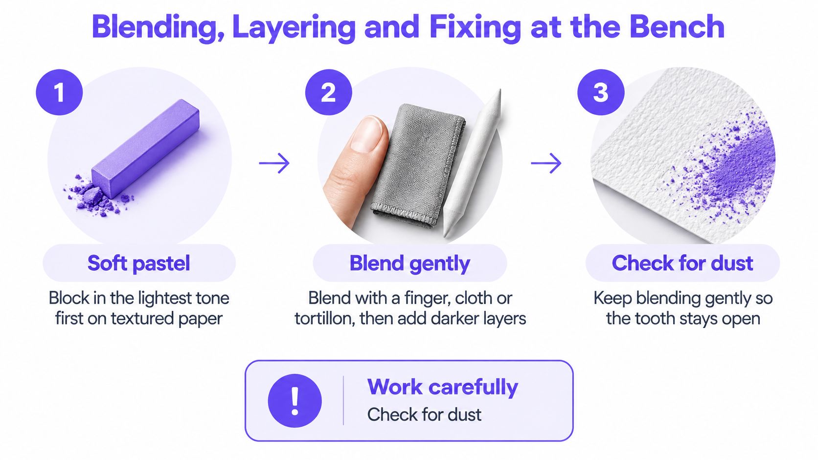
Soft pastel
- Block in lightly. Start with the lightest tone on textured paper, keeping the first application thin so later marks have somewhere to grip.
- Blend selectively. Use a clean finger, cloth or tortillon, then introduce darker passages with gentle pressure rather than repeatedly polishing the whole drawing.
- Remove loose dust. Hold the sheet over a collection tray and tap its back gently before adding another layer; don't blow across it.
- Test fixing separately. If you need an intermediate fixative, test a compatible product on a matching swatch and spray lightly at the manufacturer's recommended distance in an approved location.
Common slip: Over-fixing can darken a passage or change its texture. A drawing that looks pale before spraying may lose its intended contrast afterwards, so don't use the finished assessment piece as your first fixative test.
Our soft pastel drawing guidance provides a useful starting point for planning practice around tone and controlled marks.
Oil pastel
- Establish a thin base. Use firm, controlled pressure to key colour into the paper without leaving a thick ridge everywhere.
- Build without constant rubbing. Overlap colours deliberately, reserving the heaviest application for passages that need it.
- Scrape for texture. Use a palette knife carefully to reveal an underlying colour, keeping the blade shallow enough not to cut the support.
- Blend with solvent only when appropriate. In an approved ventilated space, use a small amount on a brush and let the solvent evaporate before working over the passage.
Common slip: Drawing into a solvent-wet layer can lift earlier colour instead of adding a clean new layer. Waiting for solvent evaporation doesn't mean the oil-pastel film has become a hard, dry paint surface.
Finish with a three-layer comparison test: base colour, contrasting overlap and final highlight. Photograph each stage, then annotate where the highlight stayed clean and where it dragged earlier pigment. That gives you a repeatable technique decision rather than a vague preference.
Lightfastness and Permanence for Assessed Work
Neither medium is automatically more permanent. Pigment selection and display conditions matter more than the words “oil” or “soft” on the box. Pastel colour can be exposed to light without the protection of a varnish or resin layer, so an attractive colour name isn't enough evidence for a final piece.
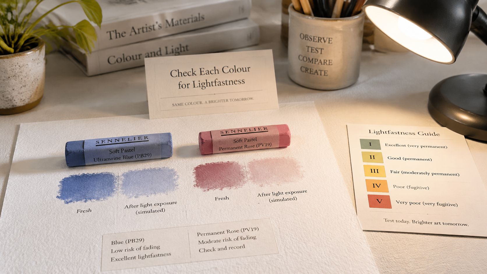
Read the individual colour rating
Blue Wool and ASTM ratings describe resistance to light-related colour change, but manufacturers don't all use a universal pastel-testing system. Don't assume that identical-looking symbols from different brands mean identical testing.
A useful product-level example comes from Cass Art's introduction to Caran d'Ache Neoart 6901: it reports ASTM D-6901 compliance, with 34 colours rated LFI, 14 rated LFII, and stated durability of up to 100 years under test conditions. That is evidence about the named product, not a promise for every oil pastel.
Reading lightfastness ratings for assessed work
| Rating | What it signals | Use for assessed work |
|---|---|---|
| ASTM LFI | Highest lightfastness rating | Choose for final assessed pieces |
| ASTM LFII | Very good lightfastness | Suitable for most portfolio work with careful display |
| Blue Wool 6 or above | Preservation-oriented benchmark on the Blue Wool scale | Treat as a professional-work benchmark, not a universal guarantee |
| Unrated or lower rating | Uncertainty or greater fading risk under light | Test and document, or avoid for final work |
Make permanence part of your material record
Keep the colour name, product range, pigment information where available and manufacturer's rating beside your swatch. Photograph the packaging or colour chart before you discard it. If no rating is published, record that absence rather than inventing an equivalent.
A home exposure test can reveal obvious change, but it doesn't establish an ASTM classification or a guaranteed lifespan. Use it as exploratory sketchbook evidence, not certification.
The same recording habit is useful when developing coloured-pencil technique, particularly if a project combines drawing materials. Select rated colours for final work, avoid fugitive pigments, choose acid-free supports and plan UV-filtering glazing where long-term display matters. Glazing reduces exposure; it doesn't make direct sunlight a sensible display position.
Dust, Solvents and Safety in Shared Spaces
Calling oil pastel “safe” and soft pastel “unsafe” ignores the process. The same oil-pastel stick can belong to a manageable solvent-free lesson or a solvent-blending activity that isn't appropriate for a bedroom.
The overview of pastel materials and hazards distinguishes the dust associated with dry pastel from the different handling of oil pastel. Both can contain pigments requiring precautions, while adding white spirit or mineral spirits introduces a separate vapour exposure.
Matching a pastel setup to the learning circumstance
| Setup | Main exposure | Controls | Best fit |
|---|---|---|---|
| Soft pastel with dust control | Airborne pastel dust | Damp wiping, working on a tray, no dry sweeping, handwashing | Learners without respiratory sensitivity who can clean the workspace |
| Solvent-free oil pastel | Pigment residue on hands and surfaces | Gloves where appropriate or handwashing, covered surfaces, no spirits | Bedrooms, shared homes and learners with respiratory sensitivity, subject to product checks |
| Oil pastel with solvent blending | Solvent vapour and pigment | Suitable ventilation, open window where appropriate, supervision | Approved supervised classrooms or ventilated studios only |
Control the activity, not just the material
For soft pastel, cover the work area and collect residue in a tray. Damp-wipe surfaces rather than dry-sweeping them, and never blow dust off the drawing. Keep food and drinks elsewhere and wash hands before eating.
For solvent-free oil pastel, keep the process completely solvent-free. Cover shared furniture, prevent hand-to-face transfer, and clean tools before returning them to household use. Low dust doesn't remove the need to check pigment warnings and age suitability.
For solvent blending, a cracked window isn't automatic proof of adequate ventilation. Follow the product safety information, keep containers closed when not in use and exclude ignition sources. Don't introduce this activity into a bedroom or an unsupervised home lesson because a blending tutorial uses it.
A cleaner-looking desk isn't proof of lower exposure. Check what enters the air and what remains on hands.
Adapt the workflow for the learner
In SEND provision, consider sensory tolerance, respiratory sensitivity, grip, fatigue and the ability to complete a clean-up sequence. A learner who dislikes sticky residue may prefer a holder or wrapped stick; someone who struggles with multi-stage routines may need a prepared tray and a visible clean-up checklist.
These decisions also apply to dusty drawing activities such as charcoal-pencil drawing. Check your setting's materials policy, carry out an activity-specific risk assessment and ask your tutor before using solvents. Don't treat a general art tutorial as individual medical advice for asthma or allergies.
Matching the Medium to Your Portfolio Objective
Pick the medium that makes the assessment objective visible. If the task concerns tonal modelling, your marks need to explain form. If it concerns surface, pressure or material experimentation, a perfectly smoothed gradient may hide the evidence you need.
The Painters Online guide to pastel painting describes the practical importance of support, layering and protection. Translate those properties into a project decision rather than presenting a list of generic advantages.
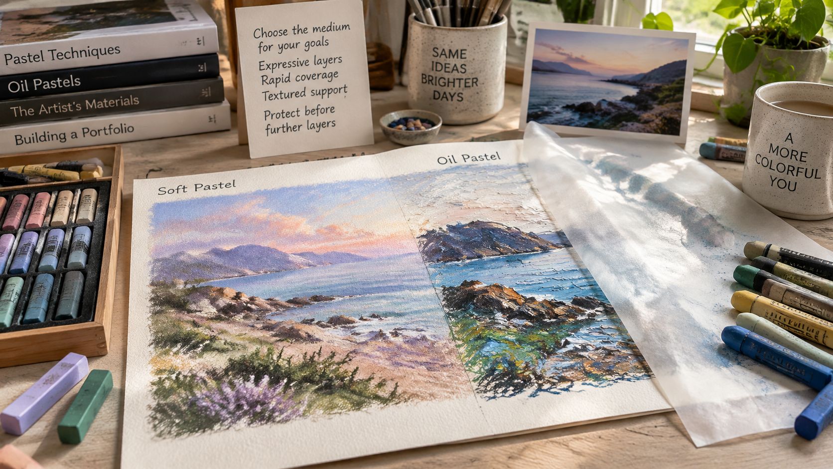
Match the evidence to the intention
- Tonal modelling and atmospheric colour: Choose soft pastel when you need gradual transitions, softened edges and responsive adjustments to value.
- Saturated colour and pressure control: Choose oil pastel when visible changes in pressure and broad, assertive marks are central to the investigation.
- Scraping and mixed-media resist: Oil pastel offers useful opportunities to reveal underlying colour or test how a waxy mark interacts with another medium.
- Visible layering with fine detail: Soft pastel on a suitable textured support lets you contrast broad passages with selective, sharper finishing marks.
University preparation requires more than a resolved image. London Metropolitan University's portfolio guidance asks for sketchbook development, photographs of processes and finished pieces, and evidence of different materials and techniques.
At OCAD, students develop their own media portfolio for assessment with our tutors' feedback and guidance. Students upload photographs of completed work and assignments throughout the course to receive feedback and build that portfolio.
Present the decision as well as the result
Photograph swatches, changes of direction and unsuccessful trials. Write a specific evaluation, such as “the scraped oil-pastel passage describes the rock surface more clearly”, rather than “oil pastel was better”.
Keep digital files organised by investigation and stage. If visual folder labels help you distinguish experiments, development and final images, Tintd's guide to folder colors offers a practical organisational resource.
For transport, prevent anything rubbing against soft-pastel work. Give heavily layered oil pastel time to settle before photographing, but still protect its surface from contact rather than assuming it has hardened. Choose for the learning objective, then record the reason in your sketchbook.
Portfolio Questions Level 2 and 3 Students Ask
How many pieces will a university expect?
Requirements are course-specific, so don't build your submission around a universal total. Newcastle University's Fine Art guidance asks for independently initiated work and weighs how ideas originate and develop, which is a different demand from filling a quota. A single pastel investigation documented from first swatch to resolved piece can carry more weight than a folder of unrelated drawings. Check the current course instructions before selecting your submission, including whether a sketchbook spread counts as one image or several works.
Should I include work that didn't succeed?
Yes, when you can explain what you learnt. The University of Salford's portfolio guidance includes work in progress and an example that failed or didn't turn out as planned. A pastel trial with clogged texture becomes useful evidence when you show the adjustment that followed: a change of paper tooth, a lighter hand on the early layers, or a different decision about solvents.
Does one medium look better to admissions tutors?
Neither label substitutes for inquiry and development. A comparison sheet with controlled tests, observations and a reasoned material choice can communicate more than an isolated polished drawing. If dust limits or a shared workspace pushed you toward oil pastel, say so. A constraint handled deliberately reads as decision-making, not compromise. Don't claim the comparison guarantees admission; make its relevance to your project clear.
Do I need both pastel types?
No. Use the material that answers your creative question, especially if budget or workspace limits your options. Small sets of both are worthwhile when comparing their behaviour contributes to your investigation. A studio's dust rules or a bedroom workspace with poor ventilation are legitimate reasons to commit to one medium and record why.
How do I show that pastel work will last?
Include a concise materials record with colour-specific lightfastness ratings, support information and your display plan. Explain any unrated colours clearly and reserve uncertain materials for experiments where possible. For final work, document your acid-free support and appropriate glazing choices rather than describing the piece as archival without evidence.
Admissions requirements and qualification assessment criteria aren't interchangeable. Meet your course requirements, then curate the university submission for the programme you're applying to.
Choose Your Pastel Before You Buy
Buy the binder before the colour. Oil pastel's wax and oil binder keeps dust down in a shared home, but it stays workable, resists casual erasing and can creep through thin paper if you press hard or build heat with layered strokes. Soft pastel gives quicker atmospheric colour and tonal modelling, provided the surface has enough tooth and you can contain powder, fix between stages and clean the bench without spreading pigment through the room.
For limited ventilation or respiratory concerns, favour solvent-free oil pastel only after reading the product warnings and matching them to the learner. For assessed investigation, choose the stick whose limits you can evidence, not the one with the prettier box. If the project compares behaviours, small sets beat a classroom assortment because every stick has to earn its place in the portfolio.
Budget for the actual project
Listed prices are snapshots from retailer pages, not guaranteed checkout totals or matching grades. Pack size changes the comparison more than the headline box price, so read the per-piece cost against the colours your final work will use.
Listed prices for oil and soft pastel sets
| Retailer | Product | Pieces | Listed price |
|---|---|---|---|
| Hope Education | Classmates oil pastels | 432 | £38.39 incl. VAT |
| Hope Education | Classmates soft pastels | 36 | £7.79 incl. VAT |
| Winsor & Newton | Oil pastel box | 30 | £41.56 |
| Winsor & Newton | Soft pastel box | 30 | £43.66 |
| GreatArt | I LOVE ART oil pastel set | 12 | From £4.85 |
| GreatArt | I LOVE ART soft pastel set | 12 | From £6.50 |
Make a purchase you can evaluate
Check open-stock replacements before ordering, then confirm the set's lightfastness notes cover the colours earmarked for final sheets. Put textured paper, surface protection, masking tape, a tray for crumbly sticks and any controls for dust or solvents into the same budget; extra colours will not correct weak adhesion or a workspace you cannot keep safe.
This week, buy a small set of each only if comparison answers the creative question, make a labelled test sheet and record the ratings for colours intended for final work. Put portfolio-planning questions to our tutors through the website enquiry route or email enquiries@artcoursework.com.
We offer tutor-led online art study in which students develop assessed portfolios through assignments, uploaded photographs and individual feedback. Visit The Online College of Art & Design (OCAD) to explore a suitable course and discuss how your pastel experiments can support your next stage of creative study.