

You've spent an afternoon drawing a still life, carefully measuring the cup, bottle and folded cloth. The objects look recognisable, yet the drawing feels cramped on one side and strangely empty on the other. You may think the problem is inaccurate drawing. Often, you're looking at only half the picture.
The gaps between objects, the air around a figure and the openings inside a form all affect what the viewer notices. Learning to see those areas can help you place objects more confidently, check proportions and make deliberate decisions about mood and movement. This is the practical value of learning to see through a Level 2 art lesson, not a vocabulary exercise.
For Level 2 and Level 3 learners, positive and negative space in art is a core compositional skill in UK art education. You'll find it in GCSE and Higher Art resources, in observational drawing, in sculpture and in portfolio critique. The useful question is not only, “Which part is the object?” It's also, “What shape does the surrounding space make, and what happens if I change it?”
Table of Contents
- Introduction Why Seeing the Gaps Matters More Than Drawing the Object
- What Positive and Negative Space Actually Means in Art
- How Negative Space Actively Shapes Composition and Balance
- Seeing It in Action From Hepworth and Moore to Everyday Images
- Practical Exercises to Train Your Eye for Negative Space
- Using Space Intentionally in Your Portfolio and Assessment Work
- Conclusion Your Next Steps to Confident Composition
Introduction Why Seeing the Gaps Matters More Than Drawing the Object
A common studio experience goes like this. You begin with a chair, a plant and a lamp, concentrating on each outline in turn. The chair becomes too wide, the plant drifts towards the edge and the lamp has no room around it. You erase and redraw the objects, but the composition still feels unsettled because the gaps have been changing with every adjustment.
Try looking at the same drawing without naming the objects. Notice the wedge of wall between the plant and lamp. Look at the narrow shape beneath the chair seat. Compare the space above the tallest form with the space beside it. These shapes are easier to compare than the objects because you aren't tempted to draw what you think a chair or plant should look like.
Studio reminder: If an object seems wrong, inspect the space beside it before correcting its outline.
This paired way of seeing is central to positive and negative space in art. The object, figure or mark has visual weight, while the surrounding and internal gaps help define its edges and position. A portrait can have carefully drawn eyes and a convincing mouth, yet still feel awkward if the space around the head is uneven. A poster can contain strong lettering and images, yet become difficult to read when the surrounding areas are squeezed.
UK teaching materials treat this as a technical composition skill, not an advanced theory reserved for specialists. The distinction appears in GCSE and Higher Art revision resources, where students learn to identify the occupied subject and the empty areas around and between it. That makes it especially useful for learners preparing assessed work, whether they study in a classroom, at home or alongside employment.
The strongest improvement usually comes when you stop asking only, “Have I drawn the object well?” Add three further questions:
- Does the surrounding space support the subject?
- Where does the eye enter and travel through the image?
- Have I left, compressed or disrupted space for a reason?
Those questions turn a definition into a decision-making tool.
What Positive and Negative Space Actually Means in Art
A chair drawn on a page can look convincing in outline yet still feel incorrectly placed. Check the shapes beneath its seat, between its legs and around its back. Those surrounding shapes often reveal proportion problems faster than the object itself.
Positive space is the subject or object that occupies an area. Negative space is the empty area around and between objects. UK GCSE and Higher Art resources use this distinction as a practical composition skill, rather than treating it as an abstract theory, as shown in BBC Bitesize's explanation of positive and negative space.
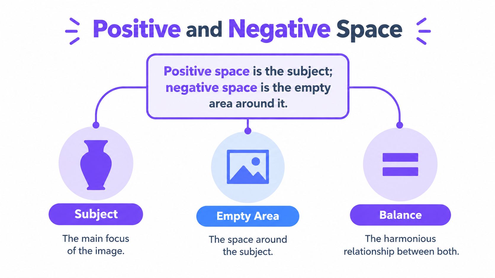
A jigsaw offers a useful comparison. Each piece has a printed image, yet its identity also depends on the edges cut around it. In a drawing, the chair is positive space, while the floor beneath it and the background framed by its legs are negative spaces. Drawing those gaps as carefully as the chair can make its proportions more reliable.
Negative space remains present when the subject has little detail. A solid black bird on white paper occupies positive space, while the white around it forms negative space. A broad area in front of the bird can suggest direction or attention. A narrow edge in front of its beak can make the image feel confined.
Space in three dimensions
Sculpture lets you test the relationship physically. Clay, stone or metal forms occupy positive space. Voids around the form, holes passing through it and openings within it are negative space. These areas affect the silhouette and allow light to enter, pass through or cast changing shadows.
Barbara Hepworth's Hollow Form with Inner Form from 1968 appears in UK GCSE and National 5 revision material as an example of British exploration of space in three-dimensional form. BBC Bitesize's British sculpture revision material places Hepworth's work in that educational context.
The same principle operates on a page. A heading, image or paragraph occupies positive space, while margins and intervals separate information and control its reading order. A guide to professional book layout design shows how margins, alignment and spacing organise a page. A related guide to line definition in art can help connect contours and boundaries with the spaces they create.
A reliable identification method
For an unfamiliar artwork, identify the occupied forms first. Then trace the shapes around and between them. Look for enclosed gaps, openings and repeated spaces. Ask whether these areas are similar, varied, balanced or deliberately disrupted.
This method helps you move from naming positive and negative space to making compositional choices. You can enlarge a gap, compress it or alter its shape, then observe how the subject's position and visual emphasis change. That observation is useful in studies made at home, in adult learning and in portfolio work for university applications.
How Negative Space Actively Shapes Composition and Balance
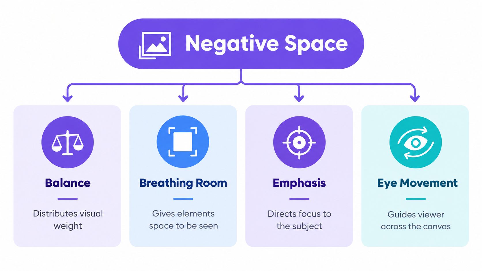
Negative space becomes useful when you treat it as something you can adjust. Enlarging a gap can give a subject calm, isolation or importance. Compressing it can create pressure, intimacy or visual urgency. Disrupting it with an interruption, pattern or unexpected cut can make the viewer pause.
Tate's display text on Helen Frankenthaler describes the negative space as having “just as active a role” as the painted space. BBC Bitesize's three-dimensional guidance similarly explains that solid form is positive space, while surrounding and interior voids are negative space, as recorded in the BBC transcript on three-dimensional art.
Enlarging space
Suppose a small figure stands near the centre of a large sheet. The surrounding space may make the figure seem quiet, vulnerable or solitary. That effect changes if you crop the image tightly around the body. The figure now occupies more of the viewer's attention, and the reduced space can make the image feel immediate.
Open space also helps a dominant shape remain legible. In a graphic composition, a logo or title surrounded by calm areas can be read before competing details attract the eye. If every corner contains a mark, the viewer has fewer visual pauses and may struggle to identify the main subject.
Compressing space
A compressed gap can be equally deliberate. Place two forms almost against one another and the narrow interval becomes a visual event. The viewer may read contact, conflict, closeness or instability. In a portrait, reducing the space in front of a face can make the sitter appear to move towards the edge, creating tension.
Compression isn't automatically a mistake. It becomes a problem when the narrow space looks accidental, especially if a shape appears to touch the edge without a clear reason. During critique, describe the result rather than calling it “too tight”. Say that the compressed gap increases pressure, then decide whether that pressure belongs in the work.
Directing attention
Negative space can guide the eye through alignment and contrast. A curved gap may echo a curved figure. A bright opening may pull attention away from a darker subject. Repeated intervals can create rhythm, while an abrupt change can signal where the viewer should stop.
Typography offers another useful comparison. If you're studying how structure, proportion and spacing influence a designed surface, research into geometric fonts from Bauhaus to 2026 can sharpen your observations. Letters themselves are positive forms, but counters, margins and intervals determine whether those forms remain clear.
Before changing a composition, describe its spatial behaviour:
- Balanced: visual weight feels distributed across the surface.
- Open: broad gaps slow the eye and give forms room.
- Compressed: narrow intervals increase contact or tension.
- Disrupted: an expected gap is interrupted, creating surprise.
Those words help you make purposeful revisions instead of moving objects at random.
Seeing It in Action From Hepworth and Moore to Everyday Images
A gallery visitor can walk around a sculpture and watch solid material and open space change together. Barbara Hepworth's pierced forms make that relationship especially clear. An opening is part of the sculpture's identity: it frames the background, alters the silhouette and lets the viewer read the form as a meeting between mass and air.
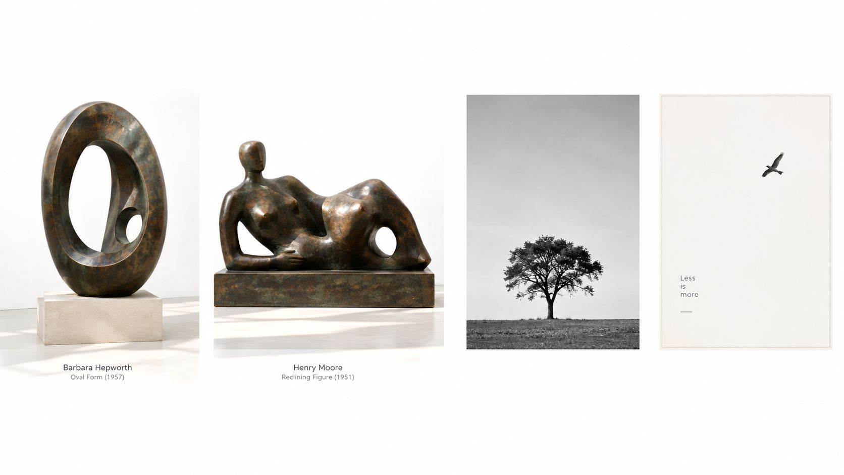
This example also connects with school-level art study. Positive space is occupied by objects, while negative space surrounds or separates them. Hepworth's Hollow Form with Inner Form from 1968 shows how that relationship can operate in three dimensions, as explained by BBC Bitesize's Hepworth revision resource. For portfolio work, ask what the opening changes. Does it make the form lighter, more stable or more exposed? Enlarging the gap can give the sculpture room to breathe. Compressing it can make the mass feel tense.
A sculptural comparison
Henry Moore's Reclining Figure: Festival offers a different spatial reading. Tate describes Moore as considering the work to have achieved “complete balance between positive and negative space”, and presents it as a symbol of post-war British confidence. The reclining body carries visual weight, while the intervals beneath, around and through it prevent that weight from becoming fixed or heavy.
| Spatial decision | Hepworth | Moore |
|---|---|---|
| Main effect | Openings become part of the abstract form | Voids help balance a recognisable body |
| Viewer's task | Look through and around the sculpture | Read mass and gap together |
| Useful portfolio question | Does the opening change the silhouette? | Does each void support the figure's stability? |
Use the comparison as a studio test. Sketch each sculpture as a few solid shapes and gaps, then enlarge one gap and compress another. Notice how the balance shifts before adding surface detail. That small change can direct attention towards an edge, an opening or the figure's centre.
Everyday visual examples
You can practise the same reading without visiting a gallery.
- A tree photograph: Branches create positive shapes, while the sky between them forms a network of negative shapes. A broad sky area can make the tree feel isolated; a tight crop can make it feel dense.
- A minimalist bird photograph: The bird may occupy only a small part of the frame. Its open surroundings direct attention towards its position and may suggest flight or stillness.
- A crowded poster: Text, images and decorative marks compete as positive forms. If the gaps collapse, the viewer may not know where to begin.
- A simple logo: The background can create an implied shape or sharpen the main symbol's edge. Turn the logo upside down or squint to check whether the surrounding shape still feels intentional.
For a portfolio study, make two thumbnail versions. Enlarge the main surrounding gap in one, then crop or compress it in the other. Compare the emotional effect, not only the neatness. Choose the version whose spatial decision supports the subject and purpose. Record what changed, so the final composition shows a deliberate choice rather than an accidental one.
Practical Exercises to Train Your Eye for Negative Space
These exercises need only ordinary objects, paper and a drawing tool. They work for a home-educated learner, an adult returning to study or a SEND learner who benefits from short, repeatable tasks and clear visual boundaries.
Draw the gaps between chairs
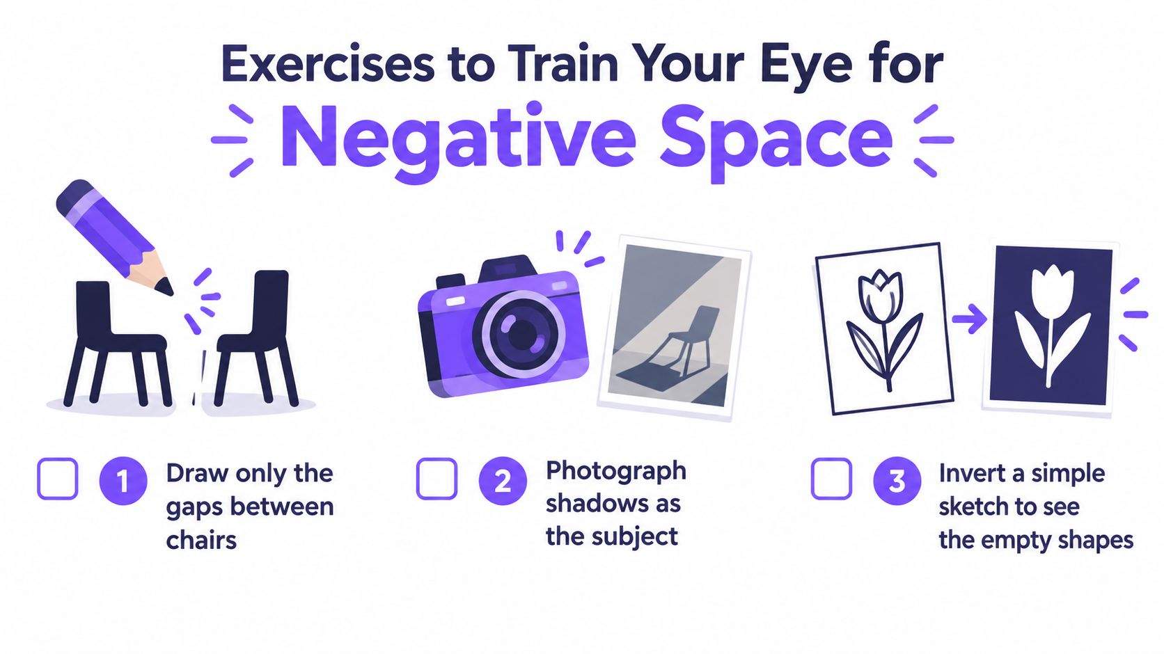
Place two chairs where you can see their legs and the spaces beneath the seats. Work in a small area of paper and draw only the shapes of the gaps. Don't draw the chair frames. Treat each opening like a flat patch of colour with an edge.
Afterwards, lightly add the chair outlines and compare the proportions. Tate's UK still-life drawing guidance recommends filling the spaces between, around and through objects because this changes how learners see overlap, occlusion and shape boundaries. You draw what is visible rather than what you assume an object should look like.
For accessibility, use a high-contrast arrangement, a thick pencil or a prepared photograph. A learner who finds a whole chair overwhelming can work with one gap first, then add another. A home-educated student can repeat the task with a table, plant or bicycle and keep the drawings as process evidence.
Fill the spaces in a still life
Arrange a cup, box and folded cloth. Instead of outlining them, shade the background and the gaps between the objects. Notice where one form overlaps another. Does the empty shape narrow at the point of contact? Does it open towards the edge of the paper?
This method is especially useful for checking whether your objects are too close together or whether one has become too large. Pause before adding detail. Compare the dark shapes as a group, then decide whether the object boundaries still make sense.
An adult learner with limited studio time can photograph the arrangement and work from the image. A SEND learner may prefer a viewfinder made from card, which isolates one area and reduces visual load.
Change the crop
Use a phone camera or a cardboard viewfinder to make three versions of the same arrangement. Keep the subject in place for the first image, move closer for the second and leave more surrounding space for the third. You're testing compression and expansion rather than trying to produce a finished photograph.
Write one sentence beside each version:
- The open version feels…
- The compressed version feels…
- The most disruptive version is created by…
You can also invert a simple sketch by shading the subject in white and the surrounding space in black. This reversal helps you check whether the empty shapes are coherent.
Negative-space exercises should train independence, not become a permanent substitute for understanding the subject. Once you can identify the gaps, return to drawing objects, figures or designs while using the same awareness. The goal is choice. Sometimes you need the exercise; sometimes you need to enlarge, compress or interrupt a gap in a finished composition.
Using Space Intentionally in Your Portfolio and Assessment Work
A portfolio should show more than a polished final image. It should reveal that you made, tested and evaluated compositional decisions. Include a small thumbnail with the original arrangement, a second version with altered spacing and a short note explaining why one version works better.
Use precise language:
- “I enlarged the area above the figure to create isolation.”
- “I compressed the gap between the forms to increase tension.”
- “I disrupted the background with repeated marks so the subject no longer floats.”
- “I kept the opening clear because it leads the eye towards the focal point.”
These notes demonstrate control without pretending that every composition must be evenly balanced. An asymmetrical image can feel stable if its visual weights counter one another. A deliberately crowded image can communicate urgency if the pressure is consistent throughout.
Build a progression
Connect negative space to foreground, middle ground and background. The gaps between overlapping forms can help establish depth. In a portrait, the space surrounding the head affects scale and emphasis. In graphic work, margins, alignment and the rule of thirds can organise where open areas appear.
Cambridge Assessment's GCSE-to-A level progression data provides a concrete benchmark for learners considering advanced study. In Art & Design, 58% of students who achieved GCSE grade 8 or above went on to obtain an A or A at A level, compared with 17% of those progressing from GCSE grade 7 and 10% from grade 6*; the figures are reported in Cambridge Assessment's progression document. This isn't a promise about an individual result, but it underlines the value of developing strong technical and critical habits early.
For further portfolio guidance, use these tips for building your artistic portfolio alongside your spatial experiments. Select work that shows variation, reflection and purposeful refinement. A university reviewer should be able to see not only what you made, but how you learned to make compositional decisions.
Conclusion Your Next Steps to Confident Composition
Positive and negative space work as a pair. You can't judge the weight of a figure without noticing the air around it, and you can't understand an opening in a sculpture without considering the solid form that frames it. The most confident compositions don't leave space unchanged by accident. They use it to establish balance, emphasis, calm, tension or movement.
Before submitting a drawing, painting, photograph or design, ask yourself:
- Where is the strongest positive form?
- Which negative shape attracts my attention first?
- Is the surrounding space open, compressed or disrupted?
- Does that choice support the subject's meaning?
- Are any gaps touching the edge unintentionally?
- Have I tested an alternative crop or arrangement?
- Can I explain the decision in one clear sentence?
Keep the chair-gap, still-life and crop exercises as short studio warm-ups. They're useful before observational drawing, figure work, photography and graphic composition because they reset your attention from naming objects to comparing shapes. For home-educated and adult learners, they also create manageable process studies. For SEND learners, the activities can be adapted through scale, contrast, simplified arrangements and shorter working periods.
At Level 2, aim to identify and control the relationship. At Level 3, push further by asking how that relationship supports an idea, audience or personal theme. University-ready work usually benefits from this second layer of thinking, where composition becomes evidence of intention rather than decoration added at the end.
The Online College of Art & Design (OCAD) offers flexible, tutor-led creative courses from Level 2 through Level 3 and Foundation Diploma pathways, with portfolio-focused assignments and support for home-educated, adult and SEND learners. Visit The Online College of Art & Design (OCAD) to explore a structured route for developing your observational drawing, composition and university portfolio.