

You've drawn a street corner from imagination. The nearest building looks almost right, then the roof slides, the windows lean, and the far wall refuses to sit behind the corner. You add shading, darken a few lines, and it still looks like a box that's collapsing. That frustration is familiar, and it's fixable. 2 point perspective gives you a construction system you can check, correct, and reuse, so your buildings hold together before you add detail.
Table of Contents
- Why 2 Point Perspective Matters for Your Art Studies
- The Core Principles of 2 Point Perspective
- A British Tradition of Teaching Perspective
- Constructing Your First 2 Point Perspective Drawing
- How Horizon Height Changes the Story
- When to Break the Rules on Purpose
- Portfolio Exercises and Self-Assessment Checklist
Why 2 Point Perspective Matters for Your Art Studies
Start with that wonky corner. The problem usually isn't your observational eye or your shading. It's that each edge was guessed separately, so no two receding lines agree about where they're going. Once you learn to send each family of parallel edges to its own vanishing point, a street, room corner, or product design stops floating and starts behaving like a solid form.
That matters at Level 2 and Level 3 because tutors don't only mark a polished final piece. They look for evidence that you can observe, analyse, construct, experiment, and evaluate. A perspective study with light guide lines still visible can show that process more clearly than a heavily shaded copy that hides how you built it.
What Level 2 and Level 3 Mean for Your Route
Students often ask whether a Level 2 course can lead to Level 3 and then university. In England, Level 2 aligns with GCSEs at grades 9 to 4 and Level 2 certificates and diplomas, while Level 3 includes A levels and Access to Higher Education Diplomas. They're different qualification levels, not just different course lengths, so choosing a Level 2 course with a clear progression relationship matters.
For attainment reporting, Level 2 is measured as five or more GCSEs at grades 9 to 4 or equivalent, and Level 3 as two or more A levels or equivalent. Universities may add subject, grade, or portfolio requirements, so your drawing evidence carries real weight alongside the qualification title.
A Skill Examiners Can Actually See
- Observational studies: A building corner with consistent convergence proves you looked at structure, not just surface.
- Analytical pages: Labelled horizon lines and off-page vanishing points show you understand the system behind the drawing.
- Experimental work: The same corner redrawn with a changed horizon demonstrates development, which is stronger than repeating one safe view.
You'll also meet the opposite idea later. Perspective isn't only about correctness. Once you can build a convincing corner, you can distort it deliberately and explain why, and that decision making is exactly what separates a technical exercise from portfolio work with intent.
The Core Principles of 2 Point Perspective
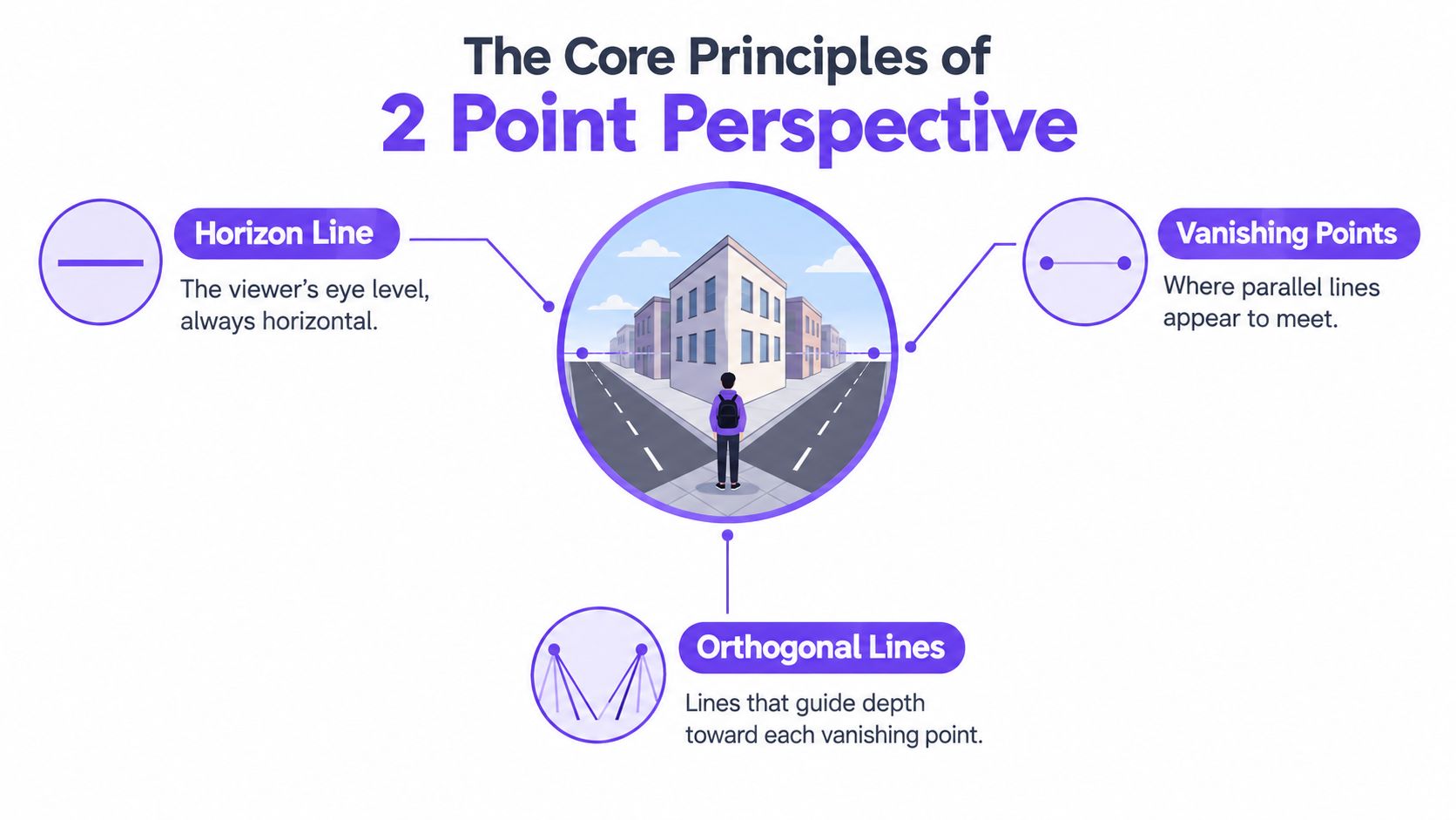
Stand on a pavement corner and look along both streets. One set of kerbs, rooflines, and window tops disappears to your left. Another set disappears to your right. You're not facing either wall squarely, and that's the whole setup. In 2 point perspective, the object's vertical faces sit at an angle to the picture plane, while its vertical edges stay vertical.
The vocabulary follows what you're already seeing. The horizon line is your eye level, drawn as a straight horizontal line. The two vanishing points sit on that line. Receding edges, called orthogonals, travel toward one point or the other depending on which direction they face in real space.
Eye Level Comes First
If you crouch, you see less roof and more underside. If you stand on steps, rooftops and paving open up. Moving the horizon does the same work on paper because the line records where your eyes are in relation to the subject. That one decision controls which planes the viewer can see before you've drawn a single wall.
Students often try to fix a drawing by moving the building up or down the page. That doesn't change the viewpoint. Changing the subject's position relative to the horizon does, because a form below eye level reveals its top, while a form rising above eye level hides it. Understanding how drawn form describes three dimensional structure helps you see why those visible planes matter.
Points That Leave the Page
Your vanishing points don't have to fit inside your sketchbook. In UK instruction, the two horizontal edge families project toward separate vanishing points on the horizon, and those points may lie outside the paper. You may need to extend the horizon onto scrap paper, a desk edge, or a longer ruler line.
Spacing controls how extreme the view feels:
- Points far apart: Convergence is gentler, so the building looks flatter and more natural.
- Points close together: Angles sharpen, corners push toward the viewer, and forms can look unnaturally wide or compressed.
- One point much closer: One face dominates, which is useful when you want to favour a main facade.
Every receding horizontal edge goes to one of the two vanishing points, and every vertical edge stays truly vertical.
Keep that sentence beside you while you draw. If a line doesn't obey it, don't shade over the problem. Find which family the edge belongs to and redirect it.
A British Tradition of Teaching Perspective
Perspective in Britain didn't remain a studio trick passed between painters. It became a formal subject tied to geometry and optics. British mathematician Brook Taylor published the first edition of his influential treatise on linear perspective in 1715, a milestone described in Yale's exhibition account of British perspective manuals and topographical drawing. Taylor's work helped establish perspective as something that could be reasoned through, not only intuited.
The next step made that reasoning usable for designers. Joshua Kirby published work focused specifically on architectural perspective in 1761, presenting simplified methods and models to help readers construct accurate compositions. Seven years later, the Royal Academy opened in London in 1768 and included a professorship of perspective in its charter. Theory, practical instruction, and art school teaching were now connected.
From Academies to Mechanics Institutes
The nineteenth century took perspective beyond elite academies. Anderson's Institution was established in Glasgow in 1796, Glasgow Mechanics' Institution followed in 1823, and the London Mechanics' Institution was founded in 1824. By 1834, Glasgow offered classes in mechanical and architectural drawing for industrial and technical communities, as documented in research on Glasgow drawing education and mechanics institutes.
By July 1856, Glasgow Mechanics' Institution employed two separate drawing teachers for mechanical and architectural drawing, painting, and perspective. Learners across Britain also used manuals, provincial academies, Government Schools of Design, and workplace training. Artisans, engineers, tradespeople, and aspiring designers needed a reproducible way to depict corners, facades, streets, and constructed forms.
Perspective earned its place in British education because it served both the artist imagining a scene and the worker who had to communicate a built object clearly.
That's the lineage behind your classroom exercise. When a tutor asks for a constructed street corner, they're not imposing a foreign academic ritual. They're teaching a British practical tradition that links visual creativity with geometric reasoning, and it still underpins architecture, product design, illustration, and visual communication.
Constructing Your First 2 Point Perspective Drawing
Use a simple building corner for your first attempt, not a whole street. You need a ruler, a light pencil for construction, and enough patience to leave guide lines visible until the structure checks out. Treat the drawing as a build. Tone and colour come after the architecture stands up.
The sequence below gives you a repeatable workflow you can use in a sketchbook, then transfer to larger portfolio sheets.
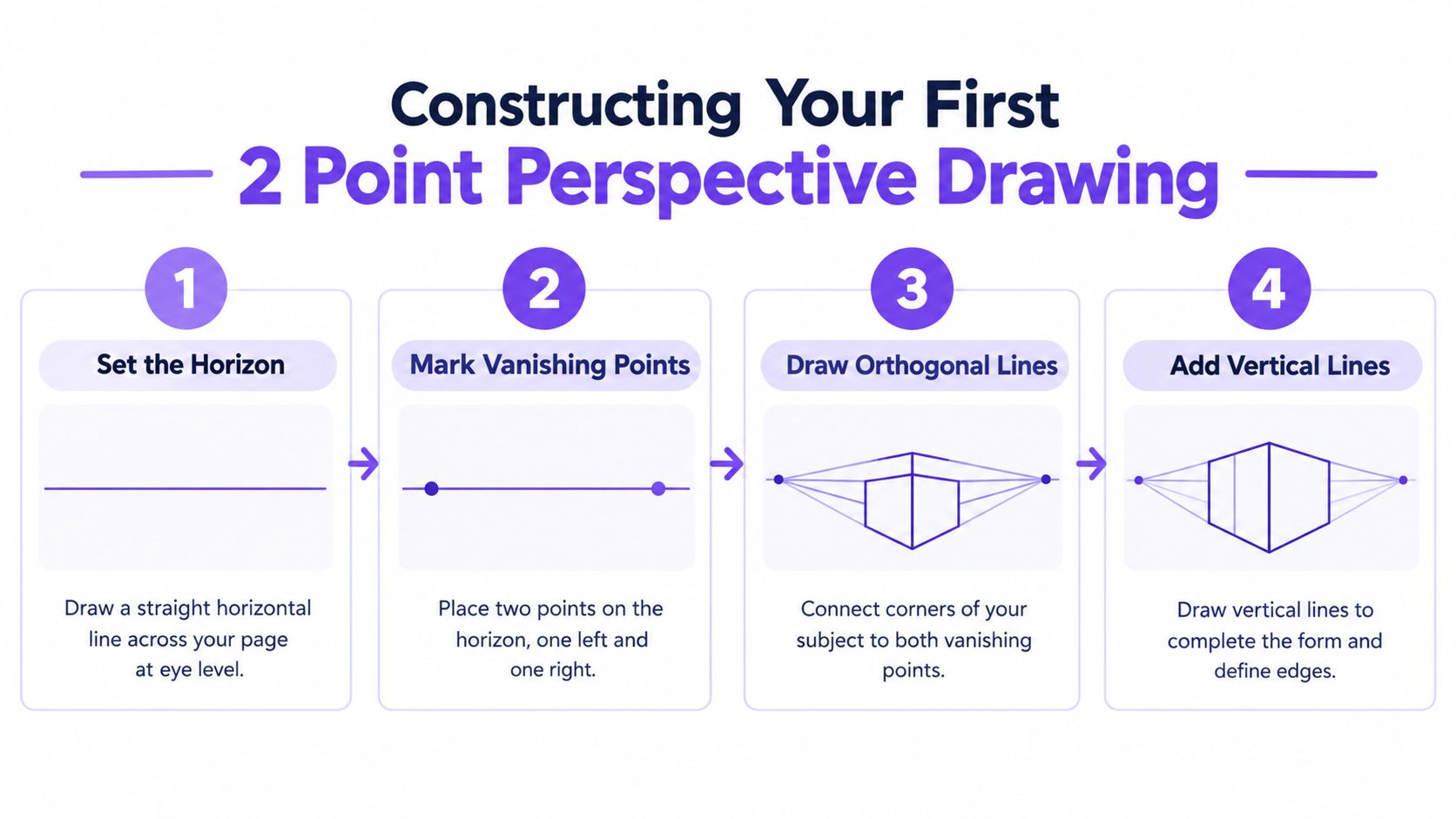
Build the Structure in Order
- Set the horizon: Draw a straight horizontal line at the eye level you want. Decide before you place the building whether the viewer is looking slightly down, across, or up.
- Place both vanishing points: Mark one left and one right on the horizon. Push them wide for a calm view, and tape extra paper to the sides if they fall off the sheet.
- Draw the principal vertical: This is the nearest corner of your building. Its top and bottom become the starting points for every receding edge.
- Project the orthogonals: From the top and bottom of that vertical, rule lines to the left point and to the right point. You've now defined two wall planes.
- Close the form: Add two more verticals where the walls end. Connect their tops back to the opposite vanishing points if you need the rear roof edges.
Watch the construction being built in real time before you add detail to your own version.
Add Details Without Breaking the System
Windows, doors, roof lines, signs, and paving aren't decoration added on top. Each one belongs to a wall plane, so its top and bottom edges must follow that wall's vanishing point. Vertical sides of windows stay vertical. A row of windows gets smaller and closer together as it recedes, and you can check that spacing against your guide lines instead of copying equal rectangles across the wall.
drawing as construction rather than outline copying changes your habits. You're placing features inside a measured spatial framework. If a door looks too tall, compare it with the corner vertical and the converging guides at that depth, not with the door nearest the viewer.
Before you erase anything, run three checks. Do all left facing horizontals meet at the same point, and do all right facing horizontals meet at theirs? Are the verticals parallel to the page edge? Do repeated elements shrink along the orthogonals? UK classroom guidance uses the same checks, and WJEC guidance on horizon placement and converging building edges reinforces that details must follow the same convergence rules as the main form. Only darken the final edges once those checks pass.
How Horizon Height Changes the Story
Draw the same corner shop three times and change only the horizon. The building hasn't moved, but the story changes completely. That's because horizon height tells the viewer where their body is in the scene, and viewers read that position emotionally before they analyse the geometry.
With a low horizon, the building rises well above eye level. You see wall planes and the underside of eaves or canopies, but no roof surface. The shop feels dominant, even imposing, which suits work about scale, authority, or feeling small in a city.
Three Positions and Three Meanings
A horizon near the building's mid height feels observational and neutral. You're standing across the street, neither overwhelmed nor in control. This is often the clearest choice for a technical study because both wall planes read easily and repeated details remain legible.
Raise the horizon into the upper half of the page and you look down on the subject. Rooftops, paving patterns, and the tops of lower objects become visible. The scene feels surveyed or explained, which is useful for design proposals and location studies where layout matters. WJEC specifically links a higher horizon with looking down on an architectural subject, while placing the subject above the horizon communicates looking upward.
| Horizon Position | Viewer Perspective | Visible Planes | Best For |
|---|---|---|---|
| Low on the page | Looking up at the building | Walls and undersides, no roof top | Drama, scale, dominance |
| Near mid height | Standing at street level | Two wall planes, limited roof | Clear observational studies |
| High on the page | Looking down on the scene | Roofs, paving, upper surfaces | Layout, overview, design explanation |
If you want a fuller explanation of eye level, read about what horizon lines do in a drawing and then test one building at all three heights. Keep the vanishing point spacing consistent so horizon height is the only variable. Annotate what each version hides, because what the viewer can't see shapes the mood as much as what they can.
Decision prompt: Choose the horizon for the feeling you want first, then construct the building to serve that feeling.
When to Break the Rules on Purpose
Here's the part many beginner tutorials leave out. 2 point perspective is a model of seeing, not a universal visual law. It assumes a static observer and a flat picture plane. Real vision involves moving eyes, a curved visual field, memory, and emotion, so an accurate construction is one choice among several, not the only honest way to draw space.
That doesn't give you permission to ignore convergence and call the result expressive. It means you learn the system well enough to depart from it for a reason you can name. An accidental leaning vertical looks like a mistake. Several verticals tilting consistently toward a raised or lowered point can create unease, speed, or instability that supports an idea.

Distortion You Can Justify
Bring the vanishing points closer together and the corner lunges toward the viewer with wide angle energy. Tilt the horizon and the whole street feels off balance, as if the viewer is moving or the ground can't be trusted. Stretch verticals, compress one facade, or exaggerate convergence on one side only, and you direct attention while changing the emotional temperature of the scene.
UK guidance supports treating drawing as exploration as well as technique. The Department for Education research review for art and design frames drawing as a means of exploring ideas, recording experience, analysing visual work, and developing creative outcomes. For GCSE, iGCSE, A Level, and portfolio learners, that means experimentation and evaluation can sit alongside observational accuracy when the intention is clear.
Try this test in your sketchbook:
- Version one: Draw the corner accurately and label the horizon and both points.
- Version two: Move the points much closer and annotate the change in energy.
- Version three: Tilt the horizon slightly and write what the instability communicates.
Place the accurate study beside the distorted ones. That pairing proves control. Your annotation should use marking friendly language, such as naming the change, its visual effect, and how it serves your theme. Examiners can then distinguish purposeful distortion from an error you didn't notice.
Portfolio Exercises and Self-Assessment Checklist
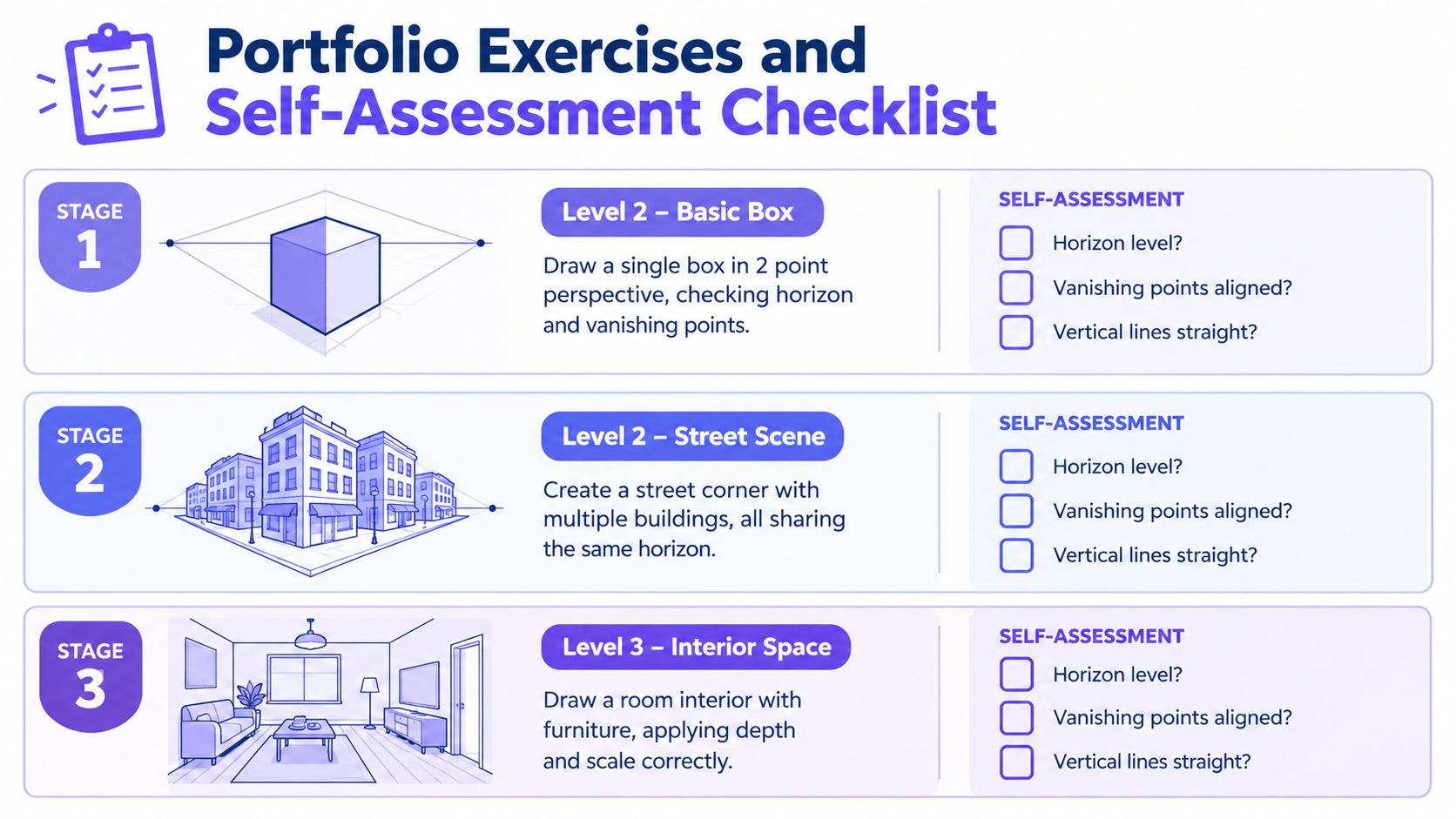
Turn one street corner into a three stage portfolio sequence. Stage one is a technical study with verified convergence and guide lines retained. Stage two redraws the same corner with one deliberate distortion, such as closer vanishing points or a tilted horizon. Stage three is a reflective annotation that compares the versions and explains which one better serves your intended mood.
Check Your Work Before Submission
- Horizon level and intentional: Can you say where the viewer stands and why?
- Vanishing points consistent: Does each receding edge reach the correct point?
- Verticals vertical: Have any corners leaned by accident?
- Scale reduces with depth: Do windows, paving, and signs shrink along the guides?
- Experiment explained: Does your annotation separate deliberate distortion from error?
Students also ask which Level 2 course best prepares them for university. The Department for Education identifies creative and design as an occupational route and states that Level 2 progression qualifications should offer a clear route to approved Level 3 study in its guide to the post 16 qualifications landscape. Choose for progression content and portfolio preparation, not title alone. As the Department for Education conditions for Level 2 progression qualifications state, Level 2 progression qualifications prepare you for Level 3 by developing the breadth of knowledge and practical skills needed for a Level 3 technical or alternative academic qualification.
Build your perspective studies into a university ready portfolio with tutor led feedback on construction, experimentation, and annotation at The Online College of Art & Design (OCAD). Explore flexible Level 2 and Level 3 art and design routes, compare the pathway that fits your goals, and start your next constructed drawing with a clear plan for progression.