

You've opened a sketchbook, picked up a pencil, and then discovered that a smiley face isn't quite as effortless as it looks. The circle leans, one eye sits higher than the other, and the mouth somehow looks worried instead of happy. That's normal. Learning to draw smiley face designs gives you a small, manageable exercise in proportion, expression, line control, and visual communication.
The familiar yellow face has a surprisingly rich history. Harvey Ross Ball created it in 1963 for State Mutual Life Assurance Company in Worcester, Massachusetts, and BBC Bitesize reports that he finished the design in less than 10 minutes. The symbol later became closely connected with UK rave culture during the 1980s and 1990s, while American novelty manufacturers Bernard and Murray Spain had reportedly sold 50 million “Have a Nice Day” smiley-face buttons by 1972 (BBC Bitesize's history of the smiley face).
Table of Contents
- Why Drawing a Smiley Face Matters for Beginners
- How to Draw a Basic Smiley Face Step by Step
- Creating Stylised Variations of the Smiley Face
- Essential Tips for Accurate and Expressive Drawings
- From Simple Sketch to Creative Confidence
Why Drawing a Smiley Face Matters for Beginners
A smiley face looks simple because it reduces a face to a few clear signals: a round form, two eyes, and a curved mouth. That reduction makes it an excellent first exercise. You can concentrate on shape, spacing, balance, and emotion without getting distracted by realistic anatomy.
Start by asking what the viewer needs to recognise happiness. The answer isn't shading or intricate detail. It's the relationship between the features. Evenly placed eyes create stability, while an upward-curving mouth gives the face its positive emotional direction. Small changes can make the same basic design look cheerful, uncertain, sleepy, or mischievous.
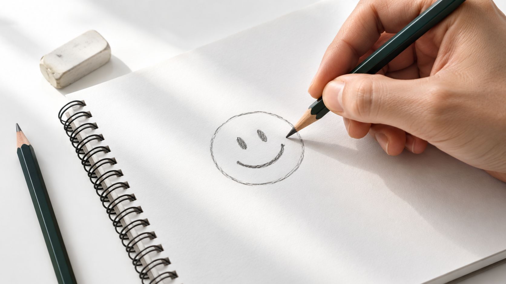
A compact lesson in visual language
The exercise also introduces a principle used throughout illustration, graphic design, animation, and typography: a small number of visual choices can carry a large amount of meaning. A designer may simplify a complex idea into an icon, just as you simplify a face into a few marks.
That makes the activity useful beyond casual doodling. A Level 2 learner can use a series of smiley faces to explore line and expression, while a Level 3 student might develop the exercise into a portfolio page about symbols, audience interpretation, or digital communication. The drawing becomes evidence of decision-making, not merely a copied cartoon.
Practical rule: Make the message clear before making the drawing detailed.
Work lightly at first. Your first version only needs to answer three questions: Is the outer shape balanced? Are the eyes positioned consistently? Does the mouth clearly communicate the intended feeling? Once those choices work, you can experiment with colour, texture, pattern, and character.
This is also why the symbol remains useful in visual culture. Its circular form and minimal features make it easy to reproduce across buttons, clothing, street graphics, music branding, tattoos, and digital interfaces. A beginner who learns to control this small composition is already practising the foundations of visual communication.
How to Draw a Basic Smiley Face Step by Step
Use a pencil, an eraser, and paper with enough space to redraw the face. Keep your early lines faint. Construction marks are not mistakes, they're temporary guides that help you make better decisions.
Build the structure first
Step 1, draw the base. Begin with a simple circle or gently rounded oval. A perfect circle isn't necessary. An oval can look more friendly or characterful, and a slightly imperfect outline can give the drawing a hand-made quality. Avoid pressing hard because you may want to adjust the shape later.
Step 2, add centre lines. Draw a light horizontal line across the face and a light vertical line from top to bottom. These lines divide the face into useful areas. The horizontal line helps you place the eyes at a similar height, while the vertical line helps you judge whether the features sit centrally.
Step 3, place the eyes. Add two evenly sized dots, ovals, or small circles on the horizontal guideline. Leave a similar amount of space between each eye and the vertical centre line. If one eye is noticeably higher, the face may look tilted, even when the outer circle is accurate.
Step 4, draw the mouth. Position the mouth below the horizontal centre. Start with a shallow upward curve, then check both corners. The corners should rise in a similar way. For a stronger expression, open the mouth slightly and add a simple lower curve, but don't add teeth or a tongue until the main shape feels balanced.
Step 5, refine and shade. Compare the left and right sides, erase the guidelines, and redraw the final marks with a steadier stroke. You can vary line weight by keeping the outer contour slightly stronger than the construction details. Add a small amount of shading only after the face remains readable without it.
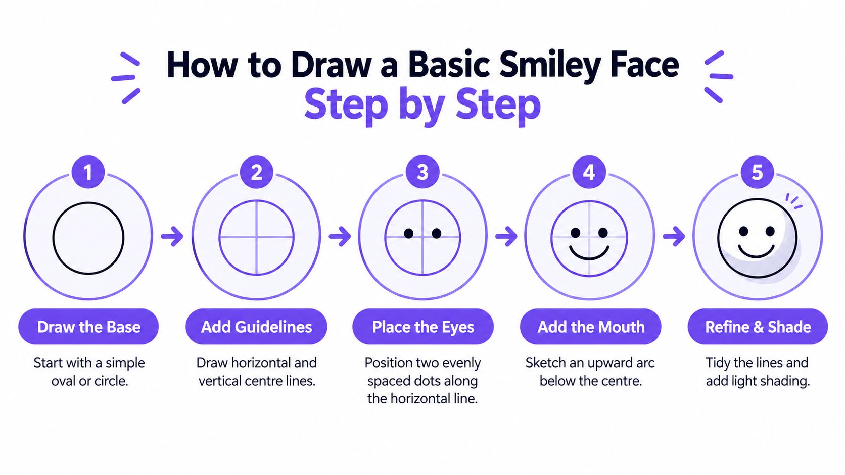
Check the expression before decorating
Hold the page at arm's length or look at the drawing as a small thumbnail. If the face stops reading clearly, the problem is probably structural rather than decorative. Check the mouth first, then the eye spacing, then the overall oval.
You can also turn this basic exercise into a personal design project. Once you understand the construction, explore unique smile tattoo ideas to try to see how a simple smile symbol can become a more permanent visual statement. You don't need to copy any design. Instead, notice how artists adapt scale, line quality, surrounding marks, and placement.
Creating Stylised Variations of the Smiley Face
Once your basic face works, change one feature at a time. This gives you a clearer understanding of cause and effect. If you alter the eyes, eyebrows, mouth, colour, and outline together, you won't know which decision changed the emotion.
Let the features carry the mood
Start with the eyebrows. Slightly raised brows can suggest surprise or delight, while one raised eyebrow may create a questioning or sarcastic tone. Angled brows pointing down towards the centre can make the face look tense or cross, even if the mouth remains curved upwards.
Next, try different eye shapes. Small dots create a neat, symbolic appearance. Tall ovals can look alert, while closed arcs suggest contentment or laughter. Large circular eyes may make the face appear surprised or childlike. The mouth then completes the reading: a narrow curve feels restrained, an open mouth feels energetic, and an uneven curve can suggest embarrassment or uncertainty.
A useful practice is to draw a small grid of faces and alter only one element in each version:
- Eyebrows: Keep the eyes and mouth fixed while changing the brow angle.
- Eyes: Use dots, arcs, ovals, and uneven shapes to compare levels of alertness.
- Mouth: Test a closed smile, open smile, sideways curve, and downturned line.
- Outline: Compare a clean circle with a wobbly hand-drawn contour.
- Colour: Use colour to support the message, but make sure the expression still works without it.
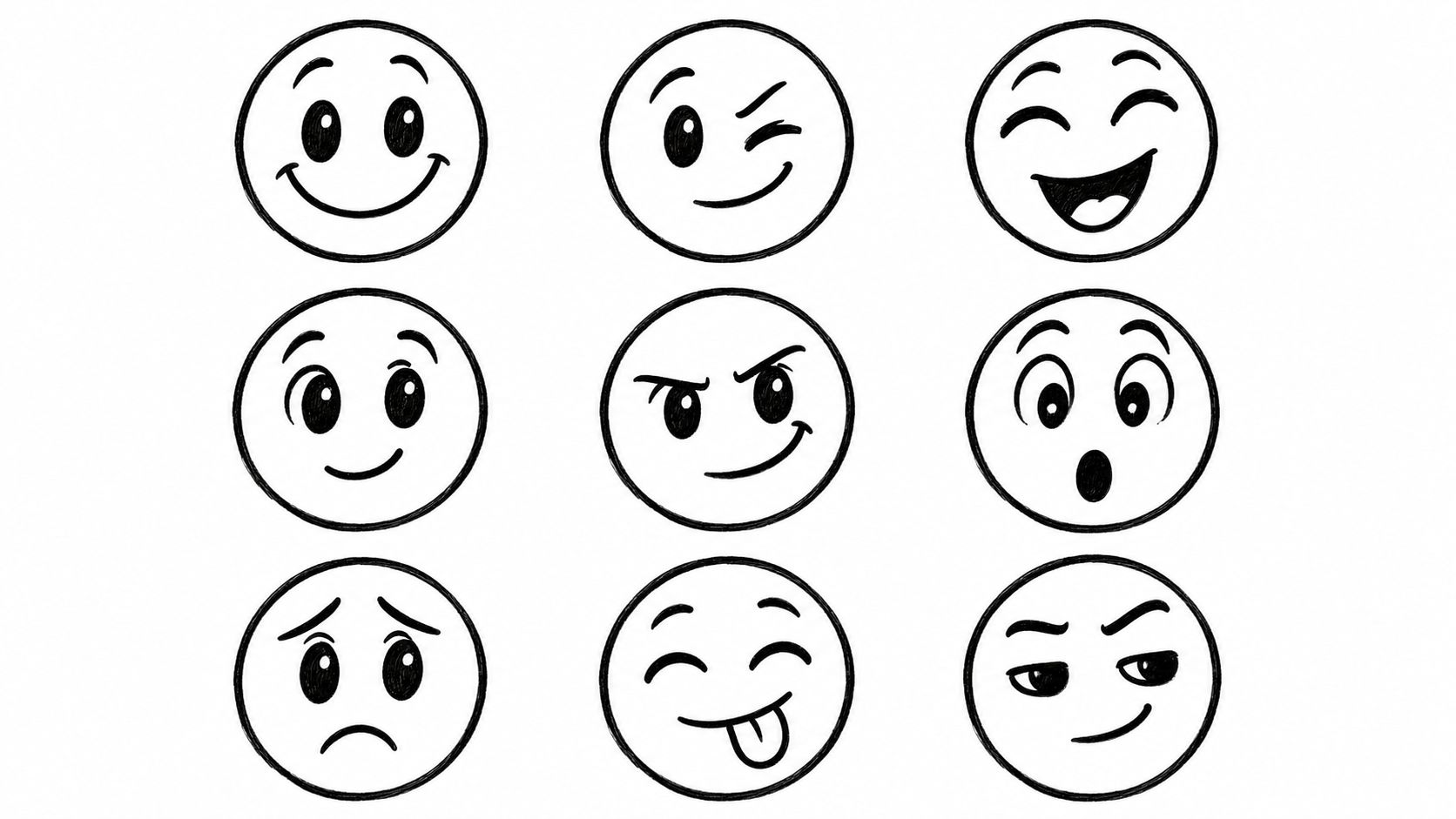
From copy to visual storytelling
A minimalist line drawing may use only a black contour and three internal marks. A cartoon version might exaggerate the eyes, add cheeks, or give the mouth a bold outline. A digital emoji-inspired version may use smooth geometry, flat colour, and a consistent visual system. None is automatically more successful. The right style depends on the audience and the message.
Here the idea of line definition becomes useful. A delicate, broken line can feel quiet or uncertain, while a thick continuous line can feel confident and playful. Reviewing line definition in art can help you connect your smiley exercise to broader decisions about contour, weight, movement, and texture.
You can also consider where the design might appear. A small face on a sticker needs a strong silhouette and clear features. A larger artwork can support texture, pattern, and layered marks. If you're exploring real-world applications, looking at products such as shop emoticon car decals can help you think about how scale, contrast, and distance affect legibility.
Treat each variation as a question: What does this mark make the viewer feel, and would another viewer read it in the same way? That question turns a doodle into a small study of visual language.
Essential Tips for Accurate and Expressive Drawings
Accuracy starts before the final line. Lightly block the oval, centre axes, eyes, and mouth before you commit to darker marks. If you draw every feature heavily from the beginning, correcting the proportions becomes difficult and the paper can become crowded with repeated lines.
Compare the two sides rather than trusting your first impression. Look at the distance from each eye to the centre line, the height of the eyes, and the length of each mouth corner. You can also turn the page upside down or view it in a mirror. A change of viewpoint often reveals a tilt that was difficult to notice while drawing normally.
Useful check: If the face looks unhappy, inspect the mouth corners and eyebrow angles before adding more detail.
Adapt the exercise for different learners
A simple activity isn't automatically accessible. A 2025 survey of 569 primary teachers found that 77% had observed worsening ability since early 2020 in precise movements such as holding a pencil, drawing, writing, or using scissors. The same survey found that 76% believed art education wasn't prioritised, while only 12% could provide more than 60 minutes of art teaching per week (National Society for Education in Art & Design coverage of declining fine-motor skills).
Offer more than one route to completion:
- Large templates: Let learners trace or decorate a large circle before attempting a freehand version.
- Alternative tools: Try thick pens, stamps, adapted grips, or a tablet with a stylus.
- One feature at a time: Practise circles, eyes, or curves separately before combining them.
- Flexible success criteria: Assess whether the drawing communicates an emotion, not whether every line is geometrically perfect.
- Clear communication: Pair the visual task with spoken or written directions for learners who use assistive technology or communicate nonverbally.
The supporting UK research describes emojis as a fast, accessible visual elicitation method that can reduce the difficulty associated with other visual activities, while recognising their central role in young people's everyday digital communication. That makes the smiley face a useful bridge between fine-motor practice, emotional literacy, and communication, provided learners can approach it through different physical and cognitive routes.
For pencil control, review how to hold a pen correctly and choose a grip that supports comfort rather than forcing one rigid position. Test the finished drawing at a small size, on both light and dark backgrounds, and in greyscale. Keep the eyes and mouth distinct, maintain strong contrast, and add alternative text in online work, such as “yellow circular face with two eyes and an upward-curved smile”, rather than relying on the image alone.
From Simple Sketch to Creative Confidence
Keep your first smiley face as a reference, then create a second version with one deliberate change. You might make the oval wider, move the eyes closer together, raise one eyebrow, or replace the closed smile with an open mouth. Write a short note beside each version explaining the emotion you intended and asking someone else what they see.
That process gives you more useful evidence than a single polished drawing. It shows that you can observe, adjust, compare, and explain. Those habits matter in school projects, portfolio development, and future study in illustration, graphic design, photography, animation, fashion, or fine art.
Planning a portfolio experiment
Use the following sequence for a small portfolio page:
- Draw one clear base face using light construction lines.
- Repeat the face several times without changing the outer shape.
- Alter one feature in each version.
- Test the drawings at small size and in monochrome.
- Add brief annotations about audience interpretation.
- Select the most effective versions and refine their line quality.
If you're preparing for an assessment, use exam-ready art revision tools to support your wider study alongside practical drawing. You can also develop a regular practice routine with how to get better at drawing, focusing on repeatable exercises rather than waiting for inspiration.
For UK creative students, progression requires careful planning. The government qualification framework places GCSE grades 9 to 4, Level 2 certificates and diplomas, Level 2 National Diplomas, Level 2 NVQs, and Functional Skills qualifications at Level 2 (UK qualification levels). Universities commonly assess applicants against course-specific Level 3 requirements, so a Level 2 creative qualification may support progression towards further study without guaranteeing direct degree entry. Check the exact admissions page and ask whether you need a Level 3 diploma, A Level, Access to Higher Education Diploma, or foundation year.
A foundation year can provide another route. UCAS lists Solent University's one-year Design Foundation Programme for applicants whose background or qualifications may not meet direct entry requirements. The listing gives a minimum of 48 UCAS Tariff points, including examples such as A Levels at DD, BTEC National Extended Diploma at PPP, and BTEC Diploma at MP, while noting that applicants below the minimum may be considered individually through evidence such as an interview or portfolio (Solent University Design Foundation Programme on UCAS). Always confirm fees, funding, progression conditions, and portfolio expectations with the university.
The Online College of Art & Design (OCAD) offers flexible, tutor-led online courses in art, design, photography, music, and related media, including Level 2 and Level 3 pathways with portfolio-centred coursework. Visit The Online College of Art & Design (OCAD) to explore drawing-focused study, SEND options, and routes that can help you develop a simple smiley-face exercise into assessed creative work.